Drawing outside.
Project 1 Trees
I have slowly started to compile within my sketchbook some scene sketches. I have my "work" sketchbook which is an A4 and as this is not always very handy to carry, I have a secondary sketchbook which I keep with me for most of the time when I am not at work. This is an 5 1/2 x 7 1/2 landscape book and I have found using a smaller book has helped me get some quick sketches down without the panic of filling a huge sheet in a small time slot.
My carrying kit started off quite cumbersome but I have refined it down so it can more or less fit in my bag or in my car without taking up too much space.
It includes:
Varied pencils from H-B9
Charcoal
White pencil
Fineliner
Black brush marker
Biro
Putty rubber
Dual tool sharpener
Elastic band
Sketchpad
Selection of papers in colour/texture
 |
| A bit messy but these are the usual suspect I carry for ease and at hand. |
I do sometimes take my watercolour pencils with and a wet brush but if I am quick sketching the drying process can sometimes be a hindrance if I am on a time budget.
The elastic band - I use this so if I am really tight for space, I can hold a pencil/pen with the pad and chuck it in my bag.
My sketchbook - I have made a card based envelope and glued this to the inside, so if I find anything interesting or postcards, images of the place I am sketching I can put them in for later use. I somehow seem to accumulate dried leaves at the moment!
In my sketchbook, I also hold within a few cut down sheets of varied papers in colour and texture, this gives me a choice of mediums to use such as the white pencil.
Also if I do a quick sketch on something else, it might get glued in within the pages. Sometimes, I might be without my sketching pack.
 |
| Here is some sketches from within the sketchbook I carry in my kit. The previous exercises from Assignment two have really assisted with my mark making and being a little more considerate on what I am putting down, even if it is quick. Also the additional freedom to add notes is great way of reminding me what I was thinking at the time. |
 |
| These are pages from my "work" sketchbook, I tend to be a little more considered and structured on these pages as they tend to be when I have more time and can experiment. |
 |
| Selection of photos for my reference. |
 |
| As I do have the major restriction of daylight time with work, if I am free for an hour or two, I sometimes get snapping, they are not designed to be arty or compositions in a whole but points I find interesting and can see the use of such as shadows and forms among the trees. |
Exercise 1: Sketching Individual Trees
This first exercise is quite an interesting break down. I must admit, I would tend to start a drawing in a whole form of all detail and build within that without possibly considering something as basic as its outline and the negative spaces it can produce.
Hitting this exercise in the winter did mean the majority of foliage was evergreen and I didn't at the time have an opportunity to expand my journey, so off to the park it had been. I picked a large established tree, it was bare, but it had many, many branches and fronds which I thought gave some great movement and filled its form almost like a solid.
Once I had looked back on this exercise I can see that in looking at the form and shapes of shadows, the tree what quite an interesting subject to pick.
Also, using the four points I did find I interpreted the creative methods differently. I was almost soft with the third step of outlining the main branches and the trunk and found when I moved t the fourth step I expressed the tree more wildly.
I found doing this quite therapeutic and simplifying the points of observation takes the sting out of the process without that overwhelming feeling of wondering how to get it all on paper.
I went back and revisited this tree in the next exercise I liked it that much!
 |
| A tree in four forms. |
Exercise 2: Larger Observational Study of an Individual Tree
Moving to this exercise, I was lucky to have a very cold, but clear and rarely dry day free to get some outside drawing done. I went in search of the tree to draw. I found this one on the back of a walk route and it was quite hidden from the others and it had some fabulous spaces between the branches that came up from the routed base.
I did this on white paper with a black ballpoint pen. I found that using the pen, allowed two things. The definition and cross hatching and lines were prominent and effective of the trees surface and also because the ink flows continually while the pen moves, I could observe more so without being to concerned with pressure or blunt nibs.
When I came home I left this for about a week, and when I went back to it, I was really pleased with it for a sketch. The pen work actually suited the dryness and bareness of the tree itself.
While I was there I also took this as an opportunity to expand my photograph collection, so snapped a few other wintered trees while there.
 |
| A3 white card and a black biro pen. Both worked well together for this tree. |
 |
| Scan of my original drawing - applied some coloured inks to extenuate the wintered bark and tones of the tree. |
 |
| Digital drawing! |
 |
| Pencil sketch of a very old tree, I added the background foliage for this as I feel it needed it to express the size of the tree. |
This below is a complete off the wall flash of inspiration. After the research of Kathe Kollwitz I wanted to try linoprinting to see how it worked, so after my first exercise, I went back and did a pencil sketch of the tree, from this I tried to copy it onto some lino I purchased from Amazon, I don't think it is the best quality and probably designed as a hobbyist type kit, but I had four tools, ink and a brayer with it so gave it ago! It is roughly about 4 x 6 inch print but after attempting the inking several times it did come out okay! A total appreciation for lino printing, it really does consume time, it took me several sessions of chiselling to create this small attempt! The constant concern of what is negative and positive is a lesson too.

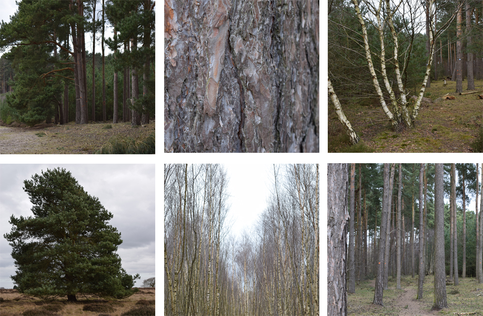
Exercise 3: Study of Several Trees
For my treescape I visited a plantation where there was a variation of trees. The scape mainly consisted of young pines and some areas had a huge mass of silver birches that stood compacted together in areas.
For my first scene, I worked over my sketch with oil pastels. This did taken a little bit longer than expected, but the build up of shape, form and marks were more thought about than possibly when I use other mediums. I found using the oil pastels also did restrict being too contained in over detailing, which is a good thing for me. The pines were quite solitary even though there was a density and the colours were hard to specify and I found the best way was to overlay pastel oil upon oil and keep flipping from one colour to another to build up the textures of the bark, grass and foliage.
I used the sparseness where the trees greenery stood above the trunks to use the space between to show the sky and light to try show the depth of the forest.
I liked this part of the forest as I liked the worn path that weaved out into the woods, and the fully formed trees at the side against the taller stripped pines, but I think as a composition of trees the forms started to get lost the more I worked on it.
It all started to become a bit "grey" in places. The positive is was a move away from what I know I can do, and to try a different way of drawing with mediums and building up imagery from what I can see.
 |
| Oil Pastels on Mixed media A3 paper. |
A few days after the above experience of treescape drawing, I felt that I wanted another go and see if I could produce the drawing I was happy with. Working from one of the photographs I used grey cartridge paper and white pencil and charcoal pencil.
I think this worked well with the silver birch trees.
The felled path was a good division and point of interest in the drawing. Going back to my oil pastel drawing, I tried to be less defined in detail but give lines that made the shapes between the trees and textures of the barks. I am happier with this one, and think I will revisit this again.
 |
| Grey cartridge paper and white pencil and charcoal pencil. |
Landscape drawing is this next stage, I automatically think of trees, fields, and hill and valley lines with the thought of landscapes. The process of creating landscape and visions of our world around us can be in the format of urban as well as rural. Maybe because at the moment of time, as humans and our expanding population and technology our urban and rural spaces change rapidly and this could be a point of interest for any social historic documentation in the future, I appreciate the fact we photograph everything these days and we all have this capacity, it is often fast, temporary and of little personality. A drawing of a landscape can produce how we feel and how we see the world around us.
I am looking forward to this project section.
Using the research points have looked at the suggested artists here: Research and Reference
Exercise 1: Cloud Formations and Tone
A drawing of a cloud is often very illustrative and not as suggested a "Drawing", I thought about why I would draw them as a solid series of shapes, that are often made up of various circular shapes. I think this is because, the basis of drawing an actual cloud is not as simple as it may seem.
Looking at the forms, there is firstly the strange natural occurrence of the outside line and it has this blurred up focused edge in the majority of areas and then occasionally a blip of a strong outline appears.
To do this exercise I did try a variety of materials to see what is the outcome. The main points of capturing clouds and the formation are to suggest their being, to get the moment down onto paper before it has gone. A very good exercise in trying to look and draw swiftly and within enough time to record what is seen.
 |
| This is on textured paper with charcoal and white chalk. |
 |
| Pencil |
 |
| Sketchbook |
 |
| Conte Stick, Fine Liner, Graphite in Sketchbook |
I even had a go at fast painting using acrylic and water, but I just found that the process did not work at speed and I kept overlaying and being heavy with the colour, whereas looking at it, I may have made better shapes with using a small amount of paint and more water.
 |
| Acrylic paint in the sketchbook. Not quite forming as well as I hoped, but there is some shape, I did find with paint I was more tempted to look at the paint more than rather than the clouds! |
 |
| Not copying, but re-describing what yous see! Taken from Vija Celmins video. Link available in my research section. |
To combat this, I made four pencil rectangles in my sketchbook, equipped myself with black fine liner and set off on a familiar route.
I had no idea where I would stop or what I was going to draw exactly. The journey to the beach was a chosen route and it is somewhere I have walked many times.
 |
| Stop and sketch 1 |
 |
| Stop and sketch 2 |
 |
| Stop and sketch 3 |
I did struggle to get the horizon of the ocean correct, but the purpose of my use of one pen was to mark make and be decisive, next time I make an horizon line, think I will start from that point.
The shape of the curve path is caught where it has tunnelled through the soft sand.
The next stop was along the sea front, the sun was fading mid draw so there had been some strong shadows and shapes, and I managed to get some of these down. I did seem to struggle with the perspective on this. I should of drawn in my lines and stuck to the direction as I did seem to lean off on one side. There were people around and I did keep a couple in as they moved through as I reached that part of the sketch.
 |
| Stop and sketch 4 |
Overall, I did enjoy this, but there is the temptation to think "I could do more", but the time framing is a good exercise and I am pleased I stuck to one tool.
Exercise 3: 360° Studies
Exercise 3: 360° Studies
I chose our large local park to try this exercise, I thought from each direction I could locate a focal point in any direction.
I have tried this exercise using soft pencil only, I wanted to try some soft mark making with pencil and see if I can make a smoother and fast catch of what I can see and get some more tones than what I could with the ink pen.
The first sketch above started with me using the large tree as my focal point and using it as a size guide through my viewer. The soft pencil allows for fast coverage of where light is sheltered and it does allow for showing thicker defined lines.
I have tried this exercise using soft pencil only, I wanted to try some soft mark making with pencil and see if I can make a smoother and fast catch of what I can see and get some more tones than what I could with the ink pen.
 |
| sketch one North. |
I resisted to not draw in every leaf and branch.
I think keeping the timing to a limit does help, I did start to over work the tree trunk and made myself move on and work on the background and what shapes they filled.
 |
| Sketch Two West |
Looking to the west - I had a part of the pond to place in and moving the viewer around until I found a satisfying area. The sun came out quite strong and cast some nice shadows and from this direction it divided the scene up to front, mid and background. Maybe my favourite view of the four.
 |
| Sketch Three South |
This view covered a vast open area, I moved my eyes to one side to use the large rocks as a focal position for me to start from. I don't know why but I did struggle to get the depth on this section, but I have to think of it as a recording of what I see so not to worry about delicate details unless they are in reaching distance of me. I was stood looking down in this direction as the land slopes slightly, I think this maybe why I felt it was a little out of kilter.
 |
| Sketch Four East |
The large band stand shelter is prominent and I was unsure whether to move myself around a little more, but then I decided to just draw what is there and use it all. I am glad I did as the sun shining made a super solid shadow casting on the grass. The downside is the detailing in the small fence near the swings, they seemed to start to get lost but they are visible and in the right place. I have to accept a fast drawing may lack precision at this early stage in my work.
Project 3 Composition
The studies in the components in the previous exercises have lead me to this stage. The composition of a landscape. Through the research of various artists I have seen a variety of studies and compositions that have shown the reading of a landscape and how it can be read and reproduced on canvas, paper or other surface.
The basis of tones, positioning, shape and forms all additions to create a successful landscape. I have experimented in occasions in my sketchbook and throughout the previous two exercises.
Exercise 1: Developing your Studies For my composition I have taken reference from project 2 and used a selected part of an image. I did look through my sketches and thought using this would also show the progression of a sketch to a drawing and the fact I had found the scene and redefined a section of it.
This did take some time to complete and I felt myself loose sections so it was a case of coming away and reworking of parts I was not pleased with. I picked this portion of the landscape because I found the deep shadows and shapes on the sand made some beautiful lines, the bars of the fence have some great repetition.
The studies in the components in the previous exercises have lead me to this stage. The composition of a landscape. Through the research of various artists I have seen a variety of studies and compositions that have shown the reading of a landscape and how it can be read and reproduced on canvas, paper or other surface.
The basis of tones, positioning, shape and forms all additions to create a successful landscape. I have experimented in occasions in my sketchbook and throughout the previous two exercises.
Exercise 1: Developing your Studies For my composition I have taken reference from project 2 and used a selected part of an image. I did look through my sketches and thought using this would also show the progression of a sketch to a drawing and the fact I had found the scene and redefined a section of it.
 |
| Pencil drawing of landscape |
Another aspect I liked came from the foreground of the sand leading to the steps down to the beach below. The horizon of the sea also was framed between the metal gates. The opposites of metal and sand and the soft grass adds to the composition.
I felt afterwards there were parts I felt let the composition down or at least weakened it. I think the haze and the vision of the sea meeting the sky doesn't translate well in black and white, I am not sure what I can do to have corrected this. I did remove some of the pencil lines and shading and reworked a couple of times.
Drawing a landscape in pencil is actually harder than I instantiated, the control of weight of shades to ensure the tones sit well is very difficult. I often found I produced too much of a heavy line when I was aim for mid tones, meaning the darker tones and lighter tones would alter, so removing and replacing the mid tones did happen several times during the draw!
I feel as a landscape composition it works, and I am pleased that I picked this subject, but in regards to it being a successful landscape, I am unsure as after the event I did wonder whether by framing the horizon I had missed the opportunity to expand the scenes to the left and the right of me, or whether it was a good decision to pick the selected view.
Exercise 2: Foreground, Middle Ground, Background
Developing this next drawing in this exercise brings together the awareness of depth and section to a scene which gives the viewer a sense of proportion, direction and space of what the artist can perceive.
I understand the process and understand the importance of foreground, middle ground and background, however the placement on paper is not as easy as I anticipated. I wanted to produce a piece that shows the reason for the exercise.
My first pit stops is to review the Artist, Nicolas Poussin and dissect a landscape to work on the success of how it is built.
I started my attempt of the landscape by gathering the suggested tools and revisiting a landscape I had come across via a previous journey, (even though that particular project was not for landscape!). At first, my initial idea seemed to be to cover the landscape but under inspection and after my attempts of working the landscape I decided the difference between the middle ground and back ground was too much, the mid ground spread quite widely but the back ground disappeared. Though, I understood I can really draw what ever I perceive as a landscape, I did not think that the background explained enough of a scape tell the story of the the three sections of a landscape.
I gave this one a restart and went off looking for a place with more interest and changing elevation.
Viewfinder ideas: I had previous experience of isolating an area to draw using a form of a viewfinder that I made from two "L" shaped boards, and open and closed them together to make interesting views of a scene.
I wanted to use a viewfinder for this exercise and try and keep the proportion in tact. I did look at purchasing these online but decided to create them.
I made two more viewfinders. Created out of board & acetate and a sharpie fine liner!

I created to versions sizeable enough to pop in my "carry around" kit.
One is a rectangle and has a larger edge to one side, to enable me to hold it steady with one hand.
The other, I sandwiched a piece of acetate with a grid marked in red fineliner. Very simple, but working!
 |
| Grid Viewfinder |
 |
| Rectangle viewfinder |
I wanted the image to portray that I did understand the exercise and that there was a reason for the tools within the exercise. As in the first instance, I was a bit perplexed by the use of soluble water colour pencils, but then after my research, it did finally absorb that the use of colour and tone would express to the viewer the depth, the directions of light, the sense of where the objects are and how close they are. For example, if I coloured everything in the same green, the trees at the front, the hedges in a field and the meadow and the trees in the distance.
Apart for the size of some of the objects what else tells me that they are further away, and what else tells me the way the light is hitting the objects.
I know there is the use of shade and tone, the colours are stronger and sharper as they come closer to the eye and those colours maybe the same in the distance, but we don't see it in that colour, we see all that is in between and also our eyes can not process the sharpness of colours in the distance under the haze of light or other objects.
Used:
A3 White heavy weight cartridge paper
B2 /B4 /B6 /B9 Pencil
Water Soluble Colour pencils
(Completely forgot to take a ruler! Don't normally carry one!)
 |
| Study of landscape - using pencils and water soluble pencils. |
My first issue i found was my overworking the foreground, this became accidental as I proceeded through the sketching, I concentrated on what I could see in the mid ground of the fields and the hedge row and trees. As I did this I then stepped back and thought the foreground was getting lost and the mid ground was becoming more to the front of the image. I tried to counteract this by over working the foreground which in my efforts, I think I made the line work start to dissolve and the excellent lines of the waters edge and the hill shapes started to look lesser against the foreground to a stage where I think it ended up looking slightly flat.
I think this is an area I can improve on and can incorporate some more scene sketches in my books to practice.
One element is understanding the use of colour and tone to show the distance and depths successfully. In painting this may be easier, but I did find using soluble pencils a little less easier as I tended to over lay too much colour or go the opposite way and infiltrate the paper with too much water.
In the "Tips" section, the majority of information is answerable within each of the last two exercises, but one self question in the section: What additional preliminary work would have been more helpful towards the larger study? is asked at the very end. This is the question that at first I thought I couldn't really answer, but the answer is obvious after my last exercise of drawing a landscape and it is practice, the practice of scene drawing is the only way to improve and understand all the aspects of a landscape.
Project Four Perspective
This project starts with a introduction into the use and basis of what perspective is with a drawing. The basic linear perspective is explained under the diagrams of opening doors and showing how physical parallel lines become non-parallel. These meet at the vanishing point. Looking or viewing an object such as a house so one side is flat to your view is described as one point perspective. I have had a practice in my sketchbook and just made some useful notes on these basic rules and simple sketch ideas on how one and two point perspective works from a view point.
Exercise one: Parallel Perspective - An Interior View.
From this exercise, I gave my first attempt at drawing with the knowledge of using the vanishing point within my drawing and knowing the directions and eye point of where they complete. I understand how to draw an object such as a row of houses or a few books, but it is a natural observation not a precise science to create them, so using perspective rules will help improve accuracy and move drawings from having the ability to draw in subjective manner to objective to produce a more accurate scene of view rather than just a personalised impression of.
Below is my sketch, this is our dining room. Firstly, I think I misjudged where the eye level sits. I stood back as our hallway is not very wide, so my position was from the room opposite. Standing, I could see the room, the ceiling and looking from a higher level than sitting down. I liked the fact I managed to get the open door angles quite well and the table worked quite well, but rather than restrict myself to the eye level I think I have tried to look at the floor and how that leads away, then the ceiling, but maybe I should of looked at this as a simpler view into the room and not tried to envelope the whole room into the view through the door. Overall, I am pleased as I really tried to work on the aspects of using vanishing lines rather than concentrate on making a drawing as a finished piece.
Exercise Two: Angular Perspective
I decided to try and find an interesting building to work from. I opted for a local chapel in a village as it has a few odd shaped buildings added on, which offer different directions and some interesting lines.
The initial visit started with a quick sketch, from this as I was trying to be limited with detail, I roughly put in my eye level and worked out the basics of where the vanishing points resided. From research and watching a couple of video son Youtube that explained perspective in some detail. - (Can be seen via a link in my research page - here ).
I located the prominent vertical lines and horizontal lines and used these as guides to show me how to locate the vanishing points. For example, the two corners, as one is slightly shorter, it shows which way the roof is leaning to from my POV. This gave me some indications and helped recreate the line drawing in more detail and I hope accuracy!
The next stage was to ensure the visual was as simple but held some accuracy and form.
 |
| From sketchbook. |
From this exercise, I gave my first attempt at drawing with the knowledge of using the vanishing point within my drawing and knowing the directions and eye point of where they complete. I understand how to draw an object such as a row of houses or a few books, but it is a natural observation not a precise science to create them, so using perspective rules will help improve accuracy and move drawings from having the ability to draw in subjective manner to objective to produce a more accurate scene of view rather than just a personalised impression of.
Below is my sketch, this is our dining room. Firstly, I think I misjudged where the eye level sits. I stood back as our hallway is not very wide, so my position was from the room opposite. Standing, I could see the room, the ceiling and looking from a higher level than sitting down. I liked the fact I managed to get the open door angles quite well and the table worked quite well, but rather than restrict myself to the eye level I think I have tried to look at the floor and how that leads away, then the ceiling, but maybe I should of looked at this as a simpler view into the room and not tried to envelope the whole room into the view through the door. Overall, I am pleased as I really tried to work on the aspects of using vanishing lines rather than concentrate on making a drawing as a finished piece.
 |
| View into dining room. |
I decided to try and find an interesting building to work from. I opted for a local chapel in a village as it has a few odd shaped buildings added on, which offer different directions and some interesting lines.
The initial visit started with a quick sketch, from this as I was trying to be limited with detail, I roughly put in my eye level and worked out the basics of where the vanishing points resided. From research and watching a couple of video son Youtube that explained perspective in some detail. - (Can be seen via a link in my research page - here ).
I located the prominent vertical lines and horizontal lines and used these as guides to show me how to locate the vanishing points. For example, the two corners, as one is slightly shorter, it shows which way the roof is leaning to from my POV. This gave me some indications and helped recreate the line drawing in more detail and I hope accuracy!
 |
| Original sketch in pencil I used some basic methods as a guide. |
 |
| Drawing in detail with guide lines. |
The other two buildings used the other vanishing point in places as I had viewed from the end corner seeing three areas of the building.
I think my eye line was much more successful than the interior drawing.
I scanned in my drawing, and from one point I tried to extend the vanishing lines off the page to see where they ended. I don't actually think I was too far out on this side. The lines coming together almost meet.
 |
| Finding the view point. |
The perspective lines are imaginary in the sense they only exist by connecting them to where you think they land.
 |
| Finished line drawing in ball point pen. |
While away a couple of weeks later, I made a pen and ink drawing of a large house, It came out okay, but the direction of perspective to the vanishing points started to go astray. I guess the practice is the key.
Sir Muirhead Bone, Rome, 1910 (pencil).
The drawing of the city street shows a high built street that has a lot of action happening down below. I reproduced the image in some basic line sketches.
You can see from my sketch the point of vanishing, is from behind a tree that is actually just within the drawing. From what I can guess, the artist is viewing this from one side of the avenue. The lines seem to work, but noticed that some of the upper building lines start to curve very slightly.
Using a bit of imagination I tried to ascertain the remainder of the other side of the street. Originally I equalled the distance of what may have been visual, (in the red pencil sketch).
Once this was in place and it positions what is in Muirhead's drawing it gives a full sense of what the street maybe like, and I think from this the unseen area was actually closer in, (the green pencil). As the tree line was probably an indication to where he was viewing from and captured the most activity in the street from this chosen angle.
He has used just one point on the horizon and with it being close within the edges of the drawing it had allowed for some accuracy and perspective.
The importance of the accuracy not only as an artist wanting to reproduce a like for like image for all viewers but it also documents social history at that particular moment.
Exercise Three: Aerial or Atmospheric Perspective
The first part of this exercise I wanted to be sure I understood how tonal gradation works in a landscape or scene.
I researched a few art work pieces of landscapes and seascape to see some examples of the point that is being made.
Below is a piece from a contemporary artist I referred to in my research. This artist does use the traditional methods of blue sky but can we draw a defined line and say "this is the horizon and these are the objects in the background." We can't as the clever use of milky colouring shows a soft and distant approach to the far scene. Same as we would have with our eye level on a huge plain.
Read more here in my research.
I also purchased a book of works by Lowry and within his work of street and city scapes, as like the Wilhelmina Barns-Graham example that we are shown, Lowry uses the murky mixes of colours to suggest the feel and oppression of the built up smog or dull low clouds hanging over the buildings.
My first sketch came from a photo taken early in the morning at a local nature reserve. I was looking desperately for somewhere to capture this sort of atmospheric feel of the distance and foreground and the assembly of the mid ground being a more gentle development and still giving perspective.
Above sort of worked, the closeness of the reeds does show the start of the view and the distance was lost in the sea mist coming into the reserve. I like the bleed of water and sky. I think I will progress this further.
 |
| The close angles are actually quite tricky, when the vanishing point is a fair distance, to keep all angles aiming for that point has started to bleed a little around one side of the house! |
Sir Muirhead Bone, Rome, 1910 (pencil).
The drawing of the city street shows a high built street that has a lot of action happening down below. I reproduced the image in some basic line sketches.
 |
| In my sketchbook over couple of pages. |
Using a bit of imagination I tried to ascertain the remainder of the other side of the street. Originally I equalled the distance of what may have been visual, (in the red pencil sketch).
Once this was in place and it positions what is in Muirhead's drawing it gives a full sense of what the street maybe like, and I think from this the unseen area was actually closer in, (the green pencil). As the tree line was probably an indication to where he was viewing from and captured the most activity in the street from this chosen angle.
He has used just one point on the horizon and with it being close within the edges of the drawing it had allowed for some accuracy and perspective.
The importance of the accuracy not only as an artist wanting to reproduce a like for like image for all viewers but it also documents social history at that particular moment.
Exercise Three: Aerial or Atmospheric Perspective
The first part of this exercise I wanted to be sure I understood how tonal gradation works in a landscape or scene.
I researched a few art work pieces of landscapes and seascape to see some examples of the point that is being made.
Below is a piece from a contemporary artist I referred to in my research. This artist does use the traditional methods of blue sky but can we draw a defined line and say "this is the horizon and these are the objects in the background." We can't as the clever use of milky colouring shows a soft and distant approach to the far scene. Same as we would have with our eye level on a huge plain.
 |
| 2015 Nial Adams Oil Painting - Big Norfolk Skies |
Read more here in my research.
I also purchased a book of works by Lowry and within his work of street and city scapes, as like the Wilhelmina Barns-Graham example that we are shown, Lowry uses the murky mixes of colours to suggest the feel and oppression of the built up smog or dull low clouds hanging over the buildings.
My first sketch came from a photo taken early in the morning at a local nature reserve. I was looking desperately for somewhere to capture this sort of atmospheric feel of the distance and foreground and the assembly of the mid ground being a more gentle development and still giving perspective.
 |
| Pencil and watercolours, |
From my previous work above, I found a super photograph on a telephone business site. It used monochromatic tones to show the scene. I used Newton & Windsor Black Ink and water only. I started drawing with a fine brush then as the ink dried I added extra layers and kept building the water and ink mix to blend the mid to the background. I wanted to capture that lost horizon that is there but can't be seen automatically. The sun was behind a thick haze and overcast the foreground. I was quite pleased with this one as the bank sides and water way shows the perspective of leading into the horizon from one side.
 |
| Black ink and water. |
I have some photographs from a few years ago when I went to New York, This is from the Empire State building looking out towards the Hudson.
I wanted to grasp the nippy air and the Autumn time. I purposely did not make a blue sky and blue water. I used just greys and oranges and mixed them. I used gelato sticks which have a waxy consistency. I first sketched in a water based marker pen, then added the colours and let them bleed to make shade and the deepness of the buildings. I added more colour after each layer dried.
I am not really pleased with it but it was an experiment to see how this method would develop.
 |
| Gelato & Marker pen. |
Project 5 Townscapes
Moving from what has been covered in the basis of landscapes and forming scenes outside and using perspective to help suggest the clarity and directions of our drawings, this area of townscapes gives the placing of everyday life and the world around us to show the integration of manmade objects in to the world around us.
Exercise 1: Sketchbook of Townscape Drawings
I made some sketches and detailed studies of the buildings across from me. Using what I could see and made notes to remind me of what I could see. I found this quite helpful when I made my main sketch.
I made some sketches of the house and the surrounds. Keeping to just some basic details of position and where about to draw the houses and whether to incorporate some or all.
The singular house is interesting but as a scape I think it will work better with more surrounds, the more show of the busy streets and moving life the more contrast to the stood onlooking rooms of the houses.
The finished piece is done in pen and ink, I started in my sketch book and laid down the basis of the houses, but as it progressed I found I started to incorporate more and more of what was there. Eventually I stopped. I took a couple of snaps and closed it up.
Reviewing my work: I finished this a week or so later. I initially was pleased with it, but then I decided I had maybe over compensated too much detail in the house and had over worked the rest of the drawing. As I had started the house first, I put in some rough details and then as I tried to explain its structure it became more and more crowded. I like the captured moment, but think If I was to do it again, I would have used less colour and line work. I will no doubt work this out through the next exercises and stages of the course. As an attempt of an urban drawing it does look okay. As I sketched free hand it does show the lines are not all straight but, I think that does add to the sensation of wear and tear and the date of the buildings and the lack lustre feel they show to the world.
Exercise 2: Study of a Townscape using line
Moving from what has been covered in the basis of landscapes and forming scenes outside and using perspective to help suggest the clarity and directions of our drawings, this area of townscapes gives the placing of everyday life and the world around us to show the integration of manmade objects in to the world around us.
Exercise 1: Sketchbook of Townscape Drawings
The first attempt at townscapes took me to try a new place, while in South west of England I was close to the town of Weymouth. I looked for a street that had plenty to view and apealled to me with varied interest. I found a main street which I particularly liked as the fast paced changability of a seaside resort over took the old houses that once stood gracefully overlooking the sea views.
Some of these houses have withstood time and kept original features and others have been modified and mauled. The ground floors knocked about and emptied to make way for tourist shops and cafes.
One of the houses almost looked untouched. It had the old fashioned brick work and the cast iron rails and still maintained its entrance to the path below. It was hidden by its neighbours and bus stop, people and traffic. The house which maybe stood alone would be magnificent but among the other it was lost.
I sketched a few points of interest of some of the other buildings, just to be sure of my intent on which building and made some notes in my book. I then decided where to reside and made some boxed sketches in a heavy pencil to show the stature of the building and its basic shapes, plus looking into the points that appealed to me and how those subtle angles and shadows showed and hid parts of the building.
 |
| 10cm box sketches in pencil. I did short but direct studies on these points, they probably don't make much sense but they were sections of the building that I thought were its signature features. |
 |
| Make notes, so I don't forget what I have drawn! |
 |
| Charcoal sketch, I was trying to get essence of one of the buildings from a different angle. Rather than draw it complete I used charcoal to enhance the movements and shadows around the building and its form. I tried to keep some quick notes too as I worked. Charcoal is a bit messy to sketch in field with! I had a lovely black side palm which I didn't realise until later when I bought an Ice cream!! Nice. |
The singular house is interesting but as a scape I think it will work better with more surrounds, the more show of the busy streets and moving life the more contrast to the stood onlooking rooms of the houses.
 |
| The street. - B6 and watercolour quick sketch. |
 |
| A section of the street and the shops below. Planning out how much can be seen and at what point I work from. |
 |
| Sketchbook drawing of the street. I am quite pleased that from this you can work out where I am sat and what I am looking out. You see the same and can see the section of street. |
Reviewing my work: I finished this a week or so later. I initially was pleased with it, but then I decided I had maybe over compensated too much detail in the house and had over worked the rest of the drawing. As I had started the house first, I put in some rough details and then as I tried to explain its structure it became more and more crowded. I like the captured moment, but think If I was to do it again, I would have used less colour and line work. I will no doubt work this out through the next exercises and stages of the course. As an attempt of an urban drawing it does look okay. As I sketched free hand it does show the lines are not all straight but, I think that does add to the sensation of wear and tear and the date of the buildings and the lack lustre feel they show to the world.
 |
| Finished piece in watercolour, and pen. |
The exercise to use line to create the scape was another stage up from my previous exercise. The previous exercise for the townscape, I used a fineliner pen and as I had mentioned I over analysed the details and I think in sections it became heavy, I think I became counter productive by trying to cover all the points of tonal work, line work, and detail. It started to become weighty.
This scape, I firstly before evn deciding where I was going or what scene I would set to, I looked through my equipment and wanted to use a different medium. Initially I was thinking biro, but I have done that a couple of times and in a way it is a bit easy as I find biro can be a bit forgiving and easy to rectify. Which in itself is not a problem, but it can make it a bit lazy in having to think about where and what I would put on paper.
I decided to try and draw with a brush pen, I have not tried this before, as I tend to end up using my brush pen as a filler for tone/shading and occasional scribbles.
It was a hot day and I was able to be in a great location of a nearby market town, It is a small populated town but on this day (a Saturday), I had the streets full with a typical rural market. The majority of stalls were flowers, plants and fresh produce.
I had not intended on drawing a market, I had been around the town a couple of times looking for angles and looking what had options for fore/mid and background.
As often I found, you get a fabulous frontage to draw but then there is now background as you are surrounded by walls and buildings.
It can take some time to locate an area that not only you can give a great visual but also accommodate an area you can stand/sit in and sketch without too much distraction or discomfort.
The preliminary pencil sketch was paved down first, from my side of the street I could see the flower stall (my foreground) the buildings leading into the square and some of the market (my midground) and the parallel street beyond (my background). My first location on the paper came from the man stood looking at the flowers and plants, I quickly sketched him in first as he was temporary and would be gone, once he was in and the plants were in where he stood, this gave me a point to refer back to for sizing and direction.
I have left the pencil lines in the drawing, it shows the change and modifications happening a I worked over with the brush pen. The brush pen does restrict detailing. The control is less than a fine nibbed tool and the flow has to be continual. Which meant I had to be more precise and decisive with where I placed lines.
 |
| Town Square on Market day. |
The perspective starts to falter with the bank building behind the market stall, but it is not too bad. It is a progression from technical aspects to a more free flowing drawing.
 Out of interest I came across this painting by Lowry some days later in a book I have been reading (Masterpieces in Art by Susan Grange). And this piece is called "Market Scene".
The clever way he has used the lighter tones and softer lines as his scene descends beyond the foreground. His sharpness of colour as the immediate people move around and this softens further the crowd moves back into the market stalls.

The clever way he has used the lighter tones and softer lines as his scene descends beyond the foreground. His sharpness of colour as the immediate people move around and this softens further the crowd moves back into the market stalls.
Stepping into this exercise from my market place sketches, I went through the various viewpoints I had found and notes. I wanted to use a variation on the previous image but looking to use the methods and points provided.
I worked on A3 white, which had a slight texture and used conte sticks in Black, brown and a deep red.
I started straight to blank paper and my first process was the eye line and then inserting the verticals. I did some basic line work and had to resist the urge to connect the dots so to speak!
I worked in the stages of diagonals and used the horizontal line to get some needed prospective.
Working in the sticks meant I needed to start light. I found on some sections I had started to over work.
I stopped and returned to the work, as I became undecided whether to restart or rework. I sat back down and carried on. Being aware not to over line or go over too much. I started positioning the buildings and the market below and the people.
My objective was to create the scene but with the use of the three colours and the white paper and not to get concerned with precision.
Is the piece successful? I would hope it is, but as I have recreated the scene, I am unsure as a new onlooker would appreciate if they can discover what is going on in the image.
I think I have used the suggestion of building up colour with the sticks well, I used this to present the front of the image and left the streets at the background faded and not so defined.
 |
| Finished Conte Sticks in limited palette. Using layers of colour to establish tonal values and depth in the scene. |
Overlayer of detail of using black very lightly to add some detail. I have been careful not to express too much black within the image to stop the sense of depth. Here is a closer image of the inner market place in the focal part of the drawing.
 |
| The focal point of the people walking into the market. |
I found this exercise a particularly useful method of understanding and producing work by concentrating on values other than precise detailing of the scene.
Exercise 4: Statues
This exercise had me a little stuck to start, and is still possibly an ongoing exercise! The studying of statues. The first issue I had was locating statues when I had the time, but I did find a couple. (this is why this is ongoing...) I will keep statue working as I come across them and get some angles to sketch.
I did work on these ones as I found them and had my book at hand. I can see the similarities to how we study for example as in the trees. The understanding and process of creating what we see in texture, form and perspective.
The difference between a statue and a human form is the softness of the edges, drawing a human has the added advantage of adding movement and a sense of tenderness to the line, but with statues it is quite harsh.
As I have found opportunities I have added them in order below.
 |
| This pen sketch of the statue was a bit lost. I think I may have been better looking at it from either below or from a corner. The side looked good when I first stated sketching as it had some great shadow and strength to show the plinth and the form above so you have an idea of perspective. But in the drawing his shape started to be lost in transforming the shadow to drawing. |
 |
| Looking up at GeorgeIV. I made a pigs ear of this. His body looks flat and the angle of the base is right as I looked up but I seemed to have drawn him almost at a leaning angle to the base he is on. But it is a quick sketch. |
 |
| Study of facial details. There is no face detail in a statue, what we see is the lines and shapes of the stone making us think we are looking at a face. The eyes and mouth don't open or move but look pursed and aware and active. I think I got the shading better on this and the lack of detailing but using the shadowing to allow the form to show. |
 |
| This one was while out one day and came across this sculpture of a man in an art exhibition. I felt a little conscious drawing while surrounded in quite a busy area but I sketched down a quick representation to try and get the expression and the shape and effect of the cold iron body. |
Assignment Three
Over the exercises that detail different aspects of landscape and understanding the way we perceive and portray the expanse of a view, all these come towards this assignment.
The visual aspects must include some important elements to show the understanding of these exercises and how they can all play important roles in creating perspective and the sense and feel of the scene around us.
For this exercise I went through all my sketches and sketchbooks and also photographs to provide myself with enough of a pool to dip in and out with ideas and work on whatever chosen scape I wanted to provide for this exercise.
My points I want:
- Show experience and understanding of perspective
- include nature in one form or another
- include buildings, look for straight lines
- interest
- composition
- mediums to reflect the surrounds
- try to be free and fluid in my drawing
- capture what I can see
Over a course of a week or so, I kept going between two options, one was from a previous exercise where I had been to one of the local market towns and sketched the market place with its section of florists and gardening plants. The other was a huge selection of images I had collected from being in San Francisco. Both gave me some ideas and inspiration.
I decided with my photographs, as for one, they reminded me of a great time and felt an affinity with the images so hoped they would give me some extra enthusiasm for aiming to envelope all aspects and provide a suitable piece.
I was a little unsure whether this would be ideal but I do feel quite at ease with drawing outside now after these last few months, (At first I was a little conscious of people looking), but that passed as I got more confident in sketching directly and not worrying so much about intense accuracy and details but more about the ambiance and feel.
I look back over the exercises and I see a difference appearing between such as my sea front drawing and my oil pastel trees, to my my market sketch in town. I think the changes occur as I have changed through exercise to exercise and what initially may have felt a bit overwhelming, I have taken on board and learnt from it. I am trying to uphold my technical skills and give way to being more at ease with a line going astray, or not absorbing every detail.
 |
| Not to bore any person with reams of images, here are some of my photos I have used as studies for this exercise. |
My beginnings started with the rough sketches and snippets from the images, I looked for that captured sense of the place and also to establish a clear perspective and linear lines for the viewer to understand.
I had several ideas and made a catalogue in a couple of pages or so of some ideas.
 |
| sketch ideas in 10 x 10cm boxes in sketch book. |
I also thought about what mediums to try and how to use them, I made some more sketches of isolated parts of the images and also tried using various sketches in ink, paint, pencils etc, to see what holds the best atmospheric effect for the drawing.
 |
| Looking at objects within the sketches. |
After some consideration on medium and materials I decided to combine conte sticks with charcoal. I think these show the roughness best and also give a hazed effect of the warm sun.
After this range of exercises, I feel a bit of knowledge and sense coming through on the behaviour of mediums and the subjects. My first appearance of this comes back from doing the exercises of tree studies, I found using oil pastels quite a struggle and even with the urges to flow with mark making, I still ended up with a mediocre drawing and the perspective and forms were poor. I carried on with that same exercise and later did a drawing in a white stick. The key to it being successful can relay on not drawing everything you see, and not drawing every detail. But to capture what is there.
 |
| Conte sticks & Charcoal mixed on blue textured A2 sheet. |
I also worked on a limited palette of white, black, grey and orange. I worked a textured light blue paper.
The reason being, that there was a lot of colour and detail, but the limited palette meant, I had to really think about where I was going to use black, use the white and combine the other colours to suggest what everything is.
The trees are black and orange, but this represents the shades and the bright light hitting the branches and leaves from the strong sun.
The pressure and lines of black fade out and I use them less frequently as I moved from fore to mid to background.
I am actually quite pleased with this study, it is an assignment I think where I feel confident and assured that the exercises have lead me somewhere and it has worked very well. Amongst some of the exercises, they have felt long and in some areas I did start to feel a bit uncoordinated in my direction and methods. But looking back it now seems to have come together quite nicely.
Lovely work - you inspire me to get going - I feel very stuck at the moment.
ReplyDeleteThank you Susan. Hope you have got the inspiration flowing again!
Delete