Assignment 1: Say Hello.
The first assignment is to produce a greeting card for myself to say hello to my tutor, Beth. I have taken an idea from some sketches and used this to make a illustration depicting myself, or more to the point what a lot of illustrators or would be illustrators do and that is to let ideas go. The image shows the boy, with his sketch pad and pen, the ideas are the light bulbs that are floating up with strings to represent balloon like thoughts. the sky is in wave like motion as the balloons would be carried away by the tide. Not fast enough so you notice they are moving, but fast enough for them to quickly become out of reach and gone!
One of the things I think is quite common among creative personalities is the amount of ideas we can get and having the time and inclination to further them. Also I find sometimes the frustration of an idea does not always work first time so it is let go. When really it sometimes takes another set of eyes or a distance from the idea or work and it can be reassessed and tuned.
I have used my pencil and watercolour, I have also tested digitally enhancing the image, but preferred to stay with my original works. I have copied this to card and made a greeting card. The actual finished print measures 14.5cm x 10cm, the original measures: 18.5cm x 14cm. I decided to bring the sizing down to make it more greeting card friendly.
 |
| The final piece for this assignment. The watercolour copied quite well and the the original size is depleted slightly keeping the detail of the colours and the pencil work. Overall the image is not too far away from what I originally intended from my sketches, the shapes and sky lines have altered but I like this version. |
The greeting card gave me the opportunity to use pencils and watercolours, these are my favourite materials I prefer to work with. I do try to use other mediums as well, and find sometimes as in this project, mixing mediums gets a detailed effect.
FEEDBACK - From my tutor report. - A point raised over this assignment is the greyscale of the figure and the colouring of the other areas. My thoughts and design behind this is that the grey represents the lack of imagination and creativity staying within me and the colour and ideas are all seeping away before I have placed them down and used them constructively.
Exercise: The History of Illustration.
Edward Bawden.
Illustrating has many different aspects and styles. The chance to look into the works of Bawden has been fascinating. He is one of a very few illustrators I have seen who had changed his styles, his line work and his methods and still produced some astounding works. I first investigated the works of other illustrators, but came back to Edward Bawden on a chance discovery of his lino work he produced depicting London. It was a print of Covent Garden Flower Market, the change from his earlier work I had already seen made me want to immediately delve in and find out more.
 |
| One of the lino prints that depicts the Bawden style! Noted: Limited colour, the perspective and depth, the starkness of the figures in black and white, A lot is happening, but the detail is not intricate. It tells the story and moves on the minimum it needs. |
Firstly, the amount of different avenues Bawden had illustrated had huge coverage. After his studies at the Royal College of Art, (which he also studied with Eric Ravilious - I think this shows in the occasional lino pieces as they look quite similar styles!) he went on to gain commercial success with advertising with the likes of Twinings and Fortnum & Mason. This style was very much traditional and "Of the Time". I think the line work and as most work would have been in black and white, the use of cross hatching and shadowing to substitute colour makes this type of illustration hold its original date and show how we have changed in our production of images.
Also, when Bawden took on the roll of an Offical War Artist during WWII his style was, to me seeing his later work and earlier work, done sympathetically and softened considering the images were representing a war. This style he adapted to also shows in his children's illustrations. And again, I think this is representative of the period it was produced in, comparing this to some of his lithograph work, it has not dated well. The lino prints, I think have stood the test of time, his sequences of images created depicting scenes of London. Taking each piece into account and looking at their familiarity, there is a theme of limited colours, limited details, and fantastic depth perspective. All these three parts of his work give them preservation and longevity, well thought out pieces.
Is Bawden's work old fashioned?
I personally think, looking at Bawdens huge catalogue the majority of his work has kept an essence of freshness and his ability to not be restricted to one or two styles has kept this interest alive in his works. I appreciate some of his commercial work is dated, as you would expect to be paid and produce what i expect of that time.
One image I found which maybe rather more classed as a piece of art than an illustration is a self portrait he produced in 1986. At this period in his life he would to extent exhausted his changes, but the portrait is a combination of quite intricate detailing and then again simple lines and colours to create the depth and give you the feeling it maybe you peeping over the canvas looking in an ornate mirror. The colour way and contemporary twist on the painting method makes this piece even today look quite modern and a newer piece compared to say - a advertisement from 1936 done by the same artist!
 |
| This is an avert Bawden produced 1936 - "Curwen Press" The font and line work is typical of this period. It has practical purpose as well as basic advertising, 80 years has dated this piece. Though, as it was created commercially I don't think it represents Bawden as an illustrator in his own right. |
 |
| Self portait - 1986. I show this as compared to the piece above it shows Bawden had a huge spectrum of abilities and talent to use his methods in different genres and mediums. This is watercolour but the brush work is done in a contemporary style and if he had produced this 50 years previous it may not have been accepted or embraced. I would class this as modern and most definitely not old fashioned. |
Jeremyville.
As soon as I had the opportunity to choose a contemporary illustrator it was so easy for me to select one who I discovered a couple of years ago. Jeremyville has a unique and most distinctive form of illustrating. It has slight reverberations of 1960's poster art such as artists like Peter Max. Jeremyville work is broken down so that it is "Less is more".
The New York illustrator originally studied Architecture in Sydney, AU. His theme of artwork began life in a very modern way. He published his works on social media and this was the beginning of a great success. His current catalogue of work includes clients: Converse, Swatch, Volkswagen and Disney.
The Jeremyville family of works is unlike a lot of today's art and illustration. It has born its own brand and strives in passion and message carrying. Very similar to what illustration originally was for.
The imagery has been created and though published online, has spawned to create books, apparel, skateboards and his work has been for murals, charity work such as FEED and also the Community Service Announcements are regularly published in Jeremyville RAW circulating in NYC.
Not surprisingly his studio is in New York, Brooklyn, which would offer huge resources for drawing his inspiration. The Jeremyville context flows with his artwork and is easy to follow, read and enjoy. A combination which has meant a formula for his illustrations to connect with people on different levels and stages of life.
A lot of the work starts in pen and ink or pencil, and then becomes the free handed ink lines with permanent markers. This adds that hand drawn touch, which is often lost in illustration today. His murals are always in block colour and carry those definite black lines to produce scenes that carry the viewer away.
 |
| A selection of Jeremyville Community Service Announcements. Each one has the minimum detail to convey the message. Not designed to be cute or cuddly, just an image with a message that doesn't offend or provoke much other than thoughts about oneself. A very clever concept indeed! |
I first discovered his work while browsing the internet a couple of years ago. His images appealed to me immediately. Crisp, clean and natural. So many simplistic designs come through now due to the ability to use the amount of software we can all get out hands on, but Jeremyville holds the undeniably hand drawn and free feel that is nearly always lost in modern produced works.
I enjoy the thick lines, the blackness, the white backgrounds and of course the enjoyment of his characters. Most of his work is under the Community Service announcements. Most of Jeremyville's work carries a message and though most are accompanied by a phrase or passage, the images themselves are as illustrations should be, able to be read and understood by the viewer, which I think is a talent in itself to have that initial idea and be able to produce and execute it so well.
Comparing the two Illustrators.
These two Illustrators are from completely opposite ends of the spectrum in the history of illustration. Edward Bawden spend his beginnings using his artistry to sell for advertisements which of the time would have been one of only a few outlets for use for an illustrator to gain success in his career.
Jeremyville started initially from the internet and from the relatively new in terms of time, online community. The style of Jeremyville is unique. It is clean lined, minimal, literal and the image as a good illustration should, tells a story for that particular page or piece. His mural work is in a similar line and engrosses the viewer to read the images.
Bawden had numerous styles and obviously had a chameleon style ability. His earlier art work from his student days and the self portrait from his latter years shows his personal style, but his lino prints and his children and war illustrations show his ability to suit is talent to the work required. His war art was in a sketched & watercolour style, whereas his lino prints or collages often boasted bold colours mixed with mute colours that were typical of the time his work was published, but this is dictated to by the majority of his work being for commercial purpose and would have briefs and selections chosen by the end user (The manufacturers or publicists etc.)
Jeremyville work is now on much a commercial level but it is Jeremyville who is the decider of his pieces and it his followers that appreciate and buy the works, whether it be in print form or as toy - some of his character styles have been manufactured into 3D models!)
The Productions of the two Illustrator's work would have been poles apart in some aspects. Bawden used Lithograph for some of his most famous pieces which would have been very time consuming and precise to create such layered and fantastic imagery. Jeremyville sits here in the present and with the use of digital assistance, his images can be brought to life and printed in a faster and much streamed line way. For instance the Jeremyville publication in NYC which is often available would be unimaginable to create, even 30 years ago. To have the ability to create images, upload them, print them and have it accessible to everyday persons would have been unimaginable expensive and only a few would have been lucky enough to have regular publications within national or international print. Due to this factor and the internet it has given Illustrators like Jeremyville a voice and window to shout from.
There is spots of similarities between the two. The use of limiting colours - this would have been to cut down on the layers of lino printing in Bawden's images and in Jeremyville it works particularly well on his mural designs. The use of backgrounds and buildings and skylines. Some art work or illustrations of cityscapes or street scenes then to focus just on what is foreground, but both artists, use the back ground to add more to the image, Jeremyville often characterizes buildings or adds elements to ensure they are notices such as signage or arrows through doors etc. Bawden line printed on the shapes of the buildings to give depth, dimension and detail.
Tools and materials.
Bawden:
Line drawing
Copper engraving
Lino prints
Water colour
Cardboard
Paper
Lithograph (limestone / wax)
Paints
Jeremyville:
White paper
Black ink
Black marker
Printing
Digital
Paint
Black ink
Black marker
Printing
Digital
Paint
 |
| This is my illustration depicting Edward Bawden style work. The image is of The Painted Ladies in San Francisco. I have drawn the image onto a canvas sheet. I have used canvas to try and help emulate the relief from using a lthograph to print an image. To colour, I have used matt acrylics and layered each colour. I have kept my colours to a minimum. Using elements from different prints I have added them to the image. I have used sponge to apply colour to maintain the relief from when the linoprint is lifted and parts of the ink or paint disperse. I have also made the image a flat dimension, the background, the houses and the foreground all are perceived as from one place. Reference to: Queen's Garden. Palace of Westminster. |
 |
| This is my illustration in the style of Jeremyville. It is depicting the scene of The Painted Ladies. I have used a black marker to lay down a basis for the images and incorporated 6 colours. The colours are from pro-marker pens which are alcohol based as I wanted to achieve a flat matt look to the image. The front houses and the back buildings are all angled in similar directions. The far blacked buildings represent the cityscape of San Francisco. I wanted the piece to look busy but have a slight relaxed calmness, the viewer needs to know its a residential area in a city and folks are living their day to day lives. |
Feedback - The point raised was to valuate my work load and place the right amount of time on each area and not spend too much time on come areas. I really appreciated this information as this is the first study exercise I have undertaken in a very long time and it is quite difficult to evaluate what time should be processed into each section as each exercise has many possible extensions. I am going to try and see over the progression of the future assignments that I place time more segmented and keep each exercise as balanced as possible.
Exercise: Getting the Gist.
The main aspect of this exercise is to interpret and translate a written piece of editorial from a newspaper or magazine and create an illustration based on the text used, pinpointing the information and conveying this in imagery by distilling and condensing the text.
The text I have chosen is from an editorial in a magazine. Written bu Scarlett Wrench the piece explains the use of social situations for career climbing, increasing popularity and creating your own status and positioning within your social circle and work placement.
I have taken words which I think are the key points to the piece and also interpreted the words into a sentence to give me a scope for the illustration.
I have taken the words and created a scene where the situation should be successful, but then created a completely negative image of what should be happening. The viewer will see the negative blatantly and then see the positive is what is not shown. As the story of the editorial is somewhat done in a tongue in cheek point of view to to get the message across I have transferred this aspect into the illustration making it also "tongue in cheek".
Text from the Editorial.
Mensheath February 2016
One word answer #22
Question: What’s the best way to win friends and influence people?
Answer: Karaoke
When post-work drinks look like they’re turning into pre-dawn karaoke renditions of Eye of the Tiger, you might be forgiven for cutting your losses and making a tactical exit. But being prudish is not the same as prudence. In fact, being the first man to take the mic can actually be a smart social move. New research from the University of Oxford found that singing helps people to bond faster than any other group activity. According to psychologist Dr Eiluned Pearce, singing from the same hymn sheet helps us to “build social cohesion when there isn’t time to establish one-to-one connections in a group.” Which means a duet with your line manager could be the best way to perfectly pitch a decent payrise.
It has also been suggested that singing can deliver many of the same meditative benefits as yoga, though we suspect this depends on the track chosen. For maximum networking effect, it’s best to opt for one you can sing in a low octave: deeper, more measured voices are linked to authoritativeness and superior leadership potential.
Foy you, that means Johnny Cash is in, while Areosmith should remain firmly in the “Where are they now?” file. But then you knew that already, didn’t you?
Scarlett Wrench
 |
| Original editorial from the magazine. The highlighted text are the important words which convey the meaning and point of the work. |
The highlighted text are the words I have drawn from the editorial and used. I broke these down into three groups: Self, Social and Career.
I have selected the words and placed in categories:
SOCIAL ACTIVITY - SELF - BUSINESS
These are the three points of the editorial. I think you can divide and share each word/s into these three categories.
From these words I have pulled up other words which link them.
From "Social Activity" we have: Drinks, Karaoke renditions, Singing, Group activity, One-to-one, social cohesion, Maximum networking.
These link to words such as: Night out, Bar, drinking, fun, mixing, friends.
From "Self" we have: First Man, Social Move, Cutting your losses, exit, Meditative benefits, One-to-one.
These link to words such as: Personal, decisions, communicating, ego, development.
From "Business" we have: Authoritativeness, superior leadership, potential, deliver, exit.
These link to words such as: Boss, in charge, manage, produce, hierarchy.
I tried some ideas and decided that either speech bubbles would be required or caption text to co-inside with the illustration. I also wanted the piece to reflect the same sense of lightheartedness that the original text expressed.
I have tried different methods of colour, digital and ink to see what is the best for the illustration. The final piece will be ink.
"I am going to create an image about the decision to mix the boss with friends, drinks and karaoke!"
Feedback - From this assignment I have started to understand the reading of imagery and my tutor rightly pointed out, I have stepped this illustration a bit further than I possibly needed to go. I can see that the point is to create an illustrative piece that still interprets the story/editorial. I think towards the end of creating the final piece I became more involved in creating the visual impact rather than what the added text represents in the image. I think if was to cover this again I would break i down a little better and maybe come up with a more appropriate line tag.
Exercise: Writing a brief.
This brief has been written to intend the work of Sir John Tenniel for the cover work of a book called Alice's Adventures in Wonderland.
The choice of illustrator is because this classic imagery is part of many childhood memories of book reading, it is a classic title and the text is submitted with these most familiar images that are recognizable to this story book.
The brief:
"I am going to create an image about the decision to mix the boss with friends, drinks and karaoke!"
 |
| This is the final piece. It is ink black ink. I have used lines to create shading, depth and texture. I have kept the story simple, used a thick line to ascertain the important parts for the viewer to pick up on. I decided colouring was not needed and that in terms of the editorial and the placement of humour, to convey the story I have used this in the illustration. |
Feedback - From this assignment I have started to understand the reading of imagery and my tutor rightly pointed out, I have stepped this illustration a bit further than I possibly needed to go. I can see that the point is to create an illustrative piece that still interprets the story/editorial. I think towards the end of creating the final piece I became more involved in creating the visual impact rather than what the added text represents in the image. I think if was to cover this again I would break i down a little better and maybe come up with a more appropriate line tag.
Exercise: Writing a brief.
This brief has been written to intend the work of Sir John Tenniel for the cover work of a book called Alice's Adventures in Wonderland.
The choice of illustrator is because this classic imagery is part of many childhood memories of book reading, it is a classic title and the text is submitted with these most familiar images that are recognizable to this story book.
The brief:
The illustration is for the front cover of a hardback book.
The illustration will accompany the title text, “Alice’s Adventures in Wonderland” and will cover two thirds of the cover. The cover will be 18cm x 24cm.
The image needs to include the main character plus another character from the story. The main character is Alice, the name in the title. Include forest scene from the story within the imagery.
The image needs to convey the intrigue of the story to both male and female from the ages of 8 years to 13 years. Or those old enough to self read.
It needs to project the story as mid childhood story, a scene from the story to capture and embrace with the reader.
The colouring needs to be muted modern inks and also incorporate some heavy shaded work to express that there is a darker side to this story.
The illustration needs influence of grotesque style and disambiguation of some characters and keep the main character with a sense of beauty.
Decorate the book edging with a frame, these needs to echo the Gothic aspect.
The work requires ink, pen and line drawing which will be translated to engraving for printing, colour suggestions and washes to be added.
The overall image needs to hold aspects of wonderment and clarity, it needs precision the sense of reality to enthrall the reader and ignite imagination for the rest of the story.
Exercise:Writing a Brief - Course work
Exercise: Writing a Brief. (learning log)
This exercise is learning about how to construct and also deconstruct a typical brief that would be presented to an Illustrator to achieve a successful job.
I firstly broke down the brief to understand all aspects of the criteria.
Identify a piece of work by an illustrator whose work you find some connection with. You might, for example choose a particular illustration because you admire its conceptual or narrative dimension: Conceptual: Based on ideas or principles, Narrative: a story or description of a series of events, Dimension: a measurement of something in particular.
Now try to write the brief for the illustration you've chosen. Starting from the context in which the illustration is positioned: setting for the event, statement or idea. Context as in what is the illustration for, where is it set etc.
Direct the illustrator in terms of what content should be included. If the content has text, identify the connection between the image and the written content: The content of characters, what will the title say, what is the connection between the text and the image. Direction of what the image should convey.
Advise the illustrator about the role the image will perform. Consider whether it is extending the meaning of the text, decorating, informing or educating and potential ways this can be achieved. What colours? What flavour?: Is the image going to convey any form of message such as educational. Is it for enhancement, encouragement, will it be directly linked to the text. Decision on colour palette to be used, is there a season of shades and tones or feel to acquire.
Be clear about who you think the intended audience for the illustration is: Clarify the gender if specific, the age range, the reading capabilities, the interests of the intended reader.
Briefly indicate which stylistic aspects you admire: The influences you want the work to be similar to or aspects of, for example: other artists or illustrators or period influences.
Describe the effects that you would like to see in the image, which aspects of distortion and what use of tools and materials is appropriate to the idea: Any special styles you prefer to see in the final image, use of paints, inks, pencil work, etc.
I am going to use a classic illustration by Sir John Tenniel who is known for his images that accompanied the Alice's Adventures in Wonderland by Lewis Carroll. This is a classic and immensely popular collection of illustrations that has still the power to create imaginations along side the book.
Feedback - My intention to create the brief is maybe to in depth. I looked over this again and was unsure over whether to revise this section or not. As Tenniel was an established illustrator would he have been given a lesser of a brief? But I question whether at this period of time the direction would be quite specific and pointed, though in this situation for this cover, would the relationship between the two - author and illustrator be of that where a brief would be quite simple and they would develop this over the work that pursued until both reach pieces or styles that were suited to how they both fell they can portray the story.
Now, personally myself, a find a brief is helpful and having certain directives will help create a piece quicker, but this maybe rather lazy and in fact the better of my work comes from not having a brief because I take many more ideas and amalgamate them, rather than take one idea from the brief and develop that within the brief boundaries.
Exercise: Spider Diagrams.
The method of spider diagrams is to enhance and understand a word or theme placed within a brief. The spider diagram gives a chance to offer a diagnoses on the word and inspect the many aspects such as other linked words, the meaning, the description, the feeling, the flavour and the essence of what the word can mean. The point of this being is to step out from the original word and elaborate and extend what it could mean and in turn fuel ourselves for more ideas, suggestions and to see things in a different perspective and create as much as possible from the brief.
Method:
The suited method that I found for creating Spider Diagrams starts with making sure I am under no distractions and placing the word in the centre of a blank sheet. The first words I lay down maybe fairly obvious. For example, with Seaside I start with the physical objects such as beach, shore, sea, sand. From these words I can break them down a stage further, thinking of sand I instantly think of sandcastles, to buckets and spades, to plastics, red, blue.
Once I feel I have become stuck with furthering words, I look in the dictionary and thesaurus and some of the words I found surprised me as they had not occurred to me. From these words I could expand slightly more words. After I had completed this I used images online via searching the original word and again some images represented the word gave me more information about the subject. Doing this as my strategy for Spider diagrams has been the successful method for myself.
Difficult words?
Most words I can find a similar or at least one or two words to link with the starting word. Some words however the most difficult words I find have been adjectives. The word "Angry" did not fruit as many words as: Seaside, Childhood and Festival.
I think this is because to describe an adjective such as a feeling or tone is quite personal and depending on personal experience and emotions the outcome or results can be different or possibly restrictive if they have little experience of the words meaning.
Using a secondary person to offer their links to the word is helpful as a second, third or fourth insight to a word can create legs to the diagram that would not be found in a book or online as the word creates a different connection to ones personal experience of the word or feeling.
Exercise:Spider Diagrams - Course work
Exercise: Spider Diagrams. (learning log)
Spider diagrams is a method I have partially used before for coming up with different ideas from a theme or title. Here on this exercise we are using four different words: Seaside, Childhood, Angry and Festival. Using the suggestions in the exercise I did all four words to see what I could dissect from these. There is ways of extending the words, via dictionary, thesaurus, internet images, google.
I find doing this method of word sourcing quite achievable and works well with diagnosing a word or theme. The most hardest words are using adjectives to enhance the spider diagram. Mostly, the adjectives are triggered by actual experience of the word and what best describes the object or feelings.
Using the spider diagram as a method of breaking down a brief has been very interesting and worthwhile exercise.
Exercise: Turning words into pictures.
This exercise explored the processes of making notes from a selected word which for instance my appear in a illustrators brief. I must admit at first I struggled with this as to draw in this manner freely but related was quite hard to let myself produce images and not be bound by perspective or where it needed to be on a page, but to keep adding to the page as words and images came into my head.
The word "Kitchen" is the theme and conveying this in images became easier the second time I repeated this exercise. I also found rather than adding images randomly, that creating a scene and building the images up as I started from one object worked better for me as the images came to me in quite quick concession as I thought and sketched one item another one or an adjective of the item came to mind.
Making a board in my sketchbook of colour swatches helped, it gave me a sense of the word and incorporated colours from the sketches.
Producing some items I did kind tricky in the sense that to draw an egg is easy, but how do you suggest it is a fresh or new egg? how do you suggest the freezer compartments are cold? I used colours, shading, and really contemplated ow to convey this in the sketches.
To test this I also did some mini sketches on a page and tried such words as: Fresh, new, cooking etc. This was a very worthwhile exercise for me.
Exercise:Turning words into pictures - Course work
Exercise: Turning words into Pictures. (learning log)
This exercise seemed to me as a form of taking quick notes in drawing form. Observing from memory and producing various images linked to the word the images relate to. The set of words included some which automatically I could imagine a multitude of items, objects and scenes, for instance, Destruction: atomic bombs, rubble, collapsed buildings, dynamite, dust and explosions. I methodically worked through the seven words, and decided to opt for Kitchen.
As a word, Kitchen automatically produces a room. I tried to dissect this into sections and what was in a room and items I thought of I put down with pencil or ink and a splash of colour.
My first attempt at this exercise went okay, though I filled the page pretty quickly and initially could not decide on how much detail I am entering or if the sketches are projecting the meaning of the word.
It is a case of noting images down as in making notes from a lecture or minutes from a meeting. Getting the images down, putting in detail if it needs to convey the feel, texture or colour.
I sketched my first page, the second attempt I started by sketching a sink in the middle and built a scene around it, not in any form or perspective, just of items elating to the word as I thought of them, but this time taking a few moments longer to add any detail, trying to get the feel for the word.
I also took some time to pinpoint some colours and textures to associate with the word. I kept these swatches together so I could review them and either add or adapt as I went in further.
The third attempt at turning the word into images, I segmented a page and tried to inform the image of the adjectives used to describe the word: Kitchen. I wanted to look at the actual descriptive words in my mind which occurred thinking of Kitchen. For example; Fresh, shiny, new.
Exercise: Making a Moodboard.
Creating a collection of accumulative items and images that reflect one word or subject. I decided to choose TRAVEL from the previous exercise. I started the exercise by using a spider diagram on the word TRAVEL, just to express some linked words to fire some ideas and give myself some inspiration.
I used colours, magazine clippings, photocopies of some images from google searches on TRAVEL and decorative papers and a selective amount of text.
Exercise: Making a Moodboard - course work
Exercise: Making a Moodboard. (learning log)
This exercise at first glance, I admit I thought would be quite easy. It has the similar concept from the spider Diagram that the moodboard evolves from the chosen word. However, I found I started out being to specific and missing opportunities of images and samples that would be suitable for the moodboard. However, I left it and came back to it and tried again, this time I built the sheet up and located items and images as I found them and where they belonged in terms of linkage, such as the adventure side I added the colour chart relevant for that section and scenes that linked this side of travelling. I incorporated some words which I think wee difficult to pinpoint in imagery and thought about travel as in movement (the boots, a bicycle, car and airplane). I also compiled a spider diagram on the word Travel, in my learning log to investigate some words that might come across in images which I may have missed.
Overall I enjoyed this and found it surprisingly challenging.
Exercise: Using Reference.
The collection of reference is a great source of information for many sections of illustration. I have now started to accumulate different articles and images. If I come across something I like or find interesting I have been saving it. Also using my phone camera to document anything of interest, texture and shape I see, whether it is relevant to what I am doing now or not.
This exercise has extended this way of thinking and habit, to gather reference for now and future.
The visual aspects of the 1950's decade is a feast for our eyes. The period accepted into it a huge flow of major influences in one huge gulp. The first being the ending of austerity and mainly end of western wars. From the war we have the introduction of all things modern, plastics, man made fibres and domestic technology. Also the evolution of the nuclear age ad family meant there was an expected standard of having perfection to the outside world.
The launch of the cinema to the whole world meant that the start of screen icons really enveloped around the fashions, styles and idealism's. The film industry also introduced the B movie and the theme of space exploration as countries competed in leaving the world to explore. This influenced the curves and the geometric shapes we see a lot of. Also the fabric patterns and paper designs had what I would suggest is a celestial theme.
After the war also came the explosion of the use of colour, in fabrics, plastics and homes. This was often colour clashing and mixing three or four colours within prints. The popular colours were, baby blues, turquoises, orange, browns, greys mixed with greens and shocking reds. We all went design mad and the real age of consumerism began too. This stopped years of "Make do and Mend" and new was the fashion, shiny, chromatic, bold.
The main launch of the 1950's was the birth of the "Teenager", the period of free thinking, being brash and embracing music, films and socializing. All these changed the way we dressed, lived and looked at the future. This echoed the newness of products and the sharp colour palettes. The home became an extension of us and the use of colours and accessories meant we could be individual for the first time in a long time and it was irrelevant if you was super rich or average wage earners.
The 1950's designs lay down the foundations for quite a lot of influence on today's art and designs. The 1950's has been one of the only decades that was all new, where people had a huge optimist outlook and after the wars and decades before it meant nearly anything goes. You can look at even he artists such as Hamilton where the foundations of pop art began. Pop art is still strong and nearly all modern designs including digital designs extend from veins of the original pop arts which bled through to the 1960's from the likes of Hamilton, Lichtenstein and Wharhol.
Also because the excitement of fabric printing had begun using abstract and modern designs, this is still quite prevalent in designs in fabric today.
I have made an illustration which I think typifys the 1950's. I have included elements which I think are the biggest infuences.
TV.
Magazines. Publications.
Music. Launch of the Portable record player.
Prints.
Designed furniture.
The launch of personal leisure time.
Colours.
Nuclear age.
Exercise: Using Reference - Course work
Exercise: Using Reference (Learning log).
Feedback - Some great direction from tutor and suggestions! There is a great website which has some relevant information regarding the era and illustrative work produced in this period after the second world war and the end of the Korean war and how it changed the styles and colourations and expanding works of many illustrative work in the public eye via TV - Cinema and of course magazines.
Exercise: An Objective Drawing.
I selected the item "Hat" from the suggestions. I wanted to choose an item that has; shape, texture and tone. I have used pencil only.
As the fabric of the hat is worn and soft, I placed the hat down on a white sheet and let it collapse naturally. This way I have been able to use the drawing to obtain and relay what the item is.
Exercise: An Objective Drawing. (learning log)
This exercise has been really useful. I have not done still life or any forms of objective studying for a long time. I found it took more time than I expected and definitely more work! The hardest part is conveying the feel and textures. I used pencil and in the one tone it was difficult to process what I could visually see to what I needed to add to the pencil work. I found that breaking down into basics at the beginning helped, lightly adding where the shade lays, detail such as the eyelets and the worn tufts on the hat. The further stages began with adding the lines and making sure I kept details all in focus as seen. This was applied to the stitches and the fabric weave. Overall, it has been extremely worthwhile.
Exercise: A Subjective Drawing
The object I have used for this exercise is a seashell. The first section of the exercise is to break down the physical vision into what the item is functionality, textural, shape, sound, feel and all its qualities.
I made a collection of words and selected "Natural" as the word to base my moodboard upon.
I created a basic line drawing of how I see the shell, the basic shape, I tried to interpret the most important parts such as the lines, the shadow and movement.
Exercise: A Subjective drawing - Course work
Exercise: A Subjective Drawing. (Learning log)
I found this exercise quite difficult in terms of working from the descriptive session and the mood board rather than wanting to view the item and draw it objectively. Though I found this interesting and allowed me to use different mediums which I would normally shy away from wanting to use. The overall result looked better than I anticipated. I understand that the final piece is to project the meaning of the item rather than what it physically is before my eyes. It was interpretive and would use this method again.
Using the images of : A Tree, A Child running or walking and a Building in black and white upon a square format. The exercise using the ability to use the same image/s in various sizes against each other.
How does your sense of the image and its meaning change when the figure is smaller than the other elements?
I used one illustration from a vintage 1950's Avon advert, the second was a lithograph from Edward Bawden's imagery of London.
Exercise: Client Visuals (Course work)
Exercise: Client Visuals. Learning log
This has been a difficult task. I first find the copying or interpreting the illustrations into line work quite difficult. The two reasons being the attempt to personalize the imagery and the second to re position parts of the images. I can now see the great importance in being able to read a line visual to the client. It needs to still show the mood, movement, spacing and impact as would be similar to a finished article to allow the client a fair and honest view of your idea and suggestion. The expansion of scaling has been useful and the information on axis ad decrease and increase purposes will be a method to continue to use.
Feedback - One point made from my report is the maybe look at more fluid and looser, gestural images for final pieces. I looked back over the visuals and I think I understand this point with regards to the fine line details I have provided. I completely get the point and think this is something I will develop over my course work. I am still finding sometimes I draw quite strict and do not break into fluidity with work that is "Client" (exercised) based, I think this is one area that I will be working on throughout the course and hope it will come naturally to me in time. I seem to hold a certain amount of ease within such as thumbnails but I feel a little restriction on creating the larger visuals. It will be interesting to look back on these in a few months time and see how I have changed or if I have changed!
Exercise: Making a Mock-up
From the book which I have choosen - Goodbye to Berlin by Christopher Isherwood. This is from the publishers Vintage Classics.
First I have read and absorbed the description on the back of the book. Here I can see the main characters and the setting for the books story. From this I know it is set in the mid 1930's in Germany. Times are hard but the opulence of the 1920's and wealth still exists. The characters seem to live a life beyond means and all have dreams of a different life.
The original brief from the illustration would have included the colour palette, the details of the characters, the original does process the information well and has created a good cover. I wanted to use the same influences but make an illustration that showed a modern design but had the air of the period it was set.
Exercise: Making a Mock-up - Course Work
Exercise: Making a Mock-up (learning log)
Assignment Three: A Poster
Over the exercises experienced throughout this section I have used the information and techniques to help establish and commit to this assignment. The assignment has aspects from the past exercises which interlink these methods and allow me to build upon these skills.
The short brief gives me enough to work with and create the poster. I have not over exercised the final piece but used the styles and important aspects of the assignment to help understand the usage of thumbnails and using line drawings to have as reference for myself and for a client.
I have opted for the Jazz Evening theme to create a poster. The stages were broken down and I stepped through each part. My first being brainstorming, then progressing to mood boards and theme collecting. From this I have drawn inspiration to create thumbnail ideas for the poster.
From taking two designs I then pencil lined the idea to detail, from these two designs I redefined the line work to make less complex but keep the actual idea visible.
The chosen piece I recreated by hand and added colour to establish my final idea.
The final piece has been created by using hand drawn sections and enhanced with the use of software to emphasize a more professional finished piece.
Assignment Three: A Poster - Course work
 |
| This is the designed cover by Sir John Tenniel. The brief has been designed to produce a piece of work that is like this. |
|
I have used the information via the exercise to dissect the illustration and create a brief that would hopefully produce a similar piece of work. The piece of artwork is one of the images I always aspire to.
Sir John Tenniel has created some fantastic pieces that accompany the Alice book series by Lewis Carroll and these images have influenced countess versions of the book. Using the points raised within the exercise to create the brief, I worked back from the imagery on this book cover and broke down the segments such as decorating, meaning of text, colouration, purpose, target audience, context and information, education and potential of achievement within the brief set out.
|
Exercise: Writing a Brief. (learning log)
This exercise is learning about how to construct and also deconstruct a typical brief that would be presented to an Illustrator to achieve a successful job.
I firstly broke down the brief to understand all aspects of the criteria.
Identify a piece of work by an illustrator whose work you find some connection with. You might, for example choose a particular illustration because you admire its conceptual or narrative dimension: Conceptual: Based on ideas or principles, Narrative: a story or description of a series of events, Dimension: a measurement of something in particular.
Now try to write the brief for the illustration you've chosen. Starting from the context in which the illustration is positioned: setting for the event, statement or idea. Context as in what is the illustration for, where is it set etc.
Direct the illustrator in terms of what content should be included. If the content has text, identify the connection between the image and the written content: The content of characters, what will the title say, what is the connection between the text and the image. Direction of what the image should convey.
Advise the illustrator about the role the image will perform. Consider whether it is extending the meaning of the text, decorating, informing or educating and potential ways this can be achieved. What colours? What flavour?: Is the image going to convey any form of message such as educational. Is it for enhancement, encouragement, will it be directly linked to the text. Decision on colour palette to be used, is there a season of shades and tones or feel to acquire.
Be clear about who you think the intended audience for the illustration is: Clarify the gender if specific, the age range, the reading capabilities, the interests of the intended reader.
Briefly indicate which stylistic aspects you admire: The influences you want the work to be similar to or aspects of, for example: other artists or illustrators or period influences.
Describe the effects that you would like to see in the image, which aspects of distortion and what use of tools and materials is appropriate to the idea: Any special styles you prefer to see in the final image, use of paints, inks, pencil work, etc.
 |
| Pencil work by Sir John Tenniel. His work was mainly for Punch Magazine but his renowned and know work is for the Alice in Wonderland series. |
 |
| Learning log page - notes |
 |
| Learning log page - notes |
 |
| Learning log page - notes |
 |
| Learning log page - notes |
I am going to use a classic illustration by Sir John Tenniel who is known for his images that accompanied the Alice's Adventures in Wonderland by Lewis Carroll. This is a classic and immensely popular collection of illustrations that has still the power to create imaginations along side the book.
 |
| Photograph of Sir John Tenniel, his work for Lewis Carroll was his most known work and the images are still used on all forms of modern pieces in today's society, |
 |
| Here, the cover has been reissued and the text changed to suit the period of which it was published. The importance is the illustration is still being used approximately published 90 years after the original. |
 |
| Sample page illustration from the book. |
 |
| Sample page illustration from the book. |
Now, personally myself, a find a brief is helpful and having certain directives will help create a piece quicker, but this maybe rather lazy and in fact the better of my work comes from not having a brief because I take many more ideas and amalgamate them, rather than take one idea from the brief and develop that within the brief boundaries.
Exercise: Spider Diagrams.
The method of spider diagrams is to enhance and understand a word or theme placed within a brief. The spider diagram gives a chance to offer a diagnoses on the word and inspect the many aspects such as other linked words, the meaning, the description, the feeling, the flavour and the essence of what the word can mean. The point of this being is to step out from the original word and elaborate and extend what it could mean and in turn fuel ourselves for more ideas, suggestions and to see things in a different perspective and create as much as possible from the brief.
Method:
The suited method that I found for creating Spider Diagrams starts with making sure I am under no distractions and placing the word in the centre of a blank sheet. The first words I lay down maybe fairly obvious. For example, with Seaside I start with the physical objects such as beach, shore, sea, sand. From these words I can break them down a stage further, thinking of sand I instantly think of sandcastles, to buckets and spades, to plastics, red, blue.
Once I feel I have become stuck with furthering words, I look in the dictionary and thesaurus and some of the words I found surprised me as they had not occurred to me. From these words I could expand slightly more words. After I had completed this I used images online via searching the original word and again some images represented the word gave me more information about the subject. Doing this as my strategy for Spider diagrams has been the successful method for myself.
Difficult words?
Most words I can find a similar or at least one or two words to link with the starting word. Some words however the most difficult words I find have been adjectives. The word "Angry" did not fruit as many words as: Seaside, Childhood and Festival.
I think this is because to describe an adjective such as a feeling or tone is quite personal and depending on personal experience and emotions the outcome or results can be different or possibly restrictive if they have little experience of the words meaning.
Using a secondary person to offer their links to the word is helpful as a second, third or fourth insight to a word can create legs to the diagram that would not be found in a book or online as the word creates a different connection to ones personal experience of the word or feeling.
Exercise:Spider Diagrams - Course work
 |
| Angry - Spider Diagram |
 |
| Childhood - Spider Diagram |
 |
| Festival - Spider Diagram |
 |
| Seaside - Spider Diagram |
 |
| Angry - Spider diagram part 2: The black words depict my original words, the blue words are from the dictionary and thesaurus. The Purple words are inspired by engine search images on the web and the green words and the words that are ticked are from asking a secondary person to offer words that are related. Again, this adjective word proved t be the hardest to expand. |
 |
| Childhood - Spider diagram part 2: The black words depict my original words, the blue words are from the dictionary and thesaurus. The Purple words are inspired by engine search images on the web and the green words and the words that are ticked are from asking a secondary person to offer words that are related. The secondary words such as Pets and scouting are personal to this person and offer words I necessarily would not have thought of. |
 |
| Festival - Spider diagram pat 2: The black words depict my original words, the blue words are from the dictionary and thesaurus. The Purple words are inspired by engine search images on the web and the green words and the words that are ticked are from asking a secondary person to offer words that are related. The majority of words were practically the same on this diagram. Maybe if I knew someone who frequented festivals their selection of words would be completely different. |
 |
| Seaside - Spider diagram part 2: The black words depict my original words, the blue words are from the dictionary and thesaurus. The Purple words are inspired by engine search images on the web and the green words and the words that are ticked are from asking a secondary person to offer words that are related. There were some interesting words from the secondary view, such as linking Seaside to kites, beach ball, boats and traffic! It takes a second perspective to sometimes open up some other alternatives. |
Spider diagrams is a method I have partially used before for coming up with different ideas from a theme or title. Here on this exercise we are using four different words: Seaside, Childhood, Angry and Festival. Using the suggestions in the exercise I did all four words to see what I could dissect from these. There is ways of extending the words, via dictionary, thesaurus, internet images, google.
I find doing this method of word sourcing quite achievable and works well with diagnosing a word or theme. The most hardest words are using adjectives to enhance the spider diagram. Mostly, the adjectives are triggered by actual experience of the word and what best describes the object or feelings.
 |
| Learning log page - Notes |
 |
| Learning log page - Notes |
From the four words: Seaside, Childhood, Angry and Festival I have created four sheets with some very diverse options. having a secondary person helped and it not only confirmed some of the words I had used but also it enhanced the diagrams by adding words I would not have thought of!
Exercise: Turning words into pictures.
This exercise explored the processes of making notes from a selected word which for instance my appear in a illustrators brief. I must admit at first I struggled with this as to draw in this manner freely but related was quite hard to let myself produce images and not be bound by perspective or where it needed to be on a page, but to keep adding to the page as words and images came into my head.
The word "Kitchen" is the theme and conveying this in images became easier the second time I repeated this exercise. I also found rather than adding images randomly, that creating a scene and building the images up as I started from one object worked better for me as the images came to me in quite quick concession as I thought and sketched one item another one or an adjective of the item came to mind.
Making a board in my sketchbook of colour swatches helped, it gave me a sense of the word and incorporated colours from the sketches.
Producing some items I did kind tricky in the sense that to draw an egg is easy, but how do you suggest it is a fresh or new egg? how do you suggest the freezer compartments are cold? I used colours, shading, and really contemplated ow to convey this in the sketches.
To test this I also did some mini sketches on a page and tried such words as: Fresh, new, cooking etc. This was a very worthwhile exercise for me.
 |
| This is a selection of sketches and colour swatches related to "Kitchen". There is such words as Fresh (The egg!) Lines (The black & white sketch of the kitchen scene) Also using the light blue to express coldness in the fridge, the brightness and shiny plastic for the cleaning bottles, The exercise has shown me how to enable documenting and expressing words in various forms, descriptive and physical. |
 |
| Kitchen - This is my first attempt at creating a visual exchange of images for words in this exercise. I sketched images as they came to me when thinking of the word "Kitchen". It started with a hand mixer, and progressed through to some other unexpected items such as a Diner neon sign. |
 |
| Kitchen - From my first part of this exercise I then repeated it again, I started with working out the first initial thought onto paper, which was the kitchen sink. From his I added quick pen and ink sketches in the scene, thinking about items, shapes, textures etc. the dimensions are not in any form of order, I placed one image down and as soon as I thought of another I placed it in to the scene. |
 |
| Kitchen - Here is a collection of colour swatches I collected to relate to the word. I imagined steels, greys, shiny blacks, brilliant whites, reflective vinyl surfaces, wood, gingham materials, reds, blues. On this swatch collection there is the wood and metal effects and shiny materials. |
 |
| Samples of sketch work. |
 |
| Kitchen - Mini images of parts of what the word Kitchen brings to mind. I have thought of edibles, fresh, plans, waste, black and white floors. |
Exercise: Turning words into Pictures. (learning log)
This exercise seemed to me as a form of taking quick notes in drawing form. Observing from memory and producing various images linked to the word the images relate to. The set of words included some which automatically I could imagine a multitude of items, objects and scenes, for instance, Destruction: atomic bombs, rubble, collapsed buildings, dynamite, dust and explosions. I methodically worked through the seven words, and decided to opt for Kitchen.
As a word, Kitchen automatically produces a room. I tried to dissect this into sections and what was in a room and items I thought of I put down with pencil or ink and a splash of colour.
My first attempt at this exercise went okay, though I filled the page pretty quickly and initially could not decide on how much detail I am entering or if the sketches are projecting the meaning of the word.
It is a case of noting images down as in making notes from a lecture or minutes from a meeting. Getting the images down, putting in detail if it needs to convey the feel, texture or colour.
I sketched my first page, the second attempt I started by sketching a sink in the middle and built a scene around it, not in any form or perspective, just of items elating to the word as I thought of them, but this time taking a few moments longer to add any detail, trying to get the feel for the word.
I also took some time to pinpoint some colours and textures to associate with the word. I kept these swatches together so I could review them and either add or adapt as I went in further.
The third attempt at turning the word into images, I segmented a page and tried to inform the image of the adjectives used to describe the word: Kitchen. I wanted to look at the actual descriptive words in my mind which occurred thinking of Kitchen. For example; Fresh, shiny, new.
Exercise: Making a Moodboard.
Creating a collection of accumulative items and images that reflect one word or subject. I decided to choose TRAVEL from the previous exercise. I started the exercise by using a spider diagram on the word TRAVEL, just to express some linked words to fire some ideas and give myself some inspiration.
I used colours, magazine clippings, photocopies of some images from google searches on TRAVEL and decorative papers and a selective amount of text.
 |
| This is my moodboard based upon TRAVEL, I have created a division on the word as some items gravitated towards one side or the other, one side being the adventurous side of travel and the journey of travelling, which includes aspects of direction, locations and natural colours and earthy images. The other side is more for obvious terms such as the global images, holidays, bright and tropical. City, sites and sun. |
Exercise: Making a Moodboard - course work
 |
| Moodboard - The side of the adventurer. |
 |
| Moodboard - The side of the Tourist. |
Exercise: Making a Moodboard. (learning log)
This exercise at first glance, I admit I thought would be quite easy. It has the similar concept from the spider Diagram that the moodboard evolves from the chosen word. However, I found I started out being to specific and missing opportunities of images and samples that would be suitable for the moodboard. However, I left it and came back to it and tried again, this time I built the sheet up and located items and images as I found them and where they belonged in terms of linkage, such as the adventure side I added the colour chart relevant for that section and scenes that linked this side of travelling. I incorporated some words which I think wee difficult to pinpoint in imagery and thought about travel as in movement (the boots, a bicycle, car and airplane). I also compiled a spider diagram on the word Travel, in my learning log to investigate some words that might come across in images which I may have missed.
Overall I enjoyed this and found it surprisingly challenging.
Exercise: Using Reference.
The collection of reference is a great source of information for many sections of illustration. I have now started to accumulate different articles and images. If I come across something I like or find interesting I have been saving it. Also using my phone camera to document anything of interest, texture and shape I see, whether it is relevant to what I am doing now or not.
This exercise has extended this way of thinking and habit, to gather reference for now and future.
The visual aspects of the 1950's decade is a feast for our eyes. The period accepted into it a huge flow of major influences in one huge gulp. The first being the ending of austerity and mainly end of western wars. From the war we have the introduction of all things modern, plastics, man made fibres and domestic technology. Also the evolution of the nuclear age ad family meant there was an expected standard of having perfection to the outside world.
The launch of the cinema to the whole world meant that the start of screen icons really enveloped around the fashions, styles and idealism's. The film industry also introduced the B movie and the theme of space exploration as countries competed in leaving the world to explore. This influenced the curves and the geometric shapes we see a lot of. Also the fabric patterns and paper designs had what I would suggest is a celestial theme.
After the war also came the explosion of the use of colour, in fabrics, plastics and homes. This was often colour clashing and mixing three or four colours within prints. The popular colours were, baby blues, turquoises, orange, browns, greys mixed with greens and shocking reds. We all went design mad and the real age of consumerism began too. This stopped years of "Make do and Mend" and new was the fashion, shiny, chromatic, bold.
The main launch of the 1950's was the birth of the "Teenager", the period of free thinking, being brash and embracing music, films and socializing. All these changed the way we dressed, lived and looked at the future. This echoed the newness of products and the sharp colour palettes. The home became an extension of us and the use of colours and accessories meant we could be individual for the first time in a long time and it was irrelevant if you was super rich or average wage earners.
The 1950's designs lay down the foundations for quite a lot of influence on today's art and designs. The 1950's has been one of the only decades that was all new, where people had a huge optimist outlook and after the wars and decades before it meant nearly anything goes. You can look at even he artists such as Hamilton where the foundations of pop art began. Pop art is still strong and nearly all modern designs including digital designs extend from veins of the original pop arts which bled through to the 1960's from the likes of Hamilton, Lichtenstein and Wharhol.
Also because the excitement of fabric printing had begun using abstract and modern designs, this is still quite prevalent in designs in fabric today.
I have made an illustration which I think typifys the 1950's. I have included elements which I think are the biggest infuences.
TV.
Magazines. Publications.
Music. Launch of the Portable record player.
Prints.
Designed furniture.
The launch of personal leisure time.
Colours.
Nuclear age.
 |
| This is my piece to depict the 1950's to a teenager looking in. I have used the influences and samples form my reference collection to elaborate the illustration. I have also used a collection of papers as backgrounds and piece them in as the walls and floor an the dress to simulate a style used a lot in 1950's illustration. |
Exercise: Using Reference - Course work
 |
| I decided to create a scrapbook to encapsulate my collection of 1950's references. I created pages for the different sections from People & Costume to Pattern & Decoration. |
 |
| Page selection within. I picked up images I liked and those that I think typified the period. Many adverts fell into two or three categories: Beauty, Home & Fashion. What I was surprised at was the amount I found that were aimed at men. I would expect that even though the world was changing it may have been men that had the expenditure income. |
 |
| More pages: I also collected some of the 1953 coronation as this was much a turning point in the UK. Though our biggest influence for the 50's decade was USA! The record player on this page influenced my design in the picture as did the huge box TV! |
 |
| Extra ads and pictures I have saved within a wallet for reference. These were images or patterns and illustration works I really liked and text information. |
 |
| Learning log page - Notes |
 |
| Learning log page - Notes |
 |
| Learning log page - Notes |
 |
| Sketch book idea layouts for main piece. Choosing the correct artifacts that would appeal to the teenager to find the images interesting enough to want to know what the illustration is representing. |
Exercise: Exploring Drawing & Painting.
This exercise seemed to me all about experimenting and trying different media under different usage.
I collected several samples of papers, foils, cards and texturized materials. Also, I got all my inks, pens, pencils, colouring implements to hand and made full use of the exercise.
My object was a cheap ice lollipop on a tray. I wanted something slightly plain but enough to allow me to embellish my work. I started the piece my pencil line work on smooth hot pressed ivory card at about 280gsm. This allowed me to put in lots of detail and line shading with soft pencils.
I then used this image as my remake for the further work. In this exercise I produced quite a lot of different samples. Each I have kept records of the technique. Some, I was surprised at the end result and learnt how it looks works well. A few of them, I was not so impressed with and preferred other methods. Overall, the exercise has actually been a step into discovering I can experiment ans try new projects within what I have at hand. Also I have found that sketching an image does not always have to incorporate the pen and smooth paper I am so used to relying on.
Exercise: Exploring Drawing & Painting - Course work
I have made samples of using such methods of crosshatching in my main sketchbook, I have used inks, pen and pencil.
I experimented on different sketches with using line and mark work to create the same sketch each time. The one i like the most is covering board in a matt acrylic and using a fine liner to create the image with shading and line work.
Exercise: Exploring drawing & painting. (learning log)
Feedback - Other options for this method of creation will come in time and I think a I grow with the course I will acquire other mediums and mixed media products to try and see how I can integrate them. My tutot suggested some othr options such as photography, collage, stamping and stenciling. I have made labels on the back of the ones I have done and will continue to experiment.
This exercise seemed to me all about experimenting and trying different media under different usage.
I collected several samples of papers, foils, cards and texturized materials. Also, I got all my inks, pens, pencils, colouring implements to hand and made full use of the exercise.
My object was a cheap ice lollipop on a tray. I wanted something slightly plain but enough to allow me to embellish my work. I started the piece my pencil line work on smooth hot pressed ivory card at about 280gsm. This allowed me to put in lots of detail and line shading with soft pencils.
I then used this image as my remake for the further work. In this exercise I produced quite a lot of different samples. Each I have kept records of the technique. Some, I was surprised at the end result and learnt how it looks works well. A few of them, I was not so impressed with and preferred other methods. Overall, the exercise has actually been a step into discovering I can experiment ans try new projects within what I have at hand. Also I have found that sketching an image does not always have to incorporate the pen and smooth paper I am so used to relying on.
 |
| Here is the sketch pad I have created. It is 5 x 7 inches and is a handy size to keep on my desk. I have created an envelope on the back cover to add any extra samples. Also I have bound this by one ring so I can add further tests as I go along and also flip my pages over quickly to view the samples and the ingredients recorded on the back. |
Exercise: Exploring Drawing & Painting - Course work
I have made samples of using such methods of crosshatching in my main sketchbook, I have used inks, pen and pencil.
 |
| Here is my samples of shading, crosshatching and line work using ink pens, markers and pencils. |
 |
| Acrylic on board, fine liner for sketch detail. |
 |
| packing board, ball point pen sketching using cross hatching. Colour added with alcohol ink. |
 |
| Using textured cold pressed card stock. I sketched the outline shape, covered with masking fluid and splattered paint onto the image, and brushed ink on one side. I tried to remove the masking fluid and it did not work as well as usually on canvas. Once removed I did stippling with a black marker pen to give the image some shade and detail. |
 |
| here is a selection of implements and colours I have used to create the sketch book of methods. This has allowed me to experiment with inks, pens and paints which I have had and never used in such ways. One being children's wax crayons. I used these on acrylic paper, the wax was coated in ink and repelled it and the effect looked amazing, which I will think I would use again! |
 |
| Here is a selection of my samples. The surface medias include: Acrylic paper, sugar card, smooth card, vellum, high quality card stock, acetate, smooth white card, textured card, lined write paper, glittered card, metallic card, kraft card, watercolour paper, canvas paper, packing board, flexi-board, corrugated cardboard and matt board. |
Exercise: An Objective Drawing.
I selected the item "Hat" from the suggestions. I wanted to choose an item that has; shape, texture and tone. I have used pencil only.
As the fabric of the hat is worn and soft, I placed the hat down on a white sheet and let it collapse naturally. This way I have been able to use the drawing to obtain and relay what the item is.
 |
| This is my pencil drawing of an old army cap. I have taken all the aspects of the item in front of me and tried to convey the details I can see onto the paper. |
This exercise has been really useful. I have not done still life or any forms of objective studying for a long time. I found it took more time than I expected and definitely more work! The hardest part is conveying the feel and textures. I used pencil and in the one tone it was difficult to process what I could visually see to what I needed to add to the pencil work. I found that breaking down into basics at the beginning helped, lightly adding where the shade lays, detail such as the eyelets and the worn tufts on the hat. The further stages began with adding the lines and making sure I kept details all in focus as seen. This was applied to the stitches and the fabric weave. Overall, it has been extremely worthwhile.
Exercise: A Subjective Drawing
The object I have used for this exercise is a seashell. The first section of the exercise is to break down the physical vision into what the item is functionality, textural, shape, sound, feel and all its qualities.
I made a collection of words and selected "Natural" as the word to base my moodboard upon.
 |
| For the mood board I extended on colours and textures such as sandpaper, I used some old buttons that had the shiny, pearlescent feel of the shell. I picked up on colours such as pearl, pinks, blue/greys and natural stone and sand tones. |
I created a basic line drawing of how I see the shell, the basic shape, I tried to interpret the most important parts such as the lines, the shadow and movement.
 |
| This is the finished drawing. I copied the line drawing to thick watercolour card which has a natural texture. I am not a great user of water colours but think the softness is what the shell needs, I did not paint delicately as the shell still needs to show its fluid shape. I used the palette from the mood board, I did not want to draw in details but add layers to create the feel and movement of the shell shape. I mixed some sea salt with the paint to create the roughness of parts of the shell such as the inside cavity. I also added a layer of glaze under the paint surface to make it have that matt texture but hard look. Once it had completely dried I dicided to give the outer of the shell a layer of acrylic gloss to make the feel of lines which run around the shell pattern. I did this by applying it thickly. I was not trying to be precise with the background or foreground but I thought the dark shadow was important to show it is hard and solidness. |
Exercise: A Subjective drawing - Course work
 |
| This is the shell I used. I found it quite hard not to draw it in a literal sense and precisely rather than actually think about the contact of what the shell is and adjectives to describe the item. |
 |
| Breaking down the visuals into a series of words, the shape, feel, textures. Solid, cold, smooth, natural, pointy, twisted, aged. |
Exercise: A Subjective Drawing. (Learning log)
I found this exercise quite difficult in terms of working from the descriptive session and the mood board rather than wanting to view the item and draw it objectively. Though I found this interesting and allowed me to use different mediums which I would normally shy away from wanting to use. The overall result looked better than I anticipated. I understand that the final piece is to project the meaning of the item rather than what it physically is before my eyes. It was interpretive and would use this method again.
 |
| Learning log page - notes |
 |
| At this stage I had layered a matt glaze onto the shell. I had added streaks of brown, coral pinks and even light blues and grey. I wanted to simulate the lines running around and across the shell. |
Exercise: Using Black and White
From the selection of themes I opted for the Sea. I have taken the concept of line work being quite basic and trying to make the line work I use count and not relying on detail so when we use the black and white selection it is this that can help converse with the viewer and imply the mood and feel of the illustration.
The seas offers an amazing space to play with and also has the added use of all the darkness that surrounds the vast waters. I want to express the movement of the water and the enormity of the foreground to the little fishing boat in the distance.
Exercise: Using Black and White - Course work
Exercise: Black and White - (Learning log).
To start the exercise I created my design using pencil and then redefined in black fine liner. My initial design was printed onto A3 card (Well, sheets of A4 masking taped together!) I did the same with it inverted. I found cutting out the pieces and re-layering quite an innovative way to think of laying out an illustration, rather than the permanent commitment of inking a block. I also found that after a while my picture looked quite tatty, the solution was to upload and use photoshop to reorganize and align the pieces.
Feedback - I got some great feedback from this piece. I am pleased with this method and I think it is something I am going to use in the future for sure.
From the selection of themes I opted for the Sea. I have taken the concept of line work being quite basic and trying to make the line work I use count and not relying on detail so when we use the black and white selection it is this that can help converse with the viewer and imply the mood and feel of the illustration.
The seas offers an amazing space to play with and also has the added use of all the darkness that surrounds the vast waters. I want to express the movement of the water and the enormity of the foreground to the little fishing boat in the distance.
 |
| Layering pieces of the inverted copy onto the original, it gave me the option to turn the illustration into a night scene and use the water reflection to optimize the use of the black and white. At first I thought that I had made a big mistake using the whale. But leaving parts of him black works really well against sea and sky. The third layer is pieces of the white but cutting out a choppy pattern to simulate the shape of the waves under the moon light. I overlaid white on the eye of the whale and on his under belly lines. |
Exercise: Using Black and White - Course work
 |
| Line work |
 |
| Inverted version! |
 |
| This was a stage I had looked at and could not decide immediately if I wanted the rays to be sunlight or light from a bright moon. |
 |
| Experimenting with layers of white on black. |
 |
| Filling in parts of the spaces with the black rather than leaving white. |
Exercise: Black and White - (Learning log).
To start the exercise I created my design using pencil and then redefined in black fine liner. My initial design was printed onto A3 card (Well, sheets of A4 masking taped together!) I did the same with it inverted. I found cutting out the pieces and re-layering quite an innovative way to think of laying out an illustration, rather than the permanent commitment of inking a block. I also found that after a while my picture looked quite tatty, the solution was to upload and use photoshop to reorganize and align the pieces.
 |
| Contemplating design using simple lines so when I invert and cut the image it won't be too complex and over lined. |
 |
| Sketchbook designs of the sea using line drawing. |
 |
| First original design using pen and ink onto A4 then blown up on scanner and inverted. |
 |
| This was the second session of paper piecing I attempted. This time I started to cut the black pieces up so I could create the moonlight / sun effect. (at this stage I did not really decide which parts would be permanently negative.) |
Exercise: Choosing Content.
Within the brief of this exercise the passage contains information to convey in a picture format of what I see from exploring the words and extending what I can see from creating the mood boards and sketches.
I read the piece several times and made notes within my learning log of the first questions regarding what the main character would be like, clothing, and the surrounds.
Here is a selection of my notes:
"He would be life worn, grey to dark hair, tall, once athletic and strong. His features are wearing, grey skin and his characteristics would be methodical and masculine. A smoker. He would be a father, maybe widowed by the blitz, his child/children would include a daughter (maybe of similar age to the victims).
He wears a suit, over sized typical of the day, shirt well pressed maybe he was ex-military, smart functional shoes, well worn but well kept. His suit grey/thick woolen.
A fairly void room, a wooden desk and chair, maybe leather seated, one or two large filing cabinets. A desk lamp and a telephone. Ashtray. Wall: Calendar, maybe a map and a basic clock."
For visual reference I collected selected images. I used the images from the internet and gathered images relating to the paragraph.
To create a moodboard I started with the word "Smoke" - The reason behind this word comes from three aspects of the story. 1. I imagine wartime London to not be smog infested but smoke from the buildings and from the burning rumble at times of bombing. 2. The smoke the character is blinded by being stuck on the case for 15 years. 3. The smoke he has when he thinks, contemplates through his day and time in the office.
Creating the simple portrait was not as "simple" as I expected. I started with a clear vision in my mind, I originally set out with intentions of using a heard and shoulders portrait, but then as I studied the boards and extract, I decided to depict him as a sole silhouette. A short crop hair, in a 1940's styled suit. He is stood contemplating over his window view. I picked out the shades of grey from the board. If I was to recreate this again, I think I would focus on the fabric of the hat and maybe not put the full figure into silhouette.
Exercise: Choosing Content - Course work
Exercise: Choosing Content. (Learning log)
Within the brief of this exercise the passage contains information to convey in a picture format of what I see from exploring the words and extending what I can see from creating the mood boards and sketches.
I read the piece several times and made notes within my learning log of the first questions regarding what the main character would be like, clothing, and the surrounds.
Here is a selection of my notes:
"He would be life worn, grey to dark hair, tall, once athletic and strong. His features are wearing, grey skin and his characteristics would be methodical and masculine. A smoker. He would be a father, maybe widowed by the blitz, his child/children would include a daughter (maybe of similar age to the victims).
He wears a suit, over sized typical of the day, shirt well pressed maybe he was ex-military, smart functional shoes, well worn but well kept. His suit grey/thick woolen.
A fairly void room, a wooden desk and chair, maybe leather seated, one or two large filing cabinets. A desk lamp and a telephone. Ashtray. Wall: Calendar, maybe a map and a basic clock."
For visual reference I collected selected images. I used the images from the internet and gathered images relating to the paragraph.
 |
| This is a collection of images I used for visual reference. The furniture and photographs all echo the period and theme of the extract. |
To create a moodboard I started with the word "Smoke" - The reason behind this word comes from three aspects of the story. 1. I imagine wartime London to not be smog infested but smoke from the buildings and from the burning rumble at times of bombing. 2. The smoke the character is blinded by being stuck on the case for 15 years. 3. The smoke he has when he thinks, contemplates through his day and time in the office.
 |
| The mood board was built up as I found colours and designs I felt would be typical of the time and of the character. I feel lots of dark shades, old metallic and browns and deep reds. Worn wood and any patterns were symmetrical and not lively. |
Creating the simple portrait was not as "simple" as I expected. I started with a clear vision in my mind, I originally set out with intentions of using a heard and shoulders portrait, but then as I studied the boards and extract, I decided to depict him as a sole silhouette. A short crop hair, in a 1940's styled suit. He is stood contemplating over his window view. I picked out the shades of grey from the board. If I was to recreate this again, I think I would focus on the fabric of the hat and maybe not put the full figure into silhouette.
 |
| Finished piece of the character. |
Exercise: Choosing Content - Course work
 |
| Sketch work on deciding for the portrait and depicting the figure in poses that would convey his meaning and purpose within the story. |
 |
| I worked on the basis of doing a portrait of the character head and shoulders, trying to decide his age, as he would likely be middle aged to have been working on a case for 15 years and yet not too old to warrant being an active officer in a crucial time in history where a police officer of all rank would be overly relied on to keep peace in a war time city. |
 |
| I looked at the possibility of detailing the character minimally and using subtle parts of the image to express this person. Such as his height, his stature, the room and objects around him. |
 |
| Here is my first portrait. I intended this to be my piece but I was not happy with it. I had tried to encapsulate him as older, wise, and worn by using shadow and grey shading. But to me, it did not tell enough about who he is or what he is. |
 |
| Learning log page - Notes |
 |
| Learning log page - Notes |
 |
| Learning log page - Notes |
 |
| The start of my mood board. I want to express greyness and almost the Film Noir that the extract brings to mind. |
 |
| I had images in mind for the portrait of the character, I wanted to show the hat as I think he would likely of been a hat wearer of the time. The shadow of his character is all that is behind him. I styled his shape on a loose trouser suit from the 1940's. Turned up trousers, strong shoulders in the jacket, a short hair cut and an upright body. As part of reflection of this exercise I am unsure if I have over processed the production of creating a portrait. I wanted to keep the simplicity in mind and yet still be able to convey to the viewer what this man is about, what he looks like, what is he doing? what is he thinking? |
Feedback - When I received my feedback regarding this piece I looked back over the final illustration and could easily see the point made. I think when you work alone on a project or assignment you kind of develop it around what you interpret as good or correct and can lose objective views. The points raised about the line work would have made the image just a touch more synchronized with the atmosphere I wanted to create.
Exercise: Visual Metaphors
When I first read the paragraphs regarding the visual metaphors I have to admit, I thought I am not going to grasp the concept easy, but as I have collected and looked at more and more images. I have found how easy it can be to break them down and strip back the image, photograph or illustration and see the sentiment, the message or meaning. As we use a lot of text on imagery these days it does make us quite lazy in reading visual metaphors. But then the way we view things is much more different now, we see things for shorter of periods of time and we "Snap" want the information instantly so some metaphors maybe are becoming more to the point, less complex. The illustration and art metaphors remain detailed and personal to the designer to convey their message or the message from the brief.. The Artist Banksy is typical of visual metaphors used in art, the metaphors are simple and clear and proven by his popularity that they work well.
Exercise: Visual Metaphors - Course work
Exercise: Visual Metaphors (Learning log).
Using the method of creating a metaphor visually is via the imagination of the person creating the metaphor. I would guess we all would come up with different suggestions and ideas for the same word or word set.
I found doing a spider diagram did help as it allowed me to incorporate words and themes that I may not have otherwise thought of.
before I started the exercise I googled the Visual Metaphor to help understand a little bit more about the term. This small paragraph was very helpful.
A description of Visual Metaphor:
A visual metaphor is an image used in the place of or in conjunction with another to suggest an analogy between the images or make a statement with them. In Western culture, metaphors are generally thought of as being verbal. In other cultures where the tradition is oral rather than written, metaphors may be primarily visual and are interpreted in a different way. Even in Western culture, it is beginning to be understood that metaphors can be extended from the verbal into the visual realm. Both verbal and visual metaphors are a way of organizing knowledge and understanding and can be used to express ideas.
Assignment Two: Point of Sale Display
The first piece I created is based on Summer. The fruit chosen is Strawberry as this typifies Summer in the United Kingdom. It is not an overly cheap fruit and is associated with links such as Wimbledon. An ideal fruit to aim at the customers whom would shop at a supermarket known for their quality of supplies and products.
The second piece to use a fruit or vegetable that depicts the autumn time, out of a selection I viewed and investigated I decided to select the onion. The onion is a typical British home grown vegetable and the shape and shade is interesting, the basis is every person who may cook with fresh ingredients would consider purchasing onions.
My images depicting the two seasons, proved quite hard, I first looked at the season itself and tried to capture the idealism of where you would want to see each item.
My inspirations for the style and colouing comes from the old dairy diary books from the 1960s and 1970s. They often used drawn images and I have tried to emulate their style. My reasoning behind this is that views would remember these images and associate the images with home life and get a sense of comfort and appreciation of them.
Assignment Two: Point of Sale Display - Course work
Assignment Two: Point of Sale Display (Learning log).
I was a little unsure what medium to use for the point of sale for the strawberry, as the work was required to use direct observation. I wanted it to look fresh but keep the realism of the fruit. I decided to try another attempt at watercolours, which I sometimes struggle to use. I found that using watercolours made the fruit look a little insipid and I possibly have over painted the finished piece though I did eventually achieve the darker red I desired.
I found my second attempt at this, doing the onion was slightly easier, I think I had found more of a opening in how to view an object and transfer it to paper. I also decided to use familiar medias with my second imagery. This helped a lot. Using pen and ink and pencil, I found I had more control and could process what was in front of me on to paper in an objective way.
The use of watercolour in the first image was a good move as it did let me experience using different media and help me expand in using these methods.
If I was to do this again, I think I would plan my ideas around what my abilities are with tools and medias and work from that as I think the second (Autumn) board came out better than the first one.
The section on designing the two pieces of art for each season and including the fruit and vegetable. I found this quite hard and looking back think I would have done them differently. I would think the best way to promote the images in illustration would have been to have committed to a less absorbed style. The over linage on the work distracts from the images and think I over thought the final piece and made them too intense in places.
In an overall look, the assignment has been useful as have the exercises. It is making me consider how I illustrate and letting me actually present other ideas that in my day to day life I just would not attempt.
When I first read the paragraphs regarding the visual metaphors I have to admit, I thought I am not going to grasp the concept easy, but as I have collected and looked at more and more images. I have found how easy it can be to break them down and strip back the image, photograph or illustration and see the sentiment, the message or meaning. As we use a lot of text on imagery these days it does make us quite lazy in reading visual metaphors. But then the way we view things is much more different now, we see things for shorter of periods of time and we "Snap" want the information instantly so some metaphors maybe are becoming more to the point, less complex. The illustration and art metaphors remain detailed and personal to the designer to convey their message or the message from the brief.. The Artist Banksy is typical of visual metaphors used in art, the metaphors are simple and clear and proven by his popularity that they work well.
 |
| This out of the four drawings made the most impression to lean to what the metaphor wants to convey. I asked two people and both understood the message of censorship. |
 |
| This drawing suggested the paper has no news, even though it states daily news and Latest. The censorship is shown via the crossed out information and the blank space and then questioned by the reader. |
 |
| I looked at the press in publishing and thought that the censorship covers TV too. This shows the news reader gagged but with microphone paused ready to read the news. |
 |
| I know this one is a bit messy but I wanted to convey that "press" covers the written and spoken word. The prison window shows both incarcerated. Prison means no freedom. The freedom restriction is on the microphone and the pencil. The censorship of press. I showed this to see if if a friend could read the image and their reaction was close. |
Exercise: Visual Metaphors - Course work
 |
| Visual Metaphor in advertising: This advert is brilliant. They have added text but with the symbol of the musical guitar in palm of a hand it does self explain the sentiment. The brand logo would have been enough to secure the meaning. |
 |
| Visual Metaphor in advertising: The Nissan vehicle is showing the strength and durability, Rather than advertise a shiny new car it shows it filthy and bizarrely carrying a cow to show its strength. |
 |
| Visual Metaphor in advertising: This advert is quite literal in its metaphor of the inhaling of toxins into your body and passing them to the child in your family etc. The showing the smoker as relaxed and not in any way alarmed shows the unknowing impact it has to convey this to the viewer. |
 |
| Visual Metaphor in advertising: Using their brand and familiarity this company has just put whole tomatoes in the bottle to show they have this much fresh tomatoes in their product. You see the bottle like this and then in store the metaphor of the fresh ingredients would work. |
 |
| Visual Metaphor in advertising: This quite simple illustration of the elephant on a background of sky, and flying birds, lets the viewer know that this brand of drink is "Lite". The word lite & Light meanings are different in sense of one is weightless and one is less of bad ingredients but the two mean one thing in this metaphor. |
 |
| Visual Metaphor in illustration: These sort of metaphors are extremely common in political satire and publications. Placing otherwise serious figure heads in comical situations to establish the political movement or situation they are in. The toppling tower shows a lot. The German politician desperately waiting t catch the falling Euro symbol. The British politician enjoying the view in relaxed state (Shown as a tourist) The type of tower and the scenery lets us know its relating to Greece. |
 |
| Visual Metaphor in illustration: Banksy uses visual metaphors in most of his works, often using typical items that are unoffensive than adding an offensive or provoking item/s afterwards. Here the dove of peace is overlaid with the bullet proof vest and the eye of a rifle aim on it's chest. |
 |
| Visual Metaphor in photography: The simple shot of the smoke and the chili sends the message this is going to be a hot pepper! |
 |
| Visual Metaphor in illustration: The pen and the large building and the surrounding people arriving express the building is popular, who to? the building is a fountain pen, this points to writer's. |
Using the method of creating a metaphor visually is via the imagination of the person creating the metaphor. I would guess we all would come up with different suggestions and ideas for the same word or word set.
I found doing a spider diagram did help as it allowed me to incorporate words and themes that I may not have otherwise thought of.
 |
| Learning log page - spider diagram |
A description of Visual Metaphor:
A visual metaphor is an image used in the place of or in conjunction with another to suggest an analogy between the images or make a statement with them. In Western culture, metaphors are generally thought of as being verbal. In other cultures where the tradition is oral rather than written, metaphors may be primarily visual and are interpreted in a different way. Even in Western culture, it is beginning to be understood that metaphors can be extended from the verbal into the visual realm. Both verbal and visual metaphors are a way of organizing knowledge and understanding and can be used to express ideas.
Assignment Two: Point of Sale Display
The first piece I created is based on Summer. The fruit chosen is Strawberry as this typifies Summer in the United Kingdom. It is not an overly cheap fruit and is associated with links such as Wimbledon. An ideal fruit to aim at the customers whom would shop at a supermarket known for their quality of supplies and products.
 |
| This piece is a square 12 x 12 inches and has been segmented into three strips. The black borders the image like a piece of art and the font is in a classic clear style. The idea behind my imagery for this is that the consumer would look at the point of sale board and acknowledge the fruit as a piece of art, something to own, even if very temporary. It is saying that this strawberry is set apart from the other fruit, it is even worth framing. |
 |
| Again, as before this is designed for a 12 x 12 board, it has the similar feeling of the piece being an artwork. The message is to encourage shoppers to look at the onion as an ingredient and a purchase. The image is precise, clear and to the point. |
My images depicting the two seasons, proved quite hard, I first looked at the season itself and tried to capture the idealism of where you would want to see each item.
My inspirations for the style and colouing comes from the old dairy diary books from the 1960s and 1970s. They often used drawn images and I have tried to emulate their style. My reasoning behind this is that views would remember these images and associate the images with home life and get a sense of comfort and appreciation of them.
 |
| Strawberry fields: I used three tones of coloured papers, I chose the red and green to simulate the colour from strawberries and the soft pink and blue to be reminiscent of the past decades. |
 |
| Onion picking: I feel that onions are such an earthy vegetable the best way to show them is outside on the field. I wanted t get the sense of autumn (use of browns and creams, and the natural habitat that we grow them in. Again, I wanted to emulate the old style of illustration and used thin fine liners and also thicker lines to give a style of printing. |
 |
| Onions revisited - After my feedback on this assignment, I looked at how this piece worked and tried to influence the importance of the onions in the image. By bringing in another layer of colour over the onions it picks them out to be more prominent in the image. I like this. It has worked well. |
 |
| Strawberries revisited - Having a change of colour and enhancing the evening sun in the image to try and convey the sentiment better than my original. Not sure this one works as well as the onions. Looking over this I think I put too much information into the back ground and it did swallow the foreground (the strawberries)! |
Assignment Two: Point of Sale Display - Course work
 |
| The mood board for summer fruits. I chose images that were crisp and clear, I made colour charts to see what colours looked fresh but included the feeling of summer fruits. I made tags for each section and on each tag I extended the fruit word with associated words. I originally chose Kiwi, Orange, Raspberry and Strawberry as suggestions. |
 |
| Studying the sections of strawberry to try and get the detail and best angle imagery to use for the POS poster. |
 |
| I created a mood board for the Autumn vegetables to see what colours and shapes became available. I expected pumpkin to be a typical autumn choice and very popular to do. I wanted a vegetable that was available to me and can offer options to promote on the 12 x 12 board. The first choice I liked is Beetroot, but one issue I had would be getting hold of a fresh rooted item, I want to draw this objectively and not from images but as a view-able item. |
Assignment Two: Point of Sale Display (Learning log).
I was a little unsure what medium to use for the point of sale for the strawberry, as the work was required to use direct observation. I wanted it to look fresh but keep the realism of the fruit. I decided to try another attempt at watercolours, which I sometimes struggle to use. I found that using watercolours made the fruit look a little insipid and I possibly have over painted the finished piece though I did eventually achieve the darker red I desired.
 |
| The strawberry sliced and sat on a white plate to allow less distraction when trying to emulate in drawing. I did find to get the seed effect was quite difficult without making the fruit look speckled and not shiny and fresh. |
I found my second attempt at this, doing the onion was slightly easier, I think I had found more of a opening in how to view an object and transfer it to paper. I also decided to use familiar medias with my second imagery. This helped a lot. Using pen and ink and pencil, I found I had more control and could process what was in front of me on to paper in an objective way.
The use of watercolour in the first image was a good move as it did let me experience using different media and help me expand in using these methods.
If I was to do this again, I think I would plan my ideas around what my abilities are with tools and medias and work from that as I think the second (Autumn) board came out better than the first one.
The section on designing the two pieces of art for each season and including the fruit and vegetable. I found this quite hard and looking back think I would have done them differently. I would think the best way to promote the images in illustration would have been to have committed to a less absorbed style. The over linage on the work distracts from the images and think I over thought the final piece and made them too intense in places.
In an overall look, the assignment has been useful as have the exercises. It is making me consider how I illustrate and letting me actually present other ideas that in my day to day life I just would not attempt.
Exercise: Illustrating Visual Space.
Using the images of : A Tree, A Child running or walking and a Building in black and white upon a square format. The exercise using the ability to use the same image/s in various sizes against each other.
How does your sense of the image and its meaning change when the figure is smaller than the other elements?
By placing in various sizes and locations on the base square and integrating a horizon on some occasions I was able to create some interesting and visual stories. From using the largest to the smallest in the three subjects allowed me to investigate how the sizes and positions can completely change and direct the story of the images. By using larger sizes against the smaller images it allows dominance of the image to convey what is important in that scene. If I use one of the smallest of the images against the two largest images it then dictates that the story is actually about the smallest image, the sense of surrounding and enclosed smaller space draws the smallest image to the front rather than distract.
 |
| Here we have the largest tree and largest building. The child is the smallest. In position the figure is central, higher on perspective on the format. No sense of horizon or grounding apart from the building and tree being foreground. But the child, is she in the foreground too? Without implanting the horizon we can look at this and be undecided what the story is. Who is most important, the tree, the building or the child? The child maybe considered the most important in terms of automatically as the item we are most comfortable with or is she important because she is above the other items? Would it be the same if the building and tree was small too? I think it would. We would always pro forward the child as important out of the three even if subconsciously. |
If the elements are at differing angles to each other and at an angle to the frame, what dynamic is suggested?
Using a base format and having the ability to maneuver the pieces around and in size it can lead to some confusing and stimulating pieces. Working on the basis of not presenting a fixed horizon or a fixed up or down I can position the items freely. Using variants of the sizes allows me to see how they work and how they feel. Approaching the images into different angles makes the work look chaotic but the most exciting.
 |
| The tree is angled, are we laying down looking up from the floor? The building is tilting too, inverting into the image and the child is running across the top, but only if we consider this the top! If you look at it from either side of the image it makes no sense but some sense to one or more of the images. The chaotic but thrilling twist of not knowing what is correct lets there be two major situations occur. A). The dominance of one item is irrelevant in size, all three are absorbed and noted. B). The story rotates around, is the girl running to the tree? IS the girl running away from the building? Is the building encroaching on the tree? Is the Tree feeding out into the building and the girl? A successful image selection which could easily be adapted for many illustrative formats. |
If all the elements are completely horizontal or vertical to the frame what dynamic is suggested? What is your opinion about this image and what sensation does it communicate?
By creating a horizontal line and using this to guide the images, it automatically creates foreground and back ground and gives the viewer a complete sense of size, proportion and what is moving in the picture. By using a vertical line, we find the same feeling of movement and direction, I think this is because we automatically let our brains fill out the missing spaces and position what is close by and what is afar, this allows us to predict how close or what distance is between the items.
 |
| Using the horizontal line lines the image into a sense of proportion. The child is small, the building i large the tree is medium, however as we have used a line we automate the building is humongous in size, the child is running in the foreground and is the correct size, the tree is a huge tree but is far away on the horizon. Using the line whether vertical or horizontal lets us predict what we are looking at and where it is in our version of reality.If we take the lines away we would see a building floating above a child. |
Which is your favourite composition? Explain why you feel it is most successful.
Once I had got an array of sizes in each image I had an extensive few hours experimenting with them. I used the suggestion of a horizontal and a vertical line. My most intriguing piece came from make a diagonal line across the format and using that as an horizon. I found the story was obtainable from both views.
 |
| The tilted horizon, The mirror is not of the building but of the child and the tree. It almost states the building is hiding these beneath, or that it is replacing them. The sizes tell us the girl is in the foreground of the horizon and is running to the tree in the distance, the building dominates the two and we wonder why is it over powering the human and nature. Is the story these have what has escaped from the building? I think this image is my favourite for being so different and a complete play on the sizes and stature of the three images. |
Exercise: Illustrating Visual Space - course work
Exercise: Illustrating Visual Space. - (learning log)
I found this exercise very positive in terms of learning a new skill, using the different sizes and plain format lets me value the images in the picture and their importance in terms of presence and size. The integration of the horizon allows for me to create even more scenes but the lack of horizon means I can use perception to tell the story and focus on the three images and which is important.


 I found the best solution to creating images is to copy and create various sizes. I found my images online and sized as: 100%, 85%, 65%, 50%, 35% and 25%. I then cut the images out and layered onto a 8 x 8 inch white card. Using a large piece of acetate I overlaid this to keep the images in place and took photographs. This allowed me to experiment easier and also step back and come back to second look and know the images have not moved or changed.

Is there any connection between hot colours and the importance of the element in telling the story?
Exercise: Reading an Image. - (learning log)
Learn this technique is not only useful for creating but also useful for deciphering other works. Often I use colour as what suits my mood and not what is correct for that particular image, subconsciously I would suspect we select the right tones but this will definitely enhance using colour in illustration for me.
Exercise: Image Development
From the image, I have created 10 separate images that can show different sections of the story form the imagery. I have cut out two L shaped pieces to create a segmented frame. By laying the frame on to the image, moving the L shapes in and out and in different situations within the image I can encapsulate segments that give a different perspective. This helps break the image down and also allows me to tell a story from sections of the picture which as a whole we may completely overlook.
After I had created ten separate sectioned images, I found it easier to crop them down and frame them onto plain black card to focus on that particular image. I named all my pieces with consideration, looking at what elements were in that section and what it said to me. I was surprised by the words and the difference in some of them.
When the picture is broken down some sections create a dark feeling, others probe questions, some can tell a full story within it's section.
Exercise: Image Development Course work.
Here is a selection of my imagery that I used for this project.I used the L shaped frames to highlight the section I wanted to use.
I have placed their chosen name beneath each piece.
Exercise: Image Development (Learning Log)
 |
| Using various sizes. |
 |
| Using various sizes. |
 |
| Using various sizes. |
 |
| Using various sizes. |
 |
| Using various sizes. (using one item to dominate the two others). |
 |
| Using various sizes. (Overlaying and predictive positioning). |
 |
| Using largest images. (overlaying in terms of relevance to the story). |
 |
| Introducing lines. (Horizontal and vertical). |
 |
| Horizontal line. Smallest image against largest in the fore ground. |
 |
| Experimenting with the horizon. Which way is up? |
 |
| Testing a diagonal line, creates a sense of confusion as we fight to stabilize what we see and try and rationalize how it should be. |
 |
| Experimenting with only seeing partial imagery of the three items. |
 |
| Using the horizon. Predictable positioning. |
 |
| Using the Horizon. Largest building and tree, but partial use of the tree makes it somehow look in proportion. |
 |
| Using various sizes on an horizon line. |
 |
| Diagonal line is the girl falling or is the world sliding? |
 |
| All items centrally gravitating, All three are automatically looked at from the centre outwards. |
I found this exercise very positive in terms of learning a new skill, using the different sizes and plain format lets me value the images in the picture and their importance in terms of presence and size. The integration of the horizon allows for me to create even more scenes but the lack of horizon means I can use perception to tell the story and focus on the three images and which is important.


Exercise: Reading an Image.
Looking at the illustration by Mark Oliver and breaking the image down into the constituent parts, which dissects the image and like a recipe lists all the ingredients which make the whole. The first item we see is the dragon, the chair and treasure, the cave, the children, the warrior armory, the floor, the claws, the flame and the colours.
What the image is about. What is it saying?
There is a story behind this image immediately. The first things we see leads to questions. Why are the children in the cave? Why has the dragon got all the treasure? what happened to the people who wore the armory? Is it night time? Is it deep in a cavern? Why is there a chair? Is the dragon fierce? Are the children in danger?
To me, the image is saying and asking all these things, rather than just tell the story it is letting you create the story from the questions too, which a good illustration should do, as that is one of the main purposes of an image.
 |
| The original piece by Mark Oliver. |
Work out the narrative and identify the story.
The illustration projects the story half way through, first the dragon has belongings, this must be the beginning or part of the story as is the armory on either side of the sleeping dragon. From this we can think: The dragon has killed many soldiers or hunters, we can see by the armory it is medieval times or folklore set. The dragon is asleep, this is his home. It is in a cave or cavern, which is dark. There is riches which the dragon protects, at this point we do not know is he protecting them because he owns them, or is he protecting what he has gained? The children are with a torch, the second child is pointing to the exit, they should not be there. The first child is brave and points to the dragon. At this moment from the picture we do not know why they are there but if we look closely, the dragons tail is pointing too!
Describe the palette and tonal range which has been used. Note if the colours are hot or cold, whether the elements are detailed or textural and where these approaches are used.
The colours used to enhance the image help tell the story too. The red tones and yellow tones help to dominate the importance of certain parts. The red dragon, He is almost solid red to engage us with the thoughts of heat and danger, the use of white and black for his horns and teeth against the red allow us to see this immediately. The red blending to yellow on the cavern ceiling first softens the red towards the children suggesting these are less of a danger but the warm tonal offer them as important too and integral. The combination of the highlighted yellow and red on the children's faces and hands lets us depict the situation and their body language as one of the first things we ascertain. There is clever use of the bright green, this is a warm green due to its hue, we see it straight away, the chair, and the same tone is used to colour the child at the front, is there a link between these two parts. I think there is. The cool colours are used to exaggerate the cave and the dankness, the darker parts are used to cast the shadows and the ceiling depth. The hints of green on the armory reflect these items to us to know they are prominent in the back story. Textural effects have been used for the cave floor, suggesting the cold stone, and the ceiling texture echos this. There is not much texture on the dragon a slight amount on the side to show some effect of scales. The image is also reflective at an angle so it is balanced, the warm colours central and the same amount of green is used and blues.
 |
| Here we see the balance of colour and the reflection of the warm colours against each other and the dominance of the two is similar though in fact the dragon is larger, the presence of the children shows similar importance. |
 |
| Here I have marked some of the parts of the image that help convey the story. 1.There is the warm tones from the torch, this draws us the the children. 2. The use of texture and darker cool colours to echo the shadows and the coldness of the cave. 3. The green chair, it has its own sign, the dragon tail points to the seat. 4. The neutral black and white for the dragons horns. Good or bad dragon? 5. The dark cool blues with the hot solid red and white against it, the dragon is dominant to this story. |
The choice of what the colours are an assistance in telling the story. I would think as humans our autopilot would always draw our eyes to what is red first, this as a natural reaction as we are set to associate red with danger or of high importance. I think the use of the hot colours here reflects two things, the first is that it shows us the dragon as integral to the story and then it shows us the radiant from the children which also shows their importance, the tones make us think the children are of no danger, as the use of a lot of warm yellow is added and the basis of their bodies is in cooler colours. The second thing is colours make us associate with temperature, the hot reds against the cool shades make us associate the walls and floor as being a cold place. Both these factors of the use of colour help us fill these parts in quite quickly.
Begin to identify the hierarchy within the image. Which are the most important elements in terms of carrying the narrative or conveying the ideas and how have these been treated?
As previously suggested, I think the importance of the green chair is what this story is about, the dragon surrounds this, in terms of colour the red envelopes the green, the green used is not a cool or neutral green it is bright and vivid. I think the lesser detail on the back side of the dragon is purposeful so we look at the centre of the dragon where the treasure and chair sits. The children are important to this part of the story, with the use of colour we can see this by the warm tonal shades surrounding them, they eye draws down to them and we look at the way the main figure is pointing to the chair/dragon. By adding hints of the green to the armory this echos that secondary they are slightly important to what the story is, more important than the floor or walls or the back of the dragon as we can see detail and colours. The use of the darker shade of blue has been used on parts that useful to the story, we see this used to make the armory stand out, the shadow around the dragon, the cave mouth, the children. The use of the dark against the other colours subtlety brings these into the picture so we look at them but know they are not the first thing of importance in the image.
Exercise: Reading an Image - Course work.
To understand the options of colours I looked at a basic version of warm and cool colours. When you do this you can clearly see against the illustration my Mark Oliver how he is been very clever and used a sample of three or four basic warm and cool colours. This has kept the illustration simple and clear.
 |
| You can see on this colour wheel the way the illustration uses the colours. From the warm side we have the dark red, the yellow and the green. From the cool side we have the dark blue, the light blue and the purple. Some colours or tones are difficult to suggest if they are warm or cool as I think it depends on their accompanying colours. EG: Black, white and brown. It would depend on the brown how much red it held too. |
 |
| Here the illustration has been converted to black and white. What do you look at first? It still lets the story but we tend to look all over the picture. The children do not stand out so much. There is detail in the chair. The dragons horns are quite prominent too! |
Exercise: Reading an Image. - (learning log)
Learn this technique is not only useful for creating but also useful for deciphering other works. Often I use colour as what suits my mood and not what is correct for that particular image, subconsciously I would suspect we select the right tones but this will definitely enhance using colour in illustration for me.
 |
| Learning log page - notes |
 |
| Learning log page - notes |
 |
| learning log page - notes |
 |
| Learning log page - quick sketch and breakdown of the illustration. Using it as a guide to pinpoint pieces that I notice with the use of the colours and textures. |
From the image, I have created 10 separate images that can show different sections of the story form the imagery. I have cut out two L shaped pieces to create a segmented frame. By laying the frame on to the image, moving the L shapes in and out and in different situations within the image I can encapsulate segments that give a different perspective. This helps break the image down and also allows me to tell a story from sections of the picture which as a whole we may completely overlook.
 |
| This is the landscape image I have used for this project. I have opted for a scene that has different elements and perspectives within it. There is foreground, action, figures, movement and a background. |
After I had created ten separate sectioned images, I found it easier to crop them down and frame them onto plain black card to focus on that particular image. I named all my pieces with consideration, looking at what elements were in that section and what it said to me. I was surprised by the words and the difference in some of them.
When the picture is broken down some sections create a dark feeling, others probe questions, some can tell a full story within it's section.
 |
| Chosen image of the section to create a poster. This piece I had named Hobo. The colours are sampled to emulate the feeling in the poster. |
 |
| This is my poster. It has been taken from a small segment of the images, possibly one of the smallest from the ten. I have named the image Boho. This is because the original clipped piece reminded me of a typical derelict carriage seen in USA and what a homeless person or nomad my reside in for a short term. I used elements of colours from the carriage, trying to create a rusted iron feel and ripped edged as it is worn and used. I also overlaid the paint with the illustration using a pen and ink technique to emulate an antique feel. The black areas are created with a brush and indian ink. The Text chosen is a loose flowing soft text. informal, brushed and soft. I chose white to reflect the importance of the word against the darkness of the carriage. |
Exercise: Image Development Course work.
Here is a selection of my imagery that I used for this project.I used the L shaped frames to highlight the section I wanted to use.
I have placed their chosen name beneath each piece.
 |
| Journey. |
 |
| Iron. |
 |
| Pause. |
 |
| Departing. |
 |
| Grey. |
 |
| Anticipation. |
 |
| Station. |
 |
| Meeting. |
 |
| Hobo. |
 |
| Waiting. |
 |
| A selection of images ready to dissect with the L shaped frames! |
 |
| Here are the 10 sections, I framed each piece in Black to announce the section. Just as an experiment I relaid each piece to recreate the image. |
 |
| Sketch ideas for chosen Image. |
 |
| Sketch ideas for chosen Image. |
 |
| Sketch ideas for chosen Image. |
 |
| Learning Log Page Notes |
 |
| Learning Log Page Notes |
Exercise: Abstract Illustration
Via this exercise I have explored the aspects of how to understand and let yourself create an abstract piece. This is created by feelings, emotions and senses of placing movement, sound and colour into an image or set of images.
Abstract work often leaves a huge question mark over my head as it takes an in depth period to look within an image and for see whatever the artist or illustrator wanted to convey.
From the selection of suggested musicians I opted for Miles Davis. I was unfamiliar with what I would be working with and I think it was the best option to start literally from a blank canvas in influence and expectation.
I started with my first piece and let myself place lines down, It took me some considerable time to complete. I found by repeating the same piece of music and reapplying onto the work I could express the sensations with the colouring and line work.
Once done, and I felt satisfied with the piece I used the framing method to select my final option. I recreated my design on square 12 x 12 inch board and used chalk based paint pens to really emphasize the strengths of the musical piece and again I listened to the piece as I worked through the work. Some of the line work from the original is copied through to the final piece but some pieces I changed as I went as they wanted to feel smoother and slick, like the music.
I created the mock of a CD cover to see if my work would pass as an illustration. I have to be honest with myself and say it possibly wouldn't, why? I am not experienced enough in trying abstract art so I don't know if the levels I have worked at represent the sentiment enough or it is too obvious and I also understand abstract also represents what a personal opinion is, it is what is abstracted from my version of the music, it may not be suggestive enough for a wider audience. I think to look at from another persons perspective it may not message what the music is. The fluidity of the imagery I created was supposed to represent the smoothness of the music changing from quite stream like a flush of water, hence the blue from narrow to wide. I used elements such as the thumb of the musician pressing down an the red shape represents two parts, the mouth and also the hands of a saxophone player. The blocks shading from red to yellow are the peaks and troughs of the music interludes. The sharp points are the high notes and the bubbles are the back tune.
Overall, this exercise has been longer and deeper into examining how I create a piece and has been worth wile in the experience of learning a new way to create and also entering the field of abstract.
Exercise: Abstract Illustration - Course work
Exercise: Abstract Illustration - (learning log)
Abstract: Adjective
Existing as an idea, feeling or quality, not as a material object.
Via this exercise I have explored the aspects of how to understand and let yourself create an abstract piece. This is created by feelings, emotions and senses of placing movement, sound and colour into an image or set of images.
Abstract work often leaves a huge question mark over my head as it takes an in depth period to look within an image and for see whatever the artist or illustrator wanted to convey.
From the selection of suggested musicians I opted for Miles Davis. I was unfamiliar with what I would be working with and I think it was the best option to start literally from a blank canvas in influence and expectation.
I started with my first piece and let myself place lines down, It took me some considerable time to complete. I found by repeating the same piece of music and reapplying onto the work I could express the sensations with the colouring and line work.
Once done, and I felt satisfied with the piece I used the framing method to select my final option. I recreated my design on square 12 x 12 inch board and used chalk based paint pens to really emphasize the strengths of the musical piece and again I listened to the piece as I worked through the work. Some of the line work from the original is copied through to the final piece but some pieces I changed as I went as they wanted to feel smoother and slick, like the music.
I created the mock of a CD cover to see if my work would pass as an illustration. I have to be honest with myself and say it possibly wouldn't, why? I am not experienced enough in trying abstract art so I don't know if the levels I have worked at represent the sentiment enough or it is too obvious and I also understand abstract also represents what a personal opinion is, it is what is abstracted from my version of the music, it may not be suggestive enough for a wider audience. I think to look at from another persons perspective it may not message what the music is. The fluidity of the imagery I created was supposed to represent the smoothness of the music changing from quite stream like a flush of water, hence the blue from narrow to wide. I used elements such as the thumb of the musician pressing down an the red shape represents two parts, the mouth and also the hands of a saxophone player. The blocks shading from red to yellow are the peaks and troughs of the music interludes. The sharp points are the high notes and the bubbles are the back tune.
Overall, this exercise has been longer and deeper into examining how I create a piece and has been worth wile in the experience of learning a new way to create and also entering the field of abstract.
 |
| My final piece as a CD cover. I found the fluidity of the chalk paint matched the movement and context of the music piece I used. Some of the parts maybe too obvious to be classed as an abstract piece but for me this is the first experience of processing and learning within this field. |
 |
| This is my original piece created in my sketchbook via listening to Miles Davis. The blends of water and ink and pencil lines are all because the work was done in several stages. I found by starting and stopping and coming back to work on the piece I found a more satisfying result. |
 |
| Using a frame to depict a part of the work to recreate into another piece. |
 |
| Deciding on a selected part of my work was tricky, it was a challenge to decide which part was the most pleasing to me and still carried the overall freshness and feeling I had created in the original. |
 |
| I moved my sketchpad around at different degrees to see how the imagery reflected from a different angle! |
 |
| I looked at sections that had the fluidity and movement I wanted to represent the music. |
 |
| I found by moving the frame just slightly to one side or another it changed the central focus and looked completely different! |
Abstract: Adjective
Existing as an idea, feeling or quality, not as a material object.
used to refer to a type of painting, drawing, or sculpture that uses shapes,lines, and colour in a way that does not try to represent the appearance of people or things:
 |
This is my final piece before I created the CD cover. The blends of white to black and white to pink represent the movement of sharp keys to a soft played piece and the deep red is to show the solid sound of the brass. The White bubbles are showing the small details which you do not notice at first, but as you listed again and again, they become more apparent.
|
Exercise: Giving Instruction
Opting from the selection of suggestions in the exercise I have chosen the Title of "Getting to My House". I wanted to make a one piece diagram that would be self-explanatory to the viewer, have direction, purpose and suggest the correct hierarchy of what is the important features of the illustration. I took the considerations of what I wanted to project as the message and what I wanted the imagery to look like.
As the title "Getting to my house" conjured up an almost child like quality to what I imagined, as most adult instructions would be written words or for example a postcode and a house number. I looked at this as an opportunity to break it down to a simple dialect of images that could be followed by young and old alike in a fun and easy way.
Exercise: Giving Instruction - Course work
Exercise: Giving Instruction - (learning log)
I researched the methods of how we use diagrammatic instructions in so much today, the reasons maybe because so many items are produced for different cultures and languages that the imagery is world wide and understood. The other reason maybe we want instant information, this method stops people reading and at a glance an image can convey more that one or two meanings. The other suggestion maybe also in the aspect of design, the images can look slick, smooth and does away with messy text and printing.
I produced a small spider diagram to enable me to ensure I pinpoint the main factors and also I have looked at traditional maps of the area. I have noticed the use of either similar or less colours on some maps. This is a very important factor in the design. In my research I located a map of Forest Hills, I really like this design as it has influenced my final design as in the way the houses and roads overlap and show the planning of the streets. Though In my final design I have used placement of buildings etc. to depict the street rather than the names.
Opting from the selection of suggestions in the exercise I have chosen the Title of "Getting to My House". I wanted to make a one piece diagram that would be self-explanatory to the viewer, have direction, purpose and suggest the correct hierarchy of what is the important features of the illustration. I took the considerations of what I wanted to project as the message and what I wanted the imagery to look like.
As the title "Getting to my house" conjured up an almost child like quality to what I imagined, as most adult instructions would be written words or for example a postcode and a house number. I looked at this as an opportunity to break it down to a simple dialect of images that could be followed by young and old alike in a fun and easy way.
 |
| This is my final piece for this exercise. I have used a simple clear palette. The colours I have chosen relate to the surroundings. I have grayed the buildings and the scenery out that bare little reference or importance. The red signals the direction and the importance of the buildings you may pass as does the combinations of the green and the white. (Flag on the Italian restaurant, the colours of the football club). The only selection of any format of written text is the house number to emulate an actual direction or building pinpoint.By using shades of green it simplifies the map and also holds some relevance to parts of the diagram we want to be noticed among the other parts of it illustration. |
 |
| Feedback - after my assignment, I took on board the feedback regarding this map and tried it again by scanning the image in and reworking the colours. I went back to a previous visual piece and used this one to highlight the red and soften the background colours with saturation to create a more pleasurable palette to view and follow. It does actually work much better than my final piece! This is the best part of some of the assignments as it is always the second look after a period of time that enables you to view it with a fresh and highlighted insight. |
Exercise: Giving Instruction - Course work
 |
| My very first suggestion in design was to plan the route. I depicted important items or buildings and points of interest that would arise if following the plan. I did not want to use any words if possible and wanted to depict using obvious buildings the correct path and recognizable route. |
 |
| From my research of different diagrammatic instructions I considered how I could use these methods in my map design. I looked at step by step boxes, comic strip style routing, 3D viewing and overhead views. |
 |
| I started by planning my design via my research notes and deciding on the POI along the way and using these I let them dictate what would be the best colours to use, I wanted to use a simple palette and not over elaborate the illustration. I considered reds, greys, blues, greens. |
 |
| My first main design, I have opted for black and white ink drawing. At this stage in design I have still been choosing colour ways and manipulating what to include in the design. |
 |
| First colouring test, using markers to highlight the places and areas. I have tried to minimize colouring and keep the map simple. |
 |
| I scanned the image in, polarized it and used digital enhancement to smooth my drawn lines, I have also added a very simple palette of colours. I want to make the colours lead the eye around. I have compared this to my final piece. I exchanged some of the colours, I did not settle with he negative version. It is too forceful and oppressive for a quite pleasant diagram. |
Exercise: Giving Instruction - (learning log)
 |
| Learning log page - notes |
 |
| Learning log page - notes |
 |
| Research into designs and the use of imagery in instruction. |
 |
| Looking at methods of illustrations and designs. |
 |
| Image of Forest Hills map by Illustrator Jane Sanders |
I researched the methods of how we use diagrammatic instructions in so much today, the reasons maybe because so many items are produced for different cultures and languages that the imagery is world wide and understood. The other reason maybe we want instant information, this method stops people reading and at a glance an image can convey more that one or two meanings. The other suggestion maybe also in the aspect of design, the images can look slick, smooth and does away with messy text and printing.
I produced a small spider diagram to enable me to ensure I pinpoint the main factors and also I have looked at traditional maps of the area. I have noticed the use of either similar or less colours on some maps. This is a very important factor in the design. In my research I located a map of Forest Hills, I really like this design as it has influenced my final design as in the way the houses and roads overlap and show the planning of the streets. Though In my final design I have used placement of buildings etc. to depict the street rather than the names.
Exercise: Viewpoint
Using the suggested gatherings of objects via theme I have chosen "The Morning After". I gathered various objects that worked and I really like the effects of glass through glass though this proved quite a difficult to actually draw. Though the overall shapes and circles and straight lines created some interested negative shapes to work around. I wanted the piece to look like the remnants of a night out, I wanted the overall positioning not to to be central, a bit off skew and aside.


Using the suggested gatherings of objects via theme I have chosen "The Morning After". I gathered various objects that worked and I really like the effects of glass through glass though this proved quite a difficult to actually draw. Though the overall shapes and circles and straight lines created some interested negative shapes to work around. I wanted the piece to look like the remnants of a night out, I wanted the overall positioning not to to be central, a bit off skew and aside.
 |
| My final design using one of my thumbnails to articulate the positioning of the image. It is approximately x 2.5 from the original thumbnail. I used the thumbnail and while the gathering was still there I used this to draw in situ. |
Exercise: Viewpoint - Course work
After I had created the still life of the related objects I placed them on plain white background to keep focus on the items. I firstly took several digital images from angles, different distances and degrees.


The next section while I had the ability to keep the object in place I went around and made thumbnail sketches using different view points as suggested. I did not use a frame but instead lined my start points up with either my left hand or pencil and worked out different shapes. I also used a chair to stand over the objects and to allow me to have vision at other angles.
 |
| A selection of my still life thumbnails in my sketch book. |
 |
| A selection of my still life thumbnails in my sketch book. |
Exercise: Viewpoint (learning Log)
Which viewpoint best fitted the word your objects illustrated? Why was that?
I liked quite a few of the viewpointss to express the theme. The chaotic look of the objects being gathered and not in any order shows the lack of care and organisation of a alcohol fueled point. I liked the birds eye view as it showed the randomness and the circles of the glasses and bottles all mimic each other and it looks uniform in a unintentional sense.
What format best illustrated your words?
I liked the thumbnail sketches to show the stillness and the shapes of the bottles and the drinks but the photographs allow the effect you get from glasses and bottles which isn't as achievable to show in a pencil/line drawing.
Did changing viewpoints make you think differently about your choice of objects and arrangement of them?
I liked the selection, though I think the added use of colours would have been good to extend the reflection of the materials but, as it was representative of the night out/morning after it needed that emptiness to represent that feeling and almost abandonment.
 |
| I photographed the piece I was trying to draw, I found it was just as easy to use the still like to take studies from for pencil drawing. |
 |
| Learning log page - Notes |
 |
Thumbnail taken to inspire the finished piece. If I did this again, I would leave more of a blank space as I think it has that vacant area to show the items are left out unattended in the morning light.
|
Exercise: Client Visuals
Using two points of illustration from my previous exercises, I have used the suggestions and guidance from the exercise to see how I can produce two pieces that would present to a client whether I was in presence or not and without too much instruction the client would understand the approximation of the line work and how it would create the final visual. I used one illustration from a vintage 1950's Avon advert, the second was a lithograph from Edward Bawden's imagery of London.
 |
| This is my final line drawing for the 1950's advert. I looked at the points of interest of the image and what were the most important parts of the image that the client would want to see as priority and be the message of the final illustration. I assessed that no background would be required. The primary story is the beautiful face using the product. Here, without over lined work, you can see where the products would sit, what the lady is doing and still obtain the full sense of the original. |
 |
| Here is the original picture so you can see how the colouration, shade, tone amplifies the sensation of luxury and femininity. The palette of colour is very well placed to enhance the colours of the brand products. There is much detail missing, but the pencil lines in my line visual still shows how the image should look. |
 |
| The choice for doing this illustration was that I could have picked a easier image but I wanted to break down the lines on a more detailed illustration where there is no presidency over one article in the image. By using lines to outline shapes and carefully making sure the lines I use are the ones to convey what that part of the image is doing. For example the two people on the bench, i have conjoined yo allow the client to understand two people are there but the line work is fuss free. |
 |
| This is the original print from Edward Bawden's London illustration book. There is a lot happening here, The overall emphasize is the park is busy and a place of leisure for many lifestyles. I hope I have managed this in the line drawing. |
Exercise: Client Visuals (Course work)
 |
| This was my first attempt on expanding the image and creating a pencil line visual. The difficulty with the first image is not to overwork or extend pencil lines unnecessarily. The fist attempt has more or less used every possible line detail. |
 |
| I redid the image again. I tried to resist over working the lines. Also I looked at continuing lines rather than over doing them. I stopped here and restarted the third attempt a few days later. |
 |
| This is the last result. Using continued lines I can show the bottles, the face and use less detail, but still the same actual illustration would present it's self to the client. |
 |
| Here is my first line drawing. I found this very hard to ensure that I kept the details but didn't over work or swamp the image in unrequired line work. Also expanding the image exposed lines that may not be noticed on a smaller scale. |
Exercise: Client Visuals. Learning log
This has been a difficult task. I first find the copying or interpreting the illustrations into line work quite difficult. The two reasons being the attempt to personalize the imagery and the second to re position parts of the images. I can now see the great importance in being able to read a line visual to the client. It needs to still show the mood, movement, spacing and impact as would be similar to a finished article to allow the client a fair and honest view of your idea and suggestion. The expansion of scaling has been useful and the information on axis ad decrease and increase purposes will be a method to continue to use.
 |
| Learning log page - notes |
 |
| Learning log page - using other illustrations to depict the line work that would suffice to work in the original suggestion to the client/publisher. Delicate line work may be required on the small illustration, but the illustrator could explore the minimum use of detail, such as the cup pattern, the striped arm. etc.. |
Exercise: Making a Mock-up
From the book which I have choosen - Goodbye to Berlin by Christopher Isherwood. This is from the publishers Vintage Classics.
First I have read and absorbed the description on the back of the book. Here I can see the main characters and the setting for the books story. From this I know it is set in the mid 1930's in Germany. Times are hard but the opulence of the 1920's and wealth still exists. The characters seem to live a life beyond means and all have dreams of a different life.
The original brief from the illustration would have included the colour palette, the details of the characters, the original does process the information well and has created a good cover. I wanted to use the same influences but make an illustration that showed a modern design but had the air of the period it was set.
 |
| Original design for the book cover. Using this and working backwards to dissect what would have been the original brief for the illustrator to work from. These can help me create a cover version and ensure it remains of suit and worthy of being a consideration to a would-be client. |
 |
| This is my digitally and hand drawn illustration. I wanted to use the software to make the cover have the soft sheen printed look as is with the original cover. I also used the software to enable me to arrange the colours according to the digital palette. To ensure I used similar colours, I scanned the cover of the original and sampled different sections of the image. With regards using text - I have used clear and precise typeface. The title is in font representative of the silver screen period. One of the main characters is on the cover, Sally Bowles, a cabaret singer. Her fashion was mixed and she is seen wearing a bright yellow beret. |
 |
| A revised version after some feedback - though this is still not my finished piece as I prefer the previous version, I still enjoyed giving this another go and seeing how changing a couple of the back ground colours and font style can alter the page/cover design and its overall feel. Saturation has been used to soften the image and endorsed the age of the book story. |
Exercise: Making a Mock-up - Course Work
 |
| Using thumbnails to get some ideas down for a mock-up of the cover. Made some figures and coordinating notes to the images. |
 |
| I extended the thumbnail designs to create some mocks of the front cover, thinking about colours and detail and placement. |
 |
| First copy using inks and basing the design around one character within the book. |
 |
| Digital colour palette. Using the samplings of colours from the original book cover I have used these to create a colour chart of the tones and shades used on the original illustration. |
Exercise: Making a Mock-up (learning log)
 |
| Learning log page - notes |
 |
| Old postcard of Berlin pre WW2 |
 |
| The cabaret and bar life of Berlin. |
 |
| There was a rich/poor divide which escalated into the war. |
 |
| Cabaret girls |
 |
| Show image of 1930s |
 |
| German cabaret girl |
 |
| Liza Minnelli in the Cabaret film. |
Assignment Three: A Poster
Over the exercises experienced throughout this section I have used the information and techniques to help establish and commit to this assignment. The assignment has aspects from the past exercises which interlink these methods and allow me to build upon these skills.
The short brief gives me enough to work with and create the poster. I have not over exercised the final piece but used the styles and important aspects of the assignment to help understand the usage of thumbnails and using line drawings to have as reference for myself and for a client.
I have opted for the Jazz Evening theme to create a poster. The stages were broken down and I stepped through each part. My first being brainstorming, then progressing to mood boards and theme collecting. From this I have drawn inspiration to create thumbnail ideas for the poster.
From taking two designs I then pencil lined the idea to detail, from these two designs I redefined the line work to make less complex but keep the actual idea visible.
The chosen piece I recreated by hand and added colour to establish my final idea.
The final piece has been created by using hand drawn sections and enhanced with the use of software to emphasize a more professional finished piece.
 |
| This is my finished poster. I ave selected a suitable text to emulate the imagery as a completed piece. The hand drawn elements have been enhanced with software to ensure a profession finish. The theme of 1950's Jazz resurgence is my influence and the colours derive from looking at similar images of clubs and artwork related to the period and the music style. |
 |
| After some great feedback I reassessed the poster work and came up with this version. The points made regarding the font spacing were taken on board and thoroughly used to create a more professional version. I am much more happier with this version and the style! |
Assignment Three: A Poster - Course work
 |
| The first step in this assignment is to brainstorm and use this method to develop so ideas and linkage to the themed poster. I used my own words and suggestions and also engine searched the word and read brief history and also looked in images. |
 |
| Going in a different direction, I created a digital mood board by searching in images and looking at the ones that most depicted the theme. There seemed to be a common use of black and white imagery and in colour palettes the various images us a lot of yellows, browns, reds, quite warm and fired colours. |
The next stage was to create some designs using my inspirations, I created some thumbnail ideas as I would if presenting to other work colleagues or the client to offer some suggestions.
 |
| Thumbnail ideas |
 |
| Thumbnail ideas |
 |
| Thumbnail ideas |
 |
| Thumbnail ideas |
I used two selected designs and created A3 line drawings in pencil. After I had created these I then re-created them once again but minimized some of the lines, trying to only use lines that were needed to still project the overall image.
Assignment Three: A Poster (learning log)
This process of bringing some of these elements together has been interesting and using the previous exercises to help me obtain a finished result. The hardest part I have found on this project is enhancing and using software to create a more professional piece of work. I am going to invest in better or more suitable software that is more aimed at illustration. However I found that hand drawing my imagery and then altering it with software a positive step and more extended on what I have been doing previously.
The breakdown and method of research and designing from scratch to a brief has been a good learning experience. The best results for this assignment I have found has been to do a section then come back to it and review my ideas. My thumbnails were produced over a time in between doing other projects, I found that I did not get stuck on one typical idea and had fresh ideas at different times.
Exercise: Identifying Tools and Materials - Course Work
My chosen artist for this exercise will be Jessine Hein. I have some more samples of her work and her blog can be found here. Again, Jessine is typical of the modern day ilustrator/artist her abilities are in not only watercolour but in sculpture and oils too.
Exercise: Identifying Tools and Materials - Learning Log.
Throughout this exercise I have stuck with my initial concept of using a watercolour illustrator, though I have to admit, this has been quite time consuming and frustrating in terms of using watercolours as for some reason I do not find it as natural as using pen / ink. This wasn't the major point of the exercise but, I am now pleased I have achieved a couple of fairly decent pieces that have helped me understand how another illustrator works and how to dissect the use of tools and materials that a piece or pieces are created from. I researched quite a few other illustrators and gathered work samples and viewed their styles and methods. I have now began a collection of reference and information on my blog which can be viewed via the home page. This is so if I want to recap or be inspired or use them as points of reference in the future times ahead, it is there. Placing this on my blog means it is accessible to myself and others at any time.
Exercise: Museum Posters
This exercise piece has progressed from a photograph to sketches to digital collage. I wanted to convey the feel of the museum but by using the one object (Tractor engine) I have created the image by using different object parts in image form that relate to the museum village. I wanted it to be slightly steampunk and for the viewer to look and recognise it is mechanical but to then if at a closer inspection recognise the objects hidden within to create the overall image. I think this works as a distance glance and as if it was positioned for example in a bust stop and people had chance to sit and idle a moment or two at the poster and absorb what is in the image. I have never done a complete digital collage before and found though it was extremely time consuming I was submersed in the effect it can give. I am quite pleased on the overall effect. Run along side the two other posters in a similar vein they would create a uniform and people may try to spot the other posters upon their travels to work out the inners of the image.
I have used to logo and added basic text to complete the final artwork.
Exercise: Museum Posters - Course work
The first main part before I begin considering design elements, I need to decide on some points raised in the brief:
Will they be a "family?" or very different? The decision on poster designs would depend upon this choice, firstly there is aspects that I think would benefit from being in similarity to one another. Text or font would unite the posters. This could produce familiarity across the age range and build brand and association from the viewers of the posters. Though, each group range has a completely different look upon what they require from the museum. Should the posters reflect their needs and wants, and if it does would be able to be done in a "family" type style of content and design. Making an object appeal to a child and then another to an adult in united style may prove difficult.
Introducing a character and a visual narrative? Another very valid point that would help associate the posters together, but would it benefit the chosen museum. The use of characters is visually stimulating and also can be used within other aspects of the museum such as signs, information boards and merchandise.
Decorative interpretation & placement of object? The decided object needs to convey enough interest to spark that desire to further investigate if the museum holds what the visitor is going to expect. Placement of object can be essential but it can also be distracting, it will need to relevant to the design an chosen object. Some items hold more interest and keep detail against a plain or simple background rather than within a scene. On the other hand a snippet of an objects background and surround can add intrigue as to what else is in that vicinity.
Representational, diagrammatic, abstract? There is a consideration to be given to my chosen style. I am going to work on the basis on how the three objects work together and see if for example a ink drawing would be attractive and work for the age range it is dedicated to. I will look at these aspects while producing my images and look at how the media represents the museum, I do not want to be obvious or go for what would be the obvious.
Exercise: Museum Posters (learning log)
Reflection on the overall exercise: I wanted to use this exercise to establish two aspects. One of which was I wanted to try a different type of illustration, I often fall to what is comfortable and not use unfamiliar methods. Looking at the posters I found in research, often a modern form of illustration had been used. I decided to collage the overall image and see how it would work using digital collage. I like the idea of using other sections of objects to create an overall object. I originally wanted to experiment and do this on all three, but found the method very time based and often after a lot of manipulating of an image, it may not sit well and the only options were to start again.(I will need to invest in better software as using an outdated version of photoshop to try and work quite intricate tasks!) I did find with perseverance the outcome quite satisfying and it is a method I may try in the future. The other part of the exercise was the positioning of the text, in a previous exercise my feedback from my tutor pushed me to try other methods and consider the natural spacing of font usage and how to isolate and use spaces within the text. Though I think with more practice I could still get the hang of this, I think this poster compared to a previous work is much improved.
Exercise: A Children's Book Cover
This exercise opens up the possibilities f what I can take from a very "Brief" brief. I think from the basis of what is being asked it is to take this and expand on all aspects to come up with some suitable suggestions and produce the visuals that would speak to the client and allow them to visualize what the finished piece could be steered towards.
Exercise: A Children's Book Cover - Course work
My first initial intention of this exercise is to research on what has gone before in this theme. I searched through book websites and search engines and found illustrative covers in various styles and medias. I wanted to see how this has be fulfilled by illustrators and designers whom would have had similar points within their brief. This is not for me to copy or use these as an elbow to get the imagery up and running, but more to see how this has been portrayed and see how the use of the illustrators work has been incorporated into the cover.
I want to make sure that the visuals are aimed directly at the target audience of the 7 - 11 year old and the illustration will be enough for the book to encourage them to select the book rather than from other books in the library.
Exercise: A Children's Book Cover - (Learning Log)
The first part of the brief is to come up with with some ideas and suggestions to get to the stage of three colour visuals for a client. As these are colour visuals and not final pieces I had to make sure I did not treat the pieces as this and over work them, complicate the images and do too much to one piece. The visuals need to be free to offer opinion and change from the client, but hopefully I have balanced them enough to give the gist. I started with a spider diagram and worked from the very basics of the brief. I don't think the importance is down the specifics such as what animals I use but more to how the image comes across and whether it will be apt for that age range. I used three methods and created three designs. The hardest part I have found is pinpointing what would be appealing to this age bracket as seven to eleven covers a period where the audience could still be very young and like child like imagery, but also slightly old enough to make their own decisions on what they want to pick up off the book shelf. I wanted the ideas to be detailed but clean and easy to read visually.
Exercise: A Menu Card - (course Work)
Exercise: A Menu Card - (Learning Log)
 |
| First line drawing - first design |
 |
| Second line drawing - first design |
 |
| First line drawing - second design |
 |
| Second line drawing - second design |
 |
| I viewed and tested quite a few text / type faces to see what would be suitable for the poster mock-up. I selected 5 different ones which I would test and see how they looked and if the suited the design and what colour I would use. |
 |
| The last stage of this part was to create a fullsize A3 design in hand design, I used markers and laid out my design and used images from the mood board to help me keep the details of the instruments quite close to the correct styles. |
Assignment Three: A Poster (learning log)
This process of bringing some of these elements together has been interesting and using the previous exercises to help me obtain a finished result. The hardest part I have found on this project is enhancing and using software to create a more professional piece of work. I am going to invest in better or more suitable software that is more aimed at illustration. However I found that hand drawing my imagery and then altering it with software a positive step and more extended on what I have been doing previously.
The breakdown and method of research and designing from scratch to a brief has been a good learning experience. The best results for this assignment I have found has been to do a section then come back to it and review my ideas. My thumbnails were produced over a time in between doing other projects, I found that I did not get stuck on one typical idea and had fresh ideas at different times.
 |
| Learning log page - notes |
 |
| Learning log page - notes |
Exercise: Identifying tools and materials
On this exercise I originally read through and thought of a few illustrators I knew and considered their work. Though, looking at what this exercise is referring to I reconsidered and researched into completely new illustrators to myself. I did not want to go direct to pen and ink or pencil which I am more familiar with, I crossed over from one illustrator via internet search to another until I had compiled a selection of various Illustrators who work with different mediums. (I have kept notes and images for future reference).
I picked out a selection of works that use watercolour. I have chosen watercolour as when I use this method it is always within a colouring aspect rather than to create an illustration and so incorporating this in the exercise may broaden my abilities and not restrict my work so much.
Here are a few works of the following Illustrators I researched:
Amy Proud
Ian R Ward
Michael Frith
Jessine Hein
Marta Bartolj
Jaqui Lee
Though, mainly watercolour, I have however noticed among the most of the illustrators that they cross over from hand or as one illustrator referred to as “Analog” work to now scanning or using digital processes to either compliment work, or create new pieces using digital art from scratch. The most common software and tools now seem to be Photoshop or similar software and digital accessories such as inkling and other digital drawing devices.
When I look at watercolour illustrations there are some similarities within the works but there is a lot of contradictions too. Most watercolour work is soft, light, stillness and opaque yet some work also in watercolour offers vibrancy and a lot of movement. The watercolour allows a sense of fluidity that is harder to create in other mediums,and I think most watercolour illustrators take full advantage of this and use the medium to incorporate a sense of movement in their work. One other element I can link within a majority of these watercolour illustrators is the clever use of colour rather than shade, such as skin tones, where for example both Hein and Frith combine a tepid cerise with a pale blue, neither are which are true flesh colours in the literal sense but both use these to represent depth and shade and contours of the human face.
Here is two separate pieces by Jessine Hein. The first is a portrait style illustration. The colours are muted and the brush strokes create form rather than the facial shape and hair being drawn in lines it is accumulated by the brush strokes and shades of colour. There is detail in the work, but there is also a lot of filled areas. Such as the watermark in the top of the hair, it does not distract the viewer from knowing this is the models hair, but it is not a true likeness, it is a gathering of colour that creates a space which fills in her hair. We look at this and we fill in the blanks by following the rest of the illustration. The second piece is more refined as in it looks to be detailed, but when we look into the centre of the image, we cannot see detail. The detail is in the foreground and again Heir has filled the areas with watercolour blots and bleeding. The colour palette is restricted compared to the first piece I have here, but when you look there is blues, greys, creams, and dark shades within the imagery.
 |
| Jessine Hein - The image has at first view amazing detail and fluidity, the portrait is defined yet under closer inspection of the line work and brush strokes there is no definite shapes or solidity. It all fits together in a natural flow to create the illustration. The use of colour, tone, movement and space create the overall finished image. Using this image I am working towards taking these materials and method of production towards my reproductions of my visuals. I think Hein uses the darker areas to exaggerate the detail of it being a face and he sensual closeness of the detail. I found it interesting to play about with this image on Photoshop and over contrast and dilute brightness. It brought forward the vast whiteness and the deep colours jumped out. It still kept its representation. |
 |
| Jessine Hein - This piece has more defined detail within the foreground and yet lacks much structure in the back ground, this has created the sense of depth , stillness and bizarrely I think silence. The leaked water markings in the watercolours make the clarity of the foreground hard to focus on and yet we magically select what we see and predict this is looking down a gorge or stream lined with tall trees in the deepest of forests and the air is misty and the viewer could well be all alone. |
 |
| Using the similar techniques and colours, the use of the white space and opaque washes I have recreated a visual piece from a previous assignment exercise. I used watercolour over a few guide lines to try and forge a pattern to how Jessine Hein works. I am pleased with the majority of the image, though I feel I have struggled to capture the vacant and almost ghost like sense of the models eyes. I also think upon reflection I have overworked the colours trying to capture the various techniques into one image. The fluidity and movement of the watercolour in Heins work is almost water like, I scanned my image and enhanced the colour and shadow to try and copy her digital imagery as well. In overall appearance I am pleased with the techniques and subjective/objective mix of how Hein uses both reality and fantasy to create the image by mixing the structure and accuracy with textures and flow of unfamiliar colours. |
 |
| On this visual I have tried to incorporate the techniques of using space and the colours to ascertain the depth and solidity of the shapes and structures. I have been less intense on basing my illustration on the colours but more on the details and spaces between the eyes, mouth and hair. I have tried extemely hard to keep a free flow with using a fine brush and yet still retain a certain percentage of reality of the actual image. I think in the first piece I was working towards an imitation of the work but in this one I tried mote to keep my own visual true to my style but incorporate her methods of space, use of light and dark. The freedom of brush stroking and keeping the detail to the expressive part of a face (eyes / mouth). I think my second visual has worked better. |
Exercise: Identifying Tools and Materials - Course Work
I compare the other watercolour illustrations as a whole from the other artists, and there seems to be two points I notice in all their work.
Point one is the use of the negative space, leaving certain areas untouched or very little paint within that part of the image.
Point two is the definition of their work. From closer inspection only one or two of the pieces show immense detail with the use of water colour. The use of water colour in most cases is to add shade and dimension with the depth of paint used.
I also wonder if the use of watercolour allows the illustrator to be more free and evoke their image to move or be dimensional all on the skill of the selective brush stroke. Also one other noticeable quality in the works is the lack or minimal use of line work. Nearly all the watercolour work is carefully created by strokes and movement rather than from a drawing and the water colour used to fill this in. It is done on some illustrations for example: Marta Bartolj uses some like work for the girl sat in the chair but it is kept minimal. This maybe as all the watercolours create a softer and unaggressive image, maybe the line work would distract the work of the watercolours and it become less pleasant to view. Also the subject matter in what the watercolours are used for. Portraits, scenic views and children, all of which need to echo some sort of softness and warmth and let the viewer feel empathy with.
 |
| Marta Bartolj - Here we can witness some small detail of line work within the image. But we know there is a rug, a bird and detailing on the chair and surrounds, but only the girl and chair is outlined. Does this give presidency to what is important in the image? |
 |
| I have inspected another illustrator, Holly Exley. Here I find a couple of similarities with other watercolour illustrators though the subjects are completely different. |
My chosen artist for this exercise will be Jessine Hein. I have some more samples of her work and her blog can be found here. Again, Jessine is typical of the modern day ilustrator/artist her abilities are in not only watercolour but in sculpture and oils too.
 |
| by Jessine Hein |
 |
| by Jessine Hein |
 |
| by Jessine Hein |
 |
| by Jessine Hein |
 |
| by Jessine Hein |
 |
| I am using this visual created on a previous exercise. I am going to work on the basis of how I think Jessine creates her artwork and try and implement the same techniques an methods. |
 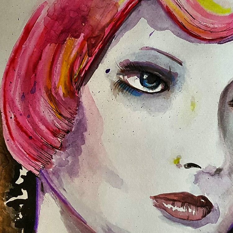 |
| I worked from a line visual in my sketchbook from a previous exercise I tried a couple of different techniques that Hein has used which included paint splashes and water blotting for coloured areas. Her details reflect objective parts such as the eyes, mouth and further intermittent details of the face including the skeletal structure. These are followed by space and blank backgrounds in one or two shades or white. The skin highlights are created in layers of colour rather than shading. I found this hard to hone in on and not over blend or under saturate. This is my first attempt at this visual, I recreated it again as though overall I was happy with it as piece completed and in watercolour which I am not preferred to use, I think I over worked and started to use my own style rather than obide by the strategy and methods from the Hein piece I am using. |
Exercise: Identifying Tools and Materials - Learning Log.
Throughout this exercise I have stuck with my initial concept of using a watercolour illustrator, though I have to admit, this has been quite time consuming and frustrating in terms of using watercolours as for some reason I do not find it as natural as using pen / ink. This wasn't the major point of the exercise but, I am now pleased I have achieved a couple of fairly decent pieces that have helped me understand how another illustrator works and how to dissect the use of tools and materials that a piece or pieces are created from. I researched quite a few other illustrators and gathered work samples and viewed their styles and methods. I have now began a collection of reference and information on my blog which can be viewed via the home page. This is so if I want to recap or be inspired or use them as points of reference in the future times ahead, it is there. Placing this on my blog means it is accessible to myself and others at any time.
 |
| This piece by Dima Rebus is a completely different theme again to the others. The use of white and space is prevalent as in other watercolour illustrators and the use of dark paint and the grey and blue doesn't offer comfort with the subject but it makes the work cold and tepid. This is what the them is about, it is not flowers, or green fields or a child's picture. It pushes our buttons as a dream like, nightmare vision we don't fully understand. It works really well and uses some of the methods from other artworks but a completely different message prevail. |
 |
| Holly Exley - The image is not fantasy and it has detail in partial accuracy and the edges of the line work is minimal, it has a plain white background. It does not share any familar theme with the two watercolour pieces below, but strikingly similar in the above covered ways these three images communicate with the use of shade, whiteness, light and softened details. |
 |
| Michael Frith - This portrait looks objective but like these other two pieces is it subjective? the actual work is not detailed or true to form, it is the use of light and colour and how we auto read the images. |
 |
| Jessine Hein - The white space and lack of definition in line work creates a softened image, I think this enhances the viewers emotion towards to work. It is nonthreatening, even with the use of black watercolour and lack of back ground details all three are pleasant to look at. |
 |
| Learning Log Page - Notes |
 |
| Learning Log Page - Notes |
 |
| Learning Log Page - Notes |
Exercise: Museum Posters
 |
| Final artwork for A3 poster aimed at 13-16 years, |
I have used to logo and added basic text to complete the final artwork.
 |
| Updated version - after some great feedback from my tutor, I reassessed the design and how to manipulate the stature of the positioning of the collage and the text. I got rid of the blue border and enlarged the text, re-positioned the font to flow more successfully. Using software I soften the image which I think makes it easier to view and adds a vintage sense of depth and curiosity. Overall I am pleased with this version and its appeal. The collage is much more able to be appreciated with a wider space to view. |
Exercise: Museum Posters - Course work
The first main part before I begin considering design elements, I need to decide on some points raised in the brief:
Will they be a "family?" or very different? The decision on poster designs would depend upon this choice, firstly there is aspects that I think would benefit from being in similarity to one another. Text or font would unite the posters. This could produce familiarity across the age range and build brand and association from the viewers of the posters. Though, each group range has a completely different look upon what they require from the museum. Should the posters reflect their needs and wants, and if it does would be able to be done in a "family" type style of content and design. Making an object appeal to a child and then another to an adult in united style may prove difficult.
Introducing a character and a visual narrative? Another very valid point that would help associate the posters together, but would it benefit the chosen museum. The use of characters is visually stimulating and also can be used within other aspects of the museum such as signs, information boards and merchandise.
Decorative interpretation & placement of object? The decided object needs to convey enough interest to spark that desire to further investigate if the museum holds what the visitor is going to expect. Placement of object can be essential but it can also be distracting, it will need to relevant to the design an chosen object. Some items hold more interest and keep detail against a plain or simple background rather than within a scene. On the other hand a snippet of an objects background and surround can add intrigue as to what else is in that vicinity.
Representational, diagrammatic, abstract? There is a consideration to be given to my chosen style. I am going to work on the basis on how the three objects work together and see if for example a ink drawing would be attractive and work for the age range it is dedicated to. I will look at these aspects while producing my images and look at how the media represents the museum, I do not want to be obvious or go for what would be the obvious.
 |
| Here is a selection of current print formats. Though, this is not essential, it gives me suggestive as to what space and text is likely to be needed to be visible on a poster, and also whether there is requirement for a text box to back up the visual on each poster. |
 |
| This is a main part of the museum. I looked at the points of interest and the variety of artifacts and considered what objects suggest these points for each of the age ranges. The objects need to be able to still provide enough design to want the viewer to consider visiting or finding out further information about the museum. |
 |
| This is a selection of some photographic images I have taken upon a visit to the museum. I looked through all the different sections and tried to identify objects that may appeal to the audience. Even if the item itself is not directly for that age, I considered their shape, attractiveness, and curiosity. |
 |
| A further cross section of my photographs. The full range are in the learning log. I found making visual recordings of the museum of the items I found appealing and the photographs help record the textures, colours and sizes. |
 |
| Colour Visual for 5 - 9 range - build up in collage so the layering adds depth and shade. The object is the tractor and from this angle looks intriguing and face like. |
 |
| Colour visual for 13 - 16 range - build up in collage, with greys or browns from the images to create an engine. This object is the tractor taken from the engines perspective. I like it as it is a part/object that has intricacy and looks alien and is what would have been technically the most advanced object on the farm. |
 |
| Colour visual for general adult audience - using the front image of the tractor, building the collage up in block colour and line detail. Trying to use the image in an abstract sense to modernize the feel of the museum and appeal to the wider age ranges within adults. |
 |
| This was my first attempt at collage. I originally wanted to try paper cutting and build this in with photographing and adding digital collage to create the finished image, however I found my skill levels were not producing what I would think is professional enough to pass as a finished piece of artwork so turned to complete digital collage as my final illustration. |
 |
| Partially finished - this is my representation of the tractor engine for the final teen poster. I am thinking that by basing this on one object but entwining segments of collaged images of articals similar to those in the museum it creates a fashionable and enchanting steampunk style image. I would run this through all three posters and keep the backgrounds and colour themes in the rich red / sea blue / white. |
Exercise: Museum Posters (learning log)
 |
| Looking at various forms are poster design for museums that do not specifically state the age range or target they are aiming for, I found what I think to be designed with the first age range of 5 - 9 years old in the forefront of their campaign. I noticed that through a lot of the posters I viewed there was many that contained the two main colours of blue and yellow. These seem to be very common and worthy of this age range, I would suggest it maybe because they are primary colours and we associate primary colours with the learning tools of this age range. Most of the posters were objects kept minimal and simple illustration to catch the child's imagination and of course, eye. |
 |
| I think this is the hardest target audience - 13 - 16 years old. A period of lesser imagination to capture and they are more astute and have started to develope what they know they like and prefer. Enticing this market of both genders would prove difficult providing the subject and age range. This range I have gathered are what I would decide as the designs which create imagination and provide what would be more a sense of curiosity at that age rather than appealing to a child's sense of fun. The styles are very different and the three posters in the top row all have a little touch of darkness to create that feeling of danger in turn bringing in curiosity. |
 |
| Throughout the posters there is a feel of maturity and I think what I would describe as sophisticated way of branding the museums advertised. A need to know the content and detail. The colour range tends to be more muted than the other groups and hold ambiance in some of their designs. from a personal view I look at a poster in the context that it would want me to know what other objects are going to be there? Is the object in the image what I want to see already? does it make me want to see more? |
 |
| Photograph taken at the museum. |
 |
| Photograph taken at the museum. |
 |
| Photograph taken at the museum. |
 |
| Photograph taken at the museum. |
 |
| Photograph taken at the museum. |
 |
| Photograph taken at the museum. |
 |
| Photograph taken at the museum. |
 |
| Photograph taken at the museum. |
 |
| Learning log pages - Notes |
 |
| Learning log page - Notes |
 |
| Sketches taken while on site. Using images on photos on display walls etc. |
 |
| Selection of thumbnails - working on basis of various objects that are related to the ages for the three poster images. |
 |
| Quick detail sketches on items relating to the age ranges, adding notes to use as reference and thinking about positioning. |
 |
| Selection of coloured thumbnails - still working on positioning, scaling down the A3 to A7 and how the object would fill the poster. |
Exercise: A Children's Book Cover
This exercise opens up the possibilities f what I can take from a very "Brief" brief. I think from the basis of what is being asked it is to take this and expand on all aspects to come up with some suitable suggestions and produce the visuals that would speak to the client and allow them to visualize what the finished piece could be steered towards.
 |
| One of my designs, using ink and pencil. This approach is soft and clear. I have kept the palette to simple colouring methods and incorporated shading and kept to a design of a 7 x 7 inch book. The text has been kept simple, clear and central. |
 |
| Second design. Digital colours. Clean and modern colours. Trying to keep the palette in contemporary tones and use the simple black and white. Each layer represents a section of natural history. Again the book is 7 x 7 inch square. |
 |
| I used the colouring on photoshop to provide a visual for this design. Out of the three I am not very happy with this one. It has not come out as I expected. I think the colouration would be better in inks, and would sell the idea better. |
Exercise: A Children's Book Cover - Course work
My first initial intention of this exercise is to research on what has gone before in this theme. I searched through book websites and search engines and found illustrative covers in various styles and medias. I wanted to see how this has be fulfilled by illustrators and designers whom would have had similar points within their brief. This is not for me to copy or use these as an elbow to get the imagery up and running, but more to see how this has been portrayed and see how the use of the illustrators work has been incorporated into the cover.
I want to make sure that the visuals are aimed directly at the target audience of the 7 - 11 year old and the illustration will be enough for the book to encourage them to select the book rather than from other books in the library.
 |
| One of the first steps I have taken is to look at the subjects that could be placed on the covers. Interesting animals and their details which a child would find attractive and want to look at within a book. I did some rough sketches in my pad and looked at sizes and shapes etc. |
 |
| The options in design would be to decide to illustrate in fantasy or realism with regards to the animals adorning the cover. I want the book to intrigue and be attractive. I also want to consider whether traditional styles are the more forward or to be brave and look at creating new contemporary designs. |
 |
| Thumbnail some ideas into my sketch book. I have a few suggestions to work on and some variations on the theme. I want to include animals but the decision on which to include or how many to include. Also I want to try other traditional and modern takes to see how the client would respond as to how they want the cover to lean towards. As traditional eg: ink drawing. maybe suited in a modern design also. Or digital / photography collage may be the way forward. |
 |
| First design is taken from a thumbnail.I am using coloured pencils on ink and basing the book on a square design. I like this but feel it is not really enough to catch the eye and needs the colours illuminating and highlighted text to help. |
 |
| Using my thumbnail sketches I opted for another design. Initially I think this design would look great as layered pieces of paper cut and paper pieced upon top of each other in vivid colours to make a photographic or scanned image for the cover. To create this as a visual I would use digital enhancement to collaborate the sections in colours. I think that this as a colour visual would work well for a client as they can dissect the sections and still be bale to have input on final colours etc. without too much of change to design. |
 |
| Using digital colouring to show the visual with the simple clear stencil text. Using a basic palette to emphasis the silhouettes of the children in the centre of the picture. |
 |
| The third design is a full cover illustration. I did this in ink as I am working to a square design I did this in large format and scaled down to 7 x 7. I scanned the image in and segmented it together. I also tried to colour using digital colouring as a visual for the client and make space for the text. I did not like the digial version. I don't think ir processed the story very well. I wanted this picture to show lots of animals but actually you don't see any. As a child it would incorporate fun to see what is recognised within the illustration. |
Exercise: A Children's Book Cover - (Learning Log)
 |
| From selected books in this theme I found various methods used in the past for illustrations. The older books used fine art but in almost a fantasist style. It was intricate, detailed and elaborate. The more modern books of the last 30 years use photography and the illustrative works have been either left to logos or interactive points to show upon the photograph. |
 |
| As well as using photographs in a cropped and collage method, the use of bright printed backgrounds are well used too. This is to produce a cover that is direct and bright and noticed. Some illustrative work in this field that is more modern is clear and basic and uses minimal lines and detail is kept quite minimal. Also the added use of incorporating the text/font style to mirror the style of illustration has been used. |
 |
| Other styles I have found include screen / lino prnting (which seems very popular with any imagery suggestive of nature. The other fine art styles of modern books using pencil drawings and detailed images in almost a soft nature. |
 |
| Learning log pages - Notes |
The first part of the brief is to come up with with some ideas and suggestions to get to the stage of three colour visuals for a client. As these are colour visuals and not final pieces I had to make sure I did not treat the pieces as this and over work them, complicate the images and do too much to one piece. The visuals need to be free to offer opinion and change from the client, but hopefully I have balanced them enough to give the gist. I started with a spider diagram and worked from the very basics of the brief. I don't think the importance is down the specifics such as what animals I use but more to how the image comes across and whether it will be apt for that age range. I used three methods and created three designs. The hardest part I have found is pinpointing what would be appealing to this age bracket as seven to eleven covers a period where the audience could still be very young and like child like imagery, but also slightly old enough to make their own decisions on what they want to pick up off the book shelf. I wanted the ideas to be detailed but clean and easy to read visually.
Exercise: A Menu Card
To create this piece for the exercise, I took on board all the aspects of the design, the logo itself has to be quite basic as a starting size of just 4 x 4 cm, does not leave much room for intricate design or over zealous colour combinations.
I wanted to use fresh colours and also incorporate what the restaurant was about. As it was stated to be modern and bright I also want the logo to establish this feeling.
My logo consists of the wine glass, the plate with fork and of course a fish. The fish would be in silver effect foiling to offer some assurance of quality and separate it from other logos. The orange and green background is to represent the freshness and although not totally citrus, I wanted them to feel lively and clean.
 |
| My final logo design. In the 40mm x 40mm state I have also cornered the top left and bottom right corner to a rounding so it gives a more modern and fresh nipped look. |
Exercise: A Menu Card - (course Work)
I have started the basis of the design firstly by looking at the colour of fresh foods. I want the logo to represent the company well and be crisp, clear and instantly recognizable as the restaurant brand. I also want the logo to hold its own status an image and if possible remain without text. I think logos that remain without their text or just a singular letter often stay as the most noticed and recognized by the public. There are some fine examples, and if the company is modern and fresh, it will want it's own app where a logo would be instantly noticed and brand their restaurant.
This method has been most successful for many online and bricks and mortar companies, if you scroll through the latest apps for food on your smart phone you can name most app images without paying much attention to the text accompanying them.
 |
| Giving colour some thought! |
I understand the importance of the design being easily read and the image also needs to produce a feeling of a modern and bright, contemporary restaurant. I think there are some important points here for me to take on board. The most visual aspect is the size, it is starting life out as a 40mm x 40mm square logo on the company menu card, working the logo and its future life out backwards is paramount here, thinking if it is successful it will become on stationery, the company vehicles. This could be then introduced to restaurant frontage, window decals, and of course as mentioned an app for customer mobile usage.
 |
| Looking at the logo in terms of further usage. The logo would need longevity to be used for further expansion. I am considering this within the brief and think further afield. |
 |
| I started by using thumbnails, here is a selection . I have taken into consideration the aspects of the restaurant and have tried to think of various ideas to incorporate all the brief. |
 |
| Thinking in different context to just mainly placing fish in the image I want to think of the restaurant as a brand and take consideration of the factors of what it serves, its placement in the market audience and what the logo needs to contain. I am kind of working backwards here, adding in to start all aspects and thinking what is not required in the final piece. |
 |
| Working on a larger scale of x2 for some semi final type designs, I am looking to incorporate the correct fresh colour and still interpret fine dining! I have worked from some of my thumbnails and added more detail and evolved them. |
 |
| One of my visual line drawing of final design idea. I used this to establish position and shapes. I want the negative shapes to be as bold as the objects in white. At this point I was still using a knife in the image, but this was taken out as the plate, fork and wine glass in a row of three worked better for the eye line. |
 |
| First attempt at final piece using inks to laydown my design, this one is done at 3x (120mm square) so I can produce thick lines and bring in the use of thicker and thinner lines to emulate the item and its weight and dimension. |
Exercise: A Menu Card - (Learning Log)
Looking at this exercise through the very brief description of what is to be created, there a a few things I know. Firstly, the restaurant is international as in European cities so the logo brand must not be barrier-ed to something that is only recognizable to one or two nationalities. The restaurant is bright, modern and has pride in fresh ingredients, so I can assess from that certain aspects of colour and styles to be considered. The logo needs to be 4 x 4cm but in the grand scale of its life it maybe used on van sides, to going on their webpage or online customer access points such as twitter, which being a modern restaurant, this would be a given to include into consideration.
I have researched other logos for restaurants, many use a combination of limited amount of text, a status item that is associated with their food methods or cooking methods, a solid colour back ground is used in many designs.
 |
| These restaurant logo types use a text and combine with design, the noted colouring is white, often this is used as we associated white with fresh and clean, which of course we want our food places to be! |
 |
| These designs have used their logo and text also the use of mixed colours and photography. The green is a fresh a vivid green in all uses, it has also been combined with red / organe / yellow to suggest fresh grown foods. |
 |
| One other aspect I thought was worth researching is the types of food and displayed food used by modern eateries. There is a certain colour palette arriving from these foods. and meals, I am going to use these colours as a base to start my design. |
 | ||||||||||||||||||||||||||||||||||||||||||||||||||||||||||||||||||||||||||||||||||||||||||||||||||||||||||||||||||||||||||||||||||||||||||||||||||||||||||||||||||||||||||||||||||||||||||||||||||||||||||||||||||||||||||||||||||||||||||||||||||||||||||||||||||||||||||||||||||||||||||||||||||||||||||||||||||||||||||||||||||||||||||||||||||||||||||||||||||||||||||||||||||||||||||||||||||||||||
Learning log pages - notes
Exercise: A Tattoo
The overall concept of tattoo design has many different aspects to consider rather than just drawing or creating a design freely, I firstly found that though a tattoo could be anything or be from any inspiration there is a certain style or design aspect that keeps them all in a bracket together, I think this is the fact all tattoos consist of the limitations in colours and the limitations of the skin. The inks can create many colours but not all colouring will work well on skin and skin tones, also there is a certain amount of status and attribution of where a tattoo comes from and what it carries as its meaning. I tried to be creative but also keep within certain boundaries and style. I wanted my work to look as it would should the design of been sort in a tattooists catalogue of work.
Exercise: A Tattoo - Course Work
Exercise: A Tattoo - (Learning Log)
Body art and tattooing has been around a lot longer than we appreciate, tattoos are seen more as a fashion statement or a preference to ones personality. When they first emerged in history, tattoos were used in terms of belonging and status within your family/tribe. Ancient artifacts and discovery of tombs with well preserved bodies have revealed their significance in past bygone ages. The styles of body art and tattoos have changed with their importance and status. These seemed to be from countries such as Egypt, Philippines, China and Japan. As the use of ink seeped into the European and western worlds, the styles and designs changed. The tribal theme was still carried out many years later but in the form of such gatherings as Army soldiers and Navy sailors. These would acquire their tattoos from often foreign lands in the old inks of blue. The tribal essence became used in the civilian cults, such as football supporters and bikers. All these would wear tattoos as status of dedication or belonging - similar to those of yesteryear.
I have looked through various websites and looked at historic pictures of tattooing and tattoos. Though the widespread acknowledgement of the cultural use of tattoos and body art is know and documented, there does seem a period of time when tattoo and tattoo wearers seemed to be almost black marketed and risque to have and only certain persons of placement would have tattoos, it was not like today where we would not blink twice at a Royal Prince having a tattoo or a famous model or movie star being adorned on a very public part of the body.
Tattoos convey on a persons skin different meanings in the current times. Often they are part of the person and depict their style or fashion. Some are designed to be a tribute to either a memorial or as to another person. The text used is often decorative with embellishment and distortion of lettering to create a ornate image of the a word. The use of other languages as well has become very fashionable of the last couple of decades, often Eastern world languages are used such as Arabic or Chinese, where the word or words are depicted in symbolism of characters.
The introduction of the internet and the worldwide broadcasts has seen an opening for this form to develop into an artwork of its own right and programs such as Miami Ink and London Ink have become international viewing and created a following of all tattoo lovers. Theses shows break down the story of a tattoo to the basis of a line drawing, the client seeing the tattoo and then going through the procedure of having the tattoo placed on their skin. It is a form of permanent art in its purest form. The colouring is not as limited an the first skin tattoos. Though the use of black or dark blue base colour seems not to have change too much in times.
The original inks used were created from different methods one noted from Samoa was the technique of burning the wood and fruit nuts off a native tree and catching the soot in the shell and using this to stain under skin. The credit of using colour in tattoos lies to the Japanese. They first used colouring, cadmium (a product from zinc) and ferric oxide ( a form of an iron oxide). They mixed chemicals with witch hazel, glycerin and rose water, despite the chances of poisoning the canvas and the complex health issues. Today the modern tattooist uses solutions containing methyl salicylate, distilled water, alcohol, benzoic acid and other ingredients.
Tattooists styles often lead to a status of desirability in certain circles, after all you would we wearing a piece of art for a very long time, it would be sensible to have a piece that could be considered by an artist. I did a little research into specific tattooists of modern day works to see how it has changed from what I and probably many others think of as traditional tattooing. Jason Butcher is a famous UK artist, his work fits into its own title genre of "Death Romantic", which I think speaks volumes considering that some may still not think tattooing as an art. To have a created genre in the basis of what you do is a huge kudos. His work is what is likely to be canvas based, with image upon image like a detailed painted collage. Lianne Moule is another UK tattooist who crosses the line of fine art into tattooing, her work is not the sort you would come across in the average tattoo parlour!
One of the other aspects of the tattoo design would be the text or font used. I have looked at the various styles and designs, the popular designs tend to classic style, italic and flourished design and gothic. There is a cross over of English styled in symbolized icons like other languages.
Overall, I feel I spent a lot of time on this exercise as I found this a new form of styling for me and quite difficult as the nature of the design was not flowing immediately, though I found my enthusiasm extended the more I wanted to see what can be created.
Feedback - I had some valuable feedback over the book exercise and the menu card, I understand the points raised to undertake the use of free line drawing and to expand on some of my other thumbnail ideas and use these as guides to create some finished pieces that are not so restricted. I am hoping the free hand in this will come in time as often I find I am narrowing my versions down to fit within all expectations and not allowing a free flow on some of the final designs I choose. This is definitely something I want to work on in the future!!
Exercise: Visual Distortion
Creating an illustration and narrative from the created collage, I think there is no set plan in this exercise as I had no idea or suggestion on what illustration I would create from my collage. As from the form of the collage to the drawing of the cat a personality developed where the viewer could see the eyes, expression and movement of the cat which in the collage was quite still and almost robotic in movement. The drawing after a few reviews and edits became a much more character based cat, which helped finalize this narrative. I initially thought the cat looked almost sinister but as I created him I think he became more friendly and here he is being in a heroic roll. I have to be honest with myself I do not know where the narrative is going or what it actually means but after a few sketches, this was what I liked the most.
Exercise: Visual Distortion - Course Work
My first part of the exercise is to draw either a dog or cat, not being an easy task for me to draw an animal I chose a cat as I thought that they had a lot of movement and texture and shape. I found a picture of a cat that I liked which showed off their flexibility and stance. I did a sketch and worked it in colour pencil within my sketchbook.
The next stage is creating the cat with just 5 lines, at first I expected this to be quite difficult, but I studied the cats shape and the negative spaces such as between the two legs and used these areas as points to start my lines from. I used a charcoal pencil and gave good fluid movement to the lines. I wanted the lines to be swift and smooth and cat-like.
Moving from the line drawing, it is moved to creating a cat in collage. I scoured through some old copies of magazines and found shapes that were fit for my idea. At first I started looking for fur like items. (the main body of the cat is made up of a mole!!) but then in my thought process, I found an old lamp stem and thought ow tail like it was in bending, so then I started looking for items not necessarily cat like in appearance but had cat qualities in other ways such as the fork used as claws on the front paw.
Exercise: Visual Distortion - (learning log)
I have done similar collage work previously but in a digital sense, but I found this exercise quite freeing and liberal. It did let me experiment and see how I can create illustrative work from other suggestions rather than the immediate. The line work also was a productive lesson, I found doing the lines quite intriguing and rather than doing it several times, I found it more worthwhile studying the object and thinking about what each line would show to the viewer. Five lines are quickly drawn and used but if I have to contemplate that it is all I can use, it is like looking at it completely differently. I am in overall happy with my finished narrative, this was one of those exercises I thought would be much a mountain but actually was not that bad! It is also a method of creativity I would never of thought of doing, but it does work, I think much is to learning to let go and try and be creative in a way one personally would not normally use or do.
Exercise: Character Development
The research in the first part of this exercise is to understand the dimension and purpose of an illustrated character. As each illustration we do is personal to ourselves as in much of that we are the ones whom create this illustrated person which in all purpose is to either evoke or create an emotion of sorts, even those designed for advertising and to convey or assist to convey a message. I started collecting snips of various characters and cataloging them to create what I would suggest is my personal library. I started out with eight basic themes but ended up with nearly double. I used magazines and print outs from search engine finds etc.
My current sections are: Animal, Family life, Sports, Specialist, Workmen, Businesss, Baby, Bad kids, Princess, girls, and then I started in other catagories which though not suggestive of specific people they are more emotional themed such as moods, expressions and comic, graphic styles of people.
The process of creating a character from a book or from my own source or imagination, as I often can illustrate from my own production I thought the best exercise would be to use a book character for one of these parts of the exercise. I used a character called Mrs Madrigal. She is middle aged, an elegant but modern thinking lady. Laid back and relaxed, Mrs Madrigal is liked by all. Here I have used what I know from the books, and created an illustrated version.
The second character I invested some time creating was from the opposite of my first character, I wanted it to be male, current, undefined, rough and modern. I decided to work on this 20 something guy who is stuck in his teens. I wanted this to relay in his expressions and stance and clothes.
below is an image of my character post development. I found this exercise a huge assistance in development as often I just create what I can illustrate and rarely change or adapt or look at reproducing the character or image again, within this method it is sure to assist and expand this part of my creativity.
Exercise: Character Development - Course work
Exercise: Character Development - (Learning Log)
Assignment Four: Magazine Illustration
From the beginning in the assignment I wanted to try and use methods I know but also expand a little in mixing the medias and seeing how it works. My initial design comes from an objective drawing, which under various processes and selection ended up as part of my finished piece. I think the working in the medias I chose was difficult to work from my visual to what it transpired as it did change slightly along the way, but overall the finished piece I am pleased with.

Feedback - from my information from the report on this assignment I have looked at redesigning the image to create a more substantial message. The different aspects I had inputted had almost drown out the purpose of the illustration. It needed to be simplified and rectified. I added the tag, removed the illustrated girl and changed the bag back to a brown carrier. The key now represents the "Ssssh.." Secret and the brown paper bag is the shame of the secret. I think this works better, I am not sure. I think I did over think the final piece too much and have tried to incorporate a little too much into trying to get the message out there resulting in the message being a little mixed up.
Assignment Four: Magazine Illustration - Course Work
Assignment Four: Magazine Illustration - (Learning Log) I wanted to try using a couple of mixed media methods in this assignment to see how it would suit to me. In the final piece I have used coloured inks for the background and watermarked and distressed the colours. The collage paper bag is mixed with illustrative line work to emphasize it. The key is photography, the character is created and incorporated into the image and the text is collage into the background. I really had to think of how to express the "Guilty Secret" in imagery, I did not want to over complicate the picture and think too much illustration would be detrimental to trying to enhance the accompanying editorial. I also found this website which had some great information on. I studied the illustrations on here to to see how they are designed. I noticed that on much there is very little to the backgrounds apart from textures and colours. This is what I have taken and used on my final design. I think this is important and I noticed from my thumbnails though to visual and to the final how the using the background changed the illustration to enhance the darker side of the theme. Website link: http://www.creativebloq.com/computer-arts/5-top-examples-editorial-illustrations-81412592 I also looked at other collage illustrations to get some suggestive ideas on how others work and incorporate this in mixed media. One illustrator I found is Martin O'Neill. His work is very detailed and the collages he has created are collaborative of themes and very stimulating to look at. His book cover for Oliver Sacks is collage used in geometrically explosive way! The further I read about O'Neill his work from illustration has also lead to his work into interiors being commissioned for a ceiling design in a bar.
Here is one of my illustrations, taken from a thumbnail and used to create a limited edition glossy print. The idea behind this decision lays with how my sketch looks and how it portrays a part of my illustrative work in a different light. It touches into the boundaries are what maybe considered art. I like this fact and I like the fact it was created from pure inspiration from a previous exercise and the piece does not reflect or dictate what was of the exercise in question and gives the sketch its own standing as a piece of illustrative art. The options for printing was actually easier than expected in some respects. I researched online and there are many companies that now offer re-printing and give a number of various options to play with. In the field of illustration this can be a boon for independents wanting to allow tasters of their work to be purchased without the need for gallery to air just one print. An ideal solution for art exhibitions. The options to sell prints online as an illustrator is also accessible.
This has really given me food for thought with regards to my direction. The opportunities to develop and use my illustration can be walked into many different routes I did not really contemplate.I am still leaning towards the graphic /picture novel artwork and also I am considering how illustrative work is used in fashion rather than fashion illustrating. I think if money and time were an option I had to play with I think I would look at sample printing on fabrics and maybe also more glossy artwork prints in larger sizes. However using the thumbnail design and creating the postcards has been fun and I have shown them to quite a few friends and colleagues and had quite a good response. Exercise: Your Own Work - Course Work I spent some time going through my sketchbook, papers and designs from my past assignments and exercises and personal pieces in my sketch book. I selected designs and illustrations on what I liked, not for their merit or success but from my own preference. Partially looking at how they can be used and developed. The free thinking enabled me to view the created lines in a different light and view these creations as pieces in their own right and accept that though they may or may not have been used for final pieces or towards final pieces they are accepted as part of my illustrative progress and work. Each individual sketch or idea belongs to myself and is my work. Below is selected pieces of a gallery of my illustrations that I have personally selected.
Into the consideration of which authorial practice would be suited depended upon my option of which piece I decided to promote. Via the sections of categories within the practices I looked at what my work would suit rather than fitting my work to suit the method. I want to feel that the piece I have chosen will be beneficial to what my influences and styles can be, To publish my work I have considered these following attributes: *What avenue is best suited to this illustration? *What is my audience? *Which point and purpose of manufacture/reproduction is ideal? *What are my production options? *What are my costs? I have valued all these aspects whilst looking through the various options and choices. (Some are which in my learning log below). I have found that if this was to be an option for work development it would improve in costs in many aspects on the more that the work was reproduced. For example: 5 prints would cost X amount, to reproduce 25 prints would be considerably cheaper. Would the cost effect the sale price? would it effect exclusivity if it was limited prints? All aspects are quite important and before reproduction begins of my artwork it would be a factor as to what value I would want to aim for or what market I am considering. Exercise Your Own Work - Learning Log Methods of Production for various illustrative work in your own right now allows for ones designs to be reproduced and used in many varieties that did not exist to the general illustrator. Where as a design would have to be produced for a company or manufacturer on a specified brief or to their specifications, the new open world of the internet allows for uploaded images to be printed and reproduced in a number of ways. One of the exciting new adaptions for this is fabric. Fabric allows illustrative work to be patterned and used in a manner of household designs and also in fashion clothes and also fashion accessories. For example the latest trends of calico or natural material tote bags for shopping is very much an in vogue item among most generations. Other companies such as wovenmonkey.com offer similar service and the complexity of software is now at a minimum so the designer can create product with out too much technical abilities. The use of imagery on other items such as ceramics allows the use of illustrative work to be used in home decor and allowances into other aspects of creativity. One being the use of companies whom will print decal images onto ceramics etc. This can create designer pieces which the illustrator / artist can resell or produce in limited quantity for their own store or wholesale to other means of out letting their products. One company called ceramicdigital offers this service.
Another possibility to expand the production of imagery is to reproduce one piece and keep it to a limitation of prints. These can now be successfully created at a high quality efficiency via many printing companies who will also offer different textural and styles of printing and of course importantly sizes. This could be a great bonus for beginning illustrators who could offer the limited prints in various outlets or own store to allow the start of their own career. Also if limitation of print numbers is not an issue one it has been created it can be reissued again and again. One company that offers this service is toadprint.co.uk The prices can vary upon size/paper type and quantity. For example 5 plus prints of an A3 piece of work would be £8.31 plus VAT each, where as a single piece would be £10.39 plus VAT. The decision on the illustrators side would be to assess the best options for creating maximum profit to cover time and expenses in the start of the illustration to the final print. Other companies that offer services: vistaprint.co.uk canvaschamp.co.uk picanova.co.uk hellocanvas.co.uk It is always comparing prices and remembering to include VAT ans delivery costs of all implement the final production price. Exercise: Editiorial Illustration Melvyn Bragg - I'm a Class Mongrel. Poor Melvyn. Even I feel a bit sorry for him. And I'm the one needling him. We're juggling teacups and Victoria sponge cakes and all the trappings of civilized gentility, but while it's all smooth and untroubled above the sofa, below it's another matter: He's paddling his feet so violently, I slightly fear for the carpet. And what's more, dammit, he won't answer my question. And it's not even a very hard one. But that's what you get when you start talking about class. Oh, it's such a juicy subject, I could talk about it all day...and today might very well be that day. Because Melvyn, the working-class boy from Cumbria, now Lord Bragg of Wigton, has gone and made a whole BBC series about it. It's a handsome three part BBC2 series of the sort that doesn't really get made any more: Solid, interesting, well researched and slightly dowdy (and I mean that in a good way.) There are interviews and clips from TV and film, and excerpts from book, and the big theory is this: that culture replaced class. (An interview with melvyn Bragg by Carole Cadwalladr. (The Guardian Newspaper).
Excercise: Editiorial Illustration - Course Work
Poor - Sorry - Needling - Teacups - Victoria Sponge - Civilized Gentility - Smooth - Untroubled - Violently - Question - Class - Juicy Subject - Working-Class - Handsome - BBC2 Series - Solid - Dowdy - Theory - Culture Repaced Class. The above words are taken from a selected text from the interview. I have read and re-read the passages and highlighted words which I think emphasize and enhance the piece. They are the descriptive of the paragraphs and also the words I think I need to produce a piece of illustrative work to use along side this. The chosen words are the ones I am drawn to and I think offer identification to the text as to what the interview is about. I am looking at the paragraphs and thinking the words as the bones of the story and picking out the bits that conjure up what the interviewer is trying to get across to the reader regarding the interviewee. I noticed some of the words and descrpitives used are very much polar. The image of "Victoria Sponge" and "Gentility" is then up against "Violently" and "Solid".
Firstly before I started on the working on the final piece I used my sketches to inspire a few design ideas. I had looked at aspects of the article I read and where it was from and used this on a basis of influence as The Guardian is sometimes heading towards the reader who would appreciate a god illustration. I have recently been doing continual line work on a couple of personal projects and have brought this to this exercise as I think it will work well. After completing several ideas loosely based my suggestives from my sketches I created a visual. From this I worked on the drawing by hand, I opted for smooth white card (tracing the image onto this as I think in print from a crisp backgound it would transfer well to newspaper/magazine print), once I was pleased with the final piece I scanned this is and enhanced the imagery with digital colouration and incorporated a background using copywright free images to help the suggestion of the story. As the story was online from the newspaper, I looked at similar editorials within the illustrations from the paper and supplement I had analysed. I want the image to be in print at 110mm x 136mm (this was the size of one of the images I viewed).
Exercise: Editiorial Illustration - Learning Log
Decorative - Serving only to decorate, in contrast to providing a meaningful experience. Conceptual - Pertaining to concepts or to the forming of concepts. Informational - Knowledge communicated or received concerning a particular fact or circumstance: news. Metaphor - Figure of speech in which a term or phrase is applied to something to which it is not literally applicable in order to suggest a resemblance. Representational - Depicting an object in a recognizable manner. Abstract - Relating to the formal aspect of art, emphasizing lines, colors, generalized or geometrical forms, etc., especially with reference to their relationship to one another. Diagrammatic - In the form of a diagram or graphic or outline. Throughout the images within the newspaper and the magazine I found several images I liked. I really appreciate illustrative works that tells a story in its own representative manner. I liked the image of the face in the mirror (Above). This uses colour as an influence to provide drama and the mystery of not having a full face on show is brilliantly done. The detailed print of the background is hardly noticeable but it adds the sense of it being a home or inside. Exercise: Travel Guides Brief: Design and provide three covers for travel books. Helsinki, Istanbul and Milan. Create a diagrammatic design that will help persuade the book to be picked up over others in that field. Book size is 12.7 x 20.3cm. They are all same size. Consider colour and style and target market. Think about market appeal. Who is the book aimed at? Think about text and drawn style.
Exercise: Travel Guides - Course work
Exercise: Travel Guides - Learning Log This exercise though entices the use of free reigns to explore possibilities also encourages me to incorporate myself to us deadlines and be productive in methods. From the previous exercises this gives me plenty of scope to endorse my style and try and come up with some great ideas. I thought a good starting point would be the digi-storyboards. I like this as I can refer to them via my tablet via the blog any time and place if I have spare time or get creative or in the instances when I have time but in different location so can still access my inspiration. I am intending to work from these and start with some rough sketching to just get some ideas down onto the paper. For the brief I have looked at what has been asked and then added what I know needs to be included in the design.
When I investigated the cities, I made a list of all the local places for the traveler to visit. I looked at Religious points and buildings, historic buildings, statues or latest art instillation, also some older traditions such as colours and shapes. Looking at diagrammatic methods I did not want to be obvious with map placement. I wanted the cover to appeal to those I expect would travel to these cities for weekends break. I liked the suggestion of the wide borders suggesting roads. The paths would lead from one location / attraction to another.
Exercise: Text and Image This exercise covers the sense of visual stimulation of the word in conjunction with the descriptive meaning, the aspects of the colour, texture and presentation. Using different font type can help interpret the word and its meaning via the readers senses picking up on the visual style of the letters used. Typeface and font styles show the importance of how lettering can influence positively and negatively on what the author / illustrator is trying to say. For instance a serious letter should not be typed in Comic Sans. The comic sans would work well within a strip or a fun text on a poster.
Exercise: Text and Image - Course Work
Exercise: Text and Image - Learning Log
https://designschool.canva.com/font-design/ The site has some great samples and hints for someone in my position as a relatively new learner of illustrative work. While looking for font information, I found the Youtube video. This software looks amazing! When electing the fonts I did change a couple as I went along, I tried several for some words and then when I started copying the fonts to recreate them I did not like the feeling of them. I noticed how a lot of the negative words or words we use often in negative talk used serif style lettering and sans serif on the others. Is that because of how fonts are traditionally designed? I am not sure. The one word which works in different fonts but needs to be capital letters is "MAD". The way in which the word is decorated effects its meaning as much as the actual font does. Most of the other words do not look as well in various font styles.
Exercise: Packaging
The three visuals for the client all are at a scale of 1:2. The mock up create represents one flavour and design which would have similarity among the others so that the design becomes brand recognizable. There is aspects of what text to include and how it should be presented on the box front. As the general age for these is for young children and for the purchasing adults I want the box to have a clear and innocent and fresh feel offering a character that young children would find appealing and that can associate with the flavour of biscuit.
I think to elaborate on this project I would like to have completed all three designs in full colour to offer the variation on the colour and animal link and the flavour link. All the animals are extinct from Madagascar and think this could offer information on the reverse of the packet for each character. Exercise: Pakaging - Course work I spent time researching and going through various lists of extinct animals. I wanted the three that I picked to be easily related to young children and not go down the Jurassic period which I think is quite an easy option. I looked through a list of various locations and found one that really had a variety of extinctions of animals that are in the very least quite harmless o the majority of humans, in the sense they do not show huge fangs or claws and would be hopefully appealing to male and female children within a variety of younger ages. The animal needs to have certain points such as familiarity and be able to be incorporated into other products in the future and also if the design is successful it can be used by the manufacturer for other productions, merchandise and online and TV advertising. This means the animal needs to have appeal, movement and likability! I found the measurements of a box of biscuits that is a standard size of 12 biscuits. This size (80mm x 138mm) gives me a base to work from.
The thumbnails were done in pencil as usually I use marker pen but want to make the animals look softer and more fluid and often I can get this with pencil work rather than harsh ink. I think to enforce the naturalness of the organic product I will either use a pencil or soft brush pen and ink.
Exercise: Packaging - Learning Log One of the first things I investigated for this exercise is what exactly is "Pester Power" I need to know the relevance of this before I start creating any work so I know my aims and directives are going to be accurate for my client. Pester Power - Also known as Nag factor in the US. Pester power is the tricks used by media and manufacturers to bombard and influence children into that "Want & Need" urgency. The most common pester power is apparently aimed at 4 - 6 years old as they do not have their own expenditure and hence create the nag factor. The first recorded notice of pester power was the first TV advertised toy, Mr Potato Head. The constant advertisements created a huge demand for the product which incidentally still runs today as a successful toy. One report on pester power, I found quite interesting which is against it being an actual motion, as children of such a young age should not be born with the ability to understand or be eloquent enough to methods of feasible persuasion. I think looking at how the brands work within our supermarkets and TV/internet, that to try and sell and maintain a strong selling platform line of products without incorporating appeal to children would result in having to invest incredible well in creating branding and reliability and familiarity with new customers.
Exercise: Working for Children
Exercise: Working for Children - Course work
Exercise: Working for Children - Learing Log
From the start of this exercise one point issue is the set years for when an illustrative piece is age appropriate to the field audience aimed for. The easiest being is pre-reader, for at this age the shapes and colours would be clear, crisp without complexity to insure recognizable people or objects that a pre-reader would associate with. The pre-school age should really start with pictures and introduce the use of text along side the imagery, but whether the age for this is within the boundaries of 3-5 years is only decided by what we as adults know and learn from what the children respond too. A 6 year old or a 7 year old may still want to pick up a book aimed at 3 - 5 year olds but feel that they shouldn't because of the lack of text or because the imagery is designed for a younger age, not on the suggestion on whether they would enjoy the book or not. I think once a child starts school and develops with other children maybe the sensations of bright colours is not as essential as we expectin importance to the story telling process. As a child, I can still recall a book my elder sister had and I was drawn to looking in the illustrations and they were of the time. In very muted colours and intricate detail, and it was colour irrelevant but the fantasy and detail within the drawings that captured my imagination. I think that perception of visual stimulation is on a completely higher level to written words and understanding the concepts of reading and word meanings. A child could look at an image and though the main character is within the picture it maybe the surroundings of the character that interacts with the child's imagination.
Exercise: Educational Strip
Exercise: Educational Strip - Course work
Exercise: Educational Strip - Learning Log
Looking at modern comic strip versions and how their designs can vary in style, sense of humour, points and source of direction. Often, political, gender specific or age specific.
Looking through various websites I have found that comic strip is now less main stream but often used within groups to represent; thoughts, ideas and political views. Also the style in which the characters and story telling offers a varied version of how a story or point is presented across to the reader. I wanted to use this exercise to see if I could produce the comic strip with the 5 boxes and still perform a connection to the audience this is aimed at. I think it has to go from the mainstream point to a less popularized style to appeal to teens and offer alternative.
I really enjoy the comic strip illustrative works, it has shown me how difficult and time consuming i can be to create and endorse a character and the imput that is needed to create a successful piece. It has given me insight to character development and enjoying the learning process of the actual task.
Assignment: Seven Days
The seven days theme is a difficult subject to take on. Without a designated brief it was hard to determine which direction to enter.
I looked at what I have been studying over the last few months and wanted to incorporate some of these points within this assignment.
My first point to bring in was the use of hand drawn font. I wanted to include this but not overload myself and use this as the main concentration.
Also one of the points of font and typeface to use was to practice using the most suitable typeface available.
I wanted to create a design page for an independent Graphic comic. It wants to be designed to tell a story over seven days. Colour or black or white print. Limitations on text to be used and keep within the measurements of the 11 x 17 inch magazine. (Standard American sized page.)
Feedback - This end piece has really given me some indication at where my skills lie best, though I am not ruling out other avenues, this segment has pushed me to accomplish a piece of work with some real pleasing results. I have some great suggestions to try from my tutor for future similar work. I am really enjoying this experimental part and hope to continue this within and out of course work. Assignment: Seven Days - Course Work
Assignment: Seven Days - Learning Log
The first thing I thought about when starting this assignment was to break down what the actual process and product is. A comic strip upon impression is a quick often witty stretch of two or several illustrations that depict a story or anecdote in a funny or satirical manner. Mainly when a comic strip is brought to mind it is the funny section of a newspaper or supplement. The modern comic strip is often used in adult material within the realms of novel form or on a very collectible basis.
The use of a repeated character or familiars in a strip would mean that the illustrator would hold a good bank of images of his/her characters so they can be referred to in various statures and keep their personality/design and colouration throughout.
The history of comic strips as we are familiar with starts from America in the very early 1900's. The origins vary of when the first strip was published, some associate the first imagery with a Swiss Artist.
This format has grown since into spawning not only massively followed publications but also entered the 3D world of cinema. For instance, Marvel started life as a comic strip magazine, but has created numerous films from the strips.
Another success is Manga style film which the majority started from the pages of comic strip stories.
I am not entirely sure why they are so popular today as often we can read and see images at a touch of a screen, the purchase of an book in graphic novel form must still hold a torch for many avid fans new and old.
I do not know if comic strip is a illustrative channel I would be good at as I think my style is currently not through one kind of medium or method, and my design is changing frequently. Though I do like the fact that you can create a database of imagery of this world that is being created and the fact it can be adapted and changed but kept familiar with in the use of the character/s and the style of illustration. So maybe I am being to negative on a path I may be wise to investigate further.
Student number#515631
Illustration 1: Key steps in illustration
David Young. It has taken sometime to decide on which path I want to follow, it is often difficult to choose from so many directions. Art, illustration, design all have such an umbrella that unless you are specific in one field that you naturally excel in, without much effort, it is hard to pinpoint your map route! The reason I feel this, is that the boundaries are easy to blur and what some may state is obviously a just a "drawing" or "sketch", may in for example my eyes, be classed as an illustration or piece of art. An image, or set of images that tells a story, lets the viewer read what is there but more importantly be able to read what is not there and fill the story or message in. If we look at illustration in this way, it is probably the oldest art form, the cave man illustrated on the walls of his home, how they hunted for food, what the food source was and how they caught it. The dwellers would look and hopefully with their imagination, picture the wild chase and what the imagery tells. Which in turn has just dawned on me that in fact, art and illustration is more powerful and stronger than any written word, it is how we started and how we still, whether being: You tube videos, instagram and TV, continue to use as a high percentage of story telling and communicating.
I feel working in the area of illustration is what I am naturally drawn to do. I find that being able to create something that is bespoke is a wonderful process. Making a page come to life just from its lines, colours and texture. Sparking imagination comes directly from three things, the spoken word, the written word and the images we create. Everything that makes us imagine descends from these.
I hope from taking this course I am able to use what abilities I have to start to explore illustrating on a commercial level. I want to rekindle what I had years ago, and spend what remaining time I have of my working years doing what I have passion and thirst for.
Above all I am very excited and thankful to have this chance to be lucky enough to try to establish myself as an illustrator.
David. Update: June 2016
Half way through the first segments of the Key steps in Illustration. So far I have found the course work a joy to proceed with, there has been times when I have lost motivation which often co-insides with work pressures and timing. However I have kept going and at the moment it is working. I have taken advice from my Tutor and joined groups on Facebook, used instagram (look for #ocafriends) and also tried to communicate via the OCA student website.
Hopefully I will progress and in the next few months complete this part of the course!
Update: October 2016
Now in to the 4th section of the Key steps in Illustration! It has been quite difficult not only finding the time, but committing myself to using my days off to dedicate time to the course. The hardest part I have found is segmenting hours to process and research work in between the working day. It can be very easy to rely on the next week, or a day off somewhere in the near future. It is a case of buckling down and dedicating an hour or two early in he morning etc. to keep myself in a state of flow as if the space from one study period to the next is long, it can be frustrating and feels like it is two steps forward one step back. However, I have stuck with it and made it through the summer! Now feeling a little more positive towards the next assignments. My feedback from my tutor has been extremely helpful and always gives me food for thought. Also, discovered Inktober this year, via Jake Parker's facebook page which has helped me establish a continuing selection of sketchbooks!!!!And you can now find some of my work on instagram! #ocasketchbook #ocafriends
Update: May 2017
It has finally reached my formal assessment time. I have completed all exercises and all assignments within the 5 sections of Illustration 1. It has been a very stressful and consuming time but in the most positive way! I have found out so much valuable and important information in such a short space of time that it has been without a doubt worth it even if my grading comes back under what I hope. I have taken each exercise separately and through each stage I have found what I am good at, what I excel at and what I am not so good at and what I need to practice more of.
Some aspects which have played a great part have come to be precious tools in all aspects of anything in my future I may under take. For instance the use of thumbnails, learning this method has taken the use of sketches and ideas and helped me understand processing and not to go with the fist idea but to elaborate and expand from that first idea. I am going to look at what will be m next stage within the path of this course. Fingers crossed I do well in my assessment. I think I have been very lucky that my tutor as offered me positive and critique feedback in my reports that has pushed me to try and look at my work through others eyes such as my clients or audiences. This sort of feedback is invaluable to say the least. It has helped push through the assignments and offered me some greatly needed guidance.
Update: July 2017
I actually passed. Overall not bad feedback / assessor remarks. And I believe the critical parts are all very relevant and honest. They do point to areas I can improve and where I have fallen down on certain areas compared to others.
I think the hardest part is keeping the enthusiasm and commitment in a steady flow throughout the variations of assignments and exercises throughout the course.
Reference Information
This section is collections/artwork/images and information I have collected as I have studied, some of it is not relevant to the exercise or assignment in hand, but I have kept it here for either future reference or just to browse and inspire. Some information and designers and illustrators/links have been pointed out to me by my tutor over the assignments I have completed as they a relevant to some of my pieces I have created. In these instances I may have not even seen the importance of some of these directions but as I have once created the work and then seen the professional work of some illustrators or designers it gives me guidance to how I am still in a very early rough stage of creativity and how it can be filtered and refined to use in many, many ways.
This is a interesting item on the illustrator Nikhil Singh.
https://caribbeanbookblog.wordpress.com/2009/11/05/nikhil-singh-speaks-out/
DOM&INK - This illustrator is a great example of using all avenues within the industries that can incorporate illustration. From fashion to book design. The use of his work helps create very sell-able merchandise. His website is a great port of call for looking at how illustration can be used in the most up to date way and have mass appeal. (quite a task I would expect!)
Laura Laine - Julie Verhoeven - Megan Hess.
Super great website found to use by accident. Was recommended Pixelovely but came across this website in search of and its handy to have as favourite link! Line of action
I did not get chance to visit this when at Somerset house in London. But throughout 2016-17 the gallery will tour so hoping I may get chance through the next year! I did however get to The House of Illustration (details on front page of blog - luckily they had Quentin Blake exhibition plus a great selection of Russian children's books over the last century!
If by chance you are on this blog and want to look at the poster site check it out here:
I have collected a various selection of images from illustrators I have found over the period of time while doing this course. I have found that my taste has varied over the sections and I continue to add to this section as I proceed. The illustrator Martin O'Neill has really caught my eye with his work and his use of digital and analogue collage work. I also have been lucky enough to have so great suggestions of sites which i might like from my tutor and overall, the nail has been hit on the head! My favourite has to be Dom&ink. I have found his work on instagram too. Another brilliant source of information and ideas!!
http://www.domandink.co.uk/
|


No comments:
Post a Comment