Drawing 1 - Form & Gesture
Exercise one: Warm up - Temporary Drawings
This is a difficult first task, not because it is of any overly taxing subjects, I just find it quite difficult to let go and be creative. Working to a plan is often easier. Free drawing is so much harder, and understanding temporary drawing really did throw me off track to start with.


A few days later, after deliberating over what to try next, I resorted to trying one of the sample suggestions. I purchased a couple of bottles of coloured detergents and set to work in the bottom of the bath!


I later experimented on the beach. I was a little unsure so I just started with some deep lines in the sand scored by a branch. I think I understand the meaning of the exercise, to let the temporary out of you, be creative with no lasting marks, the markings are fleeting, passing by and though they are a creation, they are dismissed quite easily, which I think should give me more elbow to be more creative!


It has been a week since I was on the beach, and at the time, I felt quite conscious of what I was doing. I was all enthusiastic on the way there, but once the vastness of the beach was in front of me, I did such small pieces. I think I am going to continue with the other exercises and come back and retry this. I see the point, and I see the potential. It is my lack of confidence that is stopping me. We shall be reunited Beach and stick!
PROJECT 1 - FEELING & EXPRESSION
Exercise One: Experimenting with Expressive Lines and Marks
Finding my feet with this exercise was enjoyable but in honesty it was one I had to keep going back to over a couple of days. I am not fluent in the free forming of shapes and line/mark work, so overall the exercise turned out to be more of an experiment for me!
I decided to use black as my singular colour. I had Charcoal, a sharpened stick with and ink pot and also a Conte stick, I did not have an oil stick, so I improvised with a sponge and black acrylic paint mixed with a little water. I used a sponge so I could express with pressure as I would with an oil stick and get some lightness and darkness with pressure. At first, I thought it was not likely to work like the charcoal etc. but it actually gave me some great sweeps and curves and shaping. These were all mediums that I may have dabbled with but never really used to any great extent. I was a bit unsure whether my shapes, movements, lines should be the same in each box but in different medium, but as it turned out, all my images ended up different. I did find smoothness with using the Conte stick and the charcoal. The depth and movement of lines easily changed upon the strokes. The use of the stick was new too, it has more of a stop - start process so as far as control it is harder to use, as firstly as and when the ink starts to move when it comes of the sharpened end, but also the actual mark making is harder to make depth and shape in lines, but it is very effective and has a delicate look to it.
To start, my first page "Calm" sat taped to the table top for a day before I actually began-had temporary freeze on creativity flow.
 |
| Empty page on the dining table. Dinner on lap for next 24 hours!! |
 |
| CALM: A1 sheet of 4 sections |
 |
| ANGRY: A1 sheet of 4 sections |
 |
| JOY: A1 sheet of 4 sections |
 |
| DESIRE: A1 sheet of 4 sections |
Overall, this was a very good session. I am not sure if the exercise has been done as intended, but i found the use of mark making the stick and ink the most fascinating, It is controlled but I cannot control the ink flow or if I hold the stick to the side it creates different markings.
After a long period of not using any medium like charcoal, I found the method of pressure and the fluidity of making the shapes with the conte sticks too, quite simple and makes me more aware of the shapes and movement. A great lesson!!
Exercise Two: Experimenting with Texture
I have started this exercise with a mind to try and let my creativity be opened. Looking at textures of a few house hold objects and surfaces. I started with a back of a piece of smoothed wood. I did this in a very soft pencil and tried to loosely line the movement of the wood. I did not want to let my self study or draw it but to interpret the shape and texture. I am going to try this again. I tried an opaque plastic box as an interpretation. I wanted this to represent the hardness and produced feel of the plastic. I also tried a tangerine skin. I looked into this closely and tried to add texture for the sense of the pits and repeated patterns on the skin. To try and emphasise the fruitfulness of the skin I added water and orange paint and let it drip onto the page. I used wax crayon for the curves and swirls, thinking about the smoothness and oiliness of the skin.
Using various tools and mediums I have tried to convey the feeling of the textures and feel of these varied surfaces. I have reattempted the tangerine and also the leather. I wanted the surfaces to be textural and have a sense of what the surface feels like to touch. I tried doing the wood grain by using a sepia pencil and rather than drawing the curves, I made various lines to depict the grain shapes, by making more lines and less lines in areas it helped make a good effect and texture. I also used a fine liner to try and do the ceramic pot again, this time making repeated wave lines and leaving areas for the light reflect. I want this to show the bumpy feel of the pot. The sponge had another try too, this time a used a Conte a Paris Pink stick and lightly built the colour up in layers of shapes and marks, I smeared the lines and small circles to lighten the overall appearance.
Here are some photographs of the objects, this will hopefully give the comparison to what they are in actual physical form to my samples.
Frottage
I gathered a variety of mediums to try this method. I also found the best method was to use some 60gsm paper. I tested various objects, some worked well, others not so well. I have logged them in my sketchbook and added notes to what works, what medium and of course what object.
I also had a go at layering up the leaf and various samples of mediums overlaying the leaf and rubbing. I shows the variation of detail that is visible from one item using various mediums. Also I discovered the use of rubbing in graphite but elevating pressure in some areas of rubbing to get a shading effect.
The scene was just for a bit of fun, I used five different leaves. The tall thin leaf is from a Leak! I used a tile for the ploughed meadow and a wool bag for the field opposite. Seeing the shape and forms emerging from the page when rubbing created some good imagery. I used a graphite stick for this on some cream textured paper.
PROJECT 2: BASIC SHAPES & FUNDAMENTAL FORM
Exercise One: Groups of Objects
The basis of this exercise I initially anticipated being quite easy but it has the reverse effect. I found the process of seeing the shapes and forms in front of me and bringing them to scale and dimension quite challenging. The added element of thinking of how my lines would portray and represent the feel and sense of each object added the extra element that, in all honestly threw me in a direction I was completely unfamiliar with. I used textured A2 paper and a brown crayon and started to build up the objects. I picked items I knew would be demanding, such as the pasta bag and the cola bottle. Both for the reasons of their weight and dimensions. I used a very light pressure around depicting the pastas clear outer bag and with the cola I tried over accentuating the lines where the drink was visible . The balance of cylindrical objects is the hardest point to get in proportion and depth.
Exrecise Two: Observing shadow using blocks of tone
I used a brown stick to make my sketches. I used two pale kitchen jugs of different size but both in light colour. I used a light that shined from a corner just above the jugs to try and capture some interest and reflection and shadow. I struggled in places with this judging and dissecting the gradients of the tones. I kept overlaying with the charcoal stick to heavy and then struggling to achieve a balance of tones. I think it looked okay in the end, and I managed to capture the segregated shadows on the base of the large bowl and the reflections of light off both pieces.
In the second of these pictures, you can see the shadowing starting to work within the two objects. It is quite easy to get carried away and start picking up detail and forget about the tonal sections!
Using the black did help suggest the shapes and movement of the jugs with the shading, but I did find it hard to step back and leave the image and not overlay blocks of black sweeps of charcoal. I am pleased with the result. I think you can see the direction of light and though they were on a dark surface, I did pick out the under shadows and side shadowing okay. The patch of light hitting the side of the large jug is from the background light that interfered with the side tone, as the surface was smooth it made this light patch in a shape rather than a shadow. Also the light in between the two jugs offered an bar of mid tone as the large jug reflected the light back to the small jug surface. I think on the ridges of the jug I have managed to capture this happening.
The value of using tone is essential in drawing, I have some experience in some drawing but it has always be very casual and not dissected. The knowledge of gradient in tone and shading offers me the points to be aware of and to help contribute to building an image that will be offering its own sense of shape whether a still life or symbolic styled drawing. I have not used charcoal to create full drawing before and the use of block shading offered me a new method and technique. Using mediums such as crayon sticks and charcoal brings the option to add quick shade and block areas with colour and overlay them to add deep shadow and also by sweeping the crayon/stick in motion it gives the shape or form a definition and can also make the surface description possible.
I have been using pencil for a lot of my sketches, but think in future I will incorporate some other mediums to sketch with and see what it brings me.
Exercise Three: Creating Shadow Using Lines & Marks
Taking the previous two exercises and using the contributions from them to establish a sketched image and present using lines and marks so indicate the form and dimensions of objects. I started by drawing a pepper mill, using the various samples suggested of different mediums and also various line methods such as cross hatching and spots.
I tried pencil, pen and ink, biro and a fine line marker. There is the ease of fluidity and smoothness using a pencil that you do not get with a pen but I found the pens offer a deepness in shade that is not as sharp when using pencil. I used line work to portray the shape and content of the mill. The best one came out by using a biro. It is as near to a smoothness of a pencil that is in nib form. It flowed well and I like the dark lines. They capture bits of light and it looks like a soild item.
Above: Pencil using lines as suggestive of the direction the mill is standing. Crosshatch with a black biro that worked well and out of the three it looks the most solid. Pen and Ink used with line work and spotting. I used spots to help suggest the texture of the pepper inside the mill. Also found it hard to balance the shadow using the spots.
I also used a couple of pages in my sketchbook and built up a selection of varied mediums and line/marks to use as a reference point and to have interaction with finding out what works and what doesn't.
I looked at various objects and textures around the home, such as bamboo blind, spray bottle, a box, a mug, carpet etc. I used pencils, inks, fineliner, biro, chalk stick etc. I wanted to see how various hatching and spotting would come out.
My first attempt was with a biro. I failed in the fact I still pursued filling in full edges and lines. It is difficult not to do this and to concentrate more or the areas between the shapes and the light and how to graduate the depths of shadows. It started out well but I overworked the ink outlines. This made the shapes heavy. I understand the shadowing and the purpose and effect of line work.
The charcoal attempt. This time I forced myself to avoid the outlines and to not be too accurate with detail but to look more at the shades and shadowing, trying to capture this with crosshatching and some line marks. I like the way I managed to get the feel of the pine cone and the shaping of the bowl, the lid went a bit off direction but the point I wanted was to show its shape and shadow around the lip. Also the mug handle works better on this image, I managed to keep enough lightness of reflection. The temptation as with the biro piece is to overwork the lines. I think in overall vision, this piece works much better. I am fairly pleased with it and feel it has been a progress to achieve this exercise. The fast movement of the charcoal in comparison to the pen meant the smoothness of the lines worked well and the quick rapid fire of cross hatching and shading ended well.
Review of work & understanding Tones & Shade
Understanding the use of dark, light, tone, shade within a piece of work is an ongoing learning encounter for each work. I found under a lamp, the shadows and deep lines are easier to pick out and the reflective of the strength of the light being so close meant glimmers of brightness appear within each object. When I tried to attempt to draw the two jugs, as they were both pale, it meant that the background, the shadows were stronger. The tones were very smooth and the overall appearance of the jug form was hard to initially get to provide the solid shape I wanted.
Using the method of cross hatch and by distancing the line space between each line has helped create the direction of light and the space around the objects. Suggesting the tone of an object by the light it has can be quite a task, but I think it is possible to trap the tone on the surface by using these methods suggested. When I did the 4 objects I did notice the use of lines and marks were imperative to the material or surface I needed to show with the tonal qualities. For example. The pine cone needed to have some darker line strokes under the stems and the tips needed to be smooth and left so the tones of the surface visible by the light were much lighter and reflected the light as such.
One of the points I have seen is the pinpointing of tone from an object and getting the tones right in lightness and darkness throughout the object. I did tend to jump in and apply dark shade immediately and almost work in reverse. Separating the shade from the tones helped in the charcoal version of the still life (Above).
Going back to the biro edition of the still life, I looked back and see how I started using crosshatch deep into the shadows of the surface, I think maybe this could have worked better if I had started further away and built up the cross hatching by bringing the lines in gradually and in steady sequence to give the movement of light up and away from the areas where the objects meet the surface. Again, working quickly is a good key to success, I did work faster in the charcoal image than in the biro, and I think this shows by the way the marks appear, in the biro attempt, I feel I may have been too considered and precise in some areas and should have been more free flowing and followed what my eyes could see and not have been afraid to have left out those pesky outlines!
Review - on this exercise I will continue to exercise the need to practice perspectives and styles. As I am always concerned my style is to varied it becomes lost against other artist work and my portrayals of what I draw get lost in this process, I am pleased this looks like it developing on this anxiety and some personal styles are breaking through. Yes!
LOOK HERE:
Research into Odilon Redon can be found in "My research & reference information on the side column. Also in this section I have started to pinpoint some research into the key point artists suggested for this course.
Research & reference Page
Exercise Four: Shadows & Reflected Light
The two objects are a metal ornamental vase and a ceramic vase with an interesting hole in the middle! I had opted for two items that had a good light reflection and were different materials. I placed them under a LED lamp and spent a little while arranging the two items to accumulate some interesting points of shadow and reflection from both pieces. I liked the hole in the ceramic vase as this gave great shadow. The shadow of the hole was fused with the overhead light and the lamp light making it distorted and had a good section of light and dark.
I first attempted the exercise with a charcoal stick and found I kept overworking the shadows and loosing the mid gradient I started with.
The over work started to loose the shape, weight and light reflections, the shapes of both the vases gave a clear and strong shape of the light bouncing off them both, in the charcoal here, I seemed to over blend and be more pleasing to create the solid and the shape rather than express the light and shadows coming from the direction of the lamp.
The Second session worked much better. I stayed with some of the middle grade of shadowing and though I did cross hatch and use lines and marks to push out the shaping of the shadows I think I so over worked the charcoal it lost all detail and became much of a dark mess in places.

Exercise Two: Experimenting with Texture
I have started this exercise with a mind to try and let my creativity be opened. Looking at textures of a few house hold objects and surfaces. I started with a back of a piece of smoothed wood. I did this in a very soft pencil and tried to loosely line the movement of the wood. I did not want to let my self study or draw it but to interpret the shape and texture. I am going to try this again. I tried an opaque plastic box as an interpretation. I wanted this to represent the hardness and produced feel of the plastic. I also tried a tangerine skin. I looked into this closely and tried to add texture for the sense of the pits and repeated patterns on the skin. To try and emphasise the fruitfulness of the skin I added water and orange paint and let it drip onto the page. I used wax crayon for the curves and swirls, thinking about the smoothness and oiliness of the skin.
 |
| Page from Sketchbook (Plastic/Wood/Ornament Ceramic/Tangerine) |
 |
| Page from Sketchbook (Woodgrain/Old leather/Stainless Steel/Bath sponge) |
 |
| Page from Sketchbook (Old leather/Tangerine skin/Kitchen decorative pot/Kitchen decorative pot) |
 |
| Page from Sketchbook (Spomge/Ceramic pot/Stainless steel handle/Woodgrain) |
Using various tools and mediums I have tried to convey the feeling of the textures and feel of these varied surfaces. I have reattempted the tangerine and also the leather. I wanted the surfaces to be textural and have a sense of what the surface feels like to touch. I tried doing the wood grain by using a sepia pencil and rather than drawing the curves, I made various lines to depict the grain shapes, by making more lines and less lines in areas it helped make a good effect and texture. I also used a fine liner to try and do the ceramic pot again, this time making repeated wave lines and leaving areas for the light reflect. I want this to show the bumpy feel of the pot. The sponge had another try too, this time a used a Conte a Paris Pink stick and lightly built the colour up in layers of shapes and marks, I smeared the lines and small circles to lighten the overall appearance.
Here are some photographs of the objects, this will hopefully give the comparison to what they are in actual physical form to my samples.
 |
| Kitchen ceramic decorative pot |
 |
| Old worn piece of leather |
 |
| Tangerine skin magnified to show the surface |
I gathered a variety of mediums to try this method. I also found the best method was to use some 60gsm paper. I tested various objects, some worked well, others not so well. I have logged them in my sketchbook and added notes to what works, what medium and of course what object.
 |
| Samples of some rubbings |
 |
| Sample of some rubbings |
 |
| Sample of some rubbings |
 |
| Using a selection of items to create a image from frottage. |
The scene was just for a bit of fun, I used five different leaves. The tall thin leaf is from a Leak! I used a tile for the ploughed meadow and a wool bag for the field opposite. Seeing the shape and forms emerging from the page when rubbing created some good imagery. I used a graphite stick for this on some cream textured paper.
PROJECT 2: BASIC SHAPES & FUNDAMENTAL FORM
Exercise One: Groups of Objects
 |
| Groups of Objects |
I wanted the cans to have a weighty feel and the sense of its solid mass. I experimented with some different view points to try and get the dimensions of items correct. The dimension and scale would effect my attempts at making the items have form and structure.
 |
| Group of Objects |
The above picture shows the box on its side. I wanted the box to offer that it is lightweight, I did the outline with little pressure and also looked and how it sat behind everything else. Not all the box is visible, I wanted to get the lid shape in.
 |
| Group of Objects |
Working on the above basis for the exercise, I did a selection of items. Plastic water can, water bottle, ornate wine glass, a scrunchie, some seashells and a towel. I did this on cream textured paper with charcoal stick.
I know the exercise is designed to build skills in using shapes and forms, this is why I opted for another selection of items that had a bit more variety in texture and feel. I worked on A2 with just a charcoal stick and overall I am fairly pleased. I added shading and detail to enforce what the items were, I tired different pressures for the variety of materials. The task of giving weight and shape and dimension seems like it should be easy but for some reason such as the glass it flows and shape forms help create the weight but such as the towel it has much shape and shade but getting the sense of its dimension and form was quite difficult.
I revisited this project to help exercise my ellipse work and work on the basis of understanding the process of creating them. I tried a couple of methods in my sketchbook, looking at not overworking the line and drawing a continual line and use the aspect of parallel lines and using the theory of what you cannot see has to appear somewhere else in the shape, so if it is in the eyeline and closer then that half of the ellipse holds more space and the furthest part is smaller. This probably is not explained very well, but this process worked for me. I have some pages of my sketchbook below of these works.
 |
| Groups of Objects |
I revisited this project to help exercise my ellipse work and work on the basis of understanding the process of creating them. I tried a couple of methods in my sketchbook, looking at not overworking the line and drawing a continual line and use the aspect of parallel lines and using the theory of what you cannot see has to appear somewhere else in the shape, so if it is in the eyeline and closer then that half of the ellipse holds more space and the furthest part is smaller. This probably is not explained very well, but this process worked for me. I have some pages of my sketchbook below of these works.
 |
| Ellipse practice and trying not to over work the shaping. |
 |
| Looking at ellipse in familiar objects. |
 |
| Looking at an object and how the parallels work in a cylindrical object. |
Exrecise Two: Observing shadow using blocks of tone
I used a brown stick to make my sketches. I used two pale kitchen jugs of different size but both in light colour. I used a light that shined from a corner just above the jugs to try and capture some interest and reflection and shadow. I struggled in places with this judging and dissecting the gradients of the tones. I kept overlaying with the charcoal stick to heavy and then struggling to achieve a balance of tones. I think it looked okay in the end, and I managed to capture the segregated shadows on the base of the large bowl and the reflections of light off both pieces.
 |
| Sketches in my A2 pad to try and work out light and tone as it hits the forms |
 |
| First rough attempt with brown conte stick and textured paper. |
 |
| Charcoal stick and cream textured paper. |
Using the black did help suggest the shapes and movement of the jugs with the shading, but I did find it hard to step back and leave the image and not overlay blocks of black sweeps of charcoal. I am pleased with the result. I think you can see the direction of light and though they were on a dark surface, I did pick out the under shadows and side shadowing okay. The patch of light hitting the side of the large jug is from the background light that interfered with the side tone, as the surface was smooth it made this light patch in a shape rather than a shadow. Also the light in between the two jugs offered an bar of mid tone as the large jug reflected the light back to the small jug surface. I think on the ridges of the jug I have managed to capture this happening.
The value of using tone is essential in drawing, I have some experience in some drawing but it has always be very casual and not dissected. The knowledge of gradient in tone and shading offers me the points to be aware of and to help contribute to building an image that will be offering its own sense of shape whether a still life or symbolic styled drawing. I have not used charcoal to create full drawing before and the use of block shading offered me a new method and technique. Using mediums such as crayon sticks and charcoal brings the option to add quick shade and block areas with colour and overlay them to add deep shadow and also by sweeping the crayon/stick in motion it gives the shape or form a definition and can also make the surface description possible.
I have been using pencil for a lot of my sketches, but think in future I will incorporate some other mediums to sketch with and see what it brings me.
Exercise Three: Creating Shadow Using Lines & Marks
Taking the previous two exercises and using the contributions from them to establish a sketched image and present using lines and marks so indicate the form and dimensions of objects. I started by drawing a pepper mill, using the various samples suggested of different mediums and also various line methods such as cross hatching and spots.
I tried pencil, pen and ink, biro and a fine line marker. There is the ease of fluidity and smoothness using a pencil that you do not get with a pen but I found the pens offer a deepness in shade that is not as sharp when using pencil. I used line work to portray the shape and content of the mill. The best one came out by using a biro. It is as near to a smoothness of a pencil that is in nib form. It flowed well and I like the dark lines. They capture bits of light and it looks like a soild item.
 |
| Using various mediums to make marks to suggest the pepper mill. |
Above: Pencil using lines as suggestive of the direction the mill is standing. Crosshatch with a black biro that worked well and out of the three it looks the most solid. Pen and Ink used with line work and spotting. I used spots to help suggest the texture of the pepper inside the mill. Also found it hard to balance the shadow using the spots.
I also used a couple of pages in my sketchbook and built up a selection of varied mediums and line/marks to use as a reference point and to have interaction with finding out what works and what doesn't.
 |
| Sketchbook page |
 |
| Sketchbook page |
 |
| Line making with a biro |
 |
| Line making with charcoal |
Review of work & understanding Tones & Shade
Understanding the use of dark, light, tone, shade within a piece of work is an ongoing learning encounter for each work. I found under a lamp, the shadows and deep lines are easier to pick out and the reflective of the strength of the light being so close meant glimmers of brightness appear within each object. When I tried to attempt to draw the two jugs, as they were both pale, it meant that the background, the shadows were stronger. The tones were very smooth and the overall appearance of the jug form was hard to initially get to provide the solid shape I wanted.
Using the method of cross hatch and by distancing the line space between each line has helped create the direction of light and the space around the objects. Suggesting the tone of an object by the light it has can be quite a task, but I think it is possible to trap the tone on the surface by using these methods suggested. When I did the 4 objects I did notice the use of lines and marks were imperative to the material or surface I needed to show with the tonal qualities. For example. The pine cone needed to have some darker line strokes under the stems and the tips needed to be smooth and left so the tones of the surface visible by the light were much lighter and reflected the light as such.
One of the points I have seen is the pinpointing of tone from an object and getting the tones right in lightness and darkness throughout the object. I did tend to jump in and apply dark shade immediately and almost work in reverse. Separating the shade from the tones helped in the charcoal version of the still life (Above).
Going back to the biro edition of the still life, I looked back and see how I started using crosshatch deep into the shadows of the surface, I think maybe this could have worked better if I had started further away and built up the cross hatching by bringing the lines in gradually and in steady sequence to give the movement of light up and away from the areas where the objects meet the surface. Again, working quickly is a good key to success, I did work faster in the charcoal image than in the biro, and I think this shows by the way the marks appear, in the biro attempt, I feel I may have been too considered and precise in some areas and should have been more free flowing and followed what my eyes could see and not have been afraid to have left out those pesky outlines!
Review - on this exercise I will continue to exercise the need to practice perspectives and styles. As I am always concerned my style is to varied it becomes lost against other artist work and my portrayals of what I draw get lost in this process, I am pleased this looks like it developing on this anxiety and some personal styles are breaking through. Yes!
LOOK HERE:
Research into Odilon Redon can be found in "My research & reference information on the side column. Also in this section I have started to pinpoint some research into the key point artists suggested for this course.
Research & reference Page
Exercise Four: Shadows & Reflected Light
The two objects are a metal ornamental vase and a ceramic vase with an interesting hole in the middle! I had opted for two items that had a good light reflection and were different materials. I placed them under a LED lamp and spent a little while arranging the two items to accumulate some interesting points of shadow and reflection from both pieces. I liked the hole in the ceramic vase as this gave great shadow. The shadow of the hole was fused with the overhead light and the lamp light making it distorted and had a good section of light and dark.
I first attempted the exercise with a charcoal stick and found I kept overworking the shadows and loosing the mid gradient I started with.
The over work started to loose the shape, weight and light reflections, the shapes of both the vases gave a clear and strong shape of the light bouncing off them both, in the charcoal here, I seemed to over blend and be more pleasing to create the solid and the shape rather than express the light and shadows coming from the direction of the lamp.
 |
| Too much shadow and not enough light? |
With this piece I wanted to use the shadowing and the light reflections to show the shapes and the spaces between the two vases and work out the lighter areas and the darker areas from what I could see and reproduce this on the paper.
I prefer this attempt and think I got the shadow and the light fraction of the hole in the ceramic vase better than the first charcoal work. I also think I have managed to get the edges and the solid shapes to come to life from the shadows and light rather than keep doing the lines around the objects to materialise them. The part I do not like so much is the metal handle on the square metal vase. The lamp light and the overhead light made this almost dark reflected halo on the edge of the handle and the rim top, but I think I over presented this.
I also found this piece I managed to let myself create the larger and free strokes with the charcoal but this time to leave the gradients where they needed to be and only use some line work to build up over this so the shadows looked gradual rather than stark. Only in a select few areas were the shadows truly dark, I suppose a bit like the opposite of the light reflections. All that is in between is gradual and neither true light or true dark apart from very small areas.

Assignment One
I selected items that I feel directed at myself but I also looked at using items that had some texture and also reflective qualities. I struggled to get a good daylight visual so I also used a spot lamp to help cast some deep shadows and get some sense of depth of items. I wanted to use the experience of the last exercise to work on shadows and shaping of light on different objects. I placed the objects on my desk and a small space between them and the wall to allow for some negative space and some extra shadowing, after the previous drawing with the vases I wanted to tune my skills into getting those shadows that are not so strong and have uneven edges.
Materials: Firstly, I took a step down in size, throughout I have used A2 or A1 and this time I went for A3. The reasoning behind this came from the fact I seemed to make the mistake of leaving too much area between the objects and the paper edges, which is down to my scaling and perspective, I decided to try for a smaller size and instead of trying to centralise the objects I attempted to fill the whole sheet and let the items go off the edge of the sheet rather than thinking I need to present each item individually.
I used a dark brown textured paper of 220gsm. It has a good grain texture and the drawing mediums took to it well and also the grain seemed to assist in the blending.
Drawing tools for this was a mix, I used a sepia light pencil, a sanguine dry stick and sanguine Oil pencil, also a white sketching pencil and a charcoal stick. I used a paper stump and a putty eraser too.
The items are all personal to me and who I am. I will talk you through these: The trainer and medal, I started running in January 2016, and in May 2017 I did my first 1/2 Marathon (the medal) and cut it in under 2 hours, but the running has become a great release for me so it is a huge part of my life at the moment. Inside the trainer sits a tube of white acrylic, a small round pot of acrylic and a wooden inch paint brush that is well used and stained by black paint, these are items I have used again and again for a few years before I started with the OCA, on times I have done very little artwork but when I have I used these because life at times has been on a shoestring and I bought at a budget shop they have been amazingly useful and well used. The glass bottle spray has been kept because it is a scent I have found hard to find in shops so I keep this one and use just a little when I can! The bottle next to it is an old blue acrylic paint dabber that I bought and because the colour is such an unusual blue, I hardly ever use it! It just sits on my desk looking good. The books: I collect old library books, second hand books and some new books and they all relate to history of art and fashion. The smaller book is an ex library book on 1950's fashion in advertising and the one below is a hardback copy of the story of BiBa. Both which I treasure.

Reflecting on this drawing I think I had set out to achieve the desired result. I originally thought I would use pencil but after using the charcoal and being fluid with it which you don't get so much with pencil or graphite, I wanted to try a few different mediums together. I am pleased with the line work to represent the desk surface, I am also pleased with the shadowing and the faded shadows behind the bottle, and the detail I put into the trainer using charcoal and the white soft pencil. I took on board the suggestions around looking at the spaces and shapes between the objects and incorporating the feel and weight of them while drawing them.
The use of crosshatching has been used on places such as some of the shadowing and the textures of the book cover and desk top by using line work in direction to give them texture and shape.
The parts I am not pleased with are the writing on the bottle, I knew as soon as I had finished the bottle I had made the text on the bottle not angled enough compared to how I could see the bottle and think I had drawn what I knew and not what I could see so the angle to me just isn't quite there. The brush also went a little astray, this was the curved shape, which to the light was easy to draw but the shadowed side where it sat against the shoe gave a different line and I kept repeating the same mistake of trying to mirror the sides of the brush and it ended up looking "flat". This was mainly my error by sketching in the oil pencil and being unable to reshape and shade as I wanted with the other mediums as mentioned below.
My worse mistake was mixing the mediums wrongly. I found that to start with I sketch my line and marks with the sanguine oil pencil and then when I tried to shade and correct the lighter areas with the white pencil, it wouldn't sit very well on the oil. But I know not to do that again, the oil sat better on the other colours rather than opposite way round.
Overall, this first section of Drawing 1 has started me on another path of creativity. I started with OCA for the degree in Illustration and never thought myself as much of an artist in drawing skills such a still life, but this so far has inspired me more so than I ever anticipated. On to Part Two: Intimacy...
Review - I can completely see the other perspective of looking at this final piece. In the view of another I can see how my work has tightened up and though the drawing is everything a drawing should be, it has lost a lot of free flow. I can take this on board and use it for future work. I did toy with the idea of reworking this specific piece but I incorporated a lot of hours into this and though the finished piece is not as successful as it could be I am rather and still pleased with it coming from such a sustained period of no artistic processing.
Drawing 1 Part Two - Intimacy
Observation & Interpretation
My first delve into this section is directed at the two basic needs of any successful drawing as named above. The previous exercises and studies have shown me the need to understand and take the period of time from observing to making marks as fulfilling as possible to obtain a successful reaction to what I see. Observation is a personal and a bespoke viewing, what I may consider viewing through an observation for instance of a life drawing maybe changeable to someone else who would have the different aspects, light, direction and we all are drawn to lines and shapes and forms in different ways.
The capture of detail I have discovered is not necessary the volume of detail but the study and success of snatching elements and sensations of what I see or feel when I am studying an object/objects or even a person. The detail then shows through more successfully. Looking forward it maybe that the detail is sustained in literal observation over a period and also the detail of a drawing that is not enclosed or restricted by one influence or another.
Materials & Tools
I am already in possession of a varied selection of drawing tools and papers, this has already been a great help with me on the path of this course. Previously, I have always used the majority of the time, materials I am quite familiar with and not really experimented too much. The reasons I think behind this are the risks and failure in being able to handle the medium. However, the assignment prior to this one introduced me to using graphite, charcoal and a couple of other new drawing tools, this has given me a nudge to test myself.
I have created some samples and tested some new products in my sketchbook to see how they work and flow.
The choice of material/s used can alter the style of how the image will be conveyed, learning to choose drawing tools that will suit the image will be my next pathway. Though, I think that the need to experiment and test other mediums that maybe not the first choice is always a good side step to see what can occur.
Composition
Noun: The way that people or things are arranged in a painting or a photograph.
The previous exercises guided me through drawing a composition on the skeletal level of the negative spaces, the shape and forms and the solids, tones and shade and shadow and light.
The setting of a composition may not be what makes the painting or drawing interesting but the context in which it is shown and collated.
Research:
Reading list
bridgeman & oxford art
tate
My research into Still Life Artists suggested and more can be viewed here:
Reference & Research
The ages of still life work has varied and continually evolved and changed from the influences that each artist faces. These are not necessarily one thing, they tend to be inputs from different life aspects, whether they be circumstance or from personal impressions from other human influence. I have researched into a selection of different artists.
I looked at still life from different aspects and styles. The Cubism movement was very intriguing and the style seemed to be born from a handful of artists. I had a go at a still life using pastels, I looked through methods used by Picasso and Gris, and took some of their elements to create my own. It was really an experiment to try and see what it created. I find that to look at a cubist still life it is easier to read than do. There is a certain amount of minimalism and understanding of the spaces you are creating and taking overlooked spaces that are actually the structures of the picture you see.
The next stage of research looks at positive & negative spaces. I looked at the works of Patrick Caulfield & Gary Hume. This is in my Research & Reference page.
I have as suggested by India (my tutor), and also guided by the course work started to keep a handy A5 sketchbook with me. This has been helping me.
Project 1 Detailed observation of natural objects.
This section has been inclusive of the comment above. I have been using my pad and taking some quick sketches where i can and available opportunities. Here is a selection of some pages from my book. (This book is separate to me Sketchbook of coursework).
One of the days, I took my sketchbook out for a roam on the shore. It was a really bitter cold day and unfortunately, really was a bit impossible to draw due to the horrendous wind and numb fingers. I took some images of some great still life objects, which keep for my own reference and use. One item I did have a go at sketching was an empty plastic bottle. I know it is not a natural item but it was work and battered and full of grey sand and mud. The sketches are below, I also then took it another step and using ink pens, I broke the line markings down and colour blocked the whole image to make a quite bizarre still life of the bottle on the sand!
Exercise 1: Detail and Tone
For this exercise, I created a still life with some sliced fruit and whole fruit, I wanted to try and do something that had colour and contrast so I could get some great shades and deep colour variations on shadows and shape.
My first attempts were made in my sketch book, I looked at the composition and manoeuvred the light around and looked at the objects from different angles.
My drawing came out okay, I used plain colouring pencils, which is something I very rarely use. I find the control is quite restrictive so I was pleased it came out better than I thought it would, but maybe using another medium would be better, but I really wanted to get the drawing to show the cross hatching, and I think though I am not keen on using colour pencils as a rule, the cross hatching and colour build up worked really well. It was really time consuming but it did pay off in some areas. I also tried using line build up by overlaying line upon line of colours to get the shape and space I wanted. After I had done my thumbnails, I decided an over view would work well, I may have oversized the image as it didn't fit all on the page and I also subtracted the spray bottle as I felt is one too many items to contend with and I was more looking for those shapes and spaces. I maybe should have just stuck to doing maybe one or two objects but it was a good exercise is using the medium and seeing how when I started I did about 3 hours on it and was going to start again, but stuck at it and kept building up those lines and it did come together.
Plus: - I found the crosshatching in several colour pencils worked really well to show the dimension of the orange.
The shape between the three fruits and the knife. This was interesting to do, I was looking down so it had four areas in one space. The whole negative space and this had three shadows plus the plate surface. I think I did capture this.
The small piece of crosshatching on the knife handle, this looked really effective, I used four different colours and used sharpened pencils to get the fine line to overlay.
Minus : - I think I started to lose the feel of the cut fruit and my shaping seemed to start to go a bit astray.
I kept finding myself having to stop being precise but look more at the shaping and working out the darker areas and spending time to build these up.
Using a putty rubber, I found this does not bounce the highlights out as well with coloured pencils, it was hard to remove to show the sharpness. There was a lovely sharp white line of light on the knife back edge and I over worked the lines and couldn't get this bit back.
I don't think using the pencils showed the table cloth very well, I tried to build it up, but I think it looks very scratchy and I lost the small dark line shadow around one quarter of the plate.
Feedback review- It was very reassuring to get some positive feedback from my tutor as I approached this section. The suggested reading viewing of Jan Brewerton is fabulous. This artist does show how I have touched the verges of her style. I particularly enjoy viewing Brewerton's prints as they have a comforting familiarity about them and the monochrome versions are simple and effective. I think the prospects of producing a visual like Brewertons style excites me for the future!
Project 2: Still Life.
Exercise 1: Still life using line.
I was a bit unsure about this exercise and whether I truly have grasped the use of line work. In processing the composition I tried to break the view down to stick to accessing just viewing the lines I see and putting these to the paper. I used black ink fineliner and once finished I did wash in some areas with a wet brush.
Once I had decided on my objects, I went through the decision of positioning and direction I would take. Going back a stage again, I decided to thumbnail sketch some views and see what areas had the best view. In the previous exercise I was looking for shadows and shapes to use for toning and shaping, here I wanted the some of this, but I wanted some natural chaotic lines and also manmade straight lines. I used plants for this.
My idea is to have some textures and shapes to work with, mixing this with some solids and shadows.
After my initial start, I think I just felt I was not getting the method right of understanding the importance of getting the lines to tell the story of the picture.
I came away from this work halfway through and came back to it the next day. This gave me a breather to think about it.
What I then decided to try was to hold the ink pen very lightly. I had overworked what I had already done but I liked the feel of the cactus and the feather. I held the pen looser and tried to redraw the image as I looked at the still life. The light had changed from the day before and I didn't consider this when I had stopped. But I think the shadows are not too in disarray. But I took that as a lesson learnt. To make sure I note block areas of shadows and highlights.
I also found myself crosshatching in an almost natural method once I started overlaying lines around the images.
When I had finished this I was initially pleased, but I think I have made a bit of a mess of it. I think the restrictive is understanding to be more fluid with line making. I have been going back to assessment one and retrying a couple of those exercises to see if I can be more open to creating rather than staying in my comfortable box. I did manage to get the lines to encase the shapes and the negative and positive spaces are easy to distinguish. I just need to hone in on fluidity of line.
Second attempt. I really was not happy with this line drawing and think I had overworked it, made the shapes quite flat and though at the start I did make some good spaces between the vases and the table, it all got a little lost. This time, I made more of a collective composition and used black in and a stick from assignment one section! I wanted to try and force myself to be free and not so precise but to try and work out what lines I need and where I need them and holding the stick (which is about 18" piece of dowel) I had to be a lot me less precious and more selective. I have to admit after the first hour on this, I stopped and was a little undecided whether to carry on, but I did. I am fairly pleased with it, and it probably doesn't work to my usual sort of flow.
The ink meant that in some cases where it fell from the end of the stick I had to work with it and be selecting the right area to place the line and fast, which I think worked better for me as I really had to keep looking at what I was drawing and not concern myself with shadow and colours. I also think using a strong black line in places shows the weight and strength of some of the bottles. I was not too worried about adding the details such as label names etc. (if I had done this in a fine liner I probably would have spend ages doing each label!). With the ink, it did take a long time to build the image up as it is a case of : View, decide which part, dip and draw. So, I did have to spend more time line watching and looking at the spaces.
Exercise 2: Still life in tone using colour.
I was a little apprehensive of this exercise as was not sure if I am understanding the use of tone and how to apply it. The easiest option would be to revert back to colour pencils but in the exercise it dues suggest using pastels so there can be some sweeps and movements of colour and build up.
I did start the exercise as a trial with some watercolour brush markers. I picked five colours and designated them to mid tone and low tone etc.. The still life did not look great but it was a good exercise is seeing the variation in tone areas.
I moved away from this this and gave the pastels a go. I had some attempts at this but found it was a case of sticking with it. I think the layering of the tones means you cannot always get the picture straight away and moving quick and building it up as I went. I abandoned one or two pieces mid flow because I just did not think they were sitting right.
This one is a much better version (below). I started this one and just kept working through it. it actually took me the least time in terms of what I got on paper but t seemed to me to capture the variations of the tones much more than before.
I think the best part is the middle boot. The tones of the side blend well from the layers. I regret using the dark grey with the brown around some of the dark tones of the surface as they became a bit of a black-ish mess but these were the darkest areas. I am unsure if I am happy with this. I think I am still wanting to refine it, but maybe in pastels the drawing should be more about the shapes and tones rather than the minute detail I keep wanting to add!
Review: The last two still life exercises have been a struggle, I think I initially went in with the purpose to complete two pieces of work and spend the time on the whole aspect of the image rather than take on board the purpose of the exercises. The first which focuses on the line work, I have spent a while on this. I went back and re-attempted this exercise as I really was not happy with the finished work. I think I had over worked the lines and spent too much time and put in too much detail and the lines became a bit lost and the purpose lost too. After a rethink and trying a couple of methods. I decided to create another still life. This time I used all glass bottles and arranged them so they over laid and had some strong sunlight coming through them. I bit the bullet and had a go at doing this with a piece of sharpened dowel and a pot of black ink. It took me a while to form the shapes but I did find, by using the ink on the stick, I had a limited time to place my marks and also I thought more about where I was going to place them before I dipped as the ink soaked in the wood pretty quick! The points I liked about this version of the exercise are the sharpness and solid shapes the black in has given the bottles, I also think the dimension and less is more factor has proved a success.
The second exercise again, I am not pleased with and at this point I may revisit it before assignment date and have another go. After using the black ink, I though of trying another medium, first I tried watercolour markers which I just think did not work at all, so I jumped in and went for coloured chalk pastels on cream textured paper. I thought maybe I could be a bit more free than markers and get some good background tones in to build up and get some good tone by restricting my palette colours to only 1/2 dozen or so and I desperately didn't want to incorporate too much line work so I could try and get the tone to give the sense of dimension and light/dark. I found the building of the pastels a success, but I just can't put my finger on which bit went array but I didn't like it. I think the struggle was to be loose with the lines and let it be as it would be rather than trying to go back to drawing it each time in more detail. So, overall the first exercise I think I achieved, whereas the second one I seem to have found the tones of the still life but I am not sure it is a successful drawing.
Feedback review- On this exercise the constructive points made to keep trying new approaches and take risks will try and remain with me, I do find it hard on occasion to break away from what is comfort and what personally I know brings results. Trying experimental methods may not always work, but it is experimental and it is the only way to find out if they do work! Hope I can continue to venture further using this as introductory to whats to come!
Exercise 3: Experiment with mixed media
I have not really experimented much with mixed media work on paper and thought I would try a few different marks with various tools and mediums.
I looked at various mixed media artists and their work, mixed media is quite a new and exciting method of combinations, such as collage. The use of collage has been incorporated in art to help tell the story or suggest the image clearly and give the images shape and dimensions. I researched into some artists that used varied methods. This can be seen in my Research & Reference. The use of print and photography mixed with paints really came to life in the Pop art movement.
As new mediums come into play and artists have new ways of experimenting.
Mixed media:
I took the opportunity to use the mediums to experiment with textures, I washed the paper in a water/acrylic mix and used brush flicks to build up a sand like effect. From this point I made some rough outlines and built the images up using a variety of mediums.
I was unsure if the collage works, I have done this on the large red stone and the smaller brown pebble and the worn orange shell. I used a printed paper and then added colour with inks, sponge. For highlighting areas of light, i used my knife and scraped back areas. I think this worked will on some areas. On others I used a paint pen to really brighten the glistening parts.
I painted a white acrylic base for the white large shell, when dry created the shape and details with oil pastels. I found this a hard medium to control and is doesn't do for detail, but a happy accident I found scraping into the oil with a cocktail stick I could create the shape and detail of the shell.
I did draw the outline with black ink and the cocktail stick, I made a mistake and tried to draw ink on the oil pastels and this led to the discovery of scratching in the oil!
From this, I used paint to create shapes on shells and scraped lines in them, and also did this on the top white shell by scratching lines with my knife.
Overall, I am fairly pleased with it. The shadow was done with alcohol markers as I wanted to still see the sand, it didn't work as well as I expected, but I did like mixing up the sections of the art. I also found working from the photo, I could come and go between drying sessions and the image didn't alter, whereas drawing in natural light the changing of the shadows can alter.
Review- A question arose regarding the use of collage and the choice of musical paper, I initially used this to represent sound, thinking of the shore noises and the rhythmic tide but now looking back, I think I was possibly overthinking my structures and trying to over express the exercise. A good point had been raised about being mindful and I can see how when working on an exercise the involvement can start to pool around what is being studied, and a bit like uncontrolled pooling it eventually thins out too far and dries up!
The viewing of Madaline Stilwell (an artist who uses collage in her varied collage work and as art the stories did not speak to me, but the valid point of her use of imagery and taking elements of images and constructing in precision to create it in to something else, or the making of it into a collective of other objects and images and making it belong with those other items is a fantastic skill. Very much food for thought. The drawing collage work gives me some ideas, so will keep this in mind.
Exercise Four: Monochrome
I seemed to spend a long time pondering on this exercise. I think the option of naturals mixed with manmade gave me too many options and being indecisive I kept altering what I wanted to draw. My aim was to choose something that would convey the monochromatic theme I work with and it all be quite fluid in its relation.
I went for flowers as the natural element and tried them against different items from around the home, it was harder to do than I imagined, i thought about all manner of objects but wanted the two to actually be opposite but connect.
A previous exercise I used glass and I did enjoy that so this gave be a point to start from, also my practice on getting the spherical shapes into perspective needed some work so I set myself the items.
*Rose
*Wine Glass
*Foilage
I went for a plain background. I worked with two lamps to start with testing what threw shapes and light better, I used a powerful LED light and tried many angles and spaces to see which gave good design and also I wanted to have the gleam from the glass to get some pinpoints of light, giving some depth of tone on the other objects so I could use the choice of colour to maximum.
I tried several positions for the three items. It is quite hard to make a still life interesting. Sometimes I find the rehearsal of the items can make it quite tricky and some still life (Such as the natural formation of the mixed media) that is not set is easier to work from as the rules are already set for you!
Once I had more or less decided on my position I did start to move the lighting around. There was some great shapes appearing and I moved the lamp into several positions. By using the stronger LED lamp, it did two things, one was it gave a good flood of light across the items and another is it didn't change the natural colouring too much as you get with some other lighting.
My final decision on position came after I found having the light direction at a 90' angle to the items the shock of light was brilliant on the glass. I did pull the light back slightly at a lesser angle and still got the light but got a soft and hard patch of shadow around the rose stem and leaves.
I tested several mediums in my chosen colour and set to work.
My decisions are:
Pinks - Why? Relates to softness of petals and the delicacy of the glass. Maybe even the subtle hint of romance and the suggestion of warmth.
Wax/Oil Pencils - Why? I did try crayon, this was my first idea as thought the petals and glass though different material would have the same glossy feel and sheen, but the crayon did not offer a great palette for tonal work in monochromatic. Also, with pencil I could be has hard or soft as I wanted in detail. (originally markers but this didn't work so well!).
Glass, Rose, Leaves - Why? All three hold the same quality of being delicate, all three relate to the theme of love.
After some deliberation I did make one attempt, I did it in alcohol markers as I was trying to experiment and see if the blendability would work better than the smoothness of pencil. It started well but when I got the the glass, I just knew it was going off track. Still, I carried on and did finish the piece.
It looked awful and I was not happy with it at all. Unfortunately I know it took me a while to do but I just had to try it again so went for the pencil version. I am glad I did, as it turned out much better and the perspective and monochrome basis worked well too. I washed the card first in a water mix. It made such a difference and the pencil seemed to work really well. I am so pleased I did redo this one.
Also, as it was monochromatic, I wanted to pick out the white pins of light on the glass, I used my craft knife and carefully scratched in the white reflective.
I have come back to review this piece after being away from it for a few days. The first thing I thought about was the composition. I remember positioning the light at my preferred light and had set the items up on a sheet of A1 card leaning up the wall and the base on two A4 Boxes put together so it was more at my sitting height for the angle I had wanted. Though I did get good light, I did incur a few issues with how I was sat and trying to keep the composition in one place continually without movement over the time it took, one issue being the slightest knock and the glass moved, hence on the second drawing, the rose and the foliage is holding the glass in place!
I definitely need to think more about the long term of doing a still life that isn't on a sketch basis! I am pleased with the curve and light fractions of the glass. I overworked the leaves and petals and think I lost the tonal changes on both the rose and the foliage.
I liked the direction of the stem and I am happy on the second piece I managed to get the proportion of distance as it goes back. (I did mess this up once or twice while line working at the start and was unsure if it would look proportionate). I liked the overall coverage of the one colour and honestly, did not expect it to be so difficult to create the variations of tone and depth using one colour as a basis. Using a variety of colour its much easier to add a hint of blue / grey / green etc, to suggest the changes under shadows and light.
The composition worked, but think as I had set the objects at just below my eye height, I had not considered the proportion of air space above the items for this composition.
I have regret I didn't use another form of medium to try and make it looser and looking back I think some areas it is tight and not relaxed and it shows and maybe I have concentrated on it being: A rose, A Glass, A Sprig of leaves, rather than viewing it as a whole and flowing from one item to another. Definitely a worthwhile exercise.
Project 3: At Home
Finding a subject.
The studying of a familiar room or place is a great way to get the notion of creating a scene and setting in a drawing. I think the opportunities within it being in my home and around offers that touch of familiarity and connection with the objects to draw. Personally knowing the feel and texture of items and the history and its ownership and belonging could make for interesting lines and detail as to interpretation of the pieces within a room.
Also, studying within my own space is showing me what there is to see that is right here and what is available to be used for work.
In my personal sketchbook, have a few rough sketches of items and objects from in my home. Not necessarily the full still life of a room, but pieces I am familiar with and have sketched pleasurably.
I have read through the section and take on board that exercise 1 - 3 all unite to produce a successful composition. The stages of creating this works from the first exercise onward. Guided by the notes and suggestions I have started from the first exercise. Although drawing is a natural pleasure, putting these practices into play has started to open up parts of drawing I had not explored. Looking forward through this section I hope to bring in some elements of my own skills and learn how to progress into larger drawings.
I have researched into the artists suggested within the exercise, (in my Research & Reference section.)
Exercise 1: Quick sketches around the house.
This exercise has been built up and I originally started some of my sketches with fineliner pen. I did like this as it gives some strong lines and a fineliner is brilliant for pushing out shapes and solids from the paper, however, I did think I should still keep practising using other mediums and trying to be a little more free.
I changed some mediums in situ so started with pastel pencils and went into a conte stick, and ended up doing one or two with a charcoal block.

This one above is areas of the kitchen. It was one of my first, I tried to be loose and keep drawing and observing rather than stay technical and start to over think about positioning. The bottom drawing in the ink is one of the first. I think I was trying to draw to precise and not looking at the room as a whole but focusing on the objects I could centralise on.
The sepia stick I found quite free, though a know it looks quite flat but I wanted to expand into the room and try not to over focus as the previous image.
 Here is two from the same session, the bathroom, I liked the angle of the shower and seeing the reflections in the mirror and the reflections back from the glass. It is very hard to keep such as a sheet of glass in a shower door as a solid when trying to be fluid, yet when I redid this in the stick, the glass looks more solid in this form? I think it might be because, the line at the top of the door looks defined and angle makes it look a solid.
 Some of my first sketches of the lounge, they were done in the evening so the bonus on this was getting some great casts of light making shadows. I originally felt pleased with these sketches but looking at one or two of them now I can see the difference to the latter ones.
 On these two I went all out, detailing with fine liner. The hall cupboard was done while I sat on the floor and I think the angles came out well, from the shoe rack to the shelf.
I have purposely tried not to over detail elements and keep the scene as a whole, I have noticed I tent to cling to one part (the small hall stand with the phone on it) and put in too much line work trying to correct it either for proportion or dimension when I maybe should just leave the sketch as a sketch and move on!

These two sketches were just some different angles I looked at into the rooms. The old school chair sits in the hall but it is quite low level so I sat down on the floor and got the piece from here. It had plenty of shadows and the items of the wooden chair and the teddy on top worked well with the medium. The other is a corner of my office that is stacked with books. There is nothing much in there but books and I liked the staggered make do shelf on the cabinet and the darkness in that room as there is little natural light. I did not want to be accurate but get the overall suggestive of all those books and papers crammed in!
 I had a little try of using the charcoal block, going in on a larger paper sheet and doing the lounge from one angle and trying to get the space in. I didn't want to go in and focus on things like the remote control or the coffee mug coaster! By using the block it almost restricts this immediately, but this gave me so good spaces. I can see now I have not completed the sofa or the end chair but from the lines the shapes and objects are familiar to me and visible.
 I gave the large sheet ago again, but this time in the freezing cold I stood at the end of the garage and tried to capture it all in a very quick immediate reaction to each section as I worked. I picked the furthest point and worked from there and didn't stop drawing. I am really, really pleased with this sketch. I am not sure if it is clear to other viewers of what it it but it is definitely our messy garage!
I have looked over this exercise and there are a couple of strong pieces emerging. I particularly liked the last one with the black pencil, the smoothness of the medium and the fluidity of the linework blended together well.
The safety net of the fine liner has gone, I think, though the hall cupboard came out well, the majority did seem to be too chaotic and the room depth was lost such as in the kitchen and the hall way.
Exercise 2: Composition - An Interior
Following through from exercise one, I decided to concentrate on the garage area. I found this room had the most depth and interest. The way the sides are full regardless of the wall space and the shapes of all the different objects and areas around them. Boxes squashed in, opened, unopened. Stacked up and miscellaneous items all around. There is only one window at the back of the garage, and this casts good day light in some times. It does mean the shadows all head towards the end of the garage and that my first exercise sketches of the garage door side, meant there is a lot of darkness and objects unclear in the natural light.
I had a couple of hours sketching, and came up with four concepts for the composition. Due to the day light restriction the lighting meant shadow time was premium. I tried using the overhead tube lights, but I found it was a bit bleachy and because there is three lights in there it became a bit washed out with the daylight as well.
I tried some angles and found positioning myself in certain places I could get a good view and bring in some closeness to an object and still be visual with what was in the distance.


I selected items that I feel directed at myself but I also looked at using items that had some texture and also reflective qualities. I struggled to get a good daylight visual so I also used a spot lamp to help cast some deep shadows and get some sense of depth of items. I wanted to use the experience of the last exercise to work on shadows and shaping of light on different objects. I placed the objects on my desk and a small space between them and the wall to allow for some negative space and some extra shadowing, after the previous drawing with the vases I wanted to tune my skills into getting those shadows that are not so strong and have uneven edges.
Materials: Firstly, I took a step down in size, throughout I have used A2 or A1 and this time I went for A3. The reasoning behind this came from the fact I seemed to make the mistake of leaving too much area between the objects and the paper edges, which is down to my scaling and perspective, I decided to try for a smaller size and instead of trying to centralise the objects I attempted to fill the whole sheet and let the items go off the edge of the sheet rather than thinking I need to present each item individually.
I used a dark brown textured paper of 220gsm. It has a good grain texture and the drawing mediums took to it well and also the grain seemed to assist in the blending.
Drawing tools for this was a mix, I used a sepia light pencil, a sanguine dry stick and sanguine Oil pencil, also a white sketching pencil and a charcoal stick. I used a paper stump and a putty eraser too.
The items are all personal to me and who I am. I will talk you through these: The trainer and medal, I started running in January 2016, and in May 2017 I did my first 1/2 Marathon (the medal) and cut it in under 2 hours, but the running has become a great release for me so it is a huge part of my life at the moment. Inside the trainer sits a tube of white acrylic, a small round pot of acrylic and a wooden inch paint brush that is well used and stained by black paint, these are items I have used again and again for a few years before I started with the OCA, on times I have done very little artwork but when I have I used these because life at times has been on a shoestring and I bought at a budget shop they have been amazingly useful and well used. The glass bottle spray has been kept because it is a scent I have found hard to find in shops so I keep this one and use just a little when I can! The bottle next to it is an old blue acrylic paint dabber that I bought and because the colour is such an unusual blue, I hardly ever use it! It just sits on my desk looking good. The books: I collect old library books, second hand books and some new books and they all relate to history of art and fashion. The smaller book is an ex library book on 1950's fashion in advertising and the one below is a hardback copy of the story of BiBa. Both which I treasure.

Reflecting on this drawing I think I had set out to achieve the desired result. I originally thought I would use pencil but after using the charcoal and being fluid with it which you don't get so much with pencil or graphite, I wanted to try a few different mediums together. I am pleased with the line work to represent the desk surface, I am also pleased with the shadowing and the faded shadows behind the bottle, and the detail I put into the trainer using charcoal and the white soft pencil. I took on board the suggestions around looking at the spaces and shapes between the objects and incorporating the feel and weight of them while drawing them.
The use of crosshatching has been used on places such as some of the shadowing and the textures of the book cover and desk top by using line work in direction to give them texture and shape.
The parts I am not pleased with are the writing on the bottle, I knew as soon as I had finished the bottle I had made the text on the bottle not angled enough compared to how I could see the bottle and think I had drawn what I knew and not what I could see so the angle to me just isn't quite there. The brush also went a little astray, this was the curved shape, which to the light was easy to draw but the shadowed side where it sat against the shoe gave a different line and I kept repeating the same mistake of trying to mirror the sides of the brush and it ended up looking "flat". This was mainly my error by sketching in the oil pencil and being unable to reshape and shade as I wanted with the other mediums as mentioned below.
My worse mistake was mixing the mediums wrongly. I found that to start with I sketch my line and marks with the sanguine oil pencil and then when I tried to shade and correct the lighter areas with the white pencil, it wouldn't sit very well on the oil. But I know not to do that again, the oil sat better on the other colours rather than opposite way round.
Overall, this first section of Drawing 1 has started me on another path of creativity. I started with OCA for the degree in Illustration and never thought myself as much of an artist in drawing skills such a still life, but this so far has inspired me more so than I ever anticipated. On to Part Two: Intimacy...
Review - I can completely see the other perspective of looking at this final piece. In the view of another I can see how my work has tightened up and though the drawing is everything a drawing should be, it has lost a lot of free flow. I can take this on board and use it for future work. I did toy with the idea of reworking this specific piece but I incorporated a lot of hours into this and though the finished piece is not as successful as it could be I am rather and still pleased with it coming from such a sustained period of no artistic processing.
Drawing 1 Part Two - Intimacy
Observation & Interpretation
My first delve into this section is directed at the two basic needs of any successful drawing as named above. The previous exercises and studies have shown me the need to understand and take the period of time from observing to making marks as fulfilling as possible to obtain a successful reaction to what I see. Observation is a personal and a bespoke viewing, what I may consider viewing through an observation for instance of a life drawing maybe changeable to someone else who would have the different aspects, light, direction and we all are drawn to lines and shapes and forms in different ways.
The capture of detail I have discovered is not necessary the volume of detail but the study and success of snatching elements and sensations of what I see or feel when I am studying an object/objects or even a person. The detail then shows through more successfully. Looking forward it maybe that the detail is sustained in literal observation over a period and also the detail of a drawing that is not enclosed or restricted by one influence or another.
Materials & Tools
I am already in possession of a varied selection of drawing tools and papers, this has already been a great help with me on the path of this course. Previously, I have always used the majority of the time, materials I am quite familiar with and not really experimented too much. The reasons I think behind this are the risks and failure in being able to handle the medium. However, the assignment prior to this one introduced me to using graphite, charcoal and a couple of other new drawing tools, this has given me a nudge to test myself.
 |
| Looking at variations of drawing tools. |
 |
| More varations of using various mediums |
 |
| A gallery of mediums. Alcohol markers - Crayon - Ink & spray - drawing pencils - watercolour markers - wax & watercolour - gelato sticks - Fibre tipped pens. |
I have created some samples and tested some new products in my sketchbook to see how they work and flow.
The choice of material/s used can alter the style of how the image will be conveyed, learning to choose drawing tools that will suit the image will be my next pathway. Though, I think that the need to experiment and test other mediums that maybe not the first choice is always a good side step to see what can occur.
 |
| Page from Sketchbook looking at varied methods of mark making to produce shape and shade. |
Composition
Noun: The way that people or things are arranged in a painting or a photograph.
The previous exercises guided me through drawing a composition on the skeletal level of the negative spaces, the shape and forms and the solids, tones and shade and shadow and light.
The setting of a composition may not be what makes the painting or drawing interesting but the context in which it is shown and collated.
Research:
Reading list
bridgeman & oxford art
tate
My research into Still Life Artists suggested and more can be viewed here:
Reference & Research
The ages of still life work has varied and continually evolved and changed from the influences that each artist faces. These are not necessarily one thing, they tend to be inputs from different life aspects, whether they be circumstance or from personal impressions from other human influence. I have researched into a selection of different artists.
 |
| What makes the still life? - Influences. |
I worked on these principles: Block colouring - Sample the main visual of the items - No full outlines - being aware of negative shapes - limiting colour pallette.
 |
| Trying to recreate the cubism styles of 1900-1930s. I used pastels on grey pastel paper. |
I have as suggested by India (my tutor), and also guided by the course work started to keep a handy A5 sketchbook with me. This has been helping me.
Project 1 Detailed observation of natural objects.
This section has been inclusive of the comment above. I have been using my pad and taking some quick sketches where i can and available opportunities. Here is a selection of some pages from my book. (This book is separate to me Sketchbook of coursework).
 |
| A selection of pages. I have studied natural items when and where I can. The lily head was in a reception while I waited form an appointment! |
 |
| Quick sketches of the poor battered beached bottle. |
 |
| Creating a drawing from my sketches. I was trying to look at the negative spaces around the bottle and those spaces where the plastic has creased and distorted. I wasn't really pleased with it, but I am only experimenting so nothing lost. |
For this exercise, I created a still life with some sliced fruit and whole fruit, I wanted to try and do something that had colour and contrast so I could get some great shades and deep colour variations on shadows and shape.
My first attempts were made in my sketch book, I looked at the composition and manoeuvred the light around and looked at the objects from different angles.
 |
| I worked on thumbnails for some ideas on positioning myself for the still life. I want to get good negative spaces between the items, some shadows that are varied, and also I want to practice from another angle, rather than just sitting in front of the composition. |
 |
| I experimented in shadows and colour tones in my sketchbook, I want to use this as an opportunity to try some coloured crosshatching and line work. |
 |
| More inserts from my sketchbook on the composition, I did the ink pen sketch to highlight the shapes and spaces. I am trying to see which angle offers interest. |
Plus: - I found the crosshatching in several colour pencils worked really well to show the dimension of the orange.
The shape between the three fruits and the knife. This was interesting to do, I was looking down so it had four areas in one space. The whole negative space and this had three shadows plus the plate surface. I think I did capture this.
The small piece of crosshatching on the knife handle, this looked really effective, I used four different colours and used sharpened pencils to get the fine line to overlay.
Minus : - I think I started to lose the feel of the cut fruit and my shaping seemed to start to go a bit astray.
I kept finding myself having to stop being precise but look more at the shaping and working out the darker areas and spending time to build these up.
Using a putty rubber, I found this does not bounce the highlights out as well with coloured pencils, it was hard to remove to show the sharpness. There was a lovely sharp white line of light on the knife back edge and I over worked the lines and couldn't get this bit back.
I don't think using the pencils showed the table cloth very well, I tried to build it up, but I think it looks very scratchy and I lost the small dark line shadow around one quarter of the plate.
 |
| Still life - line work & cross hatching. |
Feedback review- It was very reassuring to get some positive feedback from my tutor as I approached this section. The suggested reading viewing of Jan Brewerton is fabulous. This artist does show how I have touched the verges of her style. I particularly enjoy viewing Brewerton's prints as they have a comforting familiarity about them and the monochrome versions are simple and effective. I think the prospects of producing a visual like Brewertons style excites me for the future!
Project 2: Still Life.
Exercise 1: Still life using line.
I was a bit unsure about this exercise and whether I truly have grasped the use of line work. In processing the composition I tried to break the view down to stick to accessing just viewing the lines I see and putting these to the paper. I used black ink fineliner and once finished I did wash in some areas with a wet brush.
Once I had decided on my objects, I went through the decision of positioning and direction I would take. Going back a stage again, I decided to thumbnail sketch some views and see what areas had the best view. In the previous exercise I was looking for shadows and shapes to use for toning and shaping, here I wanted the some of this, but I wanted some natural chaotic lines and also manmade straight lines. I used plants for this.
My idea is to have some textures and shapes to work with, mixing this with some solids and shadows.
 |
| Thumbnail ideas from sketchbook |
 |
| Working on the basis of some ideas from my composition. |
After my initial start, I think I just felt I was not getting the method right of understanding the importance of getting the lines to tell the story of the picture.
I came away from this work halfway through and came back to it the next day. This gave me a breather to think about it.
What I then decided to try was to hold the ink pen very lightly. I had overworked what I had already done but I liked the feel of the cactus and the feather. I held the pen looser and tried to redraw the image as I looked at the still life. The light had changed from the day before and I didn't consider this when I had stopped. But I think the shadows are not too in disarray. But I took that as a lesson learnt. To make sure I note block areas of shadows and highlights.
I also found myself crosshatching in an almost natural method once I started overlaying lines around the images.
 |
| Line work. I think my over worked areas make the shapes blend into one another too much and differentiating between textures and shapes has been lost somewhat. |
When I had finished this I was initially pleased, but I think I have made a bit of a mess of it. I think the restrictive is understanding to be more fluid with line making. I have been going back to assessment one and retrying a couple of those exercises to see if I can be more open to creating rather than staying in my comfortable box. I did manage to get the lines to encase the shapes and the negative and positive spaces are easy to distinguish. I just need to hone in on fluidity of line.
Second attempt. I really was not happy with this line drawing and think I had overworked it, made the shapes quite flat and though at the start I did make some good spaces between the vases and the table, it all got a little lost. This time, I made more of a collective composition and used black in and a stick from assignment one section! I wanted to try and force myself to be free and not so precise but to try and work out what lines I need and where I need them and holding the stick (which is about 18" piece of dowel) I had to be a lot me less precious and more selective. I have to admit after the first hour on this, I stopped and was a little undecided whether to carry on, but I did. I am fairly pleased with it, and it probably doesn't work to my usual sort of flow.
The ink meant that in some cases where it fell from the end of the stick I had to work with it and be selecting the right area to place the line and fast, which I think worked better for me as I really had to keep looking at what I was drawing and not concern myself with shadow and colours. I also think using a strong black line in places shows the weight and strength of some of the bottles. I was not too worried about adding the details such as label names etc. (if I had done this in a fine liner I probably would have spend ages doing each label!). With the ink, it did take a long time to build the image up as it is a case of : View, decide which part, dip and draw. So, I did have to spend more time line watching and looking at the spaces.
 |
| Bottles and box - Black Ink & Dipping stick |
I was a little apprehensive of this exercise as was not sure if I am understanding the use of tone and how to apply it. The easiest option would be to revert back to colour pencils but in the exercise it dues suggest using pastels so there can be some sweeps and movements of colour and build up.
I did start the exercise as a trial with some watercolour brush markers. I picked five colours and designated them to mid tone and low tone etc.. The still life did not look great but it was a good exercise is seeing the variation in tone areas.
 |
| This was done with water based brush markers. |
 |
| This one I started but stopped. I found I seemed to start to lose some form while building the tones up, but realised if I stick with it,, it does start to form naturally! |
 |
| Pastels still life trying to capture tones. |
Review: The last two still life exercises have been a struggle, I think I initially went in with the purpose to complete two pieces of work and spend the time on the whole aspect of the image rather than take on board the purpose of the exercises. The first which focuses on the line work, I have spent a while on this. I went back and re-attempted this exercise as I really was not happy with the finished work. I think I had over worked the lines and spent too much time and put in too much detail and the lines became a bit lost and the purpose lost too. After a rethink and trying a couple of methods. I decided to create another still life. This time I used all glass bottles and arranged them so they over laid and had some strong sunlight coming through them. I bit the bullet and had a go at doing this with a piece of sharpened dowel and a pot of black ink. It took me a while to form the shapes but I did find, by using the ink on the stick, I had a limited time to place my marks and also I thought more about where I was going to place them before I dipped as the ink soaked in the wood pretty quick! The points I liked about this version of the exercise are the sharpness and solid shapes the black in has given the bottles, I also think the dimension and less is more factor has proved a success.
The second exercise again, I am not pleased with and at this point I may revisit it before assignment date and have another go. After using the black ink, I though of trying another medium, first I tried watercolour markers which I just think did not work at all, so I jumped in and went for coloured chalk pastels on cream textured paper. I thought maybe I could be a bit more free than markers and get some good background tones in to build up and get some good tone by restricting my palette colours to only 1/2 dozen or so and I desperately didn't want to incorporate too much line work so I could try and get the tone to give the sense of dimension and light/dark. I found the building of the pastels a success, but I just can't put my finger on which bit went array but I didn't like it. I think the struggle was to be loose with the lines and let it be as it would be rather than trying to go back to drawing it each time in more detail. So, overall the first exercise I think I achieved, whereas the second one I seem to have found the tones of the still life but I am not sure it is a successful drawing.
Feedback review- On this exercise the constructive points made to keep trying new approaches and take risks will try and remain with me, I do find it hard on occasion to break away from what is comfort and what personally I know brings results. Trying experimental methods may not always work, but it is experimental and it is the only way to find out if they do work! Hope I can continue to venture further using this as introductory to whats to come!
Exercise 3: Experiment with mixed media
I have not really experimented much with mixed media work on paper and thought I would try a few different marks with various tools and mediums.
 |
| A collection of various mediums that can be combined within a mixed media project. |
As new mediums come into play and artists have new ways of experimenting.
Mixed media:
- Opportunities for suggesting texture
- The ability to use the medium that relates to objects with in the artwork
- An abundance of choice
- Widens the palette for colour and detailing
- Gives choice to platform to work on from board, card, canvas, material, metals etc.
 |
| Collection of some camera shots I have collected from the shoreline. Used this as my theme for the mixed media exercise. |
I took the opportunity to use the mediums to experiment with textures, I washed the paper in a water/acrylic mix and used brush flicks to build up a sand like effect. From this point I made some rough outlines and built the images up using a variety of mediums.
I was unsure if the collage works, I have done this on the large red stone and the smaller brown pebble and the worn orange shell. I used a printed paper and then added colour with inks, sponge. For highlighting areas of light, i used my knife and scraped back areas. I think this worked will on some areas. On others I used a paint pen to really brighten the glistening parts.
I painted a white acrylic base for the white large shell, when dry created the shape and details with oil pastels. I found this a hard medium to control and is doesn't do for detail, but a happy accident I found scraping into the oil with a cocktail stick I could create the shape and detail of the shell.
I did draw the outline with black ink and the cocktail stick, I made a mistake and tried to draw ink on the oil pastels and this led to the discovery of scratching in the oil!
From this, I used paint to create shapes on shells and scraped lines in them, and also did this on the top white shell by scratching lines with my knife.
Overall, I am fairly pleased with it. The shadow was done with alcohol markers as I wanted to still see the sand, it didn't work as well as I expected, but I did like mixing up the sections of the art. I also found working from the photo, I could come and go between drying sessions and the image didn't alter, whereas drawing in natural light the changing of the shadows can alter.
 |
| Mixed media: Collage/Acrylic/Alcohol Markers/Oil Pastels/Pencil. |
Review- A question arose regarding the use of collage and the choice of musical paper, I initially used this to represent sound, thinking of the shore noises and the rhythmic tide but now looking back, I think I was possibly overthinking my structures and trying to over express the exercise. A good point had been raised about being mindful and I can see how when working on an exercise the involvement can start to pool around what is being studied, and a bit like uncontrolled pooling it eventually thins out too far and dries up!
The viewing of Madaline Stilwell (an artist who uses collage in her varied collage work and as art the stories did not speak to me, but the valid point of her use of imagery and taking elements of images and constructing in precision to create it in to something else, or the making of it into a collective of other objects and images and making it belong with those other items is a fantastic skill. Very much food for thought. The drawing collage work gives me some ideas, so will keep this in mind.
Exercise Four: Monochrome
I seemed to spend a long time pondering on this exercise. I think the option of naturals mixed with manmade gave me too many options and being indecisive I kept altering what I wanted to draw. My aim was to choose something that would convey the monochromatic theme I work with and it all be quite fluid in its relation.
I went for flowers as the natural element and tried them against different items from around the home, it was harder to do than I imagined, i thought about all manner of objects but wanted the two to actually be opposite but connect.
A previous exercise I used glass and I did enjoy that so this gave be a point to start from, also my practice on getting the spherical shapes into perspective needed some work so I set myself the items.
*Rose
*Wine Glass
*Foilage
I went for a plain background. I worked with two lamps to start with testing what threw shapes and light better, I used a powerful LED light and tried many angles and spaces to see which gave good design and also I wanted to have the gleam from the glass to get some pinpoints of light, giving some depth of tone on the other objects so I could use the choice of colour to maximum.
 |
| Looking at position and direction of the still life. Want to get an angle that is going to give me detail in light and shade to work with. Got to remember that colouring is going to hold restrictions in some areas, so the light and shades will give me some good options. |
I tried several positions for the three items. It is quite hard to make a still life interesting. Sometimes I find the rehearsal of the items can make it quite tricky and some still life (Such as the natural formation of the mixed media) that is not set is easier to work from as the rules are already set for you!
 |
| Light direction and how it changes the shapes. |
My final decision on position came after I found having the light direction at a 90' angle to the items the shock of light was brilliant on the glass. I did pull the light back slightly at a lesser angle and still got the light but got a soft and hard patch of shadow around the rose stem and leaves.
 |
| Sampling mediums. Choices of media to reflect the objects? Best of three Oil Pastels, Oil based pencils or wax crayons. |
My decisions are:
Pinks - Why? Relates to softness of petals and the delicacy of the glass. Maybe even the subtle hint of romance and the suggestion of warmth.
Wax/Oil Pencils - Why? I did try crayon, this was my first idea as thought the petals and glass though different material would have the same glossy feel and sheen, but the crayon did not offer a great palette for tonal work in monochromatic. Also, with pencil I could be has hard or soft as I wanted in detail. (originally markers but this didn't work so well!).
Glass, Rose, Leaves - Why? All three hold the same quality of being delicate, all three relate to the theme of love.
After some deliberation I did make one attempt, I did it in alcohol markers as I was trying to experiment and see if the blendability would work better than the smoothness of pencil. It started well but when I got the the glass, I just knew it was going off track. Still, I carried on and did finish the piece.
 |
| First attempt. |
It looked awful and I was not happy with it at all. Unfortunately I know it took me a while to do but I just had to try it again so went for the pencil version. I am glad I did, as it turned out much better and the perspective and monochrome basis worked well too. I washed the card first in a water mix. It made such a difference and the pencil seemed to work really well. I am so pleased I did redo this one.
Also, as it was monochromatic, I wanted to pick out the white pins of light on the glass, I used my craft knife and carefully scratched in the white reflective.
 |
| Monochromatic exercise: I did a couple of attempts at this and ended up reverting back to using an acrylic wash on white card, the drawing is in oil pencils. |
I definitely need to think more about the long term of doing a still life that isn't on a sketch basis! I am pleased with the curve and light fractions of the glass. I overworked the leaves and petals and think I lost the tonal changes on both the rose and the foliage.
I liked the direction of the stem and I am happy on the second piece I managed to get the proportion of distance as it goes back. (I did mess this up once or twice while line working at the start and was unsure if it would look proportionate). I liked the overall coverage of the one colour and honestly, did not expect it to be so difficult to create the variations of tone and depth using one colour as a basis. Using a variety of colour its much easier to add a hint of blue / grey / green etc, to suggest the changes under shadows and light.
The composition worked, but think as I had set the objects at just below my eye height, I had not considered the proportion of air space above the items for this composition.
I have regret I didn't use another form of medium to try and make it looser and looking back I think some areas it is tight and not relaxed and it shows and maybe I have concentrated on it being: A rose, A Glass, A Sprig of leaves, rather than viewing it as a whole and flowing from one item to another. Definitely a worthwhile exercise.
Project 3: At Home
Finding a subject.
The studying of a familiar room or place is a great way to get the notion of creating a scene and setting in a drawing. I think the opportunities within it being in my home and around offers that touch of familiarity and connection with the objects to draw. Personally knowing the feel and texture of items and the history and its ownership and belonging could make for interesting lines and detail as to interpretation of the pieces within a room.
Also, studying within my own space is showing me what there is to see that is right here and what is available to be used for work.
In my personal sketchbook, have a few rough sketches of items and objects from in my home. Not necessarily the full still life of a room, but pieces I am familiar with and have sketched pleasurably.
I have read through the section and take on board that exercise 1 - 3 all unite to produce a successful composition. The stages of creating this works from the first exercise onward. Guided by the notes and suggestions I have started from the first exercise. Although drawing is a natural pleasure, putting these practices into play has started to open up parts of drawing I had not explored. Looking forward through this section I hope to bring in some elements of my own skills and learn how to progress into larger drawings.
I have researched into the artists suggested within the exercise, (in my Research & Reference section.)
Exercise 1: Quick sketches around the house.
This exercise has been built up and I originally started some of my sketches with fineliner pen. I did like this as it gives some strong lines and a fineliner is brilliant for pushing out shapes and solids from the paper, however, I did think I should still keep practising using other mediums and trying to be a little more free.
I changed some mediums in situ so started with pastel pencils and went into a conte stick, and ended up doing one or two with a charcoal block.

The sepia stick I found quite free, though a know it looks quite flat but I wanted to expand into the room and try not to over focus as the previous image.


I have purposely tried not to over detail elements and keep the scene as a whole, I have noticed I tent to cling to one part (the small hall stand with the phone on it) and put in too much line work trying to correct it either for proportion or dimension when I maybe should just leave the sketch as a sketch and move on!

These two sketches were just some different angles I looked at into the rooms. The old school chair sits in the hall but it is quite low level so I sat down on the floor and got the piece from here. It had plenty of shadows and the items of the wooden chair and the teddy on top worked well with the medium. The other is a corner of my office that is stacked with books. There is nothing much in there but books and I liked the staggered make do shelf on the cabinet and the darkness in that room as there is little natural light. I did not want to be accurate but get the overall suggestive of all those books and papers crammed in!


I have looked over this exercise and there are a couple of strong pieces emerging. I particularly liked the last one with the black pencil, the smoothness of the medium and the fluidity of the linework blended together well.
The safety net of the fine liner has gone, I think, though the hall cupboard came out well, the majority did seem to be too chaotic and the room depth was lost such as in the kitchen and the hall way.
Exercise 2: Composition - An Interior
Following through from exercise one, I decided to concentrate on the garage area. I found this room had the most depth and interest. The way the sides are full regardless of the wall space and the shapes of all the different objects and areas around them. Boxes squashed in, opened, unopened. Stacked up and miscellaneous items all around. There is only one window at the back of the garage, and this casts good day light in some times. It does mean the shadows all head towards the end of the garage and that my first exercise sketches of the garage door side, meant there is a lot of darkness and objects unclear in the natural light.
I had a couple of hours sketching, and came up with four concepts for the composition. Due to the day light restriction the lighting meant shadow time was premium. I tried using the overhead tube lights, but I found it was a bit bleachy and because there is three lights in there it became a bit washed out with the daylight as well.
I tried some angles and found positioning myself in certain places I could get a good view and bring in some closeness to an object and still be visual with what was in the distance.

This version above, I liked the angle I sat at, I could see down the line of the cardboard box flap and all the boxes stacked up behind it going towards the back wall. A really good mix of texture and shapes. Also the objects nearest the window and the floor has some good tonal values as the light floods in here.

I went back to the original sketch from exercise one and I re did this and looked more at the shadows and light. The problem I have is the vastness of the floor space, plus the door holds a lot of space but no light reflection as its a matt texture. The positive to this side is the structural horizontal lines of the roof and they would provide so great detail and height. The varied objects next to the bins are an interest point but again, it is rather dark this end of the garage so it would be heavily hidden.

When I moved over the garage and started from this higher view point, looking over I was not too sure. I am more take with it now I have come away and viewed it again. There is some tonal areas and also some places that have crisp light to show clear lines and object forms. The big old heavy mattress is hiding a lot of one corner, but it does make you think of what could be around the corner? The bag of potatoes is quite humble against all the other objects. I quite like that and the bag they are in gives some great shadows and shapes.

I moved to a landscape style and tried to get both angles of the garage in. I struggled to obtain an interest within this composition. I think the lack of middle seems to divide the picture up and it has no main point of curiosity. When I did one side, I felt the view may want to know what is in the boxes, and the other side the mattress was hiding something..(the tumble dryer!) but it held interest. I am not so keen on this. I do like the ideas of cutting the composition off like suggested as in photography.
The use of foreshortening in drawing is a very useful and essential technique. The ability to offer the viewer the dimension and perspective into a drawing and the sense of closeness that can come from this point of view.
It is a difficult task to get the perspective correct if incorporating it into a still life as all items still would have to relate to the angles and sizes. There are rule breakers such as Artist Anthony Green, but by not sticking to perspective and opening the visual up to be foreshortening from many directions he created a unique fish eye style of art.
I would like to try and include this in my piece for exercise 3.
Exercise 3
I have reviewed my original four sketches from the previous exercise and want to try one of the angles that will allow the change in perspective of closer items and angles. I am also wanting to try the method of cropping the overall image that I can see and concentrate on one segment to make a drawing that shows a partial room and gives the viewer some free space to fill the rest of the room in.
I made some quick sketches and looked at how I could use the garage and try and decide from which direction to go for and also for me to be able to be comfortable for some time and have enough space to work.

All the space that is around the objects is very interesting in the garage. I think this comes from the fact the spaces, unlike in a living room, the furniture is not positioned for comfort or ease but the items are for convenience or haste or to be dealt with another day! This meant there was a collective of different textures, shapes, sizes, colours and materials.
I also looked at which areas are effected the most by the window and where the best areas are for viewing.

The plan above is a look at two possible viewing areas. The window casts light in a low level area due to the wintery sun and this does restrict shadows and tonal areas, I found some areas looked too dark and trying to work out shapes was difficult in poor light and would transpire so on paper.
One solution to this, I am using pastels or white crayon to ensure that every bit of colour can be seen despite the darkness of the days. There is some good areas of change of tones within the restrictions on light direction.

The above is my finished result of the interior drawing. The pastels worked well as I used a dark blue paper underneath. I used pastels in a previous exercise (Still life using tone using colour). It on whole was not successful for me so I really wanted to try again and see if I could achieve something that works.
At the time of the work, I had got quite settled on the floor and found myself quite immersed in this piece. I really wanted to engage with all the aspects of the interior and process the view from my point through to the end of the room.
I think I misplaced the depth, I spent quite some time working on the box flap leading into the picture and from where I could see beyond, I think I somehow misplaced how the angle of the crates on the floor should be, they look almost too far away.
Also, the toning of the tall cupboard hidden from the day light by the folded wicker screen worked will but the wicker screen seemed to absorb the tones and shapes, which I didn't notice until a day or two after.
Overall, I am pleased with this in the sense that I think I have started to move freely with by using different media again.


Review: After some distance, and a revisit. I have segmented the finished piece to see if it works better. Looking at variations of the angles and positioning, I can see how it has become quite a complex scene and the division has broke the room up into segments and lets me see what is in the overall picture piece by piece. The first cropped image shows the garage as a room still without the excess of the foreground making it a better version of this drawing.
Assignment Two
Taking all these past exercises and looking at how to incorporate all these factors to produce a final piece of this assignment section.
There is a lot of aspects to be taken into consideration and ways for this to be used as progressive.
 |
| A spider-gram on working out the brief. |
Material Source & Media
*Still life or/+ Interior scene
*Combine? How? Make sure visuals are not lost
*Contrasts/related/tonal values/linear work
* Lines/marks create a image and story
*Lighting: Daylight/interior light
*Colours/textures Bringing what is relatable
*Mixing mediums?
*Influences? Previous exercises successes
*Artists in study/influences?
After some deliberation of what to work with or on I looked at what I feel had not been so successful, rather than what had so I could use these points and push myself with these.
My points I wanted to try again:
* Still life
* Colour tones
* Using varied medias/possibly mixed
* Composition of natural materials
* Trying not to be restrictive with pen lines
I have decided to work on a still life of some flowers, the flowers had been fresh, but because of the heating they withered down quite quickly so I thought this added some interest to them in shape and bouquet and vase seemed to be a good starting point for many artists within the realms of still life.
I liked the colours, the shapes, actually the drooping of some of the stems gave some superb lines. From the use of a plain backdrop to to emphasis the colours of the flowers.
After my original line drawing was in place, I used a sheet of plastic and mixed my acrylic paints and using some cut up pieces of thick board, I dipped the thin edge of the card and started to build up the background. I started with mid-tone and then put in some darker and lighter tones. I liked leaving areas untouched so the movement of the lines could be seen. But!!! I got all the background done, which at this point I was in a dilemma on two points: a). I was not sure if this method is working towards a drawing. b). I am not sure doing this is picking up the points I wanted to make.
The point of mark making with the cardboard strips was to suggest the downward fall of the flowers wilting and I wanted to suggest movement and lack of solidity with the stems and flower heads.

I carried forward with using acrylic paint and dipping the board edges into the paint to build up the composition. I kept over working some parts and had to tell myself to walk away and return later. It was a case of switching all the lights off, closing the door and returning after a rest from it. I wanted to be continual with the feelings of the work, but not over mark the paper and start loosing some of the good marks that had been created.
Two other parts furthered to complete this, which is I the dipped stick, with Indian ink, used to draw in some areas that needed defining as they were sharpened by the light or darkened areas. There was a branch of leaves that protruded out at the front, plus all the unopened buds that had stuck in time poking out of the older flowers.
To get these to be noticed, I lightly taped tracing paper over the work in situ and then started using a fine liner to sketch in the areas I wanted highlighting. Afterwards, I transferred my drawings to white card. Cut these out and with the guide of the tracing sheet, I paper pieced them back in place with glue. I liked this point as it shows the leaves and the buds are untouched and not wilting like the remainder of the vase.
The finished piece:

Does it work? I feel by sticking with using the varied board pieces I have managed to build the image and create the still life. It is completely out of my usual way of creating an image, so this section has got me thinking about the ways to line make and transfer visual to paper.
Though the pen and ink did make a small appearance I am please with the mixed media pallet. It did take some time but I stuck at building the lines up and I think I have tried capturing the change in tones as the light shined through from one side.
Personal feedback on this: I am pleased to experiment, it may have been a complete disaster, but as a still life I think it is okay. I don't know if I am trying to be too expressive and missing the mark completely. I wanted it to be quite personal and try not to be restrictive with my own assumed ability and tools. using the simple tool of the board has given me some ideas for trying some other methods in the future.
Looking at it as a still life: I find the vase are worked well, the lines and colouration has given some solid form and shape to the glass and the water with the stems within. The back of the flowers have started to get lost but I think this maybe the part where I am reverting to think all detail must be seen, rather than giving the sensations of the forms.
I find it hard to judge if I have been successful with this assignment. I have found this section has started to open up some possibilities of my artwork and in terms of what I can start to move towards.
Drawing 1. Part Three - Expanse.
Drawing outside.
Project 1 Trees
I have slowly started to compile within my sketchbook some scene sketches. I have my "work" sketchbook which is an A4 and as this is not always very handy to carry, I have a secondary sketchbook which I keep with me for most of the time when I am not at work. This is an 5 1/2 x 7 1/2 landscape book and I have found using a smaller book has helped me get some quick sketches down without the panic of filling a huge sheet in a small time slot.
My carrying kit started off quite cumbersome but I have refined it down so it can more or less fit in my bag or in my car without taking up too much space.
It includes:
Varied pencils from H-B9
Charcoal
White pencil
Fineliner
Black brush marker
Biro
Putty rubber
Dual tool sharpener
Elastic band
Sketchpad
Selection of papers in colour/texture
 |
| A bit messy but these are the usual suspect I carry for ease and at hand. |
I do sometimes take my watercolour pencils with and a wet brush but if I am quick sketching the drying process can sometimes be a hindrance if I am on a time budget.
The elastic band - I use this so if I am really tight for space, I can hold a pencil/pen with the pad and chuck it in my bag.
My sketchbook - I have made a card based envelope and glued this to the inside, so if I find anything interesting or postcards, images of the place I am sketching I can put them in for later use. I somehow seem to accumulate dried leaves at the moment!
In my sketchbook, I also hold within a few cut down sheets of varied papers in colour and texture, this gives me a choice of mediums to use such as the white pencil.
Also if I do a quick sketch on something else, it might get glued in within the pages. Sometimes, I might be without my sketching pack.
 |
| Here is some sketches from within the sketchbook I carry in my kit. The previous exercises from Assignment two have really assisted with my mark making and being a little more considerate on what I am putting down, even if it is quick. Also the additional freedom to add notes is great way of reminding me what I was thinking at the time. |
 |
| These are pages from my "work" sketchbook, I tend to be a little more considered and structured on these pages as they tend to be when I have more time and can experiment. |
 |
| Selection of photos for my reference. |
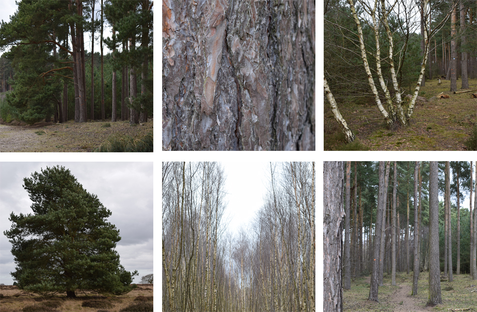 |
| As I do have the major restriction of daylight time with work, if I am free for an hour or two, I sometimes get snapping, they are not designed to be arty or compositions in a whole but points I find interesting and can see the use of such as shadows and forms among the trees. |
Exercise 1: Sketching Individual Trees
This first exercise is quite an interesting break down. I must admit, I would tend to start a drawing in a whole form of all detail and build within that without possibly considering something as basic as its outline and the negative spaces it can produce.
Hitting this exercise in the winter did mean the majority of foliage was evergreen and I didn't at the time have an opportunity to expand my journey, so off to the park it had been. I picked a large established tree, it was bare, but it had many, many branches and fronds which I thought gave some great movement and filled its form almost like a solid.
Once I had looked back on this exercise I can see that in looking at the form and shapes of shadows, the tree what quite an interesting subject to pick.
Also, using the four points I did find I interpreted the creative methods differently. I was almost soft with the third step of outlining the main branches and the trunk and found when I moved t the fourth step I expressed the tree more wildly.
I found doing this quite therapeutic and simplifying the points of observation takes the sting out of the process without that overwhelming feeling of wondering how to get it all on paper.
I went back and revisited this tree in the next exercise I liked it that much!
 |
| A tree in four forms. |
Exercise 2: Larger Observational Study of an Individual Tree
Moving to this exercise, I was lucky to have a very cold, but clear and rarely dry day free to get some outside drawing done. I went in search of the tree to draw. I found this one on the back of a walk route and it was quite hidden from the others and it had some fabulous spaces between the branches that came up from the routed base.
I did this on white paper with a black ballpoint pen. I found that using the pen, allowed two things. The definition and cross hatching and lines were prominent and effective of the trees surface and also because the ink flows continually while the pen moves, I could observe more so without being to concerned with pressure or blunt nibs.
When I came home I left this for about a week, and when I went back to it, I was really pleased with it for a sketch. The pen work actually suited the dryness and bareness of the tree itself.
While I was there I also took this as an opportunity to expand my photograph collection, so snapped a few other wintered trees while there.
 |
| A3 white card and a black biro pen. Both worked well together for this tree. |
 |
| Scan of my original drawing - applied some coloured inks to extenuate the wintered bark and tones of the tree. |
 |
| Digital drawing! |
 |
| Pencil sketch of a very old tree, I added the background foliage for this as I feel it needed it to express the size of the tree. |
This below is a complete off the wall flash of inspiration. After the research of Kathe Kollwitz I wanted to try linoprinting to see how it worked, so after my first exercise, I went back and did a pencil sketch of the tree, from this I tried to copy it onto some lino I purchased from Amazon, I don't think it is the best quality and probably designed as a hobbyist type kit, but I had four tools, ink and a brayer with it so gave it ago! It is roughly about 4 x 6 inch print but after attempting the inking several times it did come out okay! A total appreciation for lino printing, it really does consume time, it took me several sessions of chiselling to create this small attempt! The constant concern of what is negative and positive is a lesson too.

Exercise 3: Study of Several Trees
For my treescape I visited a plantation where there was a variation of trees. The scape mainly consisted of young pines and some areas had a huge mass of silver birches that stood compacted together in areas.
For my first scene, I worked over my sketch with oil pastels. This did taken a little bit longer than expected, but the build up of shape, form and marks were more thought about than possibly when I use other mediums. I found using the oil pastels also did restrict being too contained in over detailing, which is a good thing for me. The pines were quite solitary even though there was a density and the colours were hard to specify and I found the best way was to overlay pastel oil upon oil and keep flipping from one colour to another to build up the textures of the bark, grass and foliage.
I used the sparseness where the trees greenery stood above the trunks to use the space between to show the sky and light to try show the depth of the forest.
I liked this part of the forest as I liked the worn path that weaved out into the woods, and the fully formed trees at the side against the taller stripped pines, but I think as a composition of trees the forms started to get lost the more I worked on it.
It all started to become a bit "grey" in places. The positive is was a move away from what I know I can do, and to try a different way of drawing with mediums and building up imagery from what I can see.
 |
| Oil Pastels on Mixed media A3 paper. |
A few days after the above experience of treescape drawing, I felt that I wanted another go and see if I could produce the drawing I was happy with. Working from one of the photographs I used grey cartridge paper and white pencil and charcoal pencil.
I think this worked well with the silver birch trees.
The felled path was a good division and point of interest in the drawing. Going back to my oil pastel drawing, I tried to be less defined in detail but give lines that made the shapes between the trees and textures of the barks. I am happier with this one, and think I will revisit this again.
 |
| Grey cartridge paper and white pencil and charcoal pencil. |
Landscape drawing is this next stage, I automatically think of trees, fields, and hill and valley lines with the thought of landscapes. The process of creating landscape and visions of our world around us can be in the format of urban as well as rural. Maybe because at the moment of time, as humans and our expanding population and technology our urban and rural spaces change rapidly and this could be a point of interest for any social historic documentation in the future, I appreciate the fact we photograph everything these days and we all have this capacity, it is often fast, temporary and of little personality. A drawing of a landscape can produce how we feel and how we see the world around us.
I am looking forward to this project section.
Using the research points have looked at the suggested artists here: Research and Reference
Exercise 1: Cloud Formations and Tone
A drawing of a cloud is often very illustrative and not as suggested a "Drawing", I thought about why I would draw them as a solid series of shapes, that are often made up of various circular shapes. I think this is because, the basis of drawing an actual cloud is not as simple as it may seem.
Looking at the forms, there is firstly the strange natural occurrence of the outside line and it has this blurred up focused edge in the majority of areas and then occasionally a blip of a strong outline appears.
To do this exercise I did try a variety of materials to see what is the outcome. The main points of capturing clouds and the formation are to suggest their being, to get the moment down onto paper before it has gone. A very good exercise in trying to look and draw swiftly and within enough time to record what is seen.
 |
| This is on textured paper with charcoal and white chalk. |
 |
| Pencil |
 |
| Sketchbook |
 |
| Conte Stick, Fine Liner, Graphite in Sketchbook |
I even had a go at fast painting using acrylic and water, but I just found that the process did not work at speed and I kept overlaying and being heavy with the colour, whereas looking at it, I may have made better shapes with using a small amount of paint and more water.
 |
| Acrylic paint in the sketchbook. Not quite forming as well as I hoped, but there is some shape, I did find with paint I was more tempted to look at the paint more than rather than the clouds! |
 |
| Not copying, but re-describing what yous see! Taken from Vija Celmins video. Link available in my research section. |
To combat this, I made four pencil rectangles in my sketchbook, equipped myself with black fine liner and set off on a familiar route.
I had no idea where I would stop or what I was going to draw exactly. The journey to the beach was a chosen route and it is somewhere I have walked many times.
 |
| Stop and sketch 1 |
 |
| Stop and sketch 2 |
 |
| Stop and sketch 3 |
I did struggle to get the horizon of the ocean correct, but the purpose of my use of one pen was to mark make and be decisive, next time I make an horizon line, think I will start from that point.
The shape of the curve path is caught where it has tunnelled through the soft sand.
The next stop was along the sea front, the sun was fading mid draw so there had been some strong shadows and shapes, and I managed to get some of these down. I did seem to struggle with the perspective on this. I should of drawn in my lines and stuck to the direction as I did seem to lean off on one side. There were people around and I did keep a couple in as they moved through as I reached that part of the sketch.
 |
| Stop and sketch 4 |
Overall, I did enjoy this, but there is the temptation to think "I could do more", but the time framing is a good exercise and I am pleased I stuck to one tool.
Exercise 3: 360° Studies
Exercise 3: 360° Studies
I chose our large local park to try this exercise, I thought from each direction I could locate a focal point in any direction.
I have tried this exercise using soft pencil only, I wanted to try some soft mark making with pencil and see if I can make a smoother and fast catch of what I can see and get some more tones than what I could with the ink pen.
The first sketch above started with me using the large tree as my focal point and using it as a size guide through my viewer. The soft pencil allows for fast coverage of where light is sheltered and it does allow for showing thicker defined lines.
I have tried this exercise using soft pencil only, I wanted to try some soft mark making with pencil and see if I can make a smoother and fast catch of what I can see and get some more tones than what I could with the ink pen.
 |
| sketch one North. |
I resisted to not draw in every leaf and branch.
I think keeping the timing to a limit does help, I did start to over work the tree trunk and made myself move on and work on the background and what shapes they filled.
 |
| Sketch Two West |
Looking to the west - I had a part of the pond to place in and moving the viewer around until I found a satisfying area. The sun came out quite strong and cast some nice shadows and from this direction it divided the scene up to front, mid and background. Maybe my favourite view of the four.
 |
| Sketch Three South |
This view covered a vast open area, I moved my eyes to one side to use the large rocks as a focal position for me to start from. I don't know why but I did struggle to get the depth on this section, but I have to think of it as a recording of what I see so not to worry about delicate details unless they are in reaching distance of me. I was stood looking down in this direction as the land slopes slightly, I think this maybe why I felt it was a little out of kilter.
 |
| Sketch Four East |
The large band stand shelter is prominent and I was unsure whether to move myself around a little more, but then I decided to just draw what is there and use it all. I am glad I did as the sun shining made a super solid shadow casting on the grass. The downside is the detailing in the small fence near the swings, they seemed to start to get lost but they are visible and in the right place. I have to accept a fast drawing may lack precision at this early stage in my work.
Project 3 Composition
The studies in the components in the previous exercises have lead me to this stage. The composition of a landscape. Through the research of various artists I have seen a variety of studies and compositions that have shown the reading of a landscape and how it can be read and reproduced on canvas, paper or other surface.
The basis of tones, positioning, shape and forms all additions to create a successful landscape. I have experimented in occasions in my sketchbook and throughout the previous two exercises.
Exercise 1: Developing your Studies For my composition I have taken reference from project 2 and used a selected part of an image. I did look through my sketches and thought using this would also show the progression of a sketch to a drawing and the fact I had found the scene and redefined a section of it.
This did take some time to complete and I felt myself loose sections so it was a case of coming away and reworking of parts I was not pleased with. I picked this portion of the landscape because I found the deep shadows and shapes on the sand made some beautiful lines, the bars of the fence have some great repetition.
The studies in the components in the previous exercises have lead me to this stage. The composition of a landscape. Through the research of various artists I have seen a variety of studies and compositions that have shown the reading of a landscape and how it can be read and reproduced on canvas, paper or other surface.
The basis of tones, positioning, shape and forms all additions to create a successful landscape. I have experimented in occasions in my sketchbook and throughout the previous two exercises.
Exercise 1: Developing your Studies For my composition I have taken reference from project 2 and used a selected part of an image. I did look through my sketches and thought using this would also show the progression of a sketch to a drawing and the fact I had found the scene and redefined a section of it.
 |
| Pencil drawing of landscape |
Another aspect I liked came from the foreground of the sand leading to the steps down to the beach below. The horizon of the sea also was framed between the metal gates. The opposites of metal and sand and the soft grass adds to the composition.
I felt afterwards there were parts I felt let the composition down or at least weakened it. I think the haze and the vision of the sea meeting the sky doesn't translate well in black and white, I am not sure what I can do to have corrected this. I did remove some of the pencil lines and shading and reworked a couple of times.
Drawing a landscape in pencil is actually harder than I instantiated, the control of weight of shades to ensure the tones sit well is very difficult. I often found I produced too much of a heavy line when I was aim for mid tones, meaning the darker tones and lighter tones would alter, so removing and replacing the mid tones did happen several times during the draw!
I feel as a landscape composition it works, and I am pleased that I picked this subject, but in regards to it being a successful landscape, I am unsure as after the event I did wonder whether by framing the horizon I had missed the opportunity to expand the scenes to the left and the right of me, or whether it was a good decision to pick the selected view.
Exercise 2: Foreground, Middle Ground, Background
Developing this next drawing in this exercise brings together the awareness of depth and section to a scene which gives the viewer a sense of proportion, direction and space of what the artist can perceive.
I understand the process and understand the importance of foreground, middle ground and background, however the placement on paper is not as easy as I anticipated. I wanted to produce a piece that shows the reason for the exercise.
My first pit stops is to review the Artist, Nicolas Poussin and dissect a landscape to work on the success of how it is built.
I started my attempt of the landscape by gathering the suggested tools and revisiting a landscape I had come across via a previous journey, (even though that particular project was not for landscape!). At first, my initial idea seemed to be to cover the landscape but under inspection and after my attempts of working the landscape I decided the difference between the middle ground and back ground was too much, the mid ground spread quite widely but the back ground disappeared. Though, I understood I can really draw what ever I perceive as a landscape, I did not think that the background explained enough of a scape tell the story of the the three sections of a landscape.
I gave this one a restart and went off looking for a place with more interest and changing elevation.
Viewfinder ideas: I had previous experience of isolating an area to draw using a form of a viewfinder that I made from two "L" shaped boards, and open and closed them together to make interesting views of a scene.
I wanted to use a viewfinder for this exercise and try and keep the proportion in tact. I did look at purchasing these online but decided to create them.
I made two more viewfinders. Created out of board & acetate and a sharpie fine liner!

I created to versions sizeable enough to pop in my "carry around" kit.
One is a rectangle and has a larger edge to one side, to enable me to hold it steady with one hand.
The other, I sandwiched a piece of acetate with a grid marked in red fineliner. Very simple, but working!
 |
| Grid Viewfinder |
 |
| Rectangle viewfinder |
I wanted the image to portray that I did understand the exercise and that there was a reason for the tools within the exercise. As in the first instance, I was a bit perplexed by the use of soluble water colour pencils, but then after my research, it did finally absorb that the use of colour and tone would express to the viewer the depth, the directions of light, the sense of where the objects are and how close they are. For example, if I coloured everything in the same green, the trees at the front, the hedges in a field and the meadow and the trees in the distance.
Apart for the size of some of the objects what else tells me that they are further away, and what else tells me the way the light is hitting the objects.
I know there is the use of shade and tone, the colours are stronger and sharper as they come closer to the eye and those colours maybe the same in the distance, but we don't see it in that colour, we see all that is in between and also our eyes can not process the sharpness of colours in the distance under the haze of light or other objects.
Used:
A3 White heavy weight cartridge paper
B2 /B4 /B6 /B9 Pencil
Water Soluble Colour pencils
(Completely forgot to take a ruler! Don't normally carry one!)
 |
| Study of landscape - using pencils and water soluble pencils. |
My first issue i found was my overworking the foreground, this became accidental as I proceeded through the sketching, I concentrated on what I could see in the mid ground of the fields and the hedge row and trees. As I did this I then stepped back and thought the foreground was getting lost and the mid ground was becoming more to the front of the image. I tried to counteract this by over working the foreground which in my efforts, I think I made the line work start to dissolve and the excellent lines of the waters edge and the hill shapes started to look lesser against the foreground to a stage where I think it ended up looking slightly flat.
I think this is an area I can improve on and can incorporate some more scene sketches in my books to practice.
One element is understanding the use of colour and tone to show the distance and depths successfully. In painting this may be easier, but I did find using soluble pencils a little less easier as I tended to over lay too much colour or go the opposite way and infiltrate the paper with too much water.
In the "Tips" section, the majority of information is answerable within each of the last two exercises, but one self question in the section: What additional preliminary work would have been more helpful towards the larger study? is asked at the very end. This is the question that at first I thought I couldn't really answer, but the answer is obvious after my last exercise of drawing a landscape and it is practice, the practice of scene drawing is the only way to improve and understand all the aspects of a landscape.
Project Four Perspective
This project starts with a introduction into the use and basis of what perspective is with a drawing. The basic linear perspective is explained under the diagrams of opening doors and showing how physical parallel lines become non-parallel. These meet at the vanishing point. Looking or viewing an object such as a house so one side is flat to your view is described as one point perspective. I have had a practice in my sketchbook and just made some useful notes on these basic rules and simple sketch ideas on how one and two point perspective works from a view point.
Exercise one: Parallel Perspective - An Interior View.
From this exercise, I gave my first attempt at drawing with the knowledge of using the vanishing point within my drawing and knowing the directions and eye point of where they complete. I understand how to draw an object such as a row of houses or a few books, but it is a natural observation not a precise science to create them, so using perspective rules will help improve accuracy and move drawings from having the ability to draw in subjective manner to objective to produce a more accurate scene of view rather than just a personalised impression of.
Below is my sketch, this is our dining room. Firstly, I think I misjudged where the eye level sits. I stood back as our hallway is not very wide, so my position was from the room opposite. Standing, I could see the room, the ceiling and looking from a higher level than sitting down. I liked the fact I managed to get the open door angles quite well and the table worked quite well, but rather than restrict myself to the eye level I think I have tried to look at the floor and how that leads away, then the ceiling, but maybe I should of looked at this as a simpler view into the room and not tried to envelope the whole room into the view through the door. Overall, I am pleased as I really tried to work on the aspects of using vanishing lines rather than concentrate on making a drawing as a finished piece.
Exercise Two: Angular Perspective
I decided to try and find an interesting building to work from. I opted for a local chapel in a village as it has a few odd shaped buildings added on, which offer different directions and some interesting lines.
The initial visit started with a quick sketch, from this as I was trying to be limited with detail, I roughly put in my eye level and worked out the basics of where the vanishing points resided. From research and watching a couple of video son Youtube that explained perspective in some detail. - (Can be seen via a link in my research page - here ).
I located the prominent vertical lines and horizontal lines and used these as guides to show me how to locate the vanishing points. For example, the two corners, as one is slightly shorter, it shows which way the roof is leaning to from my POV. This gave me some indications and helped recreate the line drawing in more detail and I hope accuracy!
The next stage was to ensure the visual was as simple but held some accuracy and form.
 |
| From sketchbook. |
From this exercise, I gave my first attempt at drawing with the knowledge of using the vanishing point within my drawing and knowing the directions and eye point of where they complete. I understand how to draw an object such as a row of houses or a few books, but it is a natural observation not a precise science to create them, so using perspective rules will help improve accuracy and move drawings from having the ability to draw in subjective manner to objective to produce a more accurate scene of view rather than just a personalised impression of.
Below is my sketch, this is our dining room. Firstly, I think I misjudged where the eye level sits. I stood back as our hallway is not very wide, so my position was from the room opposite. Standing, I could see the room, the ceiling and looking from a higher level than sitting down. I liked the fact I managed to get the open door angles quite well and the table worked quite well, but rather than restrict myself to the eye level I think I have tried to look at the floor and how that leads away, then the ceiling, but maybe I should of looked at this as a simpler view into the room and not tried to envelope the whole room into the view through the door. Overall, I am pleased as I really tried to work on the aspects of using vanishing lines rather than concentrate on making a drawing as a finished piece.
 |
| View into dining room. |
I decided to try and find an interesting building to work from. I opted for a local chapel in a village as it has a few odd shaped buildings added on, which offer different directions and some interesting lines.
The initial visit started with a quick sketch, from this as I was trying to be limited with detail, I roughly put in my eye level and worked out the basics of where the vanishing points resided. From research and watching a couple of video son Youtube that explained perspective in some detail. - (Can be seen via a link in my research page - here ).
I located the prominent vertical lines and horizontal lines and used these as guides to show me how to locate the vanishing points. For example, the two corners, as one is slightly shorter, it shows which way the roof is leaning to from my POV. This gave me some indications and helped recreate the line drawing in more detail and I hope accuracy!
 |
| Original sketch in pencil I used some basic methods as a guide. |
 |
| Drawing in detail with guide lines. |
The other two buildings used the other vanishing point in places as I had viewed from the end corner seeing three areas of the building.
I think my eye line was much more successful than the interior drawing.
I scanned in my drawing, and from one point I tried to extend the vanishing lines off the page to see where they ended. I don't actually think I was too far out on this side. The lines coming together almost meet.
 |
| Finding the view point. |
The perspective lines are imaginary in the sense they only exist by connecting them to where you think they land.
 |
| Finished line drawing in ball point pen. |
While away a couple of weeks later, I made a pen and ink drawing of a large house, It came out okay, but the direction of perspective to the vanishing points started to go astray. I guess the practice is the key.
Sir Muirhead Bone, Rome, 1910 (pencil).
The drawing of the city street shows a high built street that has a lot of action happening down below. I reproduced the image in some basic line sketches.
You can see from my sketch the point of vanishing, is from behind a tree that is actually just within the drawing. From what I can guess, the artist is viewing this from one side of the avenue. The lines seem to work, but noticed that some of the upper building lines start to curve very slightly.
Using a bit of imagination I tried to ascertain the remainder of the other side of the street. Originally I equalled the distance of what may have been visual, (in the red pencil sketch).
Once this was in place and it positions what is in Muirhead's drawing it gives a full sense of what the street maybe like, and I think from this the unseen area was actually closer in, (the green pencil). As the tree line was probably an indication to where he was viewing from and captured the most activity in the street from this chosen angle.
He has used just one point on the horizon and with it being close within the edges of the drawing it had allowed for some accuracy and perspective.
The importance of the accuracy not only as an artist wanting to reproduce a like for like image for all viewers but it also documents social history at that particular moment.
Exercise Three: Aerial or Atmospheric Perspective
The first part of this exercise I wanted to be sure I understood how tonal gradation works in a landscape or scene.
I researched a few art work pieces of landscapes and seascape to see some examples of the point that is being made.
Below is a piece from a contemporary artist I referred to in my research. This artist does use the traditional methods of blue sky but can we draw a defined line and say "this is the horizon and these are the objects in the background." We can't as the clever use of milky colouring shows a soft and distant approach to the far scene. Same as we would have with our eye level on a huge plain.
Read more here in my research.
I also purchased a book of works by Lowry and within his work of street and city scapes, as like the Wilhelmina Barns-Graham example that we are shown, Lowry uses the murky mixes of colours to suggest the feel and oppression of the built up smog or dull low clouds hanging over the buildings.
My first sketch came from a photo taken early in the morning at a local nature reserve. I was looking desperately for somewhere to capture this sort of atmospheric feel of the distance and foreground and the assembly of the mid ground being a more gentle development and still giving perspective.
Above sort of worked, the closeness of the reeds does show the start of the view and the distance was lost in the sea mist coming into the reserve. I like the bleed of water and sky. I think I will progress this further.
 |
| The close angles are actually quite tricky, when the vanishing point is a fair distance, to keep all angles aiming for that point has started to bleed a little around one side of the house! |
Sir Muirhead Bone, Rome, 1910 (pencil).
The drawing of the city street shows a high built street that has a lot of action happening down below. I reproduced the image in some basic line sketches.
 |
| In my sketchbook over couple of pages. |
Using a bit of imagination I tried to ascertain the remainder of the other side of the street. Originally I equalled the distance of what may have been visual, (in the red pencil sketch).
Once this was in place and it positions what is in Muirhead's drawing it gives a full sense of what the street maybe like, and I think from this the unseen area was actually closer in, (the green pencil). As the tree line was probably an indication to where he was viewing from and captured the most activity in the street from this chosen angle.
He has used just one point on the horizon and with it being close within the edges of the drawing it had allowed for some accuracy and perspective.
The importance of the accuracy not only as an artist wanting to reproduce a like for like image for all viewers but it also documents social history at that particular moment.
Exercise Three: Aerial or Atmospheric Perspective
The first part of this exercise I wanted to be sure I understood how tonal gradation works in a landscape or scene.
I researched a few art work pieces of landscapes and seascape to see some examples of the point that is being made.
Below is a piece from a contemporary artist I referred to in my research. This artist does use the traditional methods of blue sky but can we draw a defined line and say "this is the horizon and these are the objects in the background." We can't as the clever use of milky colouring shows a soft and distant approach to the far scene. Same as we would have with our eye level on a huge plain.
 |
| 2015 Nial Adams Oil Painting - Big Norfolk Skies |
Read more here in my research.
I also purchased a book of works by Lowry and within his work of street and city scapes, as like the Wilhelmina Barns-Graham example that we are shown, Lowry uses the murky mixes of colours to suggest the feel and oppression of the built up smog or dull low clouds hanging over the buildings.
My first sketch came from a photo taken early in the morning at a local nature reserve. I was looking desperately for somewhere to capture this sort of atmospheric feel of the distance and foreground and the assembly of the mid ground being a more gentle development and still giving perspective.
 |
| Pencil and watercolours, |
From my previous work above, I found a super photograph on a telephone business site. It used monochromatic tones to show the scene. I used Newton & Windsor Black Ink and water only. I started drawing with a fine brush then as the ink dried I added extra layers and kept building the water and ink mix to blend the mid to the background. I wanted to capture that lost horizon that is there but can't be seen automatically. The sun was behind a thick haze and overcast the foreground. I was quite pleased with this one as the bank sides and water way shows the perspective of leading into the horizon from one side.
 |
| Black ink and water. |
I have some photographs from a few years ago when I went to New York, This is from the Empire State building looking out towards the Hudson.
I wanted to grasp the nippy air and the Autumn time. I purposely did not make a blue sky and blue water. I used just greys and oranges and mixed them. I used gelato sticks which have a waxy consistency. I first sketched in a water based marker pen, then added the colours and let them bleed to make shade and the deepness of the buildings. I added more colour after each layer dried.
I am not really pleased with it but it was an experiment to see how this method would develop.
 |
| Gelato & Marker pen. |
Project 5 Townscapes
Moving from what has been covered in the basis of landscapes and forming scenes outside and using perspective to help suggest the clarity and directions of our drawings, this area of townscapes gives the placing of everyday life and the world around us to show the integration of manmade objects in to the world around us.
Exercise 1: Sketchbook of Townscape Drawings
I made some sketches and detailed studies of the buildings across from me. Using what I could see and made notes to remind me of what I could see. I found this quite helpful when I made my main sketch.
I made some sketches of the house and the surrounds. Keeping to just some basic details of position and where about to draw the houses and whether to incorporate some or all.
The singular house is interesting but as a scape I think it will work better with more surrounds, the more show of the busy streets and moving life the more contrast to the stood onlooking rooms of the houses.
The finished piece is done in pen and ink, I started in my sketch book and laid down the basis of the houses, but as it progressed I found I started to incorporate more and more of what was there. Eventually I stopped. I took a couple of snaps and closed it up.
Reviewing my work: I finished this a week or so later. I initially was pleased with it, but then I decided I had maybe over compensated too much detail in the house and had over worked the rest of the drawing. As I had started the house first, I put in some rough details and then as I tried to explain its structure it became more and more crowded. I like the captured moment, but think If I was to do it again, I would have used less colour and line work. I will no doubt work this out through the next exercises and stages of the course. As an attempt of an urban drawing it does look okay. As I sketched free hand it does show the lines are not all straight but, I think that does add to the sensation of wear and tear and the date of the buildings and the lack lustre feel they show to the world.
Exercise 2: Study of a Townscape using line
Moving from what has been covered in the basis of landscapes and forming scenes outside and using perspective to help suggest the clarity and directions of our drawings, this area of townscapes gives the placing of everyday life and the world around us to show the integration of manmade objects in to the world around us.
Exercise 1: Sketchbook of Townscape Drawings
The first attempt at townscapes took me to try a new place, while in South west of England I was close to the town of Weymouth. I looked for a street that had plenty to view and apealled to me with varied interest. I found a main street which I particularly liked as the fast paced changability of a seaside resort over took the old houses that once stood gracefully overlooking the sea views.
Some of these houses have withstood time and kept original features and others have been modified and mauled. The ground floors knocked about and emptied to make way for tourist shops and cafes.
One of the houses almost looked untouched. It had the old fashioned brick work and the cast iron rails and still maintained its entrance to the path below. It was hidden by its neighbours and bus stop, people and traffic. The house which maybe stood alone would be magnificent but among the other it was lost.
I sketched a few points of interest of some of the other buildings, just to be sure of my intent on which building and made some notes in my book. I then decided where to reside and made some boxed sketches in a heavy pencil to show the stature of the building and its basic shapes, plus looking into the points that appealed to me and how those subtle angles and shadows showed and hid parts of the building.
 |
| 10cm box sketches in pencil. I did short but direct studies on these points, they probably don't make much sense but they were sections of the building that I thought were its signature features. |
 |
| Make notes, so I don't forget what I have drawn! |
 |
| Charcoal sketch, I was trying to get essence of one of the buildings from a different angle. Rather than draw it complete I used charcoal to enhance the movements and shadows around the building and its form. I tried to keep some quick notes too as I worked. Charcoal is a bit messy to sketch in field with! I had a lovely black side palm which I didn't realise until later when I bought an Ice cream!! Nice. |
The singular house is interesting but as a scape I think it will work better with more surrounds, the more show of the busy streets and moving life the more contrast to the stood onlooking rooms of the houses.
 |
| The street. - B6 and watercolour quick sketch. |
 |
| A section of the street and the shops below. Planning out how much can be seen and at what point I work from. |
 |
| Sketchbook drawing of the street. I am quite pleased that from this you can work out where I am sat and what I am looking out. You see the same and can see the section of street. |
Reviewing my work: I finished this a week or so later. I initially was pleased with it, but then I decided I had maybe over compensated too much detail in the house and had over worked the rest of the drawing. As I had started the house first, I put in some rough details and then as I tried to explain its structure it became more and more crowded. I like the captured moment, but think If I was to do it again, I would have used less colour and line work. I will no doubt work this out through the next exercises and stages of the course. As an attempt of an urban drawing it does look okay. As I sketched free hand it does show the lines are not all straight but, I think that does add to the sensation of wear and tear and the date of the buildings and the lack lustre feel they show to the world.
 |
| Finished piece in watercolour, and pen. |
The exercise to use line to create the scape was another stage up from my previous exercise. The previous exercise for the townscape, I used a fineliner pen and as I had mentioned I over analysed the details and I think in sections it became heavy, I think I became counter productive by trying to cover all the points of tonal work, line work, and detail. It started to become weighty.
This scape, I firstly before evn deciding where I was going or what scene I would set to, I looked through my equipment and wanted to use a different medium. Initially I was thinking biro, but I have done that a couple of times and in a way it is a bit easy as I find biro can be a bit forgiving and easy to rectify. Which in itself is not a problem, but it can make it a bit lazy in having to think about where and what I would put on paper.
I decided to try and draw with a brush pen, I have not tried this before, as I tend to end up using my brush pen as a filler for tone/shading and occasional scribbles.
It was a hot day and I was able to be in a great location of a nearby market town, It is a small populated town but on this day (a Saturday), I had the streets full with a typical rural market. The majority of stalls were flowers, plants and fresh produce.
I had not intended on drawing a market, I had been around the town a couple of times looking for angles and looking what had options for fore/mid and background.
As often I found, you get a fabulous frontage to draw but then there is now background as you are surrounded by walls and buildings.
It can take some time to locate an area that not only you can give a great visual but also accommodate an area you can stand/sit in and sketch without too much distraction or discomfort.
The preliminary pencil sketch was paved down first, from my side of the street I could see the flower stall (my foreground) the buildings leading into the square and some of the market (my midground) and the parallel street beyond (my background). My first location on the paper came from the man stood looking at the flowers and plants, I quickly sketched him in first as he was temporary and would be gone, once he was in and the plants were in where he stood, this gave me a point to refer back to for sizing and direction.
I have left the pencil lines in the drawing, it shows the change and modifications happening a I worked over with the brush pen. The brush pen does restrict detailing. The control is less than a fine nibbed tool and the flow has to be continual. Which meant I had to be more precise and decisive with where I placed lines.
 |
| Town Square on Market day. |
The perspective starts to falter with the bank building behind the market stall, but it is not too bad. It is a progression from technical aspects to a more free flowing drawing.
 Out of interest I came across this painting by Lowry some days later in a book I have been reading (Masterpieces in Art by Susan Grange). And this piece is called "Market Scene".
The clever way he has used the lighter tones and softer lines as his scene descends beyond the foreground. His sharpness of colour as the immediate people move around and this softens further the crowd moves back into the market stalls.

The clever way he has used the lighter tones and softer lines as his scene descends beyond the foreground. His sharpness of colour as the immediate people move around and this softens further the crowd moves back into the market stalls.
Stepping into this exercise from my market place sketches, I went through the various viewpoints I had found and notes. I wanted to use a variation on the previous image but looking to use the methods and points provided.
I worked on A3 white, which had a slight texture and used conte sticks in Black, brown and a deep red.
I started straight to blank paper and my first process was the eye line and then inserting the verticals. I did some basic line work and had to resist the urge to connect the dots so to speak!
I worked in the stages of diagonals and used the horizontal line to get some needed prospective.
Working in the sticks meant I needed to start light. I found on some sections I had started to over work.
I stopped and returned to the work, as I became undecided whether to restart or rework. I sat back down and carried on. Being aware not to over line or go over too much. I started positioning the buildings and the market below and the people.
My objective was to create the scene but with the use of the three colours and the white paper and not to get concerned with precision.
Is the piece successful? I would hope it is, but as I have recreated the scene, I am unsure as a new onlooker would appreciate if they can discover what is going on in the image.
I think I have used the suggestion of building up colour with the sticks well, I used this to present the front of the image and left the streets at the background faded and not so defined.
 |
| Finished Conte Sticks in limited palette. Using layers of colour to establish tonal values and depth in the scene. |
Overlayer of detail of using black very lightly to add some detail. I have been careful not to express too much black within the image to stop the sense of depth. Here is a closer image of the inner market place in the focal part of the drawing.
 |
| The focal point of the people walking into the market. |
I found this exercise a particularly useful method of understanding and producing work by concentrating on values other than precise detailing of the scene.
Exercise 4: Statues
This exercise had me a little stuck to start, and is still possibly an ongoing exercise! The studying of statues. The first issue I had was locating statues when I had the time, but I did find a couple. (this is why this is ongoing...) I will keep statue working as I come across them and get some angles to sketch.
I did work on these ones as I found them and had my book at hand. I can see the similarities to how we study for example as in the trees. The understanding and process of creating what we see in texture, form and perspective.
The difference between a statue and a human form is the softness of the edges, drawing a human has the added advantage of adding movement and a sense of tenderness to the line, but with statues it is quite harsh.
As I have found opportunities I have added them in order below.
 |
| This pen sketch of the statue was a bit lost. I think I may have been better looking at it from either below or from a corner. The side looked good when I first stated sketching as it had some great shadow and strength to show the plinth and the form above so you have an idea of perspective. But in the drawing his shape started to be lost in transforming the shadow to drawing. |
 |
| Looking up at GeorgeIV. I made a pigs ear of this. His body looks flat and the angle of the base is right as I looked up but I seemed to have drawn him almost at a leaning angle to the base he is on. But it is a quick sketch. |
 |
| Study of facial details. There is no face detail in a statue, what we see is the lines and shapes of the stone making us think we are looking at a face. The eyes and mouth don't open or move but look pursed and aware and active. I think I got the shading better on this and the lack of detailing but using the shadowing to allow the form to show. |
 |
| This one was while out one day and came across this sculpture of a man in an art exhibition. I felt a little conscious drawing while surrounded in quite a busy area but I sketched down a quick representation to try and get the expression and the shape and effect of the cold iron body. |
Assignment Three
Over the exercises that detail different aspects of landscape and understanding the way we perceive and portray the expanse of a view, all these come towards this assignment.
The visual aspects must include some important elements to show the understanding of these exercises and how they can all play important roles in creating perspective and the sense and feel of the scene around us.
For this exercise I went through all my sketches and sketchbooks and also photographs to provide myself with enough of a pool to dip in and out with ideas and work on whatever chosen scape I wanted to provide for this exercise.
My points I want:
- Show experience and understanding of perspective
- include nature in one form or another
- include buildings, look for straight lines
- interest
- composition
- mediums to reflect the surrounds
- try to be free and fluid in my drawing
- capture what I can see
Over a course of a week or so, I kept going between two options, one was from a previous exercise where I had been to one of the local market towns and sketched the market place with its section of florists and gardening plants. The other was a huge selection of images I had collected from being in San Francisco. Both gave me some ideas and inspiration.
I decided with my photographs, as for one, they reminded me of a great time and felt an affinity with the images so hoped they would give me some extra enthusiasm for aiming to envelope all aspects and provide a suitable piece.
I was a little unsure whether this would be ideal but I do feel quite at ease with drawing outside now after these last few months, (At first I was a little conscious of people looking), but that passed as I got more confident in sketching directly and not worrying so much about intense accuracy and details but more about the ambiance and feel.
I look back over the exercises and I see a difference appearing between such as my sea front drawing and my oil pastel trees, to my my market sketch in town. I think the changes occur as I have changed through exercise to exercise and what initially may have felt a bit overwhelming, I have taken on board and learnt from it. I am trying to uphold my technical skills and give way to being more at ease with a line going astray, or not absorbing every detail.
 |
| Not to bore any person with reams of images, here are some of my photos I have used as studies for this exercise. |
My beginnings started with the rough sketches and snippets from the images, I looked for that captured sense of the place and also to establish a clear perspective and linear lines for the viewer to understand.
I had several ideas and made a catalogue in a couple of pages or so of some ideas.
 |
| sketch ideas in 10 x 10cm boxes in sketch book. |
I also thought about what mediums to try and how to use them, I made some more sketches of isolated parts of the images and also tried using various sketches in ink, paint, pencils etc, to see what holds the best atmospheric effect for the drawing.
 |
| Looking at objects within the sketches. |
After some consideration on medium and materials I decided to combine conte sticks with charcoal. I think these show the roughness best and also give a hazed effect of the warm sun.
After this range of exercises, I feel a bit of knowledge and sense coming through on the behaviour of mediums and the subjects. My first appearance of this comes back from doing the exercises of tree studies, I found using oil pastels quite a struggle and even with the urges to flow with mark making, I still ended up with a mediocre drawing and the perspective and forms were poor. I carried on with that same exercise and later did a drawing in a white stick. The key to it being successful can relay on not drawing everything you see, and not drawing every detail. But to capture what is there.
 |
| Conte sticks & Charcoal mixed on blue textured A2 sheet. |
I also worked on a limited palette of white, black, grey and orange. I worked a textured light blue paper.
The reason being, that there was a lot of colour and detail, but the limited palette meant, I had to really think about where I was going to use black, use the white and combine the other colours to suggest what everything is.
The trees are black and orange, but this represents the shades and the bright light hitting the branches and leaves from the strong sun.
The pressure and lines of black fade out and I use them less frequently as I moved from fore to mid to background.
I am actually quite pleased with this study, it is an assignment I think where I feel confident and assured that the exercises have lead me somewhere and it has worked very well. Among some of the exercises, they have felt long and in some areas I did start to feel a bit uncoordinated in my direction and methods. But looking back it now seems to have come together quite nicely.
Drawing Part Four. - The Head and The Figure
Project 1 Fabric and Form
This project section is dedicated to the way we interpret and recreate fabric and how it shows form and also distorts form and can arrange its own landscape.
Fabric has qualities to convey, these are weight, texture, its role, the space it fills and the constant change of form it brings when on a body. This of course depends on the fabrics content and form. It is important to get these aspects correct to let the viewer understand the shape and form of the body underneath the fabric and how the fabric may cling, or hang from the body. In portraits such as Royals or Aristocracy members, the luxury of the fabric and materials would have been an important part of the painting.
Exercise 1: Drawing Fabric Using Line & Tone
This exercise concentrates on the aspects of the visual of lines and the creation of tones from using fabric.
For this exercise I draped a piece of plain grey fabric over the back of a dining chair so it sat over the chair and puddled on the seat.
I tried to do this as casually and not arranged as possible to see if I could get the natural folds and form of the fabric as it sits.
For the first 15 minute sketch, using an A3 pad, I worked on the basis of using line work only. I set a timer and kept to the exercise so not to over work and also not to spend too long working on one segment.
I used a brown oil based pencil as it was smooth and moved fluidly over the paper.
 |
| Line drawing of fabric on chair using oil pencil. |
The next fifteen minutes I needed to express tone only, I decided to use a pastel based pencil and work in a different colour to see how it adds weight and feeling to the fabric.
 |
| Using pastel pencil on A3 to show tone only on the fabric. |
Moving through this exercise, I used the pad and concentrated on areas of the fabric, using a variety of mediums I did some quick sketches. Using different mediums shows how this can effect the weight and style of the fabric. A dark heavy pen can make the fabric feel weighty and stiff. A light crayon can offer fluidity and movement, all are objective to how the fabric needs to be portrayed.
 |
| Smaller sketches of areas of the fabric. I think the graphite soft pencil worked well. |
My findings were that using a heavy charcoal stick did not favours for the material, it was more smoother to use and the lines and tones blended but the darkness made the fabric look oppressive and heavy.
The pastel pencil worked well, but working in a five minute time space, I worked faster and it created some interesting line work and shapes, I worked on the basis of the landscape and contouring the waves of the fabric with pencil lines. I also tried a paint pen to see how that would work, though I found working quick it did create smooth fast lines but trying to add tone didn't work so well.
 |
| Charcoal block. |
 |
| Pastel pencil and also paint marker, both used to make contouring lines of fabric. |
Exercise 2: Emphasising Form with Cloth
I was fortunate enough for this occasion to obtain someone to model for me. The male sat in dressing gown comfortably on a sofa. I sat opposite so get a view of the body, sat and the light and shadows showed quite well in the room. This is my first exercise involving a human study in this close encounter. I tried to stick to the exercise points an used a soft paper and a graphite stick and using shade and shape I created the body and tried to express the shapes and form by using a softer approach to making the light touch lines to hopefully express the feel of the fabric gown and the flesh. I did not spend much time working on facial features, hands feet but wanted to show I knew they were placed but not essential in the drawing.
This exercise is a lesson for me and I have found over the last three assignments there comes a point where I have to step back and consider what it is I am understanding and not to try and work each piece to make a piece of art but to hone my skills and learn some new skills.
Project 2 Proportion
The hardest part of drawing a human or animal I have always found in the sense of reality is to get the proportionate parts to correspond and show a life like reflection of what I see. This part is the hardest section of making a human look as you see, the foreshortening and distance between limb and limb and the changing space and lines from the flesh as it is in position and angle to how I see it.
To gather momentum on this here is some quick studies in my sketchbook. working with a graphite stick and trying various methods to project the correct angles and shapes I see. The body is a tricky piece, with very little straight lines and all around it is moving constantly, even in a still position it reflects light and tone progressively. I am thinking this is the toughest assignment section yet!
The old gentleman sitting on a stool. Here I have looked at two points. The shape of the body as whole and the how the posture shapes the outline and the secondary is the way to make his body look solid and of flesh. This part is the conundrum. I am going to have to understand how to put shade, tone, line and texture together to establish what it is I can see and feel from the human body.
Points to remember:
GETTING THE RIGHT POSE - Comfortable and natural, what are they doing? Look for background, consider the models stance, do they float? Think about what they are sitting or standing on or next to, incorporate shade and tone to show them and what is around them and the influences.
LIGHTING - Contrast, define lines with shadows and tone. Think about how the dark shadows play around where flesh meets objects or pressing against surfaces.
NUDE / CLOTHED? - The opportunity to use nude figures is prominently effective for the artist to gain understanding and the ability to read and draw the human body. Clothing works as it helps with shape and tones but the underneath is the first lesson and the clothing can only be produced well if as an artist understanding how the form works first.
Research information: I have been watching the series from BBC John Berger: Ways of Seeing. Though, at points I have found the narrative looses me on occasion the provoked issues raised in Berger's series is definitely beneficial to watch. In case any other students are here. The link is below:
YOUTUBE - John Berger: Ways of Seeing Series
Exercise 1: Quick Studies
This exercise uses time limitation to get work down onto the paper. This is an exercise I have done in some previous studies and it works well with forcing the eye to take down immediate detail and communicate the eye to the hand.
The best thing I like about this technique is the discovery of shapes and forms that had I been contemplating, may not have happened.
I worked in a couple of different papers and mediums such as ink, B9 pencil and chalk. The movement varies and the form of the body looks different at angles and with different mediums.
Exercise 2: A Longer Study
Going through from the sketching to a fuller study of the body I also looked at the raised topic of the perspective of foreshortening. This method is what adds the sense of being to a body from the direction we are studying or reproducing the image from. The basis is on the length of the body or limb, head etc, and how this length changes by view but not in physicality. This comes into play when drawing from angles and different view points. (One of the raised view point refers to a self drawing looking in a long mirror and how you see the change in size of your own anatomy but obviously your legs have not expanded or grown, we just perceive the legs from a different angle. To me it is a similar aspect as in the previous exercises and assignments where we study linear and horizons, and how the angles and vanishing points distort and skew what we see but in reality it is no different, we are just looking at it differently.
A great example of an artist who demonstrates the use of foreshortening extremely well is Philip Pearlstein. I have made some notes and images in my research section.
I did another study this time, not to project the model as with detail but to work out the form and lines of the body. I used various pencils to translate the drawing to show the body basic form and then the shapes the body makes.
The study of this model below shows my work in the stages over the period and how it started to take shape from line to form.
I started by looking at the middle line of the body and using that as guide as to where this lay within the models pose and then adding some vague indentations of the head, limbs and mid body.
This is a guide and I find that if you are liberal and light it is easier to connect the dots and work out the spaces between limb to limb or for example head to shoulders.
The problem I did find towards the end became apparent to me more so with the forearms and being slightly out of perspective to the view. This comes from two valid points from my drawing that caused this to happen. The first being the negative space between the models head and her angled arm, I somehow over spaced the distance and area and once the other areas had established it was hard to correct. The second part I found my error came from was the distortion of the foreshortening of the front arm, as it comes down the front of the body and then proceeds across the front, I seem to my eye over lengthened the limbs to what is actually visible and then where it is shortening from my view I have not engaged with the process of widening or thinking of how the arm changes in shape but the physical spaces around the arm are not shifting in view as the arm itself.
The only thing I can really say about this exercise is more practice! So that is what I intend to try and do as I proceed further!
Research Point - Under the research point regarding foreshortening, I tackled this by sitting on the floor with a narrow long mirror in front of me, with space a little tight I sat with my legs out and ensured they were close to the mirror. The foreshortening comes into play in two main areas. One is my straightened leg, it is very much hidden by the foot and the view being blocked from my point. The second is the forearm, it is bent up and away from me as I sketch, I found getting this correct a little more tricky. I tackled this by using a oil based pencil that moved fluidly and sketched over and over until I think I had best results. I did not take time on detail. More on the space, shapes and tones I could see on myself.
Project 3 Form
Exercise 1: Basic Shapes
Understanding the form of the body can be broken down into the shapes and forms that it creates to make the head, torso and limbs. Even down to the hands and toes the use of cylindrical shapes can be added together to form the hand as a whole with each joint to joint being isolated as a shape and connected to the next. In the past I have used this method when drawing models, looking at the ratio of head to body and using this as a guide to create proportion.
For this exercise the model is sat down and leaning at an angle holding her head in a tilted position. If the central axis is used here it starts off at an angle and then sweeps down the bent chest and compresses with the models posture as she leans forward. From the axis line the basis of the shapes and forms can be built. I made different attempts at this exercise, using different methods to accumulate the shapes together to make the models body and head.
The first model drawing I concentrated on getting the axis of the body in and working on building the lines and where the body develops planes and curvatures. I used these as almost map markings for getting the proportions correct. I did not want any detail, just the basic shapes and connections to create the model sat down and leaning outwards.

From this stage I worked on the lines that create the shapes. I kept a constant check on the outer shapes of the body and the spaces between her form, for example the gaps between the calves and the stool legs. The triangle forming from her bent arm to the cheek.

I repeated the sketch but this time I took the aspect that the shapes are what make the tones and shadows, and used these areas to form the shapes. Rather than draw in the whole shape, I used sections of shadows and kept them fairly basic and thought more about the areas the shadows covered. Where the sat on the body and how the shape was within the physical shape.

Moving to the front view of the model, this gives me two new points to narrate to the viewer. The axis is curving from the tilt of the head, this then moves down to the chest bone and the imaginary line almost creates a semi lozenge line as it descends back as the model leans forward and comes round to the middle of her pelvis.
The secondary aspect is how the foreshortening of the limbs start to change, from the leaning model we start to get the sense of the flesh on the thighs and stomach and breasts. These are hidden from the side view, these become different shapes.
I find the most successful method is to place in imaginary contours of the thighs etc. Imagining them sliced and how the shape changes as the flesh presses down on the bench, then is free as it approaches the bent knee.
I worked methodically on this piece. Starting with the central axis, then working out the hidden shapes and structures as I worked from the axis outwards.
I am quite pleased with this result.
 After I had completed this, I did a very quick sketch of the same angles but again, I looked at how the shadows and tones make the picture, almost like a second layer. I kept this basic and to the point to see if from this I could still make suggestions of shape and form.

This works and the body of the model and how she is leaning becomes clear as the shadows and dark areas define the lights direction and spaces between her limbs and objects.
Exercise 2: Essential Elements
Piecing some of the previous exercises together, this uses elements of them to create an overall successful use of them to create dimensional human form drawings.
For this exercise, I used two mediums, firstly I started in a 4B graphite, but found the harshness of trying to show tonal values too strong. (The images came out even darker after they I had uploaded them!) and for the second two I used a standard HB drawing pencil with a good nib. The latter worked quite well on watercolour paper for instant texture and shading.
The restrictive time does give me one advantage and that is to draw literally what is view-able and not over detail and concentrate on what is required for the exercise.
I have put the images below in order of sketch. This does show the development over the six drawings which I am quite pleased with, the line work improves and I think the portioning works better the more I draw the models body shapes.
The first two I am okay with, the standing pose I could not seem to show the shading of the side very well and it seemed to end up darker outlined than shadowed.
The last one worked well as it caught the softer light, and I had improved on showing this on my line work and hatching.
This exercise gives the viewer of the drawing the ability at a glance to see depth and shape of the body and understand the pose and how the light and shadows can cast the sensation of the curves and solidity of the flesh.
Exercise 3: Stance
The stance. How the body is structured and how it holds its flesh on the bones that lead from the spine.
Here in my sketchbook I have looked at various stances within models and how the lines vary and alter according to how the body is performing or positioned.
I usually lightly draw in a few lines around the head to keep the middle line where the nose sits and use this to guide in features. From this central line it leads down, the middle of the neck, towards the chest and cavity, from here it comes to the stomach and belly button. Down to the middle of the legs. Along the way. I often add a light line where the shoulders balance, across the chest from nipple to nipple, and then across the top of the thighs from hip to hip. This often helps me decide where the models limbs and torso is facing or positioned.
If for instance he/she is leaning then the line across the shoulders moves as does the hips in certain stances or movement. Below are pages from my sketchbooks on this subject.


This A3 sheet is filled using different stances of the model and building up on the axis of his body line and using a basic use of three colours to quickly build up dimension and muscle and tone. The body line moves and twists as he stands in different moves. The hardest is to visualise the line from the rear view, to imagine that line lead down the nape of the neck and through the spine and to the bottom and legs. Making sure this line is in place either with visual lines or dots/marks where the axis points are essentially helping proportions.
Exercise 4: Energy
This was my first attempt at creating energy by using watery paint and a soft brush. I tried to keep it simple and follow simple lines and build the body structure up from this. Though i kept the models form well, I started to over work and the swift instant markings of what I see were lost amongst the other brush marks. Overall it looked good but it did not show movement to me of the figure rising up off the ground.
This time I tried this version of the model about to stand up, I used a water based crayon and moved swiftly and more free. I did this in just a few moments to ensure the movement and moment was captured. I then retried this again, first in black marker and then again quickly in a brush pen. The second drawing I moved rapidly and tried to keep the pen moving at all time and wanted to keep the body looking as in a state of action.
Project 4 Structure
The process of understanding the fundamentals of how a skeleton is formed and functioned underneath the human/animal flesh.
When I draw a human form in sketch form or in the study of a model, I often begin with very faint structural lines. These represent the bones. As previously discussed and noted within the exercises that refer to this as the central axis, I often start with the basic location of the head to torso and its position, using the invisible line of the spine to suggest the body form and shape at the captured time. This is the very basics of the start and from here there is movement towards understanding the function and structures of the more complex aspects such as the feet and the hands, the ribs and the hip bones. I often have found from just general sketching is to always remember that all parts of the model/body are connected, so if we look at the elbow, some where there is a path from this to the ankle, and keeping this in mind and working from one area to another does help to keep a better track of proportion and working out the (often) hidden structure I am trying to draw.
Exercise 1: The Structure of the Human Body
I have begun a collection of sketches of the body from models, photographs and research books to also using my own body as resource. This exercise is one that will be continued and collated within various sketch books. Along side my main sketchbook I have started a collection of work dedicated to this section in another sketchbook so I have a point of reference and can go to this to add and use for the future.
Here below are some works I have been doing at different points and using different points of reference. I have started this section using the basis of the hand and foot structure ans this is the area I found to be hard to get into proportion and situ on a model when in a full visual stance that includes foreshortening in places.
Using other images to study the forms and angles of the body. I think the main success to a good drawing of the body is to judge the proportion and the believable contours of how the body moves and forms in various positions and from what angles we view from. The feet are a good example of this as if they are out of sync with the positioning and proportion to the leg, it can create a distortion throughout the body. Yet from certain angles the body does look smaller in places as you view foe example from a birds eye view, the face will narrow and the legs and feet will be smaller but they still have to retain proportion to work.
I also researched into the structure of the body within artists work from the historic to the contemporary. The main area that really stressed the understanding of us as humans and our form came in Italian renaissance artists studies and work. It is all in my Research & Reference section.
The one contemporary artist who I have studied and used for assistance in understanding his formation of human body in art is Igon Shiele. I have recreated and also researched his works. His work is bordering on a change of movement in art at the time he was around and I think this has created a very unique style.
The work above is a sketch of the facial expression taken from one of Shiele's models. I think his interpretation of this man shows an observation beyond the basic details. He has used a swift black crayon line down the sides of the fave which shows us the contour, the structure and the indented cheek bones, the look of vacancy and it shows the skull in a very dimensional shape. Of course I understand the head is not made up of these shapes in reality but his stark lines actually do show us the shapes and forms without any over developed workings and I can see the mans character and facial features easily.
Above, I studied and reproduced a piece from Schieles catalogue, this is "Standing Girl with Orange Stockings" He used pencil, watercolour and gouache. Using a black crayon similar to what he used in other works, I recreated it in my sketchbook, along side after the study, I used a model image from an Artists study reference book and tried to emulate his style. I looked at different aspects here. His sharpness of line, the angular joints, the true indentations of muscle and skeletal form (collar bones/hands/feet). Also Shiele did not shy away from adding dark facial features. I am not sure if this was due to some of the models decorated in make-up at the time, or if the sunken and darkness came from their standard of living.
I am going to carry on studying Shiele, I have acquired a book of some of his drawings and there are some elements of his work that captured a contemporary style that I think they still work today.
 Using elements of Schieles style I produced the above body study. There are select points I employed, the darkness of lines on areas of the body. I can see how this works to some areas. When the light and shadows are stronger the lines used are diminished or increased, as a line in dark shadow is slightly blurred and the lines where the light hits become defined and though not as thick, but are stronger.
The method Schiele used for some areas to create tone became a method of erratic but controlled areas of loose line work, I tried this on the models areas where there is texture to the body, on his legs and arms, where muscle, vein and hair lines are present. The other task I tried to use comes from the material and black wax pencil. I wanted to simulate the soft borders that came from using such a harsh colour.
Exercise 2: Three Figure Drawings
Project 5 The Moving Figure
The moving figure is one of the hardest things to capture in a drawing! I have always found this to be one of those processes where it has to me momentarily to be successful. The longer that the image is captured the more static it can become. I think this generates from the first initial lines and marks we make are those that the predominant and make capture that specific movement, once we start to elaborate we fill in elements that possibly are or were not there.
In the previous assignment section I had spent some time capturing a market scene and I recall the studies of the people as they moved in and out the stalls and wandered around, I think understanding how to capture the movement be it fast or slow is what makes it successful and not necessarily the detail.
My first sketches are from as and when I have visited places or had opportunity to sketch.
I think the background helps tell the story and often I think I can place in a few lines or indications it does help explain or offer narrative to the story.
Research point - The two reference points of Richard Hambleton's Osaka and David Haines New Balance Sneakers and KFC bucket show the comparison of capturing movement in figure but in different ways. The Hambleton brush strokes show frantic speed and uncontrolled movement, went we move fast and frantic, our moves are often the same and the control is minimal. The splashes and splats are as important, they generate movement and space around the figure and show the fluidity and erratic motion of the body moving towards us, I did consider it was moving away but if you look at the grounded foot its shape and position is flat to the ground and if this was moving away it would be angled more to show to ground and distance as despite the frantic swipes of paint the structure and shape of the body is quite accurate.
I think two areas are defined very well. One is the shape of the grounded leg as the thigh bends down towards the calf, the lines and shape is very true to life even though it is completed by a thick controlled swipe of black paint. The second I think is exiting, belongs to the hand that could be a punch, a swing or swipe at the viewer. He has created a scratched marking type line around the hand which does not show detail but shows movement.
David Haines: New Balance Sneakers Vs KFC Bucket. The detailing and work is immensely strong in this drawing. Haines shows the likeness to true life and the accuracy of human form in all three figures. It is like a snapshot photo-realist picture and dictates directly what we see. I can see the man leaning forward in the middle, we can see the two men aside holding him, but what can I see that shows movement? The first thing I think about is the lines and the shadows and tones of the fabric. Because this is so close to reality I can associate immediately with how these materials behave and how they act in movement. From this I can see his leg is in a form of motion and the fabric is behaving like so.
The unnatural static pose of his out stretched hand, a captured second of the hand as he panics, not how a hand would be positioned in an extended still moment. Haines pencil work shows such clever use of light and darkness to let us see how the movements and postures create the shapes of the shadows momentarily as they move. The mid shot of the bucket tells us as the chicken falls out that this is a snapshot, we know that buckets and chicken wings don't float in air, so immediately we know its something happening there and then. Did he kick the bucket figuratively? did he send it flying? are they holding him back? How else is the movement created, if it was captured as that bucket was in mid air, it had just be launched, who did that and where from? I think this also adds to the sense of movement. The stillness of the detailed pencil drawing is portraying a photographic like moment. A complete contrast of artwork but both successfully showing how to capture and story tell that movement is occurring to the viewer.
www.davidhaines.org/work02.html and richardhambleton.com/studio
Exercise 1: Single Moving Figure
Here I singled out the human form and tried to capture it using the basic lines, referring to the central axis and the head as very brief guidance to outline what each figure is doing. I used a brief video capturing a man standing, sitting, moving etc. This was repeated but was a constant movement pauses. Using this sort of method meant that it was a case of drawing the immediate and then starting again very soon after.

This sketch page is from as I watched people walk around the main square, I tried to draw them as swiftly as possible and capture the movements.I did find singling out people difficult among crowds and that the best way was to not be too fussy, and it being a case of look up and draw, stop. Look up draw and stop. Picking the person I first see. This was done with a charcoal sticks, as I found the mark making worked better and was swift and getting the line down without spending any time looking at my hand movement but more at the person/s passing by.
Looking at a single moving figure, I tried two different variations after the introduction to the previous artists on this project I wanted to experiment firstly by drawing a more intricate and detailed A3 drawing of movement, and for this I used a running image. I wanted to use this for the reason of movement, it being a sharp movement and the use of detail and to see if this still showed movement with tighter pencil lines rather than the smooth and liquid ink.
Again, I tried this exercise on A3 so trying off the sketchbook pages and upsizing slightly. I went on smooth white, black ink and brush and mixed mediums with dry chalk stick and sepia crayon. The model is slowly walking and returning. The motion is slow and steady. The movement smooth and soft unlike the previous exercise. I think mid draw I lost sight of the models shape slightly, but I wanted to keep free so just carried on over what I had already drawn. I recall reading about Matisse in the Experimental Drawing Book and he had worked on the basis of leaving previous line work in his art, though it was questioned, on whole it was appreciated and worked. This in mind, I kept on processing the slow movement of his arms and torso twisting slightly. The black ink is quite definite. I think the Shiele studies may have influenced me slightly!

Exercise 2: Group of Figures
Using a group of people to create a sketch study is a good way of understanding the movement and alignment of the body as it completes tasks such as walking, running or sitting. The points to try and remember is to work fast, try and capture that single moment per time the pencil is on the paper and move on. Keep using certain points for reference. For me I used a Newspaper Kiosk and also a barrier line to help me guide my prospective.
I made my sketch over a couple of pages in my sketchbook, hence, I think I went a little off scale in places, but I wasn't too bothered. I caught the queue of people at our station and from the other side of the fence into the bus depot I was not really obvious so it did give me an advantage to draw for a bit longer without feeling to conscious and also the queue didn't move very far so my models stayed pretty static as in terms of where they were stood, which let me keep going back to the line and on to the next model. A family of four kept moving and one would go and another, probably doing toilet trips with their children, and this was the only break I found where I went a bit off balance with following my sketch through, but it is a sketch so I was determined to get as much down while I could! The people in the back ground were a little restricted because I was positioned at more or less head level, the bits I could see I sketched in as they occurred. Though one guy carrying an enormous box into the station made me smile as he stood behind this woman and she did not move! So I quickly added them in as a little separate sketch.
I am still adding sketches within my smaller book which is the one I tend to carry around. My A4 one I prefer but the size is not always convenient (and less discrete!!).
After the initial sketch was created, I did revisit the sketch and I have added a little bit of watercolour tones to show some of the areas. When I did the original sketch I thought it looked fine, but actually as a sketch, though I think the task in hand was okay of showing a group of people I think that it had lacked a little dimension. I think this might of been as I spent my main focus on the foreground of people and didn't process the movement of people behind the queue from my vantage point. Maybe if I had to do this again, I would look for somewhere like a first/second floor cafe or balcony where you could view from above and get a different angle. One for me to try in my sketchbook.
Project 6 The Head
For the first basis of this exercise set I worked on the head form as a solid shape. Use the overall shape and then using very basic guides I work out the eyes, ears. etc.. The one way I try to keep this balanced is a middle line, similar to the discussed central axis and use this a rough guide for the features to work from. In general the eye line is usually slightly up off the half way line and this helps guide the other features. I always think that they eyes are the main priority, once they are in correct proportion and position the remaining features often sit better and give me a guide against scale to work from. The head is often oval based, but in some cases, I use series of straight lines to add in the position as it changes for such as the nape of the neck and the cheek and eye socket, these can all be variants depending on the angle or view point I am coming from.
Exercise 1: Facial Features


 The nose is a very tricky part of the face to judge as whether it is correct or not, as it is protruding from the skull, it can be difficult to judge it in proportion and also to suggest its shape. This is where shadowing and tone is very useful. The darker tones can show its dimension and the lighter tones and highlights can reflect the skin and the bulbous shape of a nose.
The mouth Can be created simply with small indication lines. An open mouth is often harder to produce accurately. For men they tend to have a paler lip tone and thinner lips so shading and tone does help create dimension and what the mouth is doing in terms of emotion. The under lip tones from the bottom lip to the chin offers some good line forms for this.
The overall head as a drawing. I find despite knowing some "rules" or "guides" to draw a person, often just a small indiscreet misplaced line can send the whole face out of kilter, and often when I have done this it is not immediately apparent. This is now after doing the majority of the course I understand the need to return to work. For example: below I sketched six different models. At the time I felt quite pleased with the basic shapes and lines to show the variations in head positions, but when I looked back, I think the bottom corner of the side view of a man is slightly to narrow, I have misjudged the space between the body and the protruding head. This is the width of the skull at the side angle (should be more or less equal as if from most angles) and also the space from the chin to the jaw line, is probably a bit to steep to what I could see. By putting this as a hard line, I think I have filled a void in the face which if it was not there we would still be able to work out the face is on a side angle and a full line was not needed.
Below is a full drawing of a models face, I used crayons and at the time I was not very happy with this and made notes along side. Since I revisited the drawing, I am not so dissatisfied with it. I feel it does show a bit more of the models character and the jawline I initially saw as an issue does suggest a better sense of shape than I previously thought. I think I may have overworked the models face with lines, but I think it does give a good sense of shape and light.
 Exercise 2: Your Own Head
This is a difficult exercise because I think we are never truly happy with studying ourselves. It is an open box to find all our faults and imperfections. Maybe this is why so many artists who produce self portraits create something that does capture a little bit of those doubts and insecurities in all of us.
I think we could produce a piece we would be extremely happy with then I think we would not be honest with what we see. I found the very first steps of this a job to locate artist flow in drawing myself in detail. I started as the exercise suggested with a few sketches, I kept myself free of stopping and did not spend any time on perfecting the accuracy. I went full in using pencils, inks and paint brush to make images, I guess a bit like taking notes of my face.
None of the images were similar and I kept looking for ways to show my features using the light and mediums.
The method of leaving the pen/pencil on the paper worked quite well on the sketches. I was not aiming for recognition but for a way of capturing what I could see.

To do my first attempt at a portrait I set myself against a sharp light so I could get some fractions of light on my eyes and hair, skin and shoulder. I used Charcoals, water and pencil to make this portrait working on A3 watercolour card.
The process of studying for a self portrait carries the risk of cheating in as far as it is tempting to correct certain features and make a better image. I used the charcoal as I think with this medium there is a freedom and a bit of forgiveness when mark making and it can carry a line to be either definite or indefinite. I feel like the portrait came out flat so I am going to see how this improves on the next one. I am trying to work out the flatness, maybe the charcoal or darkness was too much and it has unshaped the line work.

I was fortunate enough for this occasion to obtain someone to model for me. The male sat in dressing gown comfortably on a sofa. I sat opposite so get a view of the body, sat and the light and shadows showed quite well in the room. This is my first exercise involving a human study in this close encounter. I tried to stick to the exercise points an used a soft paper and a graphite stick and using shade and shape I created the body and tried to express the shapes and form by using a softer approach to making the light touch lines to hopefully express the feel of the fabric gown and the flesh. I did not spend much time working on facial features, hands feet but wanted to show I knew they were placed but not essential in the drawing.
This exercise is a lesson for me and I have found over the last three assignments there comes a point where I have to step back and consider what it is I am understanding and not to try and work each piece to make a piece of art but to hone my skills and learn some new skills.
 |
| Male on sofa - textured paper and graphite stick. |
Project 2 Proportion
The hardest part of drawing a human or animal I have always found in the sense of reality is to get the proportionate parts to correspond and show a life like reflection of what I see. This part is the hardest section of making a human look as you see, the foreshortening and distance between limb and limb and the changing space and lines from the flesh as it is in position and angle to how I see it.
To gather momentum on this here is some quick studies in my sketchbook. working with a graphite stick and trying various methods to project the correct angles and shapes I see. The body is a tricky piece, with very little straight lines and all around it is moving constantly, even in a still position it reflects light and tone progressively. I am thinking this is the toughest assignment section yet!
 |
| Working from photographs. Looking at lines and shape. |
 |
| Old man sitting page one. |
 |
| Old man sitting page 2. |
Points to remember:
GETTING THE RIGHT POSE - Comfortable and natural, what are they doing? Look for background, consider the models stance, do they float? Think about what they are sitting or standing on or next to, incorporate shade and tone to show them and what is around them and the influences.
LIGHTING - Contrast, define lines with shadows and tone. Think about how the dark shadows play around where flesh meets objects or pressing against surfaces.
NUDE / CLOTHED? - The opportunity to use nude figures is prominently effective for the artist to gain understanding and the ability to read and draw the human body. Clothing works as it helps with shape and tones but the underneath is the first lesson and the clothing can only be produced well if as an artist understanding how the form works first.
Research information: I have been watching the series from BBC John Berger: Ways of Seeing. Though, at points I have found the narrative looses me on occasion the provoked issues raised in Berger's series is definitely beneficial to watch. In case any other students are here. The link is below:
YOUTUBE - John Berger: Ways of Seeing Series
Exercise 1: Quick Studies
This exercise uses time limitation to get work down onto the paper. This is an exercise I have done in some previous studies and it works well with forcing the eye to take down immediate detail and communicate the eye to the hand.
The best thing I like about this technique is the discovery of shapes and forms that had I been contemplating, may not have happened.
I worked in a couple of different papers and mediums such as ink, B9 pencil and chalk. The movement varies and the form of the body looks different at angles and with different mediums.
 |
| First quick sketches in extra soft pencil (B9). |
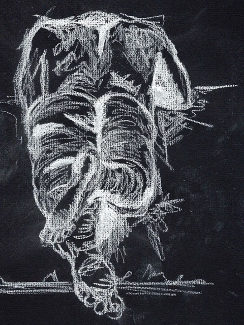 |
| \Chalk on black paper. |
 |
| Good old fashion biro on paper. |
Exercise 2: A Longer Study
Going through from the sketching to a fuller study of the body I also looked at the raised topic of the perspective of foreshortening. This method is what adds the sense of being to a body from the direction we are studying or reproducing the image from. The basis is on the length of the body or limb, head etc, and how this length changes by view but not in physicality. This comes into play when drawing from angles and different view points. (One of the raised view point refers to a self drawing looking in a long mirror and how you see the change in size of your own anatomy but obviously your legs have not expanded or grown, we just perceive the legs from a different angle. To me it is a similar aspect as in the previous exercises and assignments where we study linear and horizons, and how the angles and vanishing points distort and skew what we see but in reality it is no different, we are just looking at it differently.
A great example of an artist who demonstrates the use of foreshortening extremely well is Philip Pearlstein. I have made some notes and images in my research section.
I did another study this time, not to project the model as with detail but to work out the form and lines of the body. I used various pencils to translate the drawing to show the body basic form and then the shapes the body makes.
 |
| Male kneeling on floor. - Showing line and shapes to make the human form. |
I started by looking at the middle line of the body and using that as guide as to where this lay within the models pose and then adding some vague indentations of the head, limbs and mid body.
This is a guide and I find that if you are liberal and light it is easier to connect the dots and work out the spaces between limb to limb or for example head to shoulders.
The problem I did find towards the end became apparent to me more so with the forearms and being slightly out of perspective to the view. This comes from two valid points from my drawing that caused this to happen. The first being the negative space between the models head and her angled arm, I somehow over spaced the distance and area and once the other areas had established it was hard to correct. The second part I found my error came from was the distortion of the foreshortening of the front arm, as it comes down the front of the body and then proceeds across the front, I seem to my eye over lengthened the limbs to what is actually visible and then where it is shortening from my view I have not engaged with the process of widening or thinking of how the arm changes in shape but the physical spaces around the arm are not shifting in view as the arm itself.
 |
| Primary lines showing the position and basis of the model and position of the body. |
 |
| Starting to build, here after the initial pencil lines I switched to my choice of medium, Charcoal stick. |
 |
| From the sketch, I start to add some stronger lines and what is visual to me. |
 |
| By using the charcoal stick it did allow some movement and shapes to be more fluid and in this stage, looking back I can see the misguidance of the right arm and the problem starting to occur with the spaces around it. |
 |
| Overall it is okay, but there are parts I am happy with and parts not very happy with. The shape of the belly and curving shows well and is formed and solid against the sheet and the strain on the hip and ribs shows. The arm and neck I am not pleased with and I am thinking as I left the face with minimal detail and concentrated on the body I have miscalculated the scale of head to body, I have tried to draw the head as in view and not shown the weight of the head tipping slightly forward and put the features too frontal to view. |
Research Point - Under the research point regarding foreshortening, I tackled this by sitting on the floor with a narrow long mirror in front of me, with space a little tight I sat with my legs out and ensured they were close to the mirror. The foreshortening comes into play in two main areas. One is my straightened leg, it is very much hidden by the foot and the view being blocked from my point. The second is the forearm, it is bent up and away from me as I sketch, I found getting this correct a little more tricky. I tackled this by using a oil based pencil that moved fluidly and sketched over and over until I think I had best results. I did not take time on detail. More on the space, shapes and tones I could see on myself.
 |
| First self portrait to show foreshortening. |
Project 3 Form
Understanding the form of the body can be broken down into the shapes and forms that it creates to make the head, torso and limbs. Even down to the hands and toes the use of cylindrical shapes can be added together to form the hand as a whole with each joint to joint being isolated as a shape and connected to the next. In the past I have used this method when drawing models, looking at the ratio of head to body and using this as a guide to create proportion.
For this exercise the model is sat down and leaning at an angle holding her head in a tilted position. If the central axis is used here it starts off at an angle and then sweeps down the bent chest and compresses with the models posture as she leans forward. From the axis line the basis of the shapes and forms can be built. I made different attempts at this exercise, using different methods to accumulate the shapes together to make the models body and head.
 |
| With this sketch page I have looked at various angles and parts of the body. Breaking each section to the near.est shape form and gathering them to make fuller forms. |
The first model drawing I concentrated on getting the axis of the body in and working on building the lines and where the body develops planes and curvatures. I used these as almost map markings for getting the proportions correct. I did not want any detail, just the basic shapes and connections to create the model sat down and leaning outwards.

From this stage I worked on the lines that create the shapes. I kept a constant check on the outer shapes of the body and the spaces between her form, for example the gaps between the calves and the stool legs. The triangle forming from her bent arm to the cheek.

I repeated the sketch but this time I took the aspect that the shapes are what make the tones and shadows, and used these areas to form the shapes. Rather than draw in the whole shape, I used sections of shadows and kept them fairly basic and thought more about the areas the shadows covered. Where the sat on the body and how the shape was within the physical shape.

Moving to the front view of the model, this gives me two new points to narrate to the viewer. The axis is curving from the tilt of the head, this then moves down to the chest bone and the imaginary line almost creates a semi lozenge line as it descends back as the model leans forward and comes round to the middle of her pelvis.
The secondary aspect is how the foreshortening of the limbs start to change, from the leaning model we start to get the sense of the flesh on the thighs and stomach and breasts. These are hidden from the side view, these become different shapes.
I find the most successful method is to place in imaginary contours of the thighs etc. Imagining them sliced and how the shape changes as the flesh presses down on the bench, then is free as it approaches the bent knee.
I worked methodically on this piece. Starting with the central axis, then working out the hidden shapes and structures as I worked from the axis outwards.
I am quite pleased with this result.


This works and the body of the model and how she is leaning becomes clear as the shadows and dark areas define the lights direction and spaces between her limbs and objects.
Exercise 2: Essential Elements
Piecing some of the previous exercises together, this uses elements of them to create an overall successful use of them to create dimensional human form drawings.
For this exercise, I used two mediums, firstly I started in a 4B graphite, but found the harshness of trying to show tonal values too strong. (The images came out even darker after they I had uploaded them!) and for the second two I used a standard HB drawing pencil with a good nib. The latter worked quite well on watercolour paper for instant texture and shading.
The restrictive time does give me one advantage and that is to draw literally what is view-able and not over detail and concentrate on what is required for the exercise.
I have put the images below in order of sketch. This does show the development over the six drawings which I am quite pleased with, the line work improves and I think the portioning works better the more I draw the models body shapes.
The first two I am okay with, the standing pose I could not seem to show the shading of the side very well and it seemed to end up darker outlined than shadowed.
The last one worked well as it caught the softer light, and I had improved on showing this on my line work and hatching.
 |
| 1. Stood pose in 4B Graphite stick |
 |
| 2. Sat pose in 4B Graphite stick. |
 |
| 3. Sat pose in 4B Graphite stick |
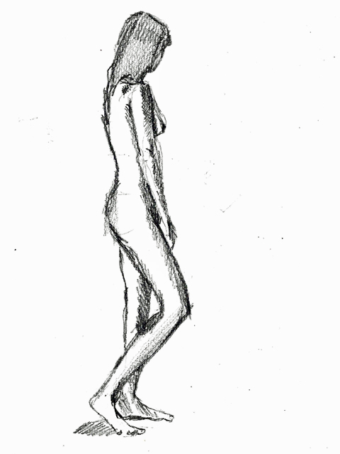 |
| 4. Stood pose in 4B graphite stick |
 |
| 5. Laying pose in HB Pencil |
 |
| 6. Kneeling pose in HB pencil |
Exercise 3: Stance
The stance. How the body is structured and how it holds its flesh on the bones that lead from the spine.
Here in my sketchbook I have looked at various stances within models and how the lines vary and alter according to how the body is performing or positioned.
I usually lightly draw in a few lines around the head to keep the middle line where the nose sits and use this to guide in features. From this central line it leads down, the middle of the neck, towards the chest and cavity, from here it comes to the stomach and belly button. Down to the middle of the legs. Along the way. I often add a light line where the shoulders balance, across the chest from nipple to nipple, and then across the top of the thighs from hip to hip. This often helps me decide where the models limbs and torso is facing or positioned.
If for instance he/she is leaning then the line across the shoulders moves as does the hips in certain stances or movement. Below are pages from my sketchbooks on this subject.
 |


This A3 sheet is filled using different stances of the model and building up on the axis of his body line and using a basic use of three colours to quickly build up dimension and muscle and tone. The body line moves and twists as he stands in different moves. The hardest is to visualise the line from the rear view, to imagine that line lead down the nape of the neck and through the spine and to the bottom and legs. Making sure this line is in place either with visual lines or dots/marks where the axis points are essentially helping proportions.
 |
| Pencil sketch on A3 of the male model in different stances and from different view points. There are simple lines underneath to make sure the axis points and central line is focus for building the sketch of the human body. |
Exercise 4: Energy
This was my first attempt at creating energy by using watery paint and a soft brush. I tried to keep it simple and follow simple lines and build the body structure up from this. Though i kept the models form well, I started to over work and the swift instant markings of what I see were lost amongst the other brush marks. Overall it looked good but it did not show movement to me of the figure rising up off the ground.
 |
| Acrylic watered down with soft brush |
 |
| Waterbased crayons |
 |
| Using thick ink pen |
 |
| Brush pen in rapid line movement to capture shape and form and action. |
Project 4 Structure
The process of understanding the fundamentals of how a skeleton is formed and functioned underneath the human/animal flesh.
When I draw a human form in sketch form or in the study of a model, I often begin with very faint structural lines. These represent the bones. As previously discussed and noted within the exercises that refer to this as the central axis, I often start with the basic location of the head to torso and its position, using the invisible line of the spine to suggest the body form and shape at the captured time. This is the very basics of the start and from here there is movement towards understanding the function and structures of the more complex aspects such as the feet and the hands, the ribs and the hip bones. I often have found from just general sketching is to always remember that all parts of the model/body are connected, so if we look at the elbow, some where there is a path from this to the ankle, and keeping this in mind and working from one area to another does help to keep a better track of proportion and working out the (often) hidden structure I am trying to draw.
Exercise 1: The Structure of the Human Body
I have begun a collection of sketches of the body from models, photographs and research books to also using my own body as resource. This exercise is one that will be continued and collated within various sketch books. Along side my main sketchbook I have started a collection of work dedicated to this section in another sketchbook so I have a point of reference and can go to this to add and use for the future.
Here below are some works I have been doing at different points and using different points of reference. I have started this section using the basis of the hand and foot structure ans this is the area I found to be hard to get into proportion and situ on a model when in a full visual stance that includes foreshortening in places.
 |
| The study of the hand in movement and form |
 |
| Expanding the study of the hand and looking at the outer shell and positioning of the bones in the fingers as they make shapes and posture. |
 |
| The study of my own foot in the mirror. Using various positions to work out how the bones form the knuckles and curves of the flesh over the structure as the foot bends, moves and stretches. |
 |
| Legs: using the mirror again I studied and sketched the way the lines change as the leg moves from one position to another. The legs are the balance of the body and when drawing a full figure sometimes if the legs are not expressed correctly, such as if it is in a foreshortened view the body can look unbalanced and not natural. Artist Philip Pearlstein shows how using light and shade around the flesh can still explain the underlying structure and its position. |
 |
| Simplistic sketching of parts of the male model. Isolating areas such as the elbow and foot, (the parts I struggle to get correct!) |
 |
| Carrying on with isolating areas to understand the foot and hand and limb areas in proportion and angles. |
I also researched into the structure of the body within artists work from the historic to the contemporary. The main area that really stressed the understanding of us as humans and our form came in Italian renaissance artists studies and work. It is all in my Research & Reference section.
The one contemporary artist who I have studied and used for assistance in understanding his formation of human body in art is Igon Shiele. I have recreated and also researched his works. His work is bordering on a change of movement in art at the time he was around and I think this has created a very unique style.
 |
| First study of the nude model. Shiele had a varied choice of model that covered all sexes and ages. Non held particular beauty and I think they all held a rawness to them which made them very captured and real. |
 |
| A copy of one of Schieles works and one of mine using variations of his style. |
I am going to carry on studying Shiele, I have acquired a book of some of his drawings and there are some elements of his work that captured a contemporary style that I think they still work today.

The method Schiele used for some areas to create tone became a method of erratic but controlled areas of loose line work, I tried this on the models areas where there is texture to the body, on his legs and arms, where muscle, vein and hair lines are present. The other task I tried to use comes from the material and black wax pencil. I wanted to simulate the soft borders that came from using such a harsh colour.
Exercise 2: Three Figure Drawings
 |
| STANDING A2 GRAPHITE STICK |
 |
| SITTING A2 GRAPHITE STICK |
 |
| LOUNGING A2 GRAPHITE STICK |
 |
| A LOOK AT THE GRAPHITE STICK AND MY LOOSE USE OF LINE |
Project 5 The Moving Figure
The moving figure is one of the hardest things to capture in a drawing! I have always found this to be one of those processes where it has to me momentarily to be successful. The longer that the image is captured the more static it can become. I think this generates from the first initial lines and marks we make are those that the predominant and make capture that specific movement, once we start to elaborate we fill in elements that possibly are or were not there.
In the previous assignment section I had spent some time capturing a market scene and I recall the studies of the people as they moved in and out the stalls and wandered around, I think understanding how to capture the movement be it fast or slow is what makes it successful and not necessarily the detail.
My first sketches are from as and when I have visited places or had opportunity to sketch.
I think the background helps tell the story and often I think I can place in a few lines or indications it does help explain or offer narrative to the story.
 |
| This was one of my first sketches, I took the opportunity in a cafe. I was not looking for proportions or story telling, just wanted to start getting some experience down in my sketchbooks. |
 |
| Quick park sketches as people pass by. |
 |
| In the coffee shop. This time I had some softer sketch pencils and just concentrated on the person and what also was around them but without over detailing. Catching the moment. |
Research point - The two reference points of Richard Hambleton's Osaka and David Haines New Balance Sneakers and KFC bucket show the comparison of capturing movement in figure but in different ways. The Hambleton brush strokes show frantic speed and uncontrolled movement, went we move fast and frantic, our moves are often the same and the control is minimal. The splashes and splats are as important, they generate movement and space around the figure and show the fluidity and erratic motion of the body moving towards us, I did consider it was moving away but if you look at the grounded foot its shape and position is flat to the ground and if this was moving away it would be angled more to show to ground and distance as despite the frantic swipes of paint the structure and shape of the body is quite accurate.
I think two areas are defined very well. One is the shape of the grounded leg as the thigh bends down towards the calf, the lines and shape is very true to life even though it is completed by a thick controlled swipe of black paint. The second I think is exiting, belongs to the hand that could be a punch, a swing or swipe at the viewer. He has created a scratched marking type line around the hand which does not show detail but shows movement.
David Haines: New Balance Sneakers Vs KFC Bucket. The detailing and work is immensely strong in this drawing. Haines shows the likeness to true life and the accuracy of human form in all three figures. It is like a snapshot photo-realist picture and dictates directly what we see. I can see the man leaning forward in the middle, we can see the two men aside holding him, but what can I see that shows movement? The first thing I think about is the lines and the shadows and tones of the fabric. Because this is so close to reality I can associate immediately with how these materials behave and how they act in movement. From this I can see his leg is in a form of motion and the fabric is behaving like so.
The unnatural static pose of his out stretched hand, a captured second of the hand as he panics, not how a hand would be positioned in an extended still moment. Haines pencil work shows such clever use of light and darkness to let us see how the movements and postures create the shapes of the shadows momentarily as they move. The mid shot of the bucket tells us as the chicken falls out that this is a snapshot, we know that buckets and chicken wings don't float in air, so immediately we know its something happening there and then. Did he kick the bucket figuratively? did he send it flying? are they holding him back? How else is the movement created, if it was captured as that bucket was in mid air, it had just be launched, who did that and where from? I think this also adds to the sense of movement. The stillness of the detailed pencil drawing is portraying a photographic like moment. A complete contrast of artwork but both successfully showing how to capture and story tell that movement is occurring to the viewer.
www.davidhaines.org/work02.html and richardhambleton.com/studio
Exercise 1: Single Moving Figure
Here I singled out the human form and tried to capture it using the basic lines, referring to the central axis and the head as very brief guidance to outline what each figure is doing. I used a brief video capturing a man standing, sitting, moving etc. This was repeated but was a constant movement pauses. Using this sort of method meant that it was a case of drawing the immediate and then starting again very soon after.
 |
| Man standing, sitting, crouching repeated. |

This sketch page is from as I watched people walk around the main square, I tried to draw them as swiftly as possible and capture the movements.I did find singling out people difficult among crowds and that the best way was to not be too fussy, and it being a case of look up and draw, stop. Look up draw and stop. Picking the person I first see. This was done with a charcoal sticks, as I found the mark making worked better and was swift and getting the line down without spending any time looking at my hand movement but more at the person/s passing by.
Looking at a single moving figure, I tried two different variations after the introduction to the previous artists on this project I wanted to experiment firstly by drawing a more intricate and detailed A3 drawing of movement, and for this I used a running image. I wanted to use this for the reason of movement, it being a sharp movement and the use of detail and to see if this still showed movement with tighter pencil lines rather than the smooth and liquid ink.
 |
| A3 drawing on coloured textured paper. Pencils and detailing in line work. Does the running motion convey? I think I have caught and shaped the body, limbs well. But the actual concept of movement may seem a little stifled by using the coloured pencils. I am not totally convinced but ti was a good experiment in actually proportion of the body in motion. |

Exercise 2: Group of Figures
Using a group of people to create a sketch study is a good way of understanding the movement and alignment of the body as it completes tasks such as walking, running or sitting. The points to try and remember is to work fast, try and capture that single moment per time the pencil is on the paper and move on. Keep using certain points for reference. For me I used a Newspaper Kiosk and also a barrier line to help me guide my prospective.
I made my sketch over a couple of pages in my sketchbook, hence, I think I went a little off scale in places, but I wasn't too bothered. I caught the queue of people at our station and from the other side of the fence into the bus depot I was not really obvious so it did give me an advantage to draw for a bit longer without feeling to conscious and also the queue didn't move very far so my models stayed pretty static as in terms of where they were stood, which let me keep going back to the line and on to the next model. A family of four kept moving and one would go and another, probably doing toilet trips with their children, and this was the only break I found where I went a bit off balance with following my sketch through, but it is a sketch so I was determined to get as much down while I could! The people in the back ground were a little restricted because I was positioned at more or less head level, the bits I could see I sketched in as they occurred. Though one guy carrying an enormous box into the station made me smile as he stood behind this woman and she did not move! So I quickly added them in as a little separate sketch.
 |
| Train queue! |
After the initial sketch was created, I did revisit the sketch and I have added a little bit of watercolour tones to show some of the areas. When I did the original sketch I thought it looked fine, but actually as a sketch, though I think the task in hand was okay of showing a group of people I think that it had lacked a little dimension. I think this might of been as I spent my main focus on the foreground of people and didn't process the movement of people behind the queue from my vantage point. Maybe if I had to do this again, I would look for somewhere like a first/second floor cafe or balcony where you could view from above and get a different angle. One for me to try in my sketchbook.
Project 6 The Head
For the first basis of this exercise set I worked on the head form as a solid shape. Use the overall shape and then using very basic guides I work out the eyes, ears. etc.. The one way I try to keep this balanced is a middle line, similar to the discussed central axis and use this a rough guide for the features to work from. In general the eye line is usually slightly up off the half way line and this helps guide the other features. I always think that they eyes are the main priority, once they are in correct proportion and position the remaining features often sit better and give me a guide against scale to work from. The head is often oval based, but in some cases, I use series of straight lines to add in the position as it changes for such as the nape of the neck and the cheek and eye socket, these can all be variants depending on the angle or view point I am coming from.
Exercise 1: Facial Features
 |

Features are the next placement once the basics of the shape of the head and guides are satisfactory to me. Eyes are very important to provide expressions and also they tell the view whether the model is looking directly at them, or at something else, this all adds to what the drawing would be telling us. As, I mentioned the eyes tend to come first so I can work on the rest of the face to keep balance and proportion correct.


The mouth Can be created simply with small indication lines. An open mouth is often harder to produce accurately. For men they tend to have a paler lip tone and thinner lips so shading and tone does help create dimension and what the mouth is doing in terms of emotion. The under lip tones from the bottom lip to the chin offers some good line forms for this.
 |
| Some of the pages in the book of various features using different mediums. |
 |
| 5 out of 6 isn't bad! Not too pleased with the last drawing, but these are practice sketches! And they work, as I know what I did wrong... |
 |
| More detailed sketches and still looking at facial angles ad how the features change and how they cast light and tones across the face to help suggest the overall features. |

This is a difficult exercise because I think we are never truly happy with studying ourselves. It is an open box to find all our faults and imperfections. Maybe this is why so many artists who produce self portraits create something that does capture a little bit of those doubts and insecurities in all of us.
I think we could produce a piece we would be extremely happy with then I think we would not be honest with what we see. I found the very first steps of this a job to locate artist flow in drawing myself in detail. I started as the exercise suggested with a few sketches, I kept myself free of stopping and did not spend any time on perfecting the accuracy. I went full in using pencils, inks and paint brush to make images, I guess a bit like taking notes of my face.
None of the images were similar and I kept looking for ways to show my features using the light and mediums.
The method of leaving the pen/pencil on the paper worked quite well on the sketches. I was not aiming for recognition but for a way of capturing what I could see.
 |
| These first drawings were quite hard going, I started looking at capturing the shape and lines around my features rather than honing in on detail. Though they are not instantly me, I can see my facial shape and aspects of each one that has caught something of me. It is a merge of these I need to find. |
 |
| My second bout of drawings. This time I changed mediums each sketch. The defined black line of the ink pen is harsh but I kept the nib constantly moving every time I looked up I still kept the nib shaping the face. I wanted to form a dimensional face. |

To do my first attempt at a portrait I set myself against a sharp light so I could get some fractions of light on my eyes and hair, skin and shoulder. I used Charcoals, water and pencil to make this portrait working on A3 watercolour card.
The process of studying for a self portrait carries the risk of cheating in as far as it is tempting to correct certain features and make a better image. I used the charcoal as I think with this medium there is a freedom and a bit of forgiveness when mark making and it can carry a line to be either definite or indefinite. I feel like the portrait came out flat so I am going to see how this improves on the next one. I am trying to work out the flatness, maybe the charcoal or darkness was too much and it has unshaped the line work.

Okay, after a while away I made a second portrait, this time I changed some aspects of the work.
The first change was the materials used and the paper used. This one is created with coloured pencils and smooth 300gsm grey A3 card. I took the decision to try coloured pencils as a drawing medium after the research section. One of the artists used coloured pencils to create highly detailed imagery. I also took my easel and positioned myself against the window on a sunny day.
The encounters discovered from this exercise started with the careful process of getting angles and positions right, I am looking very slightly downwards to the mirror as it was resting in a chair tilted up at an angle where I could get one side of me against the window and bright sun. This was a tricky process in suggesting the lightened areas on my face and body. The brightness does two things, it changes the colour we see, and it discards some lines from visuals, so we make up the edges in our perception of what we can see.
 |
| Self portrait in coloured pencils. Stood at easel against window. |
The overall likeness to me is a little lost, but I have shown it to friends and family, and all recognise it as a self-portrait. The hardest parts of a self portrait I think come from being honest and also not being too critical. I think as I see my face every day, I thought maybe it does not look like me.
The choice to use coloured pencils became quite interesting as they are quite a restrictive medium for an amateur like myself, it does take some time and precision to acquire good shading and also the process of getting like to like colouring. I struggled on this area, but I am glad I have done it as I think I would use them again but look more in depth at the process of using them. I think they are a medium that requires some methodical use and time.
Between the two portraits, I think I like the first one better because I think the use of materials allowed a better spontaneous freedom but the second one did ensure a more studied and connected use of studying what is before me. The hardest part of a self-portrait is the option to start to fill in gaps as we think they should be, and not what we see in a reflection. We see ourselves maybe slightly differently than others as we become used to our skin on a daily basis. In the first portrait I recognise myself.
I think the second one starts to loose a sense of dimension and solidity due to the medium and how I used it, I think another attempt but to try and be a little less precise and more fluid with the lines might help.
I initially sat down and thought about the models faces from previous studies within the exercises and the studies of the features and the lines and marks uses to form a face.
I started with the basis of the hints of how to form a head in the previous exercise section, this did work to a point and then I seemed to produce something that didn't speak to me at all. It felt flat, unemotional and to me it just did nothing. It did not speak of portrait or express any shape or form away from a mannequin like end product. I used watercolours and wax pencils.
I think I am going to re-take this exercise and just try to clear my head and produce something that is from my head and not try and think about the exercise too literal. I wanted to complete it as in word for "a portrait" but I think I became intent on there being; Two eyes, a nose, mouth etc. which made it a bit basic.
 |
| Not pleased with this, I think I misguided the proportions and it is flat and bland. |
I started with the intention of it being a pencil drawing but later applied ink. This time to ensure better proportion and better positioning of features I pencil lined the details around a skull and imagined the sockets and jaw line etc. From this, I started to build up the face, working on the solid shapes such as eyeballs, teeth and jaw line. Once these were in place I looked at how the skin would fall and sag on an older face. I used memories of looking at people in the past on how skin for example around the neck, and how the skin looses its firmness and elasticity.
One of the things I noticed over doing this drawing to previous is my experience in sketching and visual notices of how faces and structure work. One point I recall doing this one, is the darkness of the line under the chin and around the chin and how that piece of the face is difficult to perfect as if the shade is too strong it looks like facial hair, and also it can make a jaw line look flat or alter the face as a shape if the jaw line is incorrect.
Overall - I am fairly satisfied with this sketch and detailing, I am pleased I got the nose line well and the eyes looking in the correct alignment. Also the cheek and the sagging skin looks quite good.
The negative areas I think, come from maybe too much hair area, and also I think I had over rounded the shoulders. Also trying to age the skin with black ink may have been a little aggressive. I also think I missed a point of the mouth / lips thinning as a woman gets older. The neck may also be a little too long. But as this comes from total visual recall I did not think it was too bad as a piece.
Assignment Four
The final assignment consists of three sections, there is two figure drawings and a self portrait. Each of these sections within the assignment are designed to establish the learning and processes taken from the exercises through out The Figure and The Head.
Model in upright chair
Due to various factors obtaining a model has continually proved difficult in time restrictions an getting someone to feel they will give up personal time to sit. So, when I can to these assignment tasks, I initially dreaded tackling them. However, for the first segment, I have been quite lucky. My model agreed to sit and read while I employed myself to drawing.
From the first observation of this piece, I needed to be ready to use my time wisely and make as much use as possible of my model.
I had some rough suggestions noted down and took my subject and area into consideration. I did not want the subject to be conscious of being observed so my choices came from having the model in a chair alone, or sat in at a desk reading, (sneaky distraction). I did not over work my sketches as I was quite aware my sitter my be there for a little while!
We tried the desk first but I found two problems, one of the light was so poor against the body, it hid much of what I had in front of me, the other issue I had was angling, the desk only offered two positions, I could be in with the paper size and the space.
I found the stark light worked well against the white door, and if we used the lamps instead of overhead light the shadows materialised.
I have broadened my mediums over the last months, so looking back at what I had used, and the taking in consideration of this being a fluid and I wanted to try to be more expressive, than be drawing a body with a head and proportions but not really providing a difference to show what I have absorbed.
I had thought of using ink, but due to the fact, I had a worry I would struggle to locate time to do this with a model again at a convenient time, I opted for a Conte pastel and worked on the basis of fluid movement and then as my model moved I could capture that.
My view is from up on the desk! As we were a little restricted for space in this room, (the room was the best for showing the dark and light sides and making spacial areas of shadow.) Anyway, the looking down angle for me, works.
Going from the previous steps in drawing figures and faces, I was looking at this as an opportunity to be completely free from restricting line work. Working in A1 meant I had to be fluid but also methodical in line placement.
I started with so basic light shapes and points, and as I kept adding I did use my studies of Schiele to explore line and depth, and also take into his account how he used continual lines in some areas that led to form creases, positions and form.
The finished work on the A1 paper worked better than my first view, though I am not entirely pleased with it. I tried not to be too indecisive about putting marks down. I wanted to capture it as that hour or so passed. I did find working on the A1 a little pleasurable as I put in some long lines and sweeps with the side of the conte stick, and the further I got into the work the less tight the lines became. As the model changed position, I just worked with it and just placed down line work as each time I applied to the paper.
This assignment has given me the opportunity for experiment and an option the be be bold and try something new.
Looking over previous work in this exercise, I think I have managed to untrain myself to how I normally work, and not be so tight and restrictive with lines when expressing a human body or face.
I am going to review this again later, and start to think about doing the next section and consider my materials etc. I am thinking now I have used this part of the assignment to experiment with style and influences. I want to try and look at other aspects of portrait work and the form, maybe work in other mediums or materials.
I wanted to try and almost be opposite to my first execution on this assignment. I used black A1 paper and white ink, I did find using a life model does hold resistance against deliberating when creating a portrait and I felt that it was a case of relying on experience and knowledge that helps achieve results in one session. I feel this one pushed me a little more, I used a dark room with just the TV screen (inspired by sketches in my book of reflections from using a tablet!), I had an image in my head of how I wanted to portray what I could see.
At the start, I had given some good movement and using the wet delicate white ink made me be decisive and more controlled. (when i did the previous model drawing in the conte sticks, I did let myself be more fluid and free),
I tried two methods of keeping the ink flowing on the paper and not stopping and combined this with observation. I think I thought about this with one of my studies, and was waiting for the right piece of work to try this. Anyway, my regret over this piece, is that I feel I should have developed more lines to help engage the areas where the TV light was resting.
My angles are good, and think I have captured the body well, and it is fairly easy to see what is happening.
After I had finished, I went back and started to look at adding dark marker pen to areas I felt shade was lost. But, once I had placed a few marks I decided against this because it did not enhance the piece in any way and I was applying to the work after the session so I would have been working from memory.
I now look back and think I would have liked to have developed more tonal values and thought about adding more white, but as I have almost taken my visual and gone with a negative theme, I don't think adding more to it would have been wise without pre-testing the method. (I had the idea of white ink but when I worked on this did not really consider the vastness of A1 paper!!).
A Self Portrait: Looking at a self portrait and how a self portrait can be expressive, open, honest, deceptive or can be quite under dimensional which I think generates from how we choose to portray ourselves. I found the portraits I did in one of the previous exercises quite a tough challenge. One point I think I found the hardest was to be truthful and honest and to try and look at a mirror or photographed image of yourself with open eyes and to see yourself as a third party.
We all think Van Gogh looked like a gaunt staring face with a straw hat but did he look like that? was that his intention, or is that how he saw himself, or is it how he wanted to see him self?
I looked over works by Egon Schiele, whom I read and studied some of his works from this assignment, and to start with, I did consider his work a bit over rated and wondered if his fame came from his associations with Klimt and his notorious behaviour within that period and how he used the human form to be in what I guess was offensive poses or suggestive poses, when actually we know they are just human or his studies at their most vulnerable. I also think this after viewing several pieces of his self portrait studies was true. He showed his body his lines, his vulnerable state of being unclothed and he used his expressive markings to show the weaknesses and delicate way the flesh is.
Though, through this section I may not have developed in leaps and bounds in my artistry, I do feel the from this particular episode I am starting to understand what makes a picture, what a painting or a drawing says and I am starting to mostly think about what an artist is saying. Some are just a drawing, pleasing to look at and shows beauty in nature or in colours or shapes, and then some show adversity, despair and also emotions. These are what I am starting to see in some works.
I did learn quite a bit about the uses of self portrait, even though through the exercises I was not truly convinced I had succeeded. However, this assignment has given me a urge to try and produce something I find myself pleased with, and not pleased in the fact it is favourable to me but pleased that I have managed to capture myself.
The choices of materials and mediums can have the overall appearance of work change. As this is a self portrait, I think I am just going to go with the feeling at the time, when I come to the point of drawing.
My first considerations are two parted, one will be how to create a different kind of light, whether it be dark or lighter or shadowed, I need to show the tones as requested. My other part will be positioning, one of the draw backs I found from the previous self portrait experiments came to struggle on the accounts of positioning and comfortable stature. The first I did sat down which was not too bad, but I did try to stop myself from moving too much, and the second I did stood up looking down at an angled mirror, which I now realised meant that I kept altering my angle and also standing looking down, after a bit gets tiring on the neck!
I experimented with lights and positions and noted down some ideas in my book. I wanted to think about this as a captured moment and also wanted to try and get myself to just relax and spend the time working on this rather than over thinking it to a task like stage of completion.
As I wanted to try capturing different effects which is not always possible using mirrors, I tried a series of photography sessions. I tried using the camera as a third eye to see how light and dark works around the body and face as I tried different effects. There was two or three that I liked the effect of. I went into a large cupboard and positioned myself so I could see my face reflection in the hand mirror and slowly kept opening and closing the door to see how the light changed on my face as it came into the cupboard. I know it is a bit of a random experiment but it was interesting and the casting of shadows on the eyes and nose, it does tell a story of the face and how its form is changing from visual angle to angle depending on the reflective light and the darkness percentage. I may come back to this one. I also tried a simply use a small lamp and put it directly under my chin and angle the camera to one side to capture over lit and under lit images. These did work but I thought the over lit and under lit came away loosing any sense of feeling.
Okay, so after a few contemplative ideas and trying to think of a self portrait that was going to show expression and technique and of course I felt too much time wasted deciding on how to proceed with a self portrait, I looked back on ideas and how to try and be experimental and also try to maintain what is required. I don't want to think I am trying to be different, just to be different, but I such as Schieles's self portraits, he produced himself as whole rather than the expected self portrait.
I had a designated study day and it was starting with decision on choice, while procrastinating we had a very strong early morning light coming into the window and onto what we term the "Comfy Chair" so I took this moment and got set up with the mirror and the camera and light and somehow I came up with this full self portrait of me early in the morning, not really sure of what I am doing or feeling. It was just a complete fresh outlook on being very personal and direct with myself as a subject.
It is in soft wax pencils to show the light and the tonal values of my skin, and I wanted it to have that glow and hazy feel.
I used the whole body as this to me is as much self as just understanding your own face I guess, and I just got comfortable and tried a few angles to see how I felt.
This just worked for me, whether it classes as a self portrait as required, I really don't know and I am working on the basis I took in all my experiences of this last assignment and exercises to produce this and the research I took on artists that used this medium.
I have taken some closer images below and the overall pieces as I have worked through the piece.
After a bit of distance, I decided to look at how the tonal values needed to be more defined around the face. The simple mistake of the distance of eyebrow placement made the expression incorrect and needed to be renegotiated, this worked and kept the expression on the face. I think this is a difficult task to find success and the skin is a whole form with no real solid edges so it is all about expressing the shape and solid areas and the texture of the flesh.
I am now considering whether to re-negotiate a second portrait and concentrate on the face, my doubts come from thinking if this what is wanted or if I have expanded and chosen what a self portrait is rather than fulfilled the exercise.
As a piece, I think I have captured the mood and space well and at first I did ponder on leaving the spaces vacant, but I do like the in situ art such as Philip Pearlstein or Jenny Saville where the surroundings show the models in their relaxed state and the chairs/beds are as important to the pose as the models held position.
My self portrait below is the final piece, after some time and deliberation, even though I have kept the work on my previous self portrait, I went back and looked at the photos of light and dark and contrasting the two against each other in very opposite points of bright light and no light at all.
The first self portrait I used full early sunlight, and though this created a bleached and softer piece of work the use of darkness and smaller adding of light source made for something I had to try.
Using the narrow light against the door frame and a very dark room, I sketched out in light pencil some negative and positive shapes on my face. I had been inspired from a earlier session using the camera and some effects I got from this. Now, this was as similar as I could get, the darkness was not as strong as in my photos, but I still think overall it worked quite successfully in terms of how the shadows and tones worked on my face. To get a room to that level of darkness is quite difficult to see in the mirror. (I think this is why I went a little "wonky" on the darker side of my face!).
I used an charcoal stick to go over my drawing, and then spend some time working and reworking round the face. I then carried on using different thickness of charcoal sticks.
My negative aspects on this piece, after some distance of time is that I think I have not quite got balance in the face, but not sure if that is because my attempt at gaining the shadows and tones of the dark meant I over worked the surface of the skin, the mouth and eyes are not quite positioned right, but once I had started work on the face it did not look so wrong until I revisited.
The good points are that it is a vast improvement on my very first attempt of self portrait back in a previous exercise, I think this does have an essence of myself about it and can see my concentrating face! Another pleasing point is that I think I managed to get a good definition of the nose and chin and the neck line shows my position quite clearly as slightly turning to one side.
I forced myself to fill the sheet rather than work centrally like I did from the first ones and try and use the spaces wisely rather than leaving untouched surfaces.
I kept a sketchbook running through this section, unfortunately I did get a little messy with it, but I think these sort of processes come with time and are open for me to start developing and learn from where I go astray and help me achieve a better method of recording.
I revisited my old exercises as I went though, using artists I have found useful along the way. I do find studying and recreating their work does help understand their processes and reasoning, it has helped me quite a lot through this course.
 By revisiting some contemporary artists, eg: George Little, Tracey Emin and also classical renaissance artists especially ones who have created the human form, it has given me some confidence and ideas for how I want to further this assignment and look at using marks with maybe wider brushes to alienate myself from old ways and also to feel empowered to try it with not worrying of the end result being a complete piece of art in its own right, I am more aware that I need to be unbound and use this opportunity to expand on what I feel I have grown from over this period of the course.
I have used past exercises and contemplated over my weaker points to try and work towards creating something unique in my assignment piece. I want it to cover and help surge forward in some of the areas I feel weaker in.
(the written element).
UPDATE:

A little bit about the work:
This is from a series of photographs I had taken using my phone. We was in the process of clearing out a room and a plain mirror got fractured, due to its delicate nature the edges of the mirror were sealed with tape and left while the ceilings were decorated. The grey bare walls and the splashes of emulsion added to a very provocative selfie. There was little detail in the facial features as the image is taken from a larger photograph.
There was points I needed to cover within this. I wanted the dimness to reflect my feelings towards the period, and the cracked mirror did help with this, the segments of the shoulder and side of face sliding is almost a feeling of giving in, dissolving.
 These images show the cracked mirror, the interesting and irregular shapes. A flat dimension but with its broken surface it does create a sense of movement and undulated surface.

End note:
I would just like to say thank you to my tutor who has always given very constructive and informative information and feedback, without there has been some great artists and works I would have never known and missed out on, it has truly lead me to think I can actually produce work to the next level and I hope I can continue to learn and improve.
 |
| Sketch lines for under the skin, looking at the skull, eye sockets and jaw line. |
 |
| Finished piece in pencil and ink line work. |
Overall - I am fairly satisfied with this sketch and detailing, I am pleased I got the nose line well and the eyes looking in the correct alignment. Also the cheek and the sagging skin looks quite good.
The negative areas I think, come from maybe too much hair area, and also I think I had over rounded the shoulders. Also trying to age the skin with black ink may have been a little aggressive. I also think I missed a point of the mouth / lips thinning as a woman gets older. The neck may also be a little too long. But as this comes from total visual recall I did not think it was too bad as a piece.
Assignment Four
The final assignment consists of three sections, there is two figure drawings and a self portrait. Each of these sections within the assignment are designed to establish the learning and processes taken from the exercises through out The Figure and The Head.
Model in upright chair
Due to various factors obtaining a model has continually proved difficult in time restrictions an getting someone to feel they will give up personal time to sit. So, when I can to these assignment tasks, I initially dreaded tackling them. However, for the first segment, I have been quite lucky. My model agreed to sit and read while I employed myself to drawing.
From the first observation of this piece, I needed to be ready to use my time wisely and make as much use as possible of my model.
I had some rough suggestions noted down and took my subject and area into consideration. I did not want the subject to be conscious of being observed so my choices came from having the model in a chair alone, or sat in at a desk reading, (sneaky distraction). I did not over work my sketches as I was quite aware my sitter my be there for a little while!
We tried the desk first but I found two problems, one of the light was so poor against the body, it hid much of what I had in front of me, the other issue I had was angling, the desk only offered two positions, I could be in with the paper size and the space.
I found the stark light worked well against the white door, and if we used the lamps instead of overhead light the shadows materialised.
I have broadened my mediums over the last months, so looking back at what I had used, and the taking in consideration of this being a fluid and I wanted to try to be more expressive, than be drawing a body with a head and proportions but not really providing a difference to show what I have absorbed.
I had thought of using ink, but due to the fact, I had a worry I would struggle to locate time to do this with a model again at a convenient time, I opted for a Conte pastel and worked on the basis of fluid movement and then as my model moved I could capture that.
My view is from up on the desk! As we were a little restricted for space in this room, (the room was the best for showing the dark and light sides and making spacial areas of shadow.) Anyway, the looking down angle for me, works.
Going from the previous steps in drawing figures and faces, I was looking at this as an opportunity to be completely free from restricting line work. Working in A1 meant I had to be fluid but also methodical in line placement.
I started with so basic light shapes and points, and as I kept adding I did use my studies of Schiele to explore line and depth, and also take into his account how he used continual lines in some areas that led to form creases, positions and form.

Above are two sections of details within the larger picture, the first is the sample of line continuity with starting from the leg and working up to where the knee bends and creases the fabric. Schiele did a lot of line work and the lines often look continual and uninterrupted. I did wonder if when he worked, he kept the crayon on the paper and never took it off in some sections.
The hand/fingers are another detail I used inspiration from, but being bold and chunky with line and stroke.
|
 |
| Conte stick on A1 |
The finished work on the A1 paper worked better than my first view, though I am not entirely pleased with it. I tried not to be too indecisive about putting marks down. I wanted to capture it as that hour or so passed. I did find working on the A1 a little pleasurable as I put in some long lines and sweeps with the side of the conte stick, and the further I got into the work the less tight the lines became. As the model changed position, I just worked with it and just placed down line work as each time I applied to the paper.
This assignment has given me the opportunity for experiment and an option the be be bold and try something new.
Looking over previous work in this exercise, I think I have managed to untrain myself to how I normally work, and not be so tight and restrictive with lines when expressing a human body or face.
I am going to review this again later, and start to think about doing the next section and consider my materials etc. I am thinking now I have used this part of the assignment to experiment with style and influences. I want to try and look at other aspects of portrait work and the form, maybe work in other mediums or materials.
I wanted to try and almost be opposite to my first execution on this assignment. I used black A1 paper and white ink, I did find using a life model does hold resistance against deliberating when creating a portrait and I felt that it was a case of relying on experience and knowledge that helps achieve results in one session. I feel this one pushed me a little more, I used a dark room with just the TV screen (inspired by sketches in my book of reflections from using a tablet!), I had an image in my head of how I wanted to portray what I could see.
At the start, I had given some good movement and using the wet delicate white ink made me be decisive and more controlled. (when i did the previous model drawing in the conte sticks, I did let myself be more fluid and free),
I tried two methods of keeping the ink flowing on the paper and not stopping and combined this with observation. I think I thought about this with one of my studies, and was waiting for the right piece of work to try this. Anyway, my regret over this piece, is that I feel I should have developed more lines to help engage the areas where the TV light was resting.
My angles are good, and think I have captured the body well, and it is fairly easy to see what is happening.
After I had finished, I went back and started to look at adding dark marker pen to areas I felt shade was lost. But, once I had placed a few marks I decided against this because it did not enhance the piece in any way and I was applying to the work after the session so I would have been working from memory.
I now look back and think I would have liked to have developed more tonal values and thought about adding more white, but as I have almost taken my visual and gone with a negative theme, I don't think adding more to it would have been wise without pre-testing the method. (I had the idea of white ink but when I worked on this did not really consider the vastness of A1 paper!!).
 |
| TV in the dark - white in on black paper A1 |
A Self Portrait: Looking at a self portrait and how a self portrait can be expressive, open, honest, deceptive or can be quite under dimensional which I think generates from how we choose to portray ourselves. I found the portraits I did in one of the previous exercises quite a tough challenge. One point I think I found the hardest was to be truthful and honest and to try and look at a mirror or photographed image of yourself with open eyes and to see yourself as a third party.
We all think Van Gogh looked like a gaunt staring face with a straw hat but did he look like that? was that his intention, or is that how he saw himself, or is it how he wanted to see him self?
I looked over works by Egon Schiele, whom I read and studied some of his works from this assignment, and to start with, I did consider his work a bit over rated and wondered if his fame came from his associations with Klimt and his notorious behaviour within that period and how he used the human form to be in what I guess was offensive poses or suggestive poses, when actually we know they are just human or his studies at their most vulnerable. I also think this after viewing several pieces of his self portrait studies was true. He showed his body his lines, his vulnerable state of being unclothed and he used his expressive markings to show the weaknesses and delicate way the flesh is.
Though, through this section I may not have developed in leaps and bounds in my artistry, I do feel the from this particular episode I am starting to understand what makes a picture, what a painting or a drawing says and I am starting to mostly think about what an artist is saying. Some are just a drawing, pleasing to look at and shows beauty in nature or in colours or shapes, and then some show adversity, despair and also emotions. These are what I am starting to see in some works.
I did learn quite a bit about the uses of self portrait, even though through the exercises I was not truly convinced I had succeeded. However, this assignment has given me a urge to try and produce something I find myself pleased with, and not pleased in the fact it is favourable to me but pleased that I have managed to capture myself.
The choices of materials and mediums can have the overall appearance of work change. As this is a self portrait, I think I am just going to go with the feeling at the time, when I come to the point of drawing.
My first considerations are two parted, one will be how to create a different kind of light, whether it be dark or lighter or shadowed, I need to show the tones as requested. My other part will be positioning, one of the draw backs I found from the previous self portrait experiments came to struggle on the accounts of positioning and comfortable stature. The first I did sat down which was not too bad, but I did try to stop myself from moving too much, and the second I did stood up looking down at an angled mirror, which I now realised meant that I kept altering my angle and also standing looking down, after a bit gets tiring on the neck!
I experimented with lights and positions and noted down some ideas in my book. I wanted to think about this as a captured moment and also wanted to try and get myself to just relax and spend the time working on this rather than over thinking it to a task like stage of completion.
 |
| Thinking about light and positioning, I also wonder how to fill the area I am working on. I was considering two options for the self portrait. I looked at the full face and using the area to fill a full sheet, close and personal. I also thought about body and this being a self portrait and expressing proportion and expression together. |
Okay, so after a few contemplative ideas and trying to think of a self portrait that was going to show expression and technique and of course I felt too much time wasted deciding on how to proceed with a self portrait, I looked back on ideas and how to try and be experimental and also try to maintain what is required. I don't want to think I am trying to be different, just to be different, but I such as Schieles's self portraits, he produced himself as whole rather than the expected self portrait.
I had a designated study day and it was starting with decision on choice, while procrastinating we had a very strong early morning light coming into the window and onto what we term the "Comfy Chair" so I took this moment and got set up with the mirror and the camera and light and somehow I came up with this full self portrait of me early in the morning, not really sure of what I am doing or feeling. It was just a complete fresh outlook on being very personal and direct with myself as a subject.
It is in soft wax pencils to show the light and the tonal values of my skin, and I wanted it to have that glow and hazy feel.
I used the whole body as this to me is as much self as just understanding your own face I guess, and I just got comfortable and tried a few angles to see how I felt.
This just worked for me, whether it classes as a self portrait as required, I really don't know and I am working on the basis I took in all my experiences of this last assignment and exercises to produce this and the research I took on artists that used this medium.
I have taken some closer images below and the overall pieces as I have worked through the piece.
 |
| Close up of the tones of the chair against flesh. |
 |
| The face originally stayed like this but I needed to add more value to the tones to punctuate the nose and eyes. Not quite captured myself correctly in facial featuring and needs more work. |
 |
| Partially through the process. Not quite happy needs a bit more work. I think somewhere, I have got something out of sync within my face as the expression is there but not quite looking like myself, the detailing and definition of features needs attention. |
 |
| Finally finished! Portrait on a Sunday morning - Wax pencils on Smooth Grey A3. |
I am now considering whether to re-negotiate a second portrait and concentrate on the face, my doubts come from thinking if this what is wanted or if I have expanded and chosen what a self portrait is rather than fulfilled the exercise.
As a piece, I think I have captured the mood and space well and at first I did ponder on leaving the spaces vacant, but I do like the in situ art such as Philip Pearlstein or Jenny Saville where the surroundings show the models in their relaxed state and the chairs/beds are as important to the pose as the models held position.
My self portrait below is the final piece, after some time and deliberation, even though I have kept the work on my previous self portrait, I went back and looked at the photos of light and dark and contrasting the two against each other in very opposite points of bright light and no light at all.
The first self portrait I used full early sunlight, and though this created a bleached and softer piece of work the use of darkness and smaller adding of light source made for something I had to try.
Using the narrow light against the door frame and a very dark room, I sketched out in light pencil some negative and positive shapes on my face. I had been inspired from a earlier session using the camera and some effects I got from this. Now, this was as similar as I could get, the darkness was not as strong as in my photos, but I still think overall it worked quite successfully in terms of how the shadows and tones worked on my face. To get a room to that level of darkness is quite difficult to see in the mirror. (I think this is why I went a little "wonky" on the darker side of my face!).
I used an charcoal stick to go over my drawing, and then spend some time working and reworking round the face. I then carried on using different thickness of charcoal sticks.
 |
| Self portrait in charcoal on A3 cream card stock. |
The good points are that it is a vast improvement on my very first attempt of self portrait back in a previous exercise, I think this does have an essence of myself about it and can see my concentrating face! Another pleasing point is that I think I managed to get a good definition of the nose and chin and the neck line shows my position quite clearly as slightly turning to one side.
I forced myself to fill the sheet rather than work centrally like I did from the first ones and try and use the spaces wisely rather than leaving untouched surfaces.
Assignment Five - Personal Project
 |
| Inside cover of Sketchbook with dedication to this project. |
 |
| Writing a review in my sketchbook |
I revisited my old exercises as I went though, using artists I have found useful along the way. I do find studying and recreating their work does help understand their processes and reasoning, it has helped me quite a lot through this course.
 |
| Second page of review. |
 |
| A review of some of my books, recommended by course / tutor. All have been majorly important in research and helping understand exercises. |
 |
| Sea things in another way! |
 |
| Revisiting portraits, going way back to renaissance to work on facial lines and structure. |
 |
| A bit more studying, looking at methods, shading, crosshatching etc. (this taken from The Four Evangelists). |
 |
| I wanted to work on different medias so trying the same drawing in three methods |
 |
| Looking at contemporary artists who have created portraits, using colours, lines and marks for mood associations and meanings. |

I have used past exercises and contemplated over my weaker points to try and work towards creating something unique in my assignment piece. I want it to cover and help surge forward in some of the areas I feel weaker in.
Using mood to express a self portrait in mixed medium
The process of reproducing a self portrait became my personal aim after the four assignments, I felt this was an area I needed to explore. Throughout the four assignments I have kept myself quite restrictive with my styles and my media usage. After gathering up my sketchbook and revisiting the assignments I noticed that I did reaffirm a constant style and though I produced four fairly accomplished pieces all had feedback that could explore avenues further. I still have a sense of restriction and need to further adapt my skills. This includes using other mediums, previously I seem to have stayed within my comfort zones, tried pastels and charcoals but mainly kept familiar with a medium I can control.
To combat this, I have reviewed previous feedback, one being the positive review from a mixed media exercise, so taking this forward I wanted to express how I can work to use variety of mediums or at least away from my former “Go To” tools.
The second restriction I have fallen to is using either A4, A3 or A2 and occasionally A1, I have not really contemplated at looking at shape of how a landscape or a narrow canvas could affect my drawing, or outcome. For this after some sketches and ideas I came up with working in a square format on a canvas board after I came up with my decided subject image.
The self portrait is probably the most personal an artist can be, so this has set me the task of being open and wanted to really consider what I am conveying, not just to say “Hey, this is me!” but want you (the viewer) to look at my work and think why has he done this, why this tone, why not this and why has this happened? etc..
To accompany this work, I have dedicated time into putting more down in a sketchbook rather than my previous studies and keeping a running log of the work, of course there are photographs of my book and some indications of what it all means, in honesty I know it may seem a little confused, but I just wanted to work to my mood and capture throughout the sketchbook/log my thoughts and ideas along the way.
There are some aspects where I have diverted away from what I am doing but think in all artists there is a lot to learn in not procrastinating and working towards a piece of work and leaving everyday worries and problems to aside while you become an artist for what limited times you may have or opportunities.
My finished piece for this work, may not have come out as I initially wanted. I worked while I was in the presence of my bad mood, and I feel this has come out well in the work. I have been suffering an horrendous stressful path for a few months and though this has effected my output, I have turned it to my advantage and used it as my possession for creating something with a feeling.
I know as a viewer (especially if you look over my previous works), you may think, this is not his usual work and if you do think that, I am pleased. I don’t want it to me.
This work is for the moment the usual me, a bit dark, messy and if truthful a bit fractured.
Whether this is want is wanted to be achieved, but to me it is, because I am aware I can draw to a standard and I am aware I can shade or make shapes and forms, but my work, looking through the course felt a little underwhelming to me, like I am working towards ticking boxes on the text, whereas this I feel I have accomplished.
 |
| Busted Selfie - Mixed media on Canvas board 45x45cm. |
After a little bit of time, I just was not sure about the work, I felt I had become obsessed in the intent of mood and technique and trying to cover all basis, so I am afraid, rightly or wrongly, I revisited the canvas. My issue was the original looked flat and over worked. Though all the pointers were there I just had this urge to work further on it.
I tried an new higher quality acrylic and also a metallic poster paint, which I mixed with water to try and obtain a mirror style reflection.
I reworked over a three separate sittings and tried to establish a more sense of me in the reflection and also want the viewer to understand the glass of the mirror reflecting my broken images back at me.
I used a gloss spray and added a shine to varied sections of the painting where the light reflected sharply and other areas left untouched to give the sense of light in some areas.
Facial structure seemed to work better on this revision, I seemed to get the works of shadow and shape of the face, the partial facial features and the sliced mirror cutting away into parts. Is it confusing or can you as a viewer understand this is a cracked mirror reflection?

A little bit about the work:
This is from a series of photographs I had taken using my phone. We was in the process of clearing out a room and a plain mirror got fractured, due to its delicate nature the edges of the mirror were sealed with tape and left while the ceilings were decorated. The grey bare walls and the splashes of emulsion added to a very provocative selfie. There was little detail in the facial features as the image is taken from a larger photograph.
There was points I needed to cover within this. I wanted the dimness to reflect my feelings towards the period, and the cracked mirror did help with this, the segments of the shoulder and side of face sliding is almost a feeling of giving in, dissolving.


End note:
I would just like to say thank you to my tutor who has always given very constructive and informative information and feedback, without there has been some great artists and works I would have never known and missed out on, it has truly lead me to think I can actually produce work to the next level and I hope I can continue to learn and improve.
No comments:
Post a Comment